This document provides the lesson plan for a 3rd grade math class focusing on collecting and organizing data about discrimination in the community. Students will identify the population, sample, and variables for their study. They will develop a questionnaire to gather data and organize it into frequency tables. The lesson teaches students how to create frequency tables for both grouped and ungrouped data. As an activity, students will work together to define the topics for their study on discrimination, develop a questionnaire, and create frequency tables to analyze the collected data.
CBSE Class 6 Maths Data Handling Worksheets with AnswersTakshila Learning
CBSE Class 6 Maths Data Handling Worksheets with Answers This worksheet is for class 6 maths, comprising the topic of data handling It will help students develop a better understanding of data collection and its representation in different forms
Presentation is made by the student of M.phil Jameel Ahmed Qureshi Faculty of Education Elsa Kazi campus Hyderabad UoS Jamshoron, This presentation is an assignment assign by the Dr. Mumtaz Khwaja
Lecture 3: Systems dynamics. Domenico Dentoni, University of ParmaGcazo14
Systems Dynamics: why it is useful for systems-thinking, what it is and how it relates to causal loop diagrams; how to gather information; how to map information in teams and how to assess it. Application to framing and understanding wicked problems in agri-food chains collectively.
Introduction to Statistics -
Sampling Techniques, Types of Statistics, Descriptive Statistics,
Inferential Statistics,
Variables and Types of Data: Qualitative, Quantitative, Discrete,
Continuous, Organizing and Graphing Data: Qualitative Data, Quantitative Data
4 CREATING GRAPHS A PICTURE REALLY IS WORTH A THOUSAND WORDS4 M.docxgilbertkpeters11344
4 CREATING GRAPHS A PICTURE REALLY IS WORTH A THOUSAND WORDS
4: MEDIA LIBRARY
Premium Videos
Core Concepts in Stats Video
· Examining Data: Tables and Figures
Lightboard Lecture Video
· Creating a Simple Chart
Time to Practice Video
· Chapter 4: Problem 3
Difficulty Scale
(moderately easy but not a cinch)
WHAT YOU WILL LEARN IN THIS CHAPTER
· Understanding why a picture is really worth a thousand words
· Creating a histogram and a polygon
· Understanding the different shapes of different distributions
· Using SPSS to create incredibly cool charts
· Creating different types of charts and understanding their application and uses
WHY ILLUSTRATE DATA?
In the previous two chapters, you learned about the two most important types of descriptive statistics—measures of central tendency and measures of variability. Both of these provide you with the one best number for describing a group of data (central tendency) and a number reflecting how diverse, or different, scores are from one another (variability).
What we did not do, and what we will do here, is examine how differences in these two measures result in different-looking distributions. Numbers alone (such as M = 3 and s = 3) may be important, but a visual representation is a much more effective way of examining the characteristics of a distribution as well as the characteristics of any set of data.
So, in this chapter, we’ll learn how to visually represent a distribution of scores as well as how to use different types of graphs to represent different types of data.
CORE CONCEPTS IN STATS VIDEO
Examining Data: Tables and Figures
X-TIMESTAMP-MAP=LOCAL: Examining data helps find data entry errors, evaluate research methodology, identify outliers, and determine the shape of a distribution in a data set. Researchers typically examine collected data in two ways, by creating tables and figures. Imagine you asked a group of friends to rate a movie they've seen on a one to five scale. A table helps identify the variable and the possible values of the variable. The sample size, often referred to as n, is 14 because there are ratings reported from 14 people. This is how large the total sample is. From this, we can determine how many in the sample have each value of the variable. We can also determine the percentage that the sample has of each possible value. Figures display variables from the table. Nominal and ordinal variables can be depicted with bar charts, while interval and ratio variables can be depicted using histograms and frequency polygons. For this data set, we can use a bar chart. Distributions of data can be characterized along three aspects or dimensions, modality, symmetry, and variability. In a unimodal distribution, a small range of values has the greatest frequency or mode of the set. However, it's possible for a distribution to have more than one mode. For a bimodal distribution, we see two values that seem to occur w.
Operation “Blue Star” is the only event in the history of Independent India where the state went into war with its own people. Even after about 40 years it is not clear if it was culmination of states anger over people of the region, a political game of power or start of dictatorial chapter in the democratic setup.
The people of Punjab felt alienated from main stream due to denial of their just demands during a long democratic struggle since independence. As it happen all over the word, it led to militant struggle with great loss of lives of military, police and civilian personnel. Killing of Indira Gandhi and massacre of innocent Sikhs in Delhi and other India cities was also associated with this movement.
How to Make a Field invisible in Odoo 17Celine George
It is possible to hide or invisible some fields in odoo. Commonly using “invisible” attribute in the field definition to invisible the fields. This slide will show how to make a field invisible in odoo 17.
Acetabularia Information For Class 9 .docxvaibhavrinwa19
Acetabularia acetabulum is a single-celled green alga that in its vegetative state is morphologically differentiated into a basal rhizoid and an axially elongated stalk, which bears whorls of branching hairs. The single diploid nucleus resides in the rhizoid.
Instructions for Submissions thorugh G- Classroom.pptxJheel Barad
This presentation provides a briefing on how to upload submissions and documents in Google Classroom. It was prepared as part of an orientation for new Sainik School in-service teacher trainees. As a training officer, my goal is to ensure that you are comfortable and proficient with this essential tool for managing assignments and fostering student engagement.
June 3, 2024 Anti-Semitism Letter Sent to MIT President Kornbluth and MIT Cor...Levi Shapiro
Letter from the Congress of the United States regarding Anti-Semitism sent June 3rd to MIT President Sally Kornbluth, MIT Corp Chair, Mark Gorenberg
Dear Dr. Kornbluth and Mr. Gorenberg,
The US House of Representatives is deeply concerned by ongoing and pervasive acts of antisemitic
harassment and intimidation at the Massachusetts Institute of Technology (MIT). Failing to act decisively to ensure a safe learning environment for all students would be a grave dereliction of your responsibilities as President of MIT and Chair of the MIT Corporation.
This Congress will not stand idly by and allow an environment hostile to Jewish students to persist. The House believes that your institution is in violation of Title VI of the Civil Rights Act, and the inability or
unwillingness to rectify this violation through action requires accountability.
Postsecondary education is a unique opportunity for students to learn and have their ideas and beliefs challenged. However, universities receiving hundreds of millions of federal funds annually have denied
students that opportunity and have been hijacked to become venues for the promotion of terrorism, antisemitic harassment and intimidation, unlawful encampments, and in some cases, assaults and riots.
The House of Representatives will not countenance the use of federal funds to indoctrinate students into hateful, antisemitic, anti-American supporters of terrorism. Investigations into campus antisemitism by the Committee on Education and the Workforce and the Committee on Ways and Means have been expanded into a Congress-wide probe across all relevant jurisdictions to address this national crisis. The undersigned Committees will conduct oversight into the use of federal funds at MIT and its learning environment under authorities granted to each Committee.
• The Committee on Education and the Workforce has been investigating your institution since December 7, 2023. The Committee has broad jurisdiction over postsecondary education, including its compliance with Title VI of the Civil Rights Act, campus safety concerns over disruptions to the learning environment, and the awarding of federal student aid under the Higher Education Act.
• The Committee on Oversight and Accountability is investigating the sources of funding and other support flowing to groups espousing pro-Hamas propaganda and engaged in antisemitic harassment and intimidation of students. The Committee on Oversight and Accountability is the principal oversight committee of the US House of Representatives and has broad authority to investigate “any matter” at “any time” under House Rule X.
• The Committee on Ways and Means has been investigating several universities since November 15, 2023, when the Committee held a hearing entitled From Ivory Towers to Dark Corners: Investigating the Nexus Between Antisemitism, Tax-Exempt Universities, and Terror Financing. The Committee followed the hearing with letters to those institutions on January 10, 202
Honest Reviews of Tim Han LMA Course Program.pptxtimhan337
Personal development courses are widely available today, with each one promising life-changing outcomes. Tim Han’s Life Mastery Achievers (LMA) Course has drawn a lot of interest. In addition to offering my frank assessment of Success Insider’s LMA Course, this piece examines the course’s effects via a variety of Tim Han LMA course reviews and Success Insider comments.
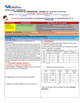
1. TERCER GRADO – MATEMÁTICA
ACTIVIDAD DE APRENDIZAJE – SEMANA 19 - Del 09/08 al 13/08 del 2021
Cuidemos nuestra salud y la de nuestras familias
Docentes: DE LA CRUZ MEZA NORMA ELIZABETH SALAZAR NINA JANETT JULIA CHÁVEZ PERALES PITTER LUIS
3ro ABCDE 3ro FGHN 3ro IJKLM
TÍTULO DE LA CLASE: RECOGEMOS Y ORGANIZAMOS DATOS SOBRE LA DISCRIMINACIÓN EN LA
COMUNIDAD.
COMPETENCIA CAPACIDADES CRITERIOS DE EVALUACIÓN
Resuelve
problemas de
Gestión de datos
e incertidumbre.
. Usa estrategias y procedimientos
para recopilar y procesar datos.
- Identifica la población, muestra y variables en el estudio sobre la
discriminación en la comunidad.
- Recopila datos mediante un cuestionario y los organiza en tablas de
frecuencia.
- Lee y analiza la información contenida en las tablas de frecuencias para
producir nueva información.
ENFOQUE TRANSVERSAL: DE DERECHOS - VALOR: Conciencia de derechos
ACTITUD: Los docentes promueven el conocimiento de los derechos humanos y la convención sobre los derechos del niño para empoderar
a los estudiantes en el ejercicio democrático.
EVIDENCIA: Desarrollo de la actividad y de los retos planteados.
PROPÓSITO: Recoger datos relacionados con la discriminación en la comunidad, organizarlas en tablas de frecuencia para producir
nueva información.
SITUACIÓN SIGNIFICATIVA DE LA EXPERIENCIA DE
APRENDIZAJE.
El Perú es un respetuoso del Estado de derecho, es decir, promueve que
se reconozca y valore la diversidad de cada una de las personas que viven
en él, de quienes piensan diferente y poseen características culturales
y saberes ancestrales distintos, pero que tienen una historia común. Así
mismo, se encarga de promover la practica de la interculturalidad y la
convivencia armoniosa con igualdad de oportunidades, sin discriminación
y de la mano con la naturaleza. Sin embargo, ocurre, que muchas veces,
las personas no actúan como lo hemos descrito anteriormente, sino que
solo piensan en sus intereses particulares y no en el bien común.
Ante ello nos preguntamos: ¿Qué argumentos nos permitirían proponer
acciones frente al problema de la discriminación en nuestra comunidad?
Para tener argumentos se hace necesario tener información sobre este
problema.
I. ACTIVANDO SABERES PREVIOS:
1.Conteste las siguientes interrogantes:
a) ¿Qué técnica e instrumento podemos utilizar para obtener
datos relevantes para una investigación?
b) ¿Qué diferencia existe entre población y muestra?
c) ¿Qué es una variable estadística y como se clasifican?
II. RECORDEMOS:
Para organizar los datos obtenidos al aplicar el cuestionario,
se utilizan las tablas de frecuencias.
A continuación, tenemos dos tablas de frecuencias que debes
observar, identificar y completar:
1. Tabla de Frecuencias de Datos …………………………………
Edad
(xi)
Frecuencia
absoluta (fi)
Frecuencia absoluta
acumulada (Fi)
Frecuencia
relativa (hi)
Frecuencia
porcentual (hi%)
14 6 6
15 4 10
16 2 12
17 5 17
18 3 20
n =
2. Tabla de Frecuencias de Datos ……………………………….
Edad
(Clases)
Marca de
clase
(xi)
Frecuencia
absoluta
(fi)
Frecuencia
relativa
(hi)
Frecuencia
porcentual
(hi%)
[12 ; 19[ 15,5 20
[19 ; 26[ 10
[26 ; 33[ 12
[33 ; 40[ 36,5 8
[40 ; 47[ 10
n =
¿Qué características tiene la tabla de frecuencias de datos
agrupados?
2. Debemos tener en cuenta que, si la muestra es muy
grande, es recomendable trabajar agrupando los datos los
cuales definen intervalos.
Para ello seguimos el siguiente proceso:
1. Determinamos el dato mínimo y máximo de la
información a organizar. (tabla 2).
Xmín = 12 ; Xmáx = 46
Con estos valores calculamos el Rango de los
valores de la información.
Rango = 46 – 12
Rango = 34
2. Determinamos el número de intervalos (k)
Usualmente se recomienda que: 5 ≤ k ≤ 20
Si el número de intervalos es muy pequeño se pierde
información y si fuese muy grande la información podría
distorsionarse y no es muy manejable.
3. Determinamos la amplitud del intervalo, se divide
el rango entre el número de intervalos elegido.
Amplitud del intervalo = 34 / 5
Amplitud del intervalo = 6,8
Amplitud del intervalo = 7
4. Determinamos las marcas de clase sumando el
limite inferior y el limite superior de cada
intervalo dividiendo esa suma entre dos.
Xi =
𝐿imite inferior+limite superior
2
X1 =
12+19
2
= 15,5
En conclusión, el tamaño de la muestra y el tipo de
variable determina la organización de la información en
tablas de frecuencias para datos no agrupados o
agrupados.
AHORA TE TOCA A TI.
Luego de recordar como se elabora una tabla de
distribución de frecuencias de datos no agrupados y adquirir
los conocimientos para elaborar una tabla de frecuencias de
datos agrupados, retomamos el trabajo sobre nuestro tema
de estudio ¿cómo se manifiesta la discriminación en nuestra
comunidad?.
1º En consenso completaremos la siguiente tabla:
¿Cuál es el tema de estudio?
¿A quiénes vamos a encuestar?
¿A cuantas personas vamos a
encuestar?
¿Qué tipo de variables vamos a
considerar en la encuesta? ¿Cuáles
son?
¿Cuál será el objetivo de la
encuesta
¿Qué preguntas consideraremos en
la encuesta? ¿Cuál es el propósito
de cada pregunta? ¿Qué preguntas
recogen datos cuantitativos?
¿Qué titulo tendrá la encuesta?
¿Qué indicaciones daremos?
¿Consideramos que las preguntas
nos permitirán recoger los datos
que necesitamos para el estudio?
¿Por qué?
En base a lo definido en el cuadro, ahora elaboramos el
cuestionario de la encuesta. (Se recomienda preguntas solo para 3
variables y que nos permita elaborar tablas de frecuencias con
datos no agrupados y agrupados)
AUTOEVALUACION:
Criterios de evaluación Lo logré Estoy en
proceso
Como puedo
mejorar?
Identifica la población,
muestra y variables en el
estudio sobre la
discriminación en la
comunidad.
- Recopila datos
mediante un cuestionario
y los organiza en tablas
de frecuencia
. Lee y analiza la
información contenida en
las tablas de frecuencias
para producir nueva
información
RETO DE LA SEMANA 19
Luego de aplicar el cuestionario elaborado en consenso.
Elabore las tablas de distribución de frecuencias
correspondientes a cada variable.
No olvides enviar tu reto en el tiempo establecido.
EXITOS