This poster for the film Cabin in the Woods was chosen for analysis because the concept seemed unique and modern. The floating cabin image caught the analyzer's attention and left them wanting to learn more about the film's story. Through analyzing elements like images, text, colors, and fonts, the analyzer concluded the poster effectively conveyed the film's horror genre through styles like a grayscale color scheme and serif fonts. Key elements like the "you think you know the story" tagline and isolated cabin image suggested an unexpected or confusing plot. The analyzer planned to apply lessons from this effective poster, like use of black, white, and serif fonts, to their own horror film trailer.
This is a presentation by Dada Robert in a Your Skill Boost masterclass organised by the Excellence Foundation for South Sudan (EFSS) on Saturday, the 25th and Sunday, the 26th of May 2024.
He discussed the concept of quality improvement, emphasizing its applicability to various aspects of life, including personal, project, and program improvements. He defined quality as doing the right thing at the right time in the right way to achieve the best possible results and discussed the concept of the "gap" between what we know and what we do, and how this gap represents the areas we need to improve. He explained the scientific approach to quality improvement, which involves systematic performance analysis, testing and learning, and implementing change ideas. He also highlighted the importance of client focus and a team approach to quality improvement.
How to Make a Field invisible in Odoo 17Celine George
It is possible to hide or invisible some fields in odoo. Commonly using “invisible” attribute in the field definition to invisible the fields. This slide will show how to make a field invisible in odoo 17.
Welcome to TechSoup New Member Orientation and Q&A (May 2024).pdfTechSoup
In this webinar you will learn how your organization can access TechSoup's wide variety of product discount and donation programs. From hardware to software, we'll give you a tour of the tools available to help your nonprofit with productivity, collaboration, financial management, donor tracking, security, and more.
Ethnobotany and Ethnopharmacology:
Ethnobotany in herbal drug evaluation,
Impact of Ethnobotany in traditional medicine,
New development in herbals,
Bio-prospecting tools for drug discovery,
Role of Ethnopharmacology in drug evaluation,
Reverse Pharmacology.
How to Create Map Views in the Odoo 17 ERPCeline George
The map views are useful for providing a geographical representation of data. They allow users to visualize and analyze the data in a more intuitive manner.
How to Split Bills in the Odoo 17 POS ModuleCeline George
Bills have a main role in point of sale procedure. It will help to track sales, handling payments and giving receipts to customers. Bill splitting also has an important role in POS. For example, If some friends come together for dinner and if they want to divide the bill then it is possible by POS bill splitting. This slide will show how to split bills in odoo 17 POS.
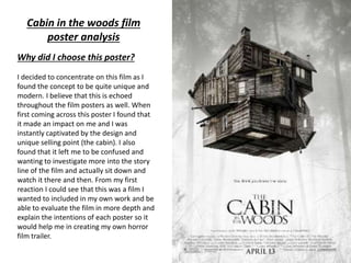
1. Why did I choose this poster?
I decided to concentrate on this film as I
found the concept to be quite unique and
modern. I believe that this is echoed
throughout the film posters as well. When
first coming across this poster I found that
it made an impact on me and I was
instantly captivated by the design and
unique selling point (the cabin). I also
found that it left me to be confused and
wanting to investigate more into the story
line of the film and actually sit down and
watch it there and then. From my first
reaction I could see that this was a film I
wanted to included in my own work and be
able to evaluate the film in more depth and
explain the intentions of each poster so it
would help me in creating my own horror
film trailer.
Cabin in the woods film
poster analysis
3. Anchor text
The short piece of text just below the image is referred to as the anchor, often put into the
poster so that the audience takes on board the piece of text and creates there own
interpretation of the film based on what they see and what they read. The anchor text is always
linked to the main image in some way. The denotations of this anchor text “you think you know
the story” is that it refers to the audience as this uses direct address by addressing the
audience by “you”. The connotations of the anchor text is that at the beginning the audience
will guess the direction in which the film is going and will be able to guess what is going to
happen but will be deluded by the film and tricked into believing something which isn't what
happens. This anchor text is in San Serif front which is the most common type of font. This font
connotes to the viewer that
This films is a horror, mystery which is shown throughout the posters. The age rating for this film
is a certificate 15 which informs the viewer that this film is not for young children. It is important
for the audience to know the age rating but for some reason it is not shown on this film poster.
Masthead
The masthead on this poster is the name of the film which is typical for any film poster, the font
used is Serif style which is a very common old style which often fits under the gothic fiction
which connotes to the viewer that this is a horror film which is linked back to gothic fiction.
4. Main body text
The main block of text at the bottom of this film poster includes, website address, cast and crew(
including director) and release date. These are all important points which the viewer should know,
displaying them at the bottom of the page connotes across to the audience that they are not as
important as the main image and title. However the release date is slightly bigger then the website
and cast, which connotes that the viewer should pay more attention to release date over the other
pieces of writing. The cast and crew and the website and in normal San Serif font , this connotes
that the film company want the writing to be read easy as the writing is smaller, they want it to be
clear to understand. However the release date is in Serif font which is the same as the masthead,
connoting that the masthead and release date are linked and are the same.
Images
The main image relates to the plot and theme of the film, this is connoted though the cabin
levitating in the air. The cabin seems to be moving like a Rubik’s cube which connotes that this
story can be confusing to some viewers and that this story is puzzle which will only be solved with
time and patience. The cabin is often used too represent the feeling of being lost and alone in the
wild. Along with the background image this affect has been made successful. The background
image is slightly faded when compared to the main image. This connotes that the cabin is more
important. The background image consists of 4 trees placed with two on each side and a space in
the middle which connotes that there is a path down the woods. Which once put with the front
image, it connotes that the cabin is in the woods and the audience will go into the woods along
this path in order to get to this cabin.
5. Colour Scheme
The colour scheme for this film poster is quite different when compared to normal film posters. In
most posters they follow the 3 colour palette rule for example red, blue and white however for this
poster they do not follow this rule but instead they use greyscale in the background image. Using
greyscale brings out the highlights and shadows in the photos used. The colour black typically
connotes death and a powerful evil. White connotes purity and innocence. Combining these two
colours connotes across to the audience that the purity and goodness is having to battle against the
dark, evilness. Which is stereotypical of a horror film. However in the main image there is a slight
hint of brown. Brown connotes a very down to earth feeling which fits in with the whole feeling of
being isolated in the woods.
Register
Register basically refers to the style of language used along side with the vocabulary. Apart from
the anchor text there isn’t much writing on this which doesn’t enable me to understand which
social class it is aimed at. This connotes that this film is aimed at various social classes. (from
upper to lower class)
What I will take away from this poster.
After analysing this poster I have concluded that I will used Serif font and also use the colours
black and white in my own trailer as I found them to be very powerful in this poster and I hope to
have the same affect in my own work. Unlike this poster I will be including the age rating as I find
it to be an important aspect to have.