Colour Palette in music 
magazines 
By Lucy Bennett
Red- different shades of red can connote different 
meanings. Dark red can mean anger, rage energy, power 
and strength this dark rich red is used in magazines which 
are trying to attract middle and working class males who 
often spend time after work relaxing. On the other hand 
light red can represent joy, sexuality, passion and love, 
light red can be used in magazines for men and females. 
The red in the magazine vibe connotes that this magazine 
is for serous men who work. 
Pink- is often associated with romance and love in 
different forms of relationships such as friendship. Pink is a 
feminine colour and often used in female magazines. The 
bright pink in Q connotes that this magazine is for women 
and has information inside which is aimed at women and is 
most likely about love. On the other hand in pink writing in 
Vibe connotes that the magazine doesn't just have 
information aimed at men.
Green- can connote safety, money, jealousy, 
greed. Money is associated with dark green whereas 
protection, healing and peace in associated with lighter 
greens. The colour green in the media can often be put 
with medical products and health products. The Green in 
both covers Kerrang and NME connotes that the 
magazines are about peace. The audience see that the 
magazines are down to earth and neural with no biased 
views. 
Purple- Connotes warm, wise, imagination, 
inspiration, this colour is often associated with royalty and 
power. Whereas light purple connotes romances, dark 
purple connotes sad emotions and frustration. The rich 
purple background in the magazine Kerrang connotes that 
the magazine is welcoming and harm suggesting to the 
audience that they are a good magazine and can be 
trusted.
Orange- can be put with the meaning of 
joy and the happiness of yellow. Dark orange can mean 
desire, pleasure and domination. Gold also means 
wisdom and wealth. The orange writing and title 
connotes that the magazine Vibe contents happy things 
meaning that the audience will be happy if they read 
this magazine. 
Yellow- Is associated with being cheerful, hope, 
joy, happiness, bright, confident. To lift peoples moods 
the colour yellow on a magazine would be best. Dull 
yellow can mean sickness and jealousy on the other hand 
light yellow can mean joy and intellect. The light yellow 
on the front cover of BBC Music magazine connotes that 
this magazine is aimed at smart people and that smart 
people listen to music and read this magazine. The 
connotations subjects that if the audience reads this 
magazine then they would be seen as smart.
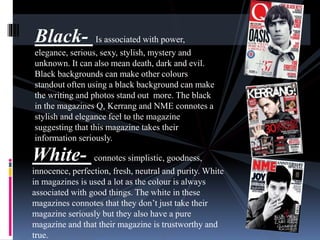
Black- Is associated with power, 
elegance, serious, sexy, stylish, mystery and 
unknown. It can also mean death, dark and evil. 
Black backgrounds can make other colours 
standout often using a black background can make 
the writing and photos stand out more. The black 
in the magazines Q, Kerrang and NME connotes a 
stylish and elegance feel to the magazine 
suggesting that this magazine takes their 
information seriously. 
White- connotes simplistic, goodness, 
innocence, perfection, fresh, neutral and purity. White 
in magazines is used a lot as the colour is always 
associated with good things. The white in these 
magazines connotes that they don’t just take their 
magazine seriously but they also have a pure 
magazine and that their magazine is trustworthy and 
true.
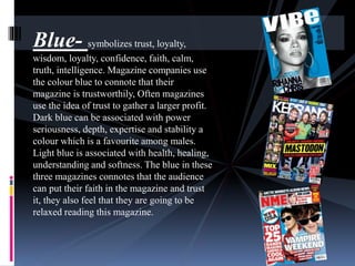
Blue- symbolizes trust, loyalty, 
wisdom, loyalty, confidence, faith, calm, 
truth, intelligence. Magazine companies use 
the colour blue to connote that their 
magazine is trustworthily, Often magazines 
use the idea of trust to gather a larger profit. 
Dark blue can be associated with power 
seriousness, depth, expertise and stability a 
colour which is a favourite among males. 
Light blue is associated with health, healing, 
understanding and softness. The blue in these 
three magazines connotes that the audience 
can put their faith in the magazine and trust 
it, they also feel that they are going to be 
relaxed reading this magazine.

Colour palettes

  • 1.
    Colour Palette inmusic magazines By Lucy Bennett
  • 2.
    Red- different shadesof red can connote different meanings. Dark red can mean anger, rage energy, power and strength this dark rich red is used in magazines which are trying to attract middle and working class males who often spend time after work relaxing. On the other hand light red can represent joy, sexuality, passion and love, light red can be used in magazines for men and females. The red in the magazine vibe connotes that this magazine is for serous men who work. Pink- is often associated with romance and love in different forms of relationships such as friendship. Pink is a feminine colour and often used in female magazines. The bright pink in Q connotes that this magazine is for women and has information inside which is aimed at women and is most likely about love. On the other hand in pink writing in Vibe connotes that the magazine doesn't just have information aimed at men.
  • 3.
    Green- can connotesafety, money, jealousy, greed. Money is associated with dark green whereas protection, healing and peace in associated with lighter greens. The colour green in the media can often be put with medical products and health products. The Green in both covers Kerrang and NME connotes that the magazines are about peace. The audience see that the magazines are down to earth and neural with no biased views. Purple- Connotes warm, wise, imagination, inspiration, this colour is often associated with royalty and power. Whereas light purple connotes romances, dark purple connotes sad emotions and frustration. The rich purple background in the magazine Kerrang connotes that the magazine is welcoming and harm suggesting to the audience that they are a good magazine and can be trusted.
  • 4.
    Orange- can beput with the meaning of joy and the happiness of yellow. Dark orange can mean desire, pleasure and domination. Gold also means wisdom and wealth. The orange writing and title connotes that the magazine Vibe contents happy things meaning that the audience will be happy if they read this magazine. Yellow- Is associated with being cheerful, hope, joy, happiness, bright, confident. To lift peoples moods the colour yellow on a magazine would be best. Dull yellow can mean sickness and jealousy on the other hand light yellow can mean joy and intellect. The light yellow on the front cover of BBC Music magazine connotes that this magazine is aimed at smart people and that smart people listen to music and read this magazine. The connotations subjects that if the audience reads this magazine then they would be seen as smart.
  • 5.
    Black- Is associatedwith power, elegance, serious, sexy, stylish, mystery and unknown. It can also mean death, dark and evil. Black backgrounds can make other colours standout often using a black background can make the writing and photos stand out more. The black in the magazines Q, Kerrang and NME connotes a stylish and elegance feel to the magazine suggesting that this magazine takes their information seriously. White- connotes simplistic, goodness, innocence, perfection, fresh, neutral and purity. White in magazines is used a lot as the colour is always associated with good things. The white in these magazines connotes that they don’t just take their magazine seriously but they also have a pure magazine and that their magazine is trustworthy and true.
  • 6.
    Blue- symbolizes trust,loyalty, wisdom, loyalty, confidence, faith, calm, truth, intelligence. Magazine companies use the colour blue to connote that their magazine is trustworthily, Often magazines use the idea of trust to gather a larger profit. Dark blue can be associated with power seriousness, depth, expertise and stability a colour which is a favourite among males. Light blue is associated with health, healing, understanding and softness. The blue in these three magazines connotes that the audience can put their faith in the magazine and trust it, they also feel that they are going to be relaxed reading this magazine.