Ways my media product use, develop or challenge forms and conventions of real...
9 CCTV Shots Explained
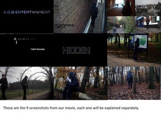
1. These are the 9 screenshots from our movie, each one will be explained separately.
2. This is the first thing to be shown when the video starts, this is
because its showing who the distribution company is and lets
the audience know the company and the type of films it shows.
The effect on the title is it glows and shines, we did this to
make the audience notice it more and also makes it more
memorable. The title then fades out to black and then the
actual video begins. The reason we picked SDB is because these
are the initials of our first names.
We chose to put this at the start as it is a typical convention of
most films, as they show the distribution company before the
film starts.
3. In this clip you can see that we edited it to make it look like a
CCTV camera style shot. We chose to do this as CCTV cameras
signify that you are being watched, which is quite has quite an
eerie feel to it, and in the novel 1984 by George Orwell,
everyone is watched all the time and they have no freedom,
the novel itself is meant to be quite scary and we are
incorporating this into our film.
Also this is a shot where you can see the antagonists clothing,
he has his hood up hiding his face (which links into the film title
‘Hidden’), and he is wearing mostly black clothes, and someone
walking around in all black with a hood up is shown to be quite
menacing and also a person which is to be avoided, showing
they are generally not safe to be around.
4. This shows the editing that we did and also sets the scene
some more, from this you can see it is in a town and its is
probably quite old because of the style of the building, it also
shows you the different places around town that the character
has been, suggesting that they may know the area well. All the
shots still don’t show who the actual person is, making their
identity a mystery, this is used in some other thriller films that
we got inspiration from, such as Seven, where they see that
someone (who is the antagonist) is making a book with
different people in it who are the killers next targets, and in
that films opening they did not reveal who the antagonist was
until he appeared nearer to the end of the film, which is what
ours will be like.
5. This clip shows what the titles look like, and you can also see
that the titles are animated and here is a shot of how they
transition. The titles are bold and capital so that they stand out
and the reason we did this is because most thriller films have
large titles that are normally quite bold, for example Taken, the
font in the opening sequence to that is quite bold and plain,
the boldness is appealing to males and the fact the font is not
too action like, or scratchy like in horror films, will attract
females to the film as well.
6. The definition of hidden is ‘kept out of sight; concealed’. This
links into our film because the Antagonist is hiding his face and
features throughout the film linking into the title.
The title is big and bold and takes up most of the screen
because we wanted people to focus on it and remember the
name of the film.
The title is black as well as the background but can be seen
because of the glow around it, the reason we did this is
because it separates the main title from the other smaller
titles/credits and because the writing is also black we thought it
gave the title a darker and more scary feel to it.
7. In this shot you see the antagonist looking at a map of the park,
also the fact that his hand is up by his face suggests that he is
thinking as some people tend to do this when they are thinking
about something. Also the map suggests that some of the film
takes place in this area and he may have plans to do something
in that area.
The choice to put a hood on the character was because hoods
nowadays is considered to be menacing and scary in a way,
especially in the UK as most gangs wear hoods to hide their
faces, and because our character has his hood up it shows he
does not want his face to be shown and in a way is meant to be
scary.
8. In this shot he is reaching into his pocket, and just before this
you see him on the phone (which is one of our props), so this
shot is showing him put it away, we have used quite a low
angle shot on this clip as it makes him look quite tall and also
shows quite a lot of the scenery around him such as the woods
and park.
9. In this clip you see the antagonist reading a newspaper, which
is also one of our props. The effects we added on this shot was
the blur effect and also we adjusted the brightness a bit, we did
this as the clip was too bright before and darkening it slightly
makes it seem like more of a thriller film. The blur is used to
add mystery to the clip. Also in this shot you can see him
surrounded by trees suggesting he is in the woods, which is
where some of the film takes part.
10. This is the last shot in the film, it shows the antagonist walking
away into the distance, the shot then fades to black to add
mystery to where he is going, and we also picked this as the
final shot as it is effective in closing the scene, as throughout
the whole sequence he was followed to the woods, suggesting
he may plan something involving it and once he is there he
walks away from the camera closing the scene and hiding what
he is doing in the woods.