Download to read offline


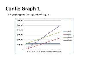


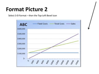


The document explains how to create a breakeven chart in Excel, emphasizing that breakeven analysis should not be isolated from related factors like volume, cost, and pricing strategy. It provides a detailed step-by-step guide on preparing data, configuring graphs, and inserting elements to make an interactive breakeven analysis. The breakeven equation and examples are included to demonstrate concepts effectively.