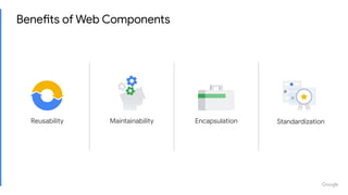
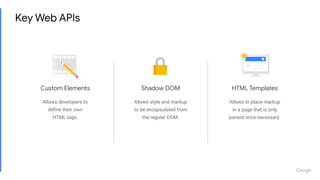
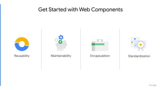
Felix Arntz / WordCamp London 2019
Web Components
Introduction to
Web Components are a standardized set of browser
APIs that allow you to define your own HTML tags,
reusable and self-contained.
<p>Hovering <a href="#tooltip1" class="tooltip-source">this text</a> will display a tooltip.</p>
<div id="tooltip1" class="tooltip">
<span class="tooltip-nag"></span>
This is the tooltip content.
</div>
<style>
.tooltip {
position: absolute;
display: none;
max-width: 16rem;
}
/* many more style rules... */
</style>
<script>
document.querySelector( '.tooltip-source' ).addEventListener( 'hover', event => {
event.preventDefault();
/* lots and lots more JavaScript... */
} );
</script>
Example: Tooltips
Example: Tooltips
<my-tooltips>
<p>Hovering <my-tooltip-anchor target="#tooltip1">this text</my-tooltip-anchor> will display a tooltip.</p>
<my-tooltip id="tooltip1">
This is the tooltip content.
</my-tooltip>
</my-tooltips>
Benefits of Web Components
MaintainabilityReusability Encapsulation Standardization
React vs. Vue vs. Web Components
React Vue Web Components
const { Component } = React;
class MyComponent extends
Component {
…
}
Vue.component(
‘my-component’, {
…
}
);
class MyComponent extends
HTMLElement {
…
}
customElements.define(
‘my-component’,
MyComponent
);
<MyComponent></MyComponent> <my-component></my-component> <my-component></my-component>
JSX (pre-processing required) HTML templates HTML templates
Framework Framework Standard
Key Takeaway: This is an unfair and false comparison.
Standardized Leaf Components
const { Component } = React;
class MyComponent extends Component {
render() {
const { active } = this.props;
return (
<my-leaf-component active={ active }>
</my-leaf-component>
);
}
}
class MyLeafComponent extends HTMLElement {
static get is() {
return 'my-leaf-component';
}
static get observedAttributes() {
return [ 'active' ];
}
}
customElements.define(
MyLeafComponent.is,
MyLeafComponent
);
React ❤ Web Components!
https://youtu.be/plt-iH_47GE
Source: https://softwareengineeringdaily.com/2018/10/22/google-javascript-with-malte-ubl/
Many frameworks are modeled around some notion of
components. [...]
So there's one thing that I am very sure of,
which is that we will see Web Components as the basically
only technology used for what I would call leaf components.
Malte Ubl
“
”Tech Lead of the AMP Project
Shadow DOM
Allows style and markup
to be encapsulated from
the regular DOM.
Custom Elements
Allows developers to
define their own
HTML tags.
HTML Templates
Allows to place markup
in a page that is only
parsed once necessary.
Key Web APIs
Current Browser Support
See full browser support
caniuse.com/#feat=custom-elementsv1
caniuse.com/#feat=shadowdomv1
caniuse.com/#feat=template
Also, check out the polyfill!
(github.com/webcomponents/custom-elements)
Let’s build a demo!
<h2 class="nav-tab-wrapper">
<a class="nav-tab nav-tab-active" href="#tab1">
Introduction
</a>
<a class="nav-tab" href="#tab2">
Polymer
</a>
<!-- ... -->
</h2>
<div id="tab1" class="nav-tab-panel nav-tab-panel-active"><!-- Panel 1 content. --></div>
<div id="tab2" class="nav-tab-panel"><!-- Panel 2 content. --></div>
<!-- ... -->
<h2 class="nav-tab-wrapper" role="tablist">
<a class="nav-tab nav-tab-active" href="#tab1" aria-controls="tab1" aria-selected="true" role="tab">
Introduction
</a>
<a class="nav-tab" href="#tab2" aria-controls="tab2" aria-selected="false" tabindex="-1" role="tab">
Polymer
</a>
<!-- ... -->
</h2>
<div id="tab1" class="nav-tab-panel nav-tab-panel-active" role="tabpanel"><!-- Panel 1 content. --></div>
<div id="tab2" class="nav-tab-panel" aria-hidden="true" role="tabpanel"><!-- Panel 2 content. --></div>
<!-- ... -->
Typical WordPress Approach
● wcig-tab for a single tab
● wcig-tab-panel for a single panel
associated with a tab
● wcig-tabs for the overall wrapper
Three Custom Elements
<wcig-tabs>
<wcig-tab slot="tabs" href="#tab1" selected>
Introduction
</wcig-tab>
<wcig-tab-panel slot="tabpanels" id="tab1" active>
<!-- Panel 1 content. -->
</wcig-tab-panel>
<wcig-tab slot="tabs" href="#tab2">
Polymer
</wcig-tab>
<wcig-tab-panel slot="tabpanels" id="tab2">
<!-- Panel 2 content. -->
</wcig-tab-panel>
<!-- ... -->
</wcig-tabs>
Custom Elements
https://html.spec.whatwg.org/#custom-elements
The Custom Elements API
1. Create a class that extends HTMLElement
2. Implement the element’s behavior and style in that class
3. Register the element with
customElements.define( tagName, elementClass )
class Tab extends HTMLElement {
constructor() {
super();
// ...
}
static get is() {
return 'wcig-tab';
}
static get observedAttributes() {
// ...
}
attributeChangedCallback( name, oldValue, newValue ) {
// ...
}
connectedCallback() {
// ...
}
disconnectedCallback() {
// ...
}
}
Scaffolding our Tab Element
connectedCallback() {
if ( ! this.hasAttribute( 'role' ) ) {
this.setAttribute( 'role', 'tab' );
}
const isSelected = this.hasAttribute( 'selected' );
if ( ! this.hasAttribute( 'tabindex' ) ) {
this.setAttribute( 'tabindex', isSelected ? 0 : -1 );
}
if ( ! this.hasAttribute( 'aria-selected' ) ) {
this.setAttribute( 'aria-selected', isSelected ? 'true' : 'false' );
}
this.addEventListener( 'click', this._onClick );
}
disconnectedCallback() {
this.removeEventListener( 'click', this._onClick );
}
Handling Custom Markup and Events
_onClick() {
if ( this.disabled || this.selected ) {
return;
}
this.selected = true;
this.dispatchEvent(
new CustomEvent(
'select',
{
bubbles: true
}
)
);
}
Emitting a Tab Selection Event
static get observedAttributes() {
return [ 'selected', 'disabled' ];
}
attributeChangedCallback( name, oldValue, newValue ) {
switch ( name ) {
case 'selected':
this.setAttribute( 'tabindex', null !== newValue ? 0 : -1 );
this.setAttribute( 'aria-selected', null !== newValue ? 'true' : 'false' );
break;
case 'disabled':
this.setAttribute( 'aria-disabled', null !== newValue ? 'true' : 'false' );
if ( null !== newValue || ! this.selected ) {
this.removeAttribute( 'tabindex' );
this.blur();
} else {
this.setAttribute( 'tabindex', 0 );
}
break;
}
}
Reacting to Attribute Changes
class Tab extends HTMLElement {
// ...
get selected() {
return this.hasAttribute( 'selected' );
}
set selected( val ) {
const isSelected = Boolean( val );
if ( isSelected ) {
this.setAttribute( 'selected', '' );
} else {
this.removeAttribute( 'selected' );
}
}
}
Reflecting Properties to Attributes
const tab = document.createElement(
'wcig-tab'
);
tab.selected = true;
<wcig-tab selected></wcig-tab>
class Tab extends HTMLElement {
// ...
}
customElements.define( Tab.is, Tab );
Registering The Custom Element
Shadow DOM
https://dom.spec.whatwg.org/#shadow-trees
What is the Shadow DOM?
● In addition to regular DOM node children, an element can have a
separate shadow tree attached to it.
● The element the shadow tree is attached to is called the shadow host.
● The document fragment attached to the shadow host is called the
shadow root.
● Elements in the shadow tree are scoped to the shadow host element and
cannot be accessed from the outside.
Example: The Built-in Range Input
Shadow trees have been used for quite a while by browsers already!
Providing Scoped Styles and Markup
class Tab extends HTMLElement {
constructor() {
super();
this.attachShadow( { mode: 'open' } );
this.shadowRoot.innerHTML = `
<style>
:host {
display: block;
/* ... */
}
:host(:focus),
:host(:hover) {
/* ... */
}
:host([selected]) {
/* ... */
}
</style>
<slot></slot>
`;
}
// ...
}
HTML Templates
https://html.spec.whatwg.org/#the-template-element
The template Element
<template id="my-template">
<div id="element-from-template">
<p>Element content.</p>
</div>
</template>
const template = document.querySelector( '#my-template' );
const element = template.content.cloneNode( true );
Improving Performance with a Template
const template = document.createElement( 'template' );
template.innerHTML = `
<style>
:host {
display: block;
/* ... */
}
/* ... */
</style>
<slot></slot>
`;
class Tab extends HTMLElement {
constructor() {
super();
this.attachShadow( { mode: 'open' } );
this.shadowRoot.appendChild( template.content.cloneNode( true ) );
}
// ...
}
To Be Continued...
Look up the full codebase at
github.com/felixarntz/web-components-in-gutenberg
Further Reading
● https://developers.google.com/web/fundamentals/web-components/customelements
● https://developers.google.com/web/fundamentals/web-components/shadowdom
● https://developers.google.com/web/fundamentals/web-components/best-practices
● https://developers.google.com/web/fundamentals/primers/async-functions
● https://developers.google.com/web/fundamentals/primers/modules
● https://developer.mozilla.org/en-US/docs/Web/JavaScript/Reference/Template_literals
● https://developer.mozilla.org/en-US/docs/Web/JavaScript/Reference/Functions/set
● https://developer.mozilla.org/en-US/docs/Web/JavaScript/Reference/Functions/get
Proprietary + Confidential
Web Components Projects
https://www.webcomponents.org
https://www.polymer-project.org
https://amp.dev
https://amp-wp.org
https://github.com/felixarntz/web-components-in-gutenberg
Get Started with Web Components
MaintainabilityReusability Encapsulation Standardization
Proprietary + Confidential
Thank You
Felix Arntz
@felixarntz

Introduction to Web Components

  • 1.
    Felix Arntz /WordCamp London 2019 Web Components Introduction to
  • 2.
    Web Components area standardized set of browser APIs that allow you to define your own HTML tags, reusable and self-contained.
  • 3.
    <p>Hovering <a href="#tooltip1"class="tooltip-source">this text</a> will display a tooltip.</p> <div id="tooltip1" class="tooltip"> <span class="tooltip-nag"></span> This is the tooltip content. </div> <style> .tooltip { position: absolute; display: none; max-width: 16rem; } /* many more style rules... */ </style> <script> document.querySelector( '.tooltip-source' ).addEventListener( 'hover', event => { event.preventDefault(); /* lots and lots more JavaScript... */ } ); </script> Example: Tooltips
  • 4.
    Example: Tooltips <my-tooltips> <p>Hovering <my-tooltip-anchortarget="#tooltip1">this text</my-tooltip-anchor> will display a tooltip.</p> <my-tooltip id="tooltip1"> This is the tooltip content. </my-tooltip> </my-tooltips>
  • 5.
    Benefits of WebComponents MaintainabilityReusability Encapsulation Standardization
  • 6.
    React vs. Vuevs. Web Components React Vue Web Components const { Component } = React; class MyComponent extends Component { … } Vue.component( ‘my-component’, { … } ); class MyComponent extends HTMLElement { … } customElements.define( ‘my-component’, MyComponent ); <MyComponent></MyComponent> <my-component></my-component> <my-component></my-component> JSX (pre-processing required) HTML templates HTML templates Framework Framework Standard Key Takeaway: This is an unfair and false comparison.
  • 7.
    Standardized Leaf Components const{ Component } = React; class MyComponent extends Component { render() { const { active } = this.props; return ( <my-leaf-component active={ active }> </my-leaf-component> ); } } class MyLeafComponent extends HTMLElement { static get is() { return 'my-leaf-component'; } static get observedAttributes() { return [ 'active' ]; } } customElements.define( MyLeafComponent.is, MyLeafComponent ); React ❤ Web Components!
  • 8.
  • 9.
    Source: https://softwareengineeringdaily.com/2018/10/22/google-javascript-with-malte-ubl/ Many frameworksare modeled around some notion of components. [...] So there's one thing that I am very sure of, which is that we will see Web Components as the basically only technology used for what I would call leaf components. Malte Ubl “ ”Tech Lead of the AMP Project
  • 10.
    Shadow DOM Allows styleand markup to be encapsulated from the regular DOM. Custom Elements Allows developers to define their own HTML tags. HTML Templates Allows to place markup in a page that is only parsed once necessary. Key Web APIs
  • 11.
    Current Browser Support Seefull browser support caniuse.com/#feat=custom-elementsv1 caniuse.com/#feat=shadowdomv1 caniuse.com/#feat=template Also, check out the polyfill! (github.com/webcomponents/custom-elements)
  • 12.
  • 14.
    <h2 class="nav-tab-wrapper"> <a class="nav-tabnav-tab-active" href="#tab1"> Introduction </a> <a class="nav-tab" href="#tab2"> Polymer </a> <!-- ... --> </h2> <div id="tab1" class="nav-tab-panel nav-tab-panel-active"><!-- Panel 1 content. --></div> <div id="tab2" class="nav-tab-panel"><!-- Panel 2 content. --></div> <!-- ... --> <h2 class="nav-tab-wrapper" role="tablist"> <a class="nav-tab nav-tab-active" href="#tab1" aria-controls="tab1" aria-selected="true" role="tab"> Introduction </a> <a class="nav-tab" href="#tab2" aria-controls="tab2" aria-selected="false" tabindex="-1" role="tab"> Polymer </a> <!-- ... --> </h2> <div id="tab1" class="nav-tab-panel nav-tab-panel-active" role="tabpanel"><!-- Panel 1 content. --></div> <div id="tab2" class="nav-tab-panel" aria-hidden="true" role="tabpanel"><!-- Panel 2 content. --></div> <!-- ... --> Typical WordPress Approach
  • 15.
    ● wcig-tab fora single tab ● wcig-tab-panel for a single panel associated with a tab ● wcig-tabs for the overall wrapper Three Custom Elements <wcig-tabs> <wcig-tab slot="tabs" href="#tab1" selected> Introduction </wcig-tab> <wcig-tab-panel slot="tabpanels" id="tab1" active> <!-- Panel 1 content. --> </wcig-tab-panel> <wcig-tab slot="tabs" href="#tab2"> Polymer </wcig-tab> <wcig-tab-panel slot="tabpanels" id="tab2"> <!-- Panel 2 content. --> </wcig-tab-panel> <!-- ... --> </wcig-tabs>
  • 16.
  • 17.
    The Custom ElementsAPI 1. Create a class that extends HTMLElement 2. Implement the element’s behavior and style in that class 3. Register the element with customElements.define( tagName, elementClass )
  • 18.
    class Tab extendsHTMLElement { constructor() { super(); // ... } static get is() { return 'wcig-tab'; } static get observedAttributes() { // ... } attributeChangedCallback( name, oldValue, newValue ) { // ... } connectedCallback() { // ... } disconnectedCallback() { // ... } } Scaffolding our Tab Element
  • 19.
    connectedCallback() { if (! this.hasAttribute( 'role' ) ) { this.setAttribute( 'role', 'tab' ); } const isSelected = this.hasAttribute( 'selected' ); if ( ! this.hasAttribute( 'tabindex' ) ) { this.setAttribute( 'tabindex', isSelected ? 0 : -1 ); } if ( ! this.hasAttribute( 'aria-selected' ) ) { this.setAttribute( 'aria-selected', isSelected ? 'true' : 'false' ); } this.addEventListener( 'click', this._onClick ); } disconnectedCallback() { this.removeEventListener( 'click', this._onClick ); } Handling Custom Markup and Events
  • 20.
    _onClick() { if (this.disabled || this.selected ) { return; } this.selected = true; this.dispatchEvent( new CustomEvent( 'select', { bubbles: true } ) ); } Emitting a Tab Selection Event
  • 21.
    static get observedAttributes(){ return [ 'selected', 'disabled' ]; } attributeChangedCallback( name, oldValue, newValue ) { switch ( name ) { case 'selected': this.setAttribute( 'tabindex', null !== newValue ? 0 : -1 ); this.setAttribute( 'aria-selected', null !== newValue ? 'true' : 'false' ); break; case 'disabled': this.setAttribute( 'aria-disabled', null !== newValue ? 'true' : 'false' ); if ( null !== newValue || ! this.selected ) { this.removeAttribute( 'tabindex' ); this.blur(); } else { this.setAttribute( 'tabindex', 0 ); } break; } } Reacting to Attribute Changes
  • 22.
    class Tab extendsHTMLElement { // ... get selected() { return this.hasAttribute( 'selected' ); } set selected( val ) { const isSelected = Boolean( val ); if ( isSelected ) { this.setAttribute( 'selected', '' ); } else { this.removeAttribute( 'selected' ); } } } Reflecting Properties to Attributes const tab = document.createElement( 'wcig-tab' ); tab.selected = true; <wcig-tab selected></wcig-tab>
  • 23.
    class Tab extendsHTMLElement { // ... } customElements.define( Tab.is, Tab ); Registering The Custom Element
  • 24.
  • 25.
    What is theShadow DOM? ● In addition to regular DOM node children, an element can have a separate shadow tree attached to it. ● The element the shadow tree is attached to is called the shadow host. ● The document fragment attached to the shadow host is called the shadow root. ● Elements in the shadow tree are scoped to the shadow host element and cannot be accessed from the outside.
  • 26.
    Example: The Built-inRange Input Shadow trees have been used for quite a while by browsers already!
  • 27.
    Providing Scoped Stylesand Markup class Tab extends HTMLElement { constructor() { super(); this.attachShadow( { mode: 'open' } ); this.shadowRoot.innerHTML = ` <style> :host { display: block; /* ... */ } :host(:focus), :host(:hover) { /* ... */ } :host([selected]) { /* ... */ } </style> <slot></slot> `; } // ... }
  • 28.
  • 29.
    The template Element <templateid="my-template"> <div id="element-from-template"> <p>Element content.</p> </div> </template> const template = document.querySelector( '#my-template' ); const element = template.content.cloneNode( true );
  • 30.
    Improving Performance witha Template const template = document.createElement( 'template' ); template.innerHTML = ` <style> :host { display: block; /* ... */ } /* ... */ </style> <slot></slot> `; class Tab extends HTMLElement { constructor() { super(); this.attachShadow( { mode: 'open' } ); this.shadowRoot.appendChild( template.content.cloneNode( true ) ); } // ... }
  • 31.
    To Be Continued... Lookup the full codebase at github.com/felixarntz/web-components-in-gutenberg
  • 32.
    Further Reading ● https://developers.google.com/web/fundamentals/web-components/customelements ●https://developers.google.com/web/fundamentals/web-components/shadowdom ● https://developers.google.com/web/fundamentals/web-components/best-practices ● https://developers.google.com/web/fundamentals/primers/async-functions ● https://developers.google.com/web/fundamentals/primers/modules ● https://developer.mozilla.org/en-US/docs/Web/JavaScript/Reference/Template_literals ● https://developer.mozilla.org/en-US/docs/Web/JavaScript/Reference/Functions/set ● https://developer.mozilla.org/en-US/docs/Web/JavaScript/Reference/Functions/get
  • 33.
  • 34.
  • 35.
  • 36.
  • 37.
  • 39.
    Get Started withWeb Components MaintainabilityReusability Encapsulation Standardization
  • 40.
    Proprietary + Confidential ThankYou Felix Arntz @felixarntz