Download to read offline


![2004 Rachel
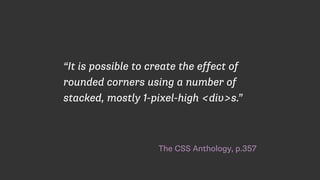
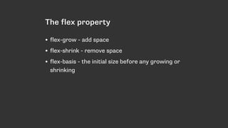
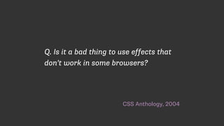
“Users [of IE] might see square corners
instead of rounded ones […] but they’ll
be able to use the site just as well as
their Mozilla-wielding counterparts.”](https://image.slidesharecdn.com/fronteers-modern-layout-151009104802-lva1-app6891/85/But-what-about-old-browsers-80-320.jpg)
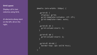


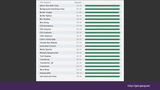

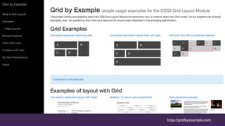

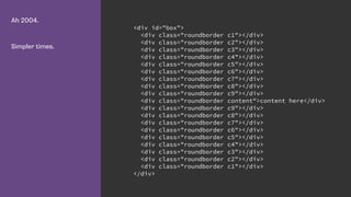
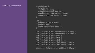
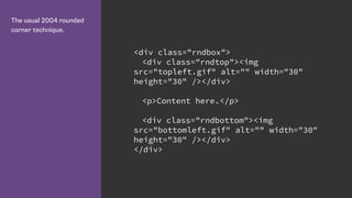
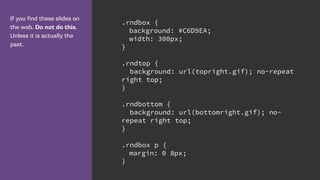
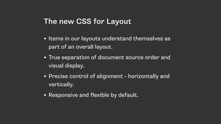
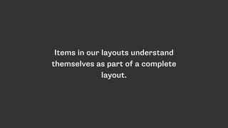
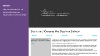
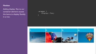
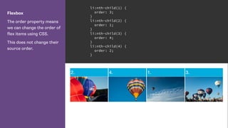
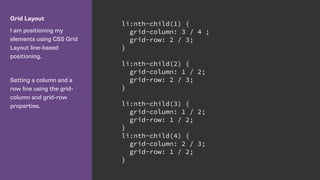
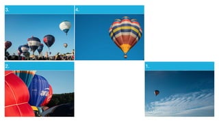
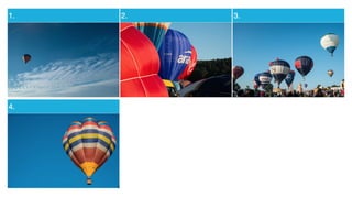
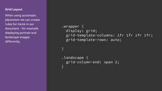
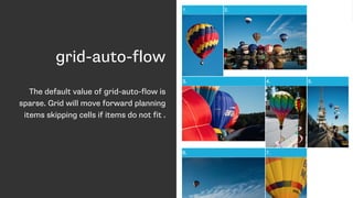
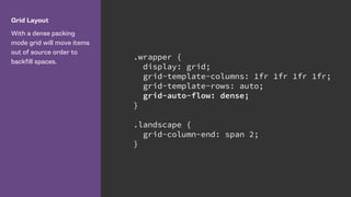
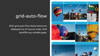
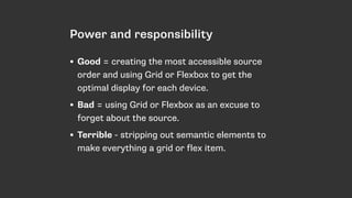
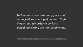
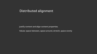
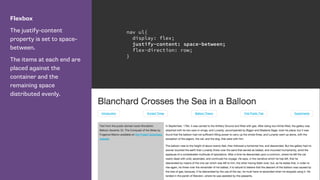
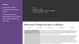
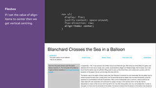
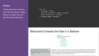
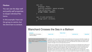
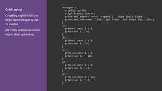
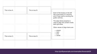
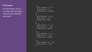
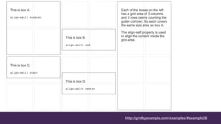
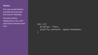
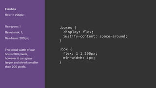
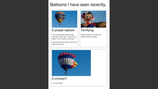
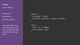
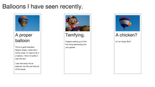
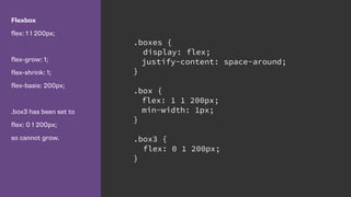
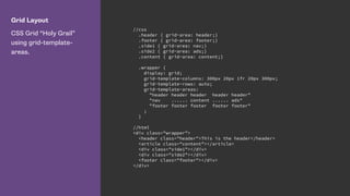
The document discusses various CSS layout techniques, focusing on the evolution from older methods (like stacked divs for rounded corners) to modern approaches such as Flexbox and CSS Grid. It emphasizes the importance of maintaining semantic markup while utilizing layout systems that enhance responsiveness and accessibility. Guidance is provided for using alignment properties in Flexbox and Grid, alongside recommendations for controlling layout flexibility.


![Getting Started with Apache Spark: Big Data Made Simple [Free Meetup]](https://cdn.slidesharecdn.com/ss_thumbnails/apachesparkgettingstarted-260203175547-8361bcc3-thumbnail.jpg?width=640&height=640&fit=bounds)


