Download to read offline


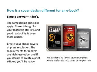


The document outlines essential steps for effective cover design, emphasizing the importance of identifying target audiences and genres, as well as using appropriate visuals and typography. It provides guidelines for creating an appealing cover that is easy to read, ensures good contrast, and conveys the book's message without overwhelming potential readers. Additionally, it addresses the design considerations for both print and e-book formats, along with instructions for back cover and spine layouts.