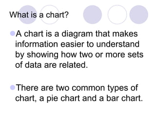
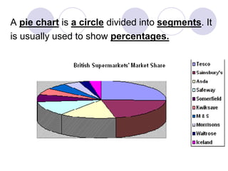
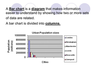
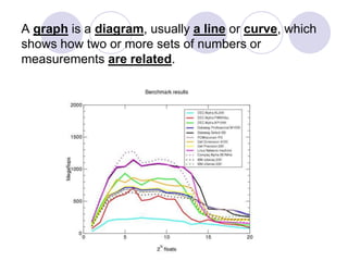
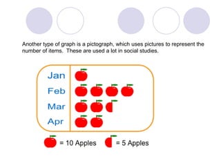
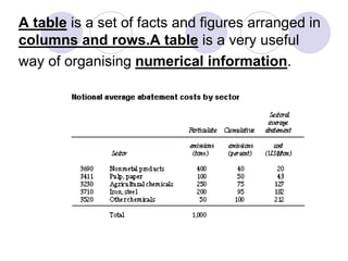
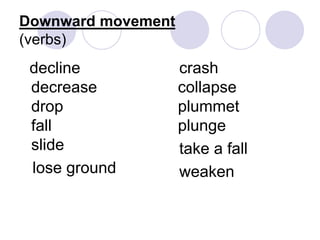
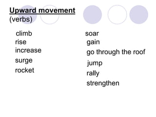
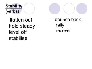
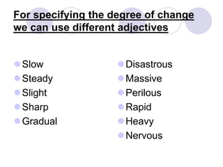
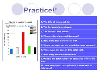
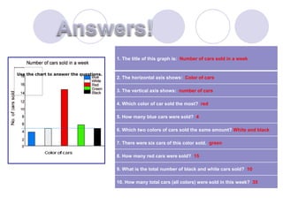
2. What is a chart?
A chart is a diagram that makes
information easier to understand
by showing how two or more sets
of data are related.
There are two common types of
chart, a pie chart and a bar chart.
3. A pie chart is a circle divided into segments. It
is usually used to show percentages.
4. A Bar chart is a diagram that makes information
easier to understand by showing how two or more sets
of data are related.
A bar chart is divided into columns.
5. A graph is a diagram, usually a line or curve, which
shows how two or more sets of numbers or
measurements are related.
6. Another type of graph is a pictograph, which uses pictures to represent the
number of items. These are used a lot in social studies.
7. A table is a set of facts and figures arranged in
columns and rows.A table is a very useful
way of organising numerical information.
8. So what do these graphs and charts
show us?
Graphs and charts are used to give us a
visual representation of how data changes,
usually over a period of time.
The words we can use to describe the
changes will be presented on the following
slides.
9. What is a trend?
Trends are the changes or
movements in facts and figures over
a period of time.
We can use different verbs and
nouns to describe trends
Extrapolate means to find or “take
out” the data we are looking for.
13. For specifying the degree of change
we can use different adjectives
Slow
Steady
Slight
Sharp
Gradual
Disastrous
Massive
Perilous
Rapid
Heavy
Nervous
14. 1. The title of this graph is:
2. The horizontal axis shows:
3. The vertical axis shows:
4. Which color of car sold the most?
5. How many blue cars were sold?
6. Which two colors of cars sold the same amount?
7. There were six cars of this color sold.
8. How many red cars were sold?
9. What is the total number of black and white cars
sold?
10. How many total cars (all colors) were sold in
this week?
Use the chart to answer the questions.
15. 1. The title of this graph is: Number of cars sold in a week
2. The horizontal axis shows: Color of cars
3. The vertical axis shows: number of cars
4. Which color of car sold the most? red
5. How many blue cars were sold? 4
6. Which two colors of cars sold the same amount? White and black
7. There were six cars of this color sold. green
8. How many red cars were sold? 15
9. What is the total number of black and white cars sold? 10
10. How many total cars (all colors) were sold in this week? 35
Use the chart to answer the questions.
16. Sometimes we are asked to read information from graphs and charts and
then use it to set up and solve a problem or problems.
We will use a link to the internet to explore some examples and practice
problems.
Please copy this link so that you can go back and practice whenever you wish.
http://www.omegamath.com/Data/d1.1.html
17. What we have learned
Graphs and charts are used to show the
trends of data over time
The axes on graphs tell us what data is
being represented.
We can extrapolate the data we need from
graphs and charts to create and solve
problems in order to find the information
we need to answer a problem or question.