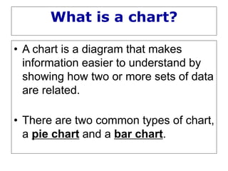
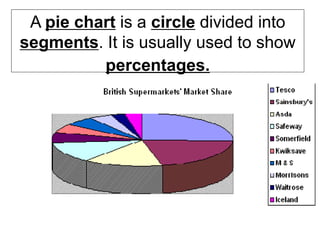
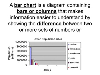
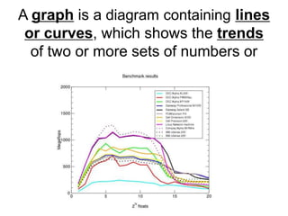
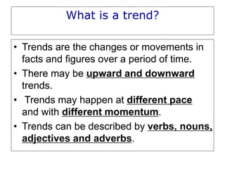
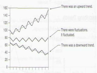
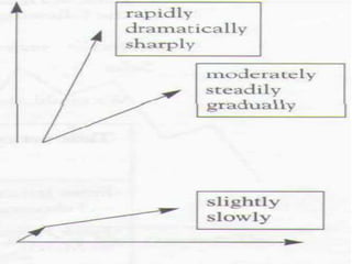
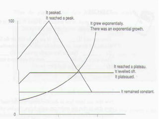
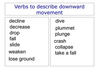
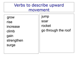
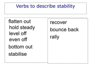
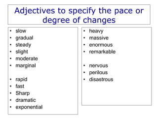
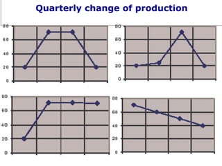
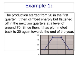
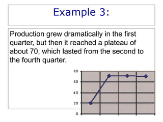
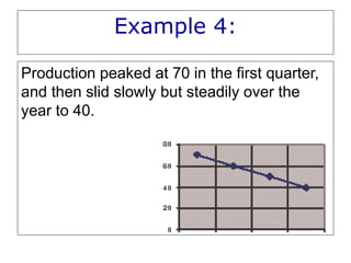
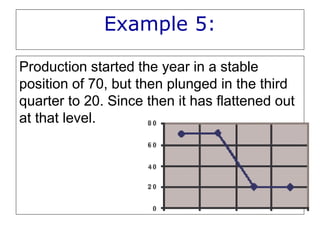
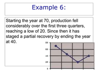
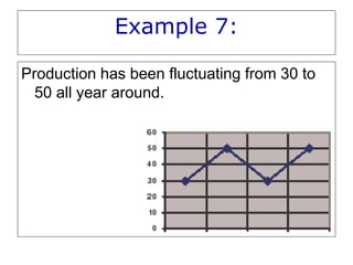
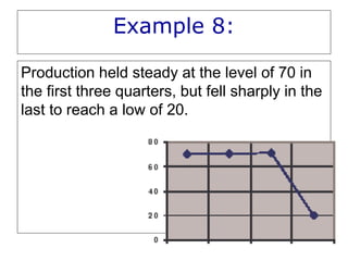
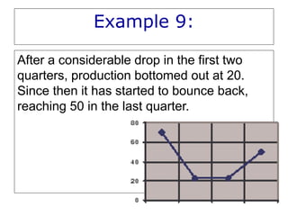
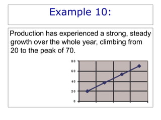
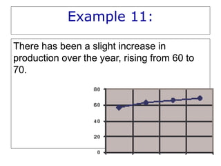
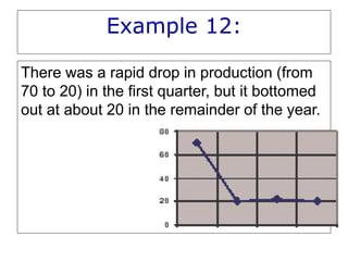
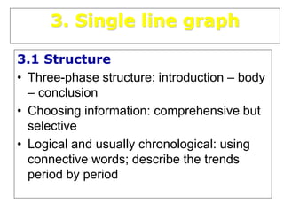
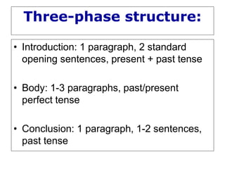
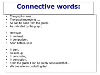
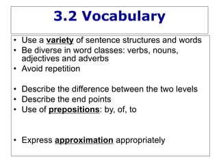
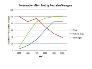
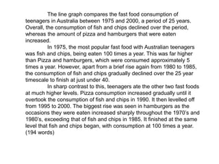
Describing
Tables, Charts and Graphs
• Write paragraph of introduction by quoting/ paraphrasing
the title
• Write paragraph of comment – comparing and
contrasting
• Write paragraph of conclusion
Four graphic forms
• Table
• Pie chart
• Bar chart
• (Line) graph
A table is a set of facts and figures
arranged in columns and rows. A table is
a very useful way of organising numerical
information.
What is a chart?
• A chart is a diagram that makes
information easier to understand by
showing how two or more sets of data
are related.
• There are two common types of chart,
a pie chart and a bar chart.
A pie chart is a circle divided into
segments. It is usually used to show
percentages.
A bar chart is a diagram containing
bars or columns that makes
information easier to understand by
showing the difference between two
or more sets of numbers or
measurements.
A graph is a diagram containing lines
or curves, which shows the trends
of two or more sets of numbers or
measurements.
2. Describing trends in graphs
What is a trend?
• Trends are the changes or movements in
facts and figures over a period of time.
• There may be upward and downward
trends.
• Trends may happen at different pace
and with different momentum.
• Trends can be described by verbs, nouns,
adjectives and adverbs.
Verbs to describe downward
movement
decline
decrease
drop
fall
slide
weaken
lose ground
dive
plummet
plunge
crash
collapse
take a fall
Verbs to describe upward
movement
grow
rise
increase
climb
gain
strengthen
surge
jump
soar
rocket
go through the roof
Verbs to describe stability
flatten out
hold steady
level off
even off
bottom out
stabilise
recover
bounce back
rally
Adjectives to specify the pace or
degree of changes
• slow
• gradual
• steady
• slight
• moderate
• marginal
• rapid
• fast
• Sharp
• dramatic
• exponential
• heavy
• massive
• enormous
• remarkable
• nervous
• perilous
• disastrous
Quarterly change of production
Example 1:
The production started from 20 in the first
quarter. It then climbed sharply but flattened
off in the next two quarters at a level of
around 70. Since then, it has plummeted
back to 20 again towards the end of the year.
Example 2:
Production grew more and more rapidly over
the first three quarters and then reached a
peak of 70 in the third quarter. Since then, it
has quickly dropped to 20 in the last quarter .
Example 3:
Production grew dramatically in the first
quarter, but then it reached a plateau of
about 70, which lasted from the second to
the fourth quarter.
Example 4:
Production peaked at 70 in the first quarter,
and then slid slowly but steadily over the
year to 40.
Example 5:
Production started the year in a stable
position of 70, but then plunged in the third
quarter to 20. Since then it has flattened out
at that level.
Example 6:
Starting the year at 70, production fell
considerably over the first three quarters,
reaching a low of 20. Since then it has
staged a partial recovery by ending the year
at 40.
Example 7:
Production has been fluctuating from 30 to
50 all year around.
Example 8:
Production held steady at the level of 70 in
the first three quarters, but fell sharply in the
last to reach a low of 20.
Example 9:
After a considerable drop in the first two
quarters, production bottomed out at 20.
Since then it has started to bounce back,
reaching 50 in the last quarter.
Example 10:
Production has experienced a strong, steady
growth over the whole year, climbing from
20 to the peak of 70.
Example 11:
There has been a slight increase in
production over the year, rising from 60 to
70.
Example 12:
There was a rapid drop in production (from
70 to 20) in the first quarter, but it bottomed
out at about 20 in the remainder of the year.
3. Single line graph
3.1 Structure
• Three-phase structure: introduction – body
– conclusion
• Choosing information: comprehensive but
selective
• Logical and usually chronological: using
connective words; describe the trends
period by period
Three-phase structure:
• Introduction: 1 paragraph, 2 standard
opening sentences, present + past tense
• Body: 1-3 paragraphs, past/present
perfect tense
• Conclusion: 1 paragraph, 1-2 sentences,
past tense
Connective words:
• The graph shows …
• The graph represents …
• As can be seen from the graph,
• As indicated by the graph,
• However,
• In contrast,
• In comparison,
• After, before, until
• In sum,
• To sum up,
• In concluding,
• In conclusion,
• From the graph it can be safely concluded that…
• We are safe in concluding that …
3.2 Vocabulary
• Use a variety of sentence structures and words
• Be diverse in word classes: verbs, nouns,
adjectives and adverbs
• Avoid repetition
• Describe the difference between the two levels
• Describe the end points
• Use of prepositions: by, of, to
• Express approximation appropriately
1. There has been a sharp fall in meat consumption.
2. Share prices dipped briefly at the start of the year.
3. There was a dramatic improvement in her fitness level.
4. Share prices will recover rapidly next year.
5. There has been a steady growth in the use of GM foods in some
countries.
The line graph compares the fast food consumption of
teenagers in Australia between 1975 and 2000, a period of 25 years.
Overall, the consumption of fish and chips declined over the period,
whereas the amount of pizza and hamburgers that were eaten
increased.
In 1975, the most popular fast food with Australian teenagers
was fish and chips, being eaten 100 times a year. This was far higher
than Pizza and hamburgers, which were consumed approximately 5
times a year. However, apart from a brief rise again from 1980 to 1985,
the consumption of fish and chips gradually declined over the 25 year
timescale to finish at just under 40.
In sharp contrast to this, teenagers ate the other two fast foods
at much higher levels. Pizza consumption increased gradually until it
overtook the consumption of fish and chips in 1990. It then levelled off
from 1995 to 2000. The biggest rise was seen in hamburgers as the
occasions they were eaten increased sharply throughout the 1970’s and
1980’s, exceeding that of fish and chips in 1985. It finished at the same
level that fish and chips began, with consumption at 100 times a year.
(194 words)

Describing Graph.ppt

  • 1.
  • 2.
    • Write paragraphof introduction by quoting/ paraphrasing the title • Write paragraph of comment – comparing and contrasting • Write paragraph of conclusion
  • 3.
    Four graphic forms •Table • Pie chart • Bar chart • (Line) graph
  • 4.
    A table isa set of facts and figures arranged in columns and rows. A table is a very useful way of organising numerical information.
  • 5.
    What is achart? • A chart is a diagram that makes information easier to understand by showing how two or more sets of data are related. • There are two common types of chart, a pie chart and a bar chart.
  • 6.
    A pie chartis a circle divided into segments. It is usually used to show percentages.
  • 7.
    A bar chartis a diagram containing bars or columns that makes information easier to understand by showing the difference between two or more sets of numbers or measurements.
  • 8.
    A graph isa diagram containing lines or curves, which shows the trends of two or more sets of numbers or measurements.
  • 9.
  • 10.
    What is atrend? • Trends are the changes or movements in facts and figures over a period of time. • There may be upward and downward trends. • Trends may happen at different pace and with different momentum. • Trends can be described by verbs, nouns, adjectives and adverbs.
  • 14.
    Verbs to describedownward movement decline decrease drop fall slide weaken lose ground dive plummet plunge crash collapse take a fall
  • 15.
    Verbs to describeupward movement grow rise increase climb gain strengthen surge jump soar rocket go through the roof
  • 16.
    Verbs to describestability flatten out hold steady level off even off bottom out stabilise recover bounce back rally
  • 17.
    Adjectives to specifythe pace or degree of changes • slow • gradual • steady • slight • moderate • marginal • rapid • fast • Sharp • dramatic • exponential • heavy • massive • enormous • remarkable • nervous • perilous • disastrous
  • 18.
  • 19.
    Example 1: The productionstarted from 20 in the first quarter. It then climbed sharply but flattened off in the next two quarters at a level of around 70. Since then, it has plummeted back to 20 again towards the end of the year.
  • 20.
    Example 2: Production grewmore and more rapidly over the first three quarters and then reached a peak of 70 in the third quarter. Since then, it has quickly dropped to 20 in the last quarter .
  • 21.
    Example 3: Production grewdramatically in the first quarter, but then it reached a plateau of about 70, which lasted from the second to the fourth quarter.
  • 22.
    Example 4: Production peakedat 70 in the first quarter, and then slid slowly but steadily over the year to 40.
  • 24.
    Example 5: Production startedthe year in a stable position of 70, but then plunged in the third quarter to 20. Since then it has flattened out at that level.
  • 25.
    Example 6: Starting theyear at 70, production fell considerably over the first three quarters, reaching a low of 20. Since then it has staged a partial recovery by ending the year at 40.
  • 26.
    Example 7: Production hasbeen fluctuating from 30 to 50 all year around.
  • 27.
    Example 8: Production heldsteady at the level of 70 in the first three quarters, but fell sharply in the last to reach a low of 20.
  • 28.
    Example 9: After aconsiderable drop in the first two quarters, production bottomed out at 20. Since then it has started to bounce back, reaching 50 in the last quarter.
  • 29.
    Example 10: Production hasexperienced a strong, steady growth over the whole year, climbing from 20 to the peak of 70.
  • 30.
    Example 11: There hasbeen a slight increase in production over the year, rising from 60 to 70.
  • 31.
    Example 12: There wasa rapid drop in production (from 70 to 20) in the first quarter, but it bottomed out at about 20 in the remainder of the year.
  • 32.
    3. Single linegraph 3.1 Structure • Three-phase structure: introduction – body – conclusion • Choosing information: comprehensive but selective • Logical and usually chronological: using connective words; describe the trends period by period
  • 33.
    Three-phase structure: • Introduction:1 paragraph, 2 standard opening sentences, present + past tense • Body: 1-3 paragraphs, past/present perfect tense • Conclusion: 1 paragraph, 1-2 sentences, past tense
  • 34.
    Connective words: • Thegraph shows … • The graph represents … • As can be seen from the graph, • As indicated by the graph, • However, • In contrast, • In comparison, • After, before, until • In sum, • To sum up, • In concluding, • In conclusion, • From the graph it can be safely concluded that… • We are safe in concluding that …
  • 35.
    3.2 Vocabulary • Usea variety of sentence structures and words • Be diverse in word classes: verbs, nouns, adjectives and adverbs • Avoid repetition • Describe the difference between the two levels • Describe the end points • Use of prepositions: by, of, to • Express approximation appropriately
  • 36.
    1. There hasbeen a sharp fall in meat consumption. 2. Share prices dipped briefly at the start of the year. 3. There was a dramatic improvement in her fitness level. 4. Share prices will recover rapidly next year. 5. There has been a steady growth in the use of GM foods in some countries.
  • 38.
    The line graphcompares the fast food consumption of teenagers in Australia between 1975 and 2000, a period of 25 years. Overall, the consumption of fish and chips declined over the period, whereas the amount of pizza and hamburgers that were eaten increased. In 1975, the most popular fast food with Australian teenagers was fish and chips, being eaten 100 times a year. This was far higher than Pizza and hamburgers, which were consumed approximately 5 times a year. However, apart from a brief rise again from 1980 to 1985, the consumption of fish and chips gradually declined over the 25 year timescale to finish at just under 40. In sharp contrast to this, teenagers ate the other two fast foods at much higher levels. Pizza consumption increased gradually until it overtook the consumption of fish and chips in 1990. It then levelled off from 1995 to 2000. The biggest rise was seen in hamburgers as the occasions they were eaten increased sharply throughout the 1970’s and 1980’s, exceeding that of fish and chips in 1985. It finished at the same level that fish and chips began, with consumption at 100 times a year. (194 words)