VIP Call Girls in Amravati Aarohi 8250192130 Independent Escort Service Amravati
Q5
1. Q5. How did you attract and address your audience?
Questionnaire results (14 participants)
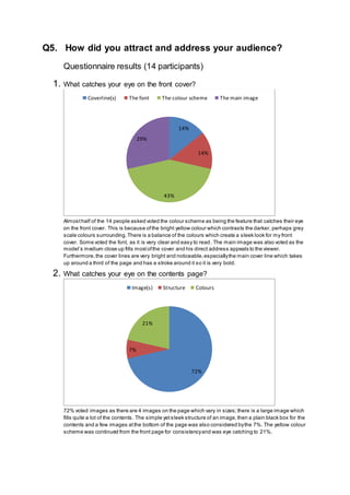
1. What catches your eye on the front cover?
Almosthalf of the 14 people asked voted the colour scheme as being the feature that catches their eye
on the front cover. This is because ofthe bright yellow colour which contrasts the darker, perhaps grey
scale colours surrounding.There is a balance of the colours which create a sleek look for my front
cover. Some voted the font, as it is very clear and easy to read. The main image was also voted as the
model’s medium close up fills mostofthe cover and his direct address appeals to the viewer.
Furthermore,the cover lines are very bright and noticeable,especiallythe main cover line which takes
up around a third of the page and has a stroke around it so it is very bold.
2. What catches your eye on the contents page?
72% voted images as there are 4 images on the page which vary in sizes;there is a large image which
fills quite a lot of the contents. The simple yetsleek structure of an image,then a plain black box for the
contents and a few images atthe bottom of the page was also considered bythe 7%. The yellow colour
scheme was continued from the front page for consistencyand was eye catching to 21%.
14%
14%
43%
29%
Coverline(s) The font The colour scheme The main image
72%
7%
21%
Image(s) Structure Colours
2. 3. What catches your eye on the double page spread?
9 of the 14 people said thatthe quote was eye catching on the double page spread.This maybe
because ofhow bright yellow the text is, aligned to the left side of the page,compared to the restof the
black, white and grey colour scheme.3 people said the image was eye catching.The image extended
over both pages with text over it and was a medium shotofthe model sitting behind a drum kit. 2 said
the colours were eye catching; this may be because the darker image background looked dull so the
white and yellow text stood out more.
4. Do you like the colour scheme? Why?
93% said that they liked the colour scheme,with reasons such as itbeing “bright”,“vibrant”, “eye-
catching”,it “draws attention”,it looks “professional”,“powerful”,“colourful” and thatit “stands out”. This
makes me appreciate thatI used the colour scheme as itis liked by the majority of my audience.On the
other hand,7% dislike the colour scheme,saying itis “contrasting”.
0
1
2
3
4
5
6
7
8
9
10
Quote Image Colours
93%
7%
Yes No
3. 5. Does the magazine suit the age group of 16-18?
16-18 year olds were my targeted age group for the magazine based on the questionnaire Idid before
constructing mymagazine,in that questionnaire everyone who answered was 16-18 therefore the
majority86% of people who agreed that the magazine suits the age group was expected. However, the
14% who disagreed perhaps thoughtthe magazine suited maybe an older audience because ofthe
plain colours and sophisticated fonts.
6. Do you think my magazine is targeted towards boys or girls?
I initiallyexpected girls to be attracted to this magazine because ofthe constantuse of a male model
and hardly any pictures of a female model;however I was wrong as the majority64% of my audience
thoughtthe magazine was aimed atboys. This is understandable as there are hardlyany feminine
features such as stereotypical mentions ofmakeup or even a pink colour. Perhaps the magazine
appeals to boys more as it looks more masculine and professional.Although,36% agreed that the
magazine could be for girls.
86%
14%
Yes No
64%
36%
Boys Girls
4. 7. What is the maximum you would pay for this?
8 people said thatthey would pay £3 for my magazine.This is reasonable because ofthe high standard
of my magazine.People are able to easilyafford this magazine.4 people,however, would pay £1.
Perhaps this is because theywould not be very interested in reading the magazine and therefore would
want it to be as cheap as possible,which is understandable.
8. Which is your favourite image and why?
6 people said thattheir favourite image was the main image on the front cove because ofthe models
direct address.As well as this, because itis a medium close up you can see the models expression
more clearly therefore it is more intriguing to the public.5 people said their favourite was the image on
the double page spread because ofthe use of the “drums” prop linking to the genre and the models
medium shotlooking interesting.3 people said the main image ofthe model holding a guitar on the
contents page is their favourite because ofthe “prop” used of the guitar.
0
1
2
3
4
5
6
7
8
9
£1.00 £2.00 £3.00 £4.00
Quantityofpeople
Price of magazine
0 1 2 3 4 5 6 7
Main Image on Front
Image on DPS
Main Image on Contents
5. 9. Which is your favourite cover line and why?
Majority of the voters favourite cover line was the “Beyoncé one” with reasons including thather name is
significantas itis “bold”,“bright”, that she is their “favourite” and the fact that she is a “well known artist”.
Having a popular artiston my front cover like that encourages a wide audience.Similarly,the Weeknd
cover line is also 3 people’s favourite as he is their “favourite” artist. The “10 ways to…” cover line is 3
people’s favourite as it is “friendly” and “attractive” to the audience.
10. Which of these are true on my double page spread?
13 people agreed thatmy layout was professional.I agree with this because I ensured all text was
correctly aligned and I made sure thatthe double page spread looked as professional as possible,there
was a quote and a summaryto the left of the spread followed by the image which is clear to see then
the article to the rightof the spread.8 people said thatit looks a real magazine which proves that the
double page spread was up to a high standard.6 people said the quote was interesting as itwas almost
mysterious and encouraged us to find out how the artistfound his genre.The masthead was placed
among the article. I used warp text on the article to go around the shape ofthe masthead to make it look
skilful.9 people believed the image was intriguing as we saw the model sitting behind a drum kit looking
forward, making the reader wonder whathe is looking at. 5 people though the text was easy to read, this
is quite a small number;perhaps because ofhow small the text was,however it had to be kept small so
the article could fit on the page.
0
1
2
3
4
5
6
7
8
9
The Beyonce coverline 10 ways to become an
artist coverline
The Weeknd coverline
5
9
9
6
13
8
0 2 4 6 8 10 12 14
The text is easy to read
The image is intriguing
The masthead has good placement
The quote is interesting
The layout is professional
This looks like a real magazine
6. 11. What genre would you associate my double page spread with? Why?
As expected, the majority72% associated the R&B genre with my magazine which I think is a suitable
genre and very close to my alternative R&B genre. My audience said thatthe “colour scheme” matches
the genre and the masthead is quite urban so itsuits the genre as well. Hip hop is quite similar to,so I
am not surprised that14% voted for it. I did not expect to have the 7% that voted for rock or indie,
although it shows me how diverse myaudience are and that my magazine can be associated with more
genres than I originallythought.
12. Does my magazine stereotype the genre you chose?
As this was a specialised audience ofstudents who do media,Iwas not surprised the majority93%
thoughtthat my magazine stereotypes the genre they chose. The 7% however musthave thoughtof a
different genre from R&B therefore disagreed with the question.
72%
14%
7%
7%
R&B Hip Hip Rock Indie
93%
7%
Yes No
7. 13. In what ways does my magazine follow or challenge the stereotypes?
93% say that my magazine follows stereotypes.This is because ofthe “colour scheme” being similar to
other magazines in the genre,the models “clothing”,the text being “informal”,the use of R&B “jargon”,
the “instruments” and other “artists ofthe genre”. The 7% believe that the magazine challenges
stereotypes because ofa common “red” colour that is used in other R&B magazines.
14. Would you suggest any improvements?
An equal amountofmy audience either suggested improvements or didn’t.Suggested improvements
included adding more “coverlines”,appealing to a “larger audience”,to make the double page spread
more “distinguishable”, to fill the “dead space” in the double page spread,to use “lighting” in some
pictures”,to use “differentmodels” and for the language to be more “original”.This is all completely
understandable and Iwill ensure to consider all ofthis if I were to make another music magazine. On the
other hand,there was a commentthat my magazine is “packed with information” and is very “eye-
catching” which gives me confidence with my productat this time.
93%
7%
Follows stereotypes Challenges stereotypes
0
1
2
3
4
5
6
7
8
Yes No
8. 15. What do you like about my magazine and why?
Overall, my audience liked the structure of the magazine,saying it looked very “professional”,“modern”,
“clean” and looks like a “real magazine”.4 liked the colour scheme,saying it“stands out”,it is
“consistent”,“intriguing” and “appealing”.The “angles” and “shots” ofthe images were also liked by3
people.The masthead was “interesting” to another 2.
Overview: the audience agreed thatmy magazine repres ented mygenre appropriatelyand that they
thoughtit looked like a real magazine because ofits professional structure and font.The use of images
was eye catching as well to the audience.The audience mostlyliked the colour scheme because ofthe
bright yellow colour that contrasted with the darker colours in the magazine.The audience also agreed
that the magazine suits the age group of 16-18 as I was aiming for this age group, showing thatI am
successful.Although,I expected the magazine to be aimed towards females because ofthe male
model,however the answers showed that people thoughtthe magazine is aimed atmales instead,
perhaps because ofthe masculine colour scheme.People associated mygenre with similar genres like
R&B and hip hop which shows thatI incorporated mygenre well.
0 1 2 3 4 5 6
The masthead
Images
Colour scheme
Layout/ structure