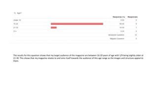
1. The results for this question shows that my target audience of the magazine are between 16-20 years of age with 1/9 being slightly older at
21-30. This shows that my magazine relates to and aims itself towards the audience of this age range as the images and structure appeal to
them.
2. From my results it is clear that the gender of the audience is both male and female and that even though the magazine mainly contains
images of the male gender, it does not alienate or ignore the female gender so they still feel encouraged to read it.
3. My results show that the layout, structure and overall appearance of the magazine looks like the genre of magazine it is as 100% of people
said it was either indie or indie rock. As the magazine is an indie rock magazine these results show it was successful.
4. The results for this question show that most people thought the masthead was the most noticeable feature on the front cover of the magazine
closely followed by the main image – this shows that my magazine follows codes and conventions as those two features are meant to be the most
noticeable over the others.
5. When asking the same question for my DPS, it shows that the features follow codes and conventions as most people said the main
headline and main image was the most noticeable which they should be.
6. I then asked the same question about my contents page and the results clearly show that the title and images used were the
features that stood out most to the audience. This again follows the codes and conventions of music magazine contents page and
shows that it has been done correctly to make it look realistic.
7. This question shows that my magazine is appealing to the audience and looks realistic as 100% of people said they would buy the
magazine if it was on sale.
8. I then asked a slightly different question and the results show what feature made the magazine look the most appealing was the colour
scheme used as the most people said this. It is closely followed by the coverlines – this means that they attract the audience as they may
relate to it in some way. 4/10 people said they liked the colour scheme of the magazine.
9. The same question was then asked about the DPS and the results show that the colour scheme again was the most attractive and appealing
feature of the page. This shows that I took the answers from the previous questionnaire into account and used the answers that people
said about which colours were their favourite and which colours they believed worked well together.
10. Like the front cover and contents page, the results show that the colour scheme was a very attractive and appealing features as the colours
used not only complemented one another, but also contrasted each other making the magazine easy to see and read.
11. I then asked the opposite to find out
what improvements I could make to
the magazine to see where I can
improve on to make it more appealing.
On the front cover it is clear that 4/10
people then said they did not like the
colour scheme. As 4 people liked the
colour scheme and 4 people didn’t this
shows that people have different
preferences so I should have picked
specific colours that people said they
liked in the previous questionnaire. The
section underneath shows that the
majority of people did not like the
colour scheme as they said there were
too many colours used making it
distracting.
12. It is very clear from this result that the
feature that was not used well on this
page was the main body and the main
reason for this is that it was very difficult
to read due to the colour not being
contrasting enough. During the
production it was difficult to find a colour
that fits so I should have changed the
colour of the background or positioned
the subject slightly smaller so it did not
bleed across as much in order for the text
to be more clear and simple to read. It
also states that the text is too long and
boring so I should have shortens the
answers down slightly to give a more
appealing look to the magazine.
13. I then asked the same question
about the contents page and the
results show that the article
headings were the most disliked
feature of the page for the reason
that they are too small and blend in
with the brief overview of the
article making it difficult to read. To
fix this I could have made the article
headings slightly bigger or slightly
separate from the other text to
make it stand out more.
14. 100% of people said that the magazine front cover overall looks realistic which was the aim of the production – this shows that the way I have
used the features follows codes and conventions of music magazines giving a successful and correctly made product.
15. When asking the same question for my DPS pages most people said it does look realistic which shows most codes and conventions are used
correctly but two people said that is was unrealistic as the text used on the body is very hard to see making the whole page look unprofessional
and unrealistic.
16. The results show that the contents page is a very well created and produced as 100% of people said it looks realistic. This shows that the page is very
professional and set pout very well following all codes and conventions of a music magazine contents page.