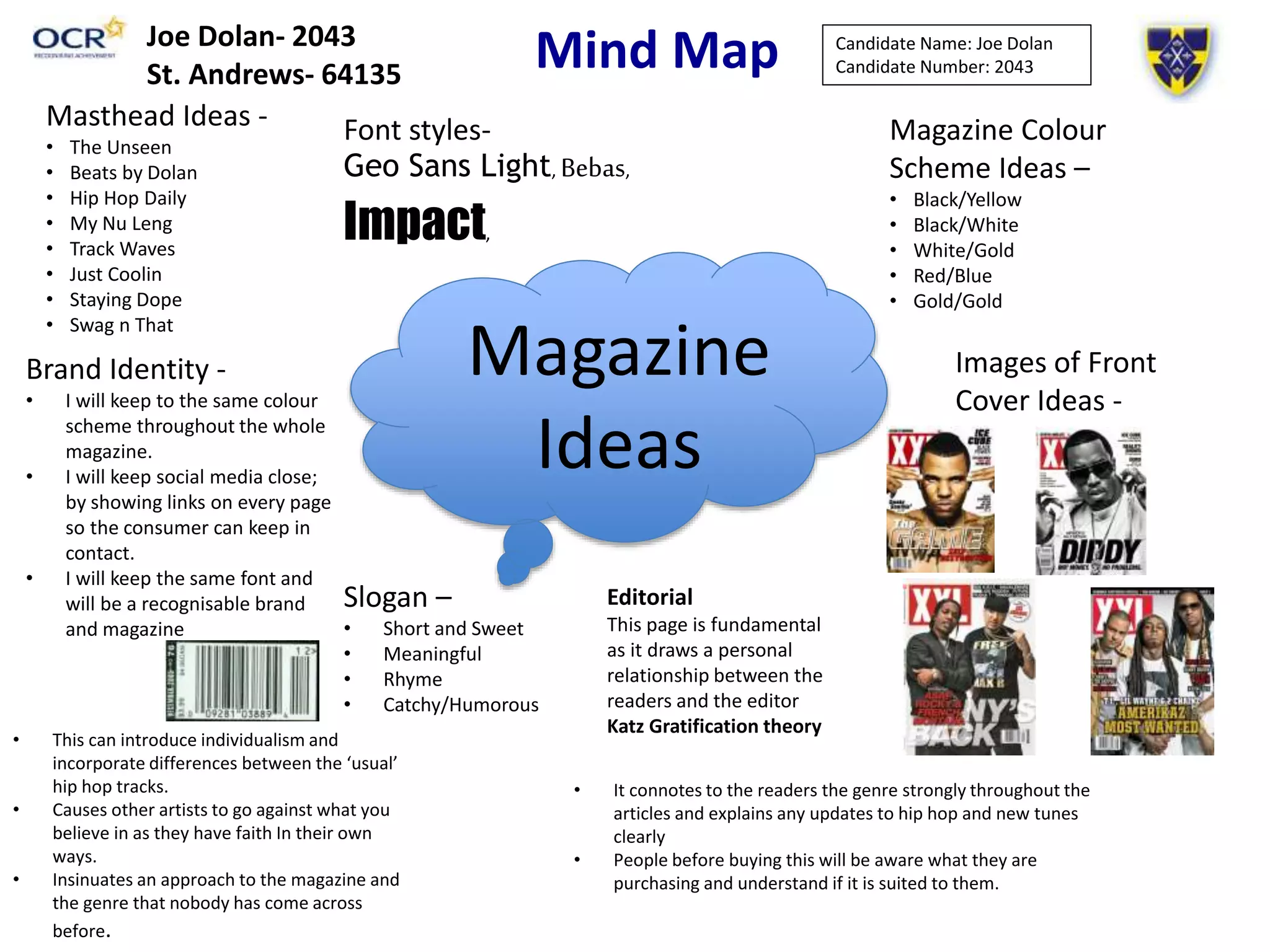
Mind Map
• This can introduce individualism and
incorporate differences between the ‘usual’
hip hop tracks.
• Causes other artists to go against what you
believe in as they have faith In their own
ways.
• Insinuates an approach to the magazine and
the genre that nobody has come across
before.
• It connotes to the readers the genre strongly throughout the
articles and explains any updates to hip hop and new tunes
clearly
• People before buying this will be aware what they are
purchasing and understand if it is suited to them.
Magazine
Ideas
Images of Front
Cover Ideas -
Magazine Colour
Scheme Ideas –
• Black/Yellow
• Black/White
• White/Gold
• Red/Blue
• Gold/Gold
Masthead Ideas -
• The Unseen
• Beats by Dolan
• Hip Hop Daily
• My Nu Leng
• Track Waves
• Just Coolin
• Staying Dope
• Swag n That
Brand Identity -
• I will keep to the same colour
scheme throughout the whole
magazine.
• I will keep social media close;
by showing links on every page
so the consumer can keep in
contact.
• I will keep the same font and
will be a recognisable brand
and magazine
Slogan –
• Short and Sweet
• Meaningful
• Rhyme
• Catchy/Humorous
Candidate Name: Joe Dolan
Candidate Number: 2043
Editorial
This page is fundamental
as it draws a personal
relationship between the
readers and the editor
Katz Gratification theory
Font styles-
Geo Sans Light, Bebas,
Impact,
Joe Dolan- 2043
St. Andrews- 64135
Masthead Name Ideas
Masthead Name
Ideas
Font Bebas
THEUnseen
The connotation behind this name as
it relates to the album produced by
Quasimoto who changed the hip hop
scene from the underground level
back up out in the open. So this
album is a significant event in Hip Hop
and could be quite an effective
tribute.
Font Geo Sans Light
Stay Dope
On the streets the word Dope means
‘cool’ and most people who
stereotype this hip hop scene like to
look cool and powerful as opposed to
other gangs and people on the street.
So ‘Stay Dope’ could suggest that hip
hop members should stay cool no
matter what the occasion or scenario. Font Impact
Beats by Dolan
Using Beats by Dolan could be effective because it shows
the editors last name and brings a ‘Star Appeal’ towards
the editor and also brings forward attention to those
behind the magazine. Impact font is also similar to XXL
font as it is bold and plain.
Inspiration
• I have chosen to use XXL as my magazine of inspiration and they use the red colour
scheme very effectively therefore I have chosen to put my font in a recognisable
font like XXL and similarly to the Vibe magazine of which I use as my second
inspirational source. The stories I will choose to use will be mainly sob stories
which will highlight the artists poor background and cause the reader to want to
read on and discover more about their life's and how they turned it around.
• The reasons I chose the images on the previous slide was because they were all
from my magazine of inspiration and represents my selected genre of music
effectively for example the fashion they are portraying and also the type of people
who will be best suited for my front camera e.g. African/American
Social media
• The synergy I will be using for my front cover will be Facebook/Twitter/Instagram
as they are the most popular social networking sites therefore making it effective
for the magazine to link to a well known social site. This can allow the reader to
become more in touch with the magazine and when it will be released and how
they can get in touch with the production of the magazine and any special
releases.
Strapline Language
Strapline
Language
Hip Hop Knockout - This strapline
can suggest that you will knocked
out by the context within the
magazine and how it will be better
than anything else you can read.
Lurking in the shadows- This
was an idea for the strapline
that I chose was mainly due to
it linking effectively with ‘The
Unseen’ masthead.
The UK’s Biggest Hip Hop Magazine- With this
bold statement it could encourage the target
audience to check the magazine out as it is the
biggest hip hop magazine. This was inspired by
XXL strapline.
Images of Props
Images of
Props
Colour Schemes
Colour
Schemes
Black and White- This colour
scheme is usually used in
magazines such as XXL and Vibe.
Although there is also splashes
off orange and red used to
create a more powerful brand
identity.
Black and Red- This is the most
regularly used colour scheme used in
XXL and captures the darkness
combined with the red passion that
stands out within the page.
Black only- This is shown in
hip hop artists fashion and
has been very popular so
therefore is a possible
approach to my magazine.
This would be used to
connote the darkness
surrounding the hip hop
scene and how it has
changed throughout time.
White only- This has been used in previous
interviews on XXL magazine spreads and
looks very effective and professional.
Added Information
• I will make the magazine £1.99 as it will be a relatively frequent release for hip hop
fans as I am going to release an issue on a weekly basis therefore if the price was
any more expensive than £1.99 it would cause people to loose out on purchasing
the magazine and wouldn’t generate enough sales to maintain a popular
magazine.

Joe Dolan Mind Map

  • 1.
    Mind Map • Thiscan introduce individualism and incorporate differences between the ‘usual’ hip hop tracks. • Causes other artists to go against what you believe in as they have faith In their own ways. • Insinuates an approach to the magazine and the genre that nobody has come across before. • It connotes to the readers the genre strongly throughout the articles and explains any updates to hip hop and new tunes clearly • People before buying this will be aware what they are purchasing and understand if it is suited to them. Magazine Ideas Images of Front Cover Ideas - Magazine Colour Scheme Ideas – • Black/Yellow • Black/White • White/Gold • Red/Blue • Gold/Gold Masthead Ideas - • The Unseen • Beats by Dolan • Hip Hop Daily • My Nu Leng • Track Waves • Just Coolin • Staying Dope • Swag n That Brand Identity - • I will keep to the same colour scheme throughout the whole magazine. • I will keep social media close; by showing links on every page so the consumer can keep in contact. • I will keep the same font and will be a recognisable brand and magazine Slogan – • Short and Sweet • Meaningful • Rhyme • Catchy/Humorous Candidate Name: Joe Dolan Candidate Number: 2043 Editorial This page is fundamental as it draws a personal relationship between the readers and the editor Katz Gratification theory Font styles- Geo Sans Light, Bebas, Impact, Joe Dolan- 2043 St. Andrews- 64135
  • 2.
    Masthead Name Ideas MastheadName Ideas Font Bebas THEUnseen The connotation behind this name as it relates to the album produced by Quasimoto who changed the hip hop scene from the underground level back up out in the open. So this album is a significant event in Hip Hop and could be quite an effective tribute. Font Geo Sans Light Stay Dope On the streets the word Dope means ‘cool’ and most people who stereotype this hip hop scene like to look cool and powerful as opposed to other gangs and people on the street. So ‘Stay Dope’ could suggest that hip hop members should stay cool no matter what the occasion or scenario. Font Impact Beats by Dolan Using Beats by Dolan could be effective because it shows the editors last name and brings a ‘Star Appeal’ towards the editor and also brings forward attention to those behind the magazine. Impact font is also similar to XXL font as it is bold and plain.
  • 3.
    Inspiration • I havechosen to use XXL as my magazine of inspiration and they use the red colour scheme very effectively therefore I have chosen to put my font in a recognisable font like XXL and similarly to the Vibe magazine of which I use as my second inspirational source. The stories I will choose to use will be mainly sob stories which will highlight the artists poor background and cause the reader to want to read on and discover more about their life's and how they turned it around. • The reasons I chose the images on the previous slide was because they were all from my magazine of inspiration and represents my selected genre of music effectively for example the fashion they are portraying and also the type of people who will be best suited for my front camera e.g. African/American Social media • The synergy I will be using for my front cover will be Facebook/Twitter/Instagram as they are the most popular social networking sites therefore making it effective for the magazine to link to a well known social site. This can allow the reader to become more in touch with the magazine and when it will be released and how they can get in touch with the production of the magazine and any special releases.
  • 4.
    Strapline Language Strapline Language Hip HopKnockout - This strapline can suggest that you will knocked out by the context within the magazine and how it will be better than anything else you can read. Lurking in the shadows- This was an idea for the strapline that I chose was mainly due to it linking effectively with ‘The Unseen’ masthead. The UK’s Biggest Hip Hop Magazine- With this bold statement it could encourage the target audience to check the magazine out as it is the biggest hip hop magazine. This was inspired by XXL strapline.
  • 5.
  • 6.
    Colour Schemes Colour Schemes Black andWhite- This colour scheme is usually used in magazines such as XXL and Vibe. Although there is also splashes off orange and red used to create a more powerful brand identity. Black and Red- This is the most regularly used colour scheme used in XXL and captures the darkness combined with the red passion that stands out within the page. Black only- This is shown in hip hop artists fashion and has been very popular so therefore is a possible approach to my magazine. This would be used to connote the darkness surrounding the hip hop scene and how it has changed throughout time. White only- This has been used in previous interviews on XXL magazine spreads and looks very effective and professional.
  • 7.
    Added Information • Iwill make the magazine £1.99 as it will be a relatively frequent release for hip hop fans as I am going to release an issue on a weekly basis therefore if the price was any more expensive than £1.99 it would cause people to loose out on purchasing the magazine and wouldn’t generate enough sales to maintain a popular magazine.