1. Photography Lighting
Salford City College Ryan Denner High key lighting is used to make her face stand out
Eccles Centre so, she’s easily recognisable. The background of the
AS Media Studies
Foundation Portfolio
image is blurred which makes her face stand out and,
makes it look professional. It appeals to the target
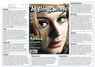
Masthead---------------------------------------------------- audience as it is a high quality image suggesting the
The masthead is bold and, in front of the main image so, it standard of the magazine. She is shown to look
stands out suggesting it is one of the key features to the sad/upset suggesting what the article will be about.
magazines success. It follows the house style and, is plain
colours suggesting the magazine is serious while also Main image
suggesting, the simplicity of the music produced by the The main image shows a close up of the artists face
artist featured on the cover. It demonstrates to the and, is easily recognisable from it showing that they
audience that the magazine is serious and, not a fun are a big star who will help sell the magazine. It uses
comical magazine. The black outline round the masthead direct address as she is looking directly at the
makes it stand out from the background and, gives it a 3D audience almost pleading with the audience to buy
effect adding to the overall effectiveness of the masthead. the magazine to find out about her. It is in the
The font used for it looks formal suggesting the type of background to the rest of the text so; it’s easy to see
article that will be inside. It covers the whole width of the the other details on the magazine cover. The colours
page so; it is easily visible from all angles and, is easy to see used fit in with the house style adding to the overall
the name of the magazine. professional look of the magazine. It appeals to the
audience as they, can easily see what the main article
Colour is about and, see that it is presented in a professional
The main colours used are quite dull and, plain. This way.
suggests that the articles inside may feature a lot of text
and, be factual therefore appealing to the older target Typefaces
audience. Yellow is used to help brighten up the front cover The font used looks very formal and, serious
allowing it to stand out easier on the shelf encouraging the suggesting the type of articles featured inside. The
audience to pick it up. White is used to suggest the font is bold and easy to read so; people are able to
simplicity and, purity of the singer featured while black is easily see the information about the magazine. It is in
used to suggest the interview may be about a bad time in contrasting colours to the main image so, it stands
her life. out. It appeals to the audience as it looks professional
and, fits into the house style.
Model credit
The model credit is quite large and, easily visible showing House Style
that they are going to help sell the magazine to the The house style looks very professional and, formal
audience. However, it isn’t as large as the masthead appealing to the target audience. The main colour
suggesting that will be a bigger selling point for the scheme uses quite dull/plain colours making it look
magazine that the star featured. The text used is bold so, more forma and, serious. Yellow and, white text is
stands out and, fits in with the house style. It will appeal to used to brighten up the magazine while also looking
the audience as its plain and, simple much like the rest of professional and, fitting in with the rest of the house
the front cover. style. The style is a simple design which adds to the
overall impact of the magazine cover.
Coverlines
The coverlines are all down one side of the page and, are Main cover line Target Audience
confined to a certain space so; they don’t obstruct the main The main cover line sums up what the main article will be The target audience for the magazine will be mainly young adults as they are
image suggesting that the main image is the most important about inside. It suggests that the article will be talking about most likely to be fans of the artists featured and, the older generation may not be
part for the audience. They are used to sum up the other articles the success of the cover star. The main cover line is in yellow interested in them. And, the magazine may be too serious for teenagers so they
inside so, the audience know what else will be featured and, demonstrating that the article will be about the happy,
encourage the audience to buy it even if they aren’t a fan of the would not won’t to read it. It would appeal to both genders as both would be
positive side to her life. It would attract the audience as it
cover star. They will appeal to the target audience as they look only hints at what the article is about encouraging the fans of the musicians featured. The target audience would buy the magazine to
professional suggesting the type of articles inside. audience to buy it to find out more. find out all the information about the artists lives while being entertained.