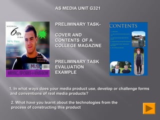
1. AS MEDIA UNIT G321
PRELIMINARY TASK-
COVER AND
CONTENTS OF A
COLLEGE MAGAZINE
PRELIMINARY TASK
EVALUATION
EXAMPLE
1. In what ways does your media product use, develop or challenge forms
and conventions of real media products?
2. What have you learnt about the technologies from the
process of constructing this product
3. Vs
The use of different sell and cover VIBE
lines. My college magazine
Has sell lines to do with students and
college. Also I have used a student as
my main image. Whereas there is a
celebrity for Vibe as they have a wider
audience range and their audience
need someone on the magazine who
they know which is why they chose Lil
Wayne as he is a global icon.
Use of colour
schemes, bold and
bright colours to
attract my audience
of both genders.
I have used a medium close up shot
of a male. His smile and eye contact
make it look and feel friendly which
relates to a college magazine
because the environment is friendly
around college. Hip hop though is
associated with attitude so Lil Wayne
looks moody and creates his own
aggressive and vain look.
4. Contents as
title page.
Text layout
of ‘contents
Layout out
of columns
for features
within the
magazine
and
categorised.
Images
which relate
to the
magazines.
5. Solihull 6th Form Vs VIBE
Vibe magazine has an
initial of the magazine
name on the contents
page. Whereas the
college magazine doesn’t
really have one due to it
not being an international
magazine like vibe.
Using more then 1
image for my
magazine makes it
look more brighter
than Vibe. Also I have
inserted page
numbers onto my
images so that the
audience can find out
what page to go to so
they can find a certain
thing.
6. o get
odle t ures tspage.
Usi ng M o g the feat te my conten
ces. Learnin gn to crea
resour of In De
si
e
us , to ges.
to op a
. ow tosh te im
H o la
Ph nipu
ma
cameras
Usin g digital
nd type
(shot , angle a
of shot).
7. Using the digital camera, i could ensure that My
image was an MCU which dominated the frame.
Here it shows I have added a magazine title and footer. I have added these features so it looks more
professional and useable.
This shows how I used Photoshop to manipulate my images,
and one of my stages of development. As you can see:
• I changed the levels of the colours, to add more emphasis
on the student. Originally he had red eye which I corrected
with the red eye tool. I made sure everything looked perfect.
•I also added font with drop shadow and effects to make the
magazine more eye catching. I added a blur effect which you
can see makes my image look more professional on my
magazine. I have also made my final image look darker by
changing the contrast of everything around the student so he
looks like a actual model.
8. I had a main text box at the top
with the main title and I made
sure I used the same font as I
used for my cover lines on my
front cover.
I inserted my images that I wanted to
use. These images were longshots
and MCU’s. Within these pictures I
added little boxes which had the
number of the page associated with
the text. As you can see I cropped the
pictures out so the students stand out
and my audience can relate to them
and their environment. Also I have not
used rectangle boxes for my pictures,
I have instead curved them more on
the edges so it looks more
professional and not to dull.
![Masthead
Cover Lines
Dominant
Image [rule of
thirds]
Barcode](data:image/gif;base64,R0lGODlhAQABAIAAAAAAAP///yH5BAEAAAAALAAAAAABAAEAAAIBRAA7)