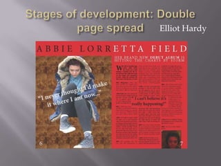
2. Firstly, I used the rectangle tool to create a large red box then used the
eyedropper tool to establish the correct colour by ‘eyedropping’ the colour
of my masthead on the front cover. Then I sent this to back layer by
Arrange > Send to back. Then I placed and image from Photoshop that I
created and duplicated it across one page. I also used the rectangle frame
tool to creates positions for the page numbers then I set the content for
them to be text filled.
3. Next I used the text tool to create a large text box along the top of both pages and inserted
this text of the artist’s name. and edited the Kerning (to -8) and the Tracking (to 290) so that
the letters were spread out across the page and set them to ‘semibold’ so it would stand out.
I also placed a picture from Photoshop that I created with a transparent background by
cutting away the part of the image I didn’t want with the lasso/polygonal selection tool and
cut and pasting it away. The direct selection tool allowed me to position her wherever I
pleased so I dragged the model over the top of my already created image.
4. Next I decided to insert my subheading for the article to give a brief insight as to what
my article was about and background information. I did this by created a rectangle
frame and choosing the content to be text and making sure my text was ‘justified to all
lines’ and made the text debut album bold to stand out further. Next I copied my
prewrote article on word into another text-selected rectangle frame (that I chose to
have has three columns wide) and edited the ‘Drop cap’ to 3 lines deep. And chose
different fronts for who was speaking and left the speaker in bold. Once again I made
sure the text was justified to all lines.
5. Finally, I added three more frames: the first was a text box with a quote tilted
across the main image to intrigue the reader as to what journey the artist has taken
to get where she is now. The next frame centre of the article so that it was set to
around text, ensuring that it stood out on the page and was large and ‘semibold’
The final was a image filled frame containing the album art that I imported from
my pictures so that the audience knew what it looks like and where to buy it.