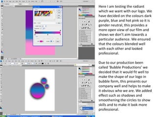
Here I am testing the radiant
which we want with our logo. We
have decided on the colours dark
purple, blue and hot pink so it is
gender neutral, this provides a
more open view of our film and
shows we don’t aim towards a
particular audience. We ensured
that the colours blended well
with each other and looked
professional.

Due to our production been
called ‘Bubble Productions’ we
decided that it would fit well to
make the shape of our logo in
bubble form, this presents our
company well and helps to make
it obvious who we are. We added
effect such as shadows and
smoothening the circles to show
skills and to make it look more
professional.
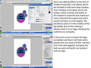
Here I am adding effects to the text of
‘Bubble Production’ the effects which
we decided to add were drop shadow,
inner shadow, outer glow, bevel and
embos, colour overlay and stroke as
this helped to make the text stand out
more instead of the typical text when
would not have as much appeal. We
decided to place it in the middle of the
big bubble due to this making it
obvious that it is our logo, showing the
audience our company.

In this print screen it shows the logo
completed and how it will look when
placed onto our work and film. We feel
that it fits well together and gives the
look we were aiming for our product
and our logo.

Logo power poi

  • 1.
    Here I amtesting the radiant which we want with our logo. We have decided on the colours dark purple, blue and hot pink so it is gender neutral, this provides a more open view of our film and shows we don’t aim towards a particular audience. We ensured that the colours blended well with each other and looked professional. Due to our production been called ‘Bubble Productions’ we decided that it would fit well to make the shape of our logo in bubble form, this presents our company well and helps to make it obvious who we are. We added effect such as shadows and smoothening the circles to show skills and to make it look more professional.
  • 2.
    Here I amadding effects to the text of ‘Bubble Production’ the effects which we decided to add were drop shadow, inner shadow, outer glow, bevel and embos, colour overlay and stroke as this helped to make the text stand out more instead of the typical text when would not have as much appeal. We decided to place it in the middle of the big bubble due to this making it obvious that it is our logo, showing the audience our company. In this print screen it shows the logo completed and how it will look when placed onto our work and film. We feel that it fits well together and gives the look we were aiming for our product and our logo.