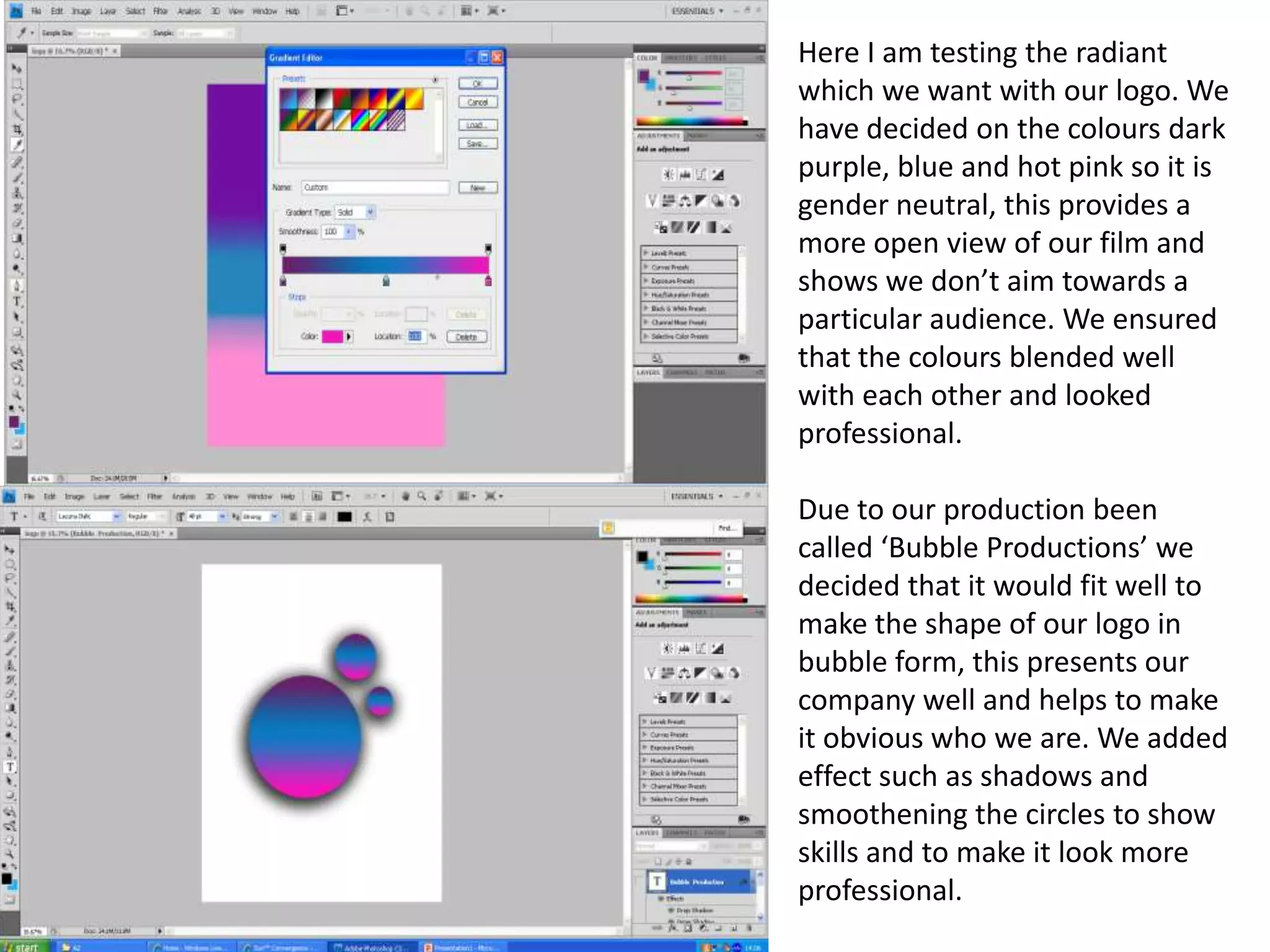
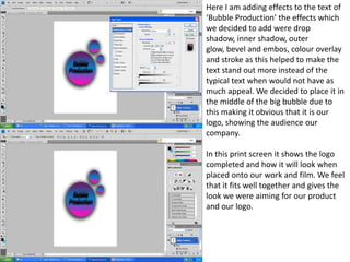
The document discusses the development of a logo for the film company Bubble Productions. They chose a color scheme of dark purple, blue, and hot pink to appear gender neutral and appeal to a wide audience. The logo features bubbles to represent the company name, with effects added to make the text and circles look professional. The completed logo is tested and feels like it fits well and achieves the intended look for their company and films.

