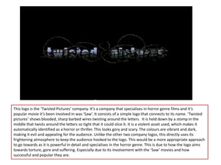
The document discusses and compares the logos of three film companies - Walt Disney, Universal, and Twisted Pictures. It analyzes each logo's design elements, colors, and how effectively they represent the genre of films each company produces. The Walt Disney logo uses bright colors and a castle to appeal to families, but is not scary enough for a horror genre. The Universal logo uses the world and galaxy with basic bright colors to represent action and comedy films for all audiences. Finally, the Twisted Pictures logo uses bloody barbed wire and a violent design that directly represents the horror genre through torture, gore and suffering, making it the most appropriate logo discussed for a horror-focused company.