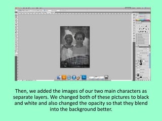
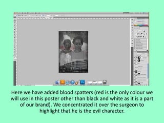
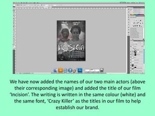
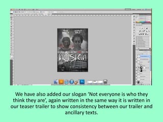
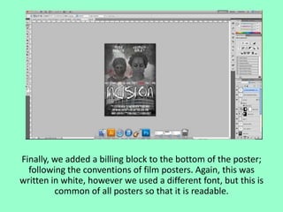
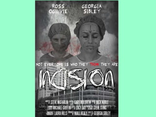
Editing process of our new
poster
We found a picture of a hospital on the internet, then
changed the hue and saturation to black and white and
created darker edges around the image.
We added a picture of a sky with clouds, where we also
changed the hue and saturation to black and white.
We then added a rust texture so that the joining of the two
images wasn’t obvious.
Then, we added the images of our two main characters as
separate layers. We changed both of these pictures to black
and white and also changed the opacity so that they blend
into the background better.
Here we have added blood spatters (red is the only colour we
will use in this poster other than black and white as it is a part
of our brand). We concentrated it over the surgeon to
highlight that he is the evil character.
We have now added the names of our two main actors (above
their corresponding image) and added the title of our film
‘Incision’. The writing is written in the same colour (white) and
the same font, ‘Crazy Killer’ as the titles in our film to help
establish our brand.
We have also added our slogan ‘Not everyone is who they
think they are’, again written in the same way it is written in
our teaser trailer to show consistency between our trailer and
ancillary texts.
Finally, we added a billing block to the bottom of the poster;
following the conventions of film posters. Again, this was
written in white, however we used a different font, but this is
common of all posters so that it is readable.
Editing our Poster

Editing our Poster

  • 1.
    Editing process ofour new poster
  • 2.
    We found apicture of a hospital on the internet, then changed the hue and saturation to black and white and created darker edges around the image.
  • 3.
    We added apicture of a sky with clouds, where we also changed the hue and saturation to black and white.
  • 4.
    We then addeda rust texture so that the joining of the two images wasn’t obvious.
  • 5.
    Then, we addedthe images of our two main characters as separate layers. We changed both of these pictures to black and white and also changed the opacity so that they blend into the background better.
  • 6.
    Here we haveadded blood spatters (red is the only colour we will use in this poster other than black and white as it is a part of our brand). We concentrated it over the surgeon to highlight that he is the evil character.
  • 7.
    We have nowadded the names of our two main actors (above their corresponding image) and added the title of our film ‘Incision’. The writing is written in the same colour (white) and the same font, ‘Crazy Killer’ as the titles in our film to help establish our brand.
  • 8.
    We have alsoadded our slogan ‘Not everyone is who they think they are’, again written in the same way it is written in our teaser trailer to show consistency between our trailer and ancillary texts.
  • 9.
    Finally, we addeda billing block to the bottom of the poster; following the conventions of film posters. Again, this was written in white, however we used a different font, but this is common of all posters so that it is readable.