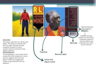
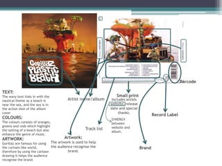
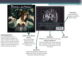
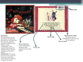
ALBUM ARTWORK ANALYSIS
FRONT & BACK COVERS
Special features
                                                                                      Extra editions
                                                                                      Website


                                                                                     SYNERGY between
                                                                                  website and the album,
COLOURS:                                                                           combining audiences
                                                                                    who buy albums and
The colours used here are vibrant and
bright. The yellow in contrast with                                     Barcode    audiences who rather
                                                                                      use the internet.
the red, green and blue all help
recognise the genre of music
(western/blues) furthermore help
appeal audiences.
PHOTOGRAPHY:                               Tracklist
The photography is very simple which                     Record Label
implies the artists simplicity in music,
but also suggests that this artist
doesn’t need over exaggerated                   Artist and
clothes to get attention from his               album name
audience.
Barcode

TEXT:
The wavy text links in with the                                   Small print
nautical theme as a beach is           Artist name/album        Includes artists
near the sea, and the sea is in                                website, release
the action shot of the album                                   date and special
cover                                                               thanks.
                                                                                           Record Label
COLOURS:                                                       SYNERGY
The colours consists of oranges,                               between
greens and reds which highlight                                website and
the setting of a beach but also                   Track list
                                                               album.
enhance the genre of music.
ARTWORK:                             Artwork:
Gorillaz are famous for using The artwork is used to help
the cartoon like world,        the audience recognise the                          Brand
therefore by using the cartoon           brand.
drawing it helps the audience
recognise the brand.
Tracklist:
                                                                                                             Helps the buyer
                                                                                                           navigate around the
                                                                                                              album easily.


PHOTOGRAPHY:                       Artist and album
The photography helps to                                                 Website:                     Barcode
illustrate the artists genre of          name:
                                     Text is very simple    SYNERGY between internet and album.
music. Florence’s music is very
serene, earthy and yet powerful,      implying that the              Bonus features:
                                       audience should       The text explains how if you inset the
therefore by using the neutral
                                   immediately know who     disc two bonus tracks can be unlocked,
colours of green and brown she
                                        this artist is.      this is enhances they audience to buy
is able to portray her genre.
                                                                           the album

                                                    Artwork:
                                         Helps the audience recognise the
                                        album and brand. Colours are kept
                                          neutral to enhance the genre.
Barcode


Artwork:                                                                               Album/artist name:
One Hot Minute was the                                            Brand logo             The album name is
only album that guitarist                                                           highlighted to catch the eye
Dave Navarro recorded with                                                                of the audience.
the band. His presence                                                         Record label
altered the Red Hot Chili     Bonus features:
Peppers' sound
                              extra selling point,
considerably. This is
represented through the
                              enhances the           Track list
change in album artwork       audience to buy the
compared to the other         album.
albums.
COLOUR RED: The colour
red is the iconic colour of
the band so using this
colour helps the audience
recognise the brand.
Artist/album
                                                                                               name


                                                                                              Barcode


                 Artist name/album title

PHOTOGRAPHY:                                                          RECORD LABEL
The photo that she used is an iconic             SMALL PRINT          PRODUCER(WARNER BROS)
previously taken photo, illustrating he          Producers/year       DISC logo
status and how she is well known,                made/copyright
especially when her career began. The      information/featured artists
album is an album of her ‘greatest hits’
therefore using an iconic photo implies
that all her music will also be iconic,
enhancing the audience to buy the          Tracklist
album.

Front and Back album cover analysis

  • 1.
  • 2.
    Special features Extra editions Website SYNERGY between website and the album, COLOURS: combining audiences who buy albums and The colours used here are vibrant and bright. The yellow in contrast with Barcode audiences who rather use the internet. the red, green and blue all help recognise the genre of music (western/blues) furthermore help appeal audiences. PHOTOGRAPHY: Tracklist The photography is very simple which Record Label implies the artists simplicity in music, but also suggests that this artist doesn’t need over exaggerated Artist and clothes to get attention from his album name audience.
  • 3.
    Barcode TEXT: The wavy textlinks in with the Small print nautical theme as a beach is Artist name/album Includes artists near the sea, and the sea is in website, release the action shot of the album date and special cover thanks. Record Label COLOURS: SYNERGY The colours consists of oranges, between greens and reds which highlight website and the setting of a beach but also Track list album. enhance the genre of music. ARTWORK: Artwork: Gorillaz are famous for using The artwork is used to help the cartoon like world, the audience recognise the Brand therefore by using the cartoon brand. drawing it helps the audience recognise the brand.
  • 4.
    Tracklist: Helps the buyer navigate around the album easily. PHOTOGRAPHY: Artist and album The photography helps to Website: Barcode illustrate the artists genre of name: Text is very simple SYNERGY between internet and album. music. Florence’s music is very serene, earthy and yet powerful, implying that the Bonus features: audience should The text explains how if you inset the therefore by using the neutral immediately know who disc two bonus tracks can be unlocked, colours of green and brown she this artist is. this is enhances they audience to buy is able to portray her genre. the album Artwork: Helps the audience recognise the album and brand. Colours are kept neutral to enhance the genre.
  • 5.
    Barcode Artwork: Album/artist name: One Hot Minute was the Brand logo The album name is only album that guitarist highlighted to catch the eye Dave Navarro recorded with of the audience. the band. His presence Record label altered the Red Hot Chili Bonus features: Peppers' sound extra selling point, considerably. This is represented through the enhances the Track list change in album artwork audience to buy the compared to the other album. albums. COLOUR RED: The colour red is the iconic colour of the band so using this colour helps the audience recognise the brand.
  • 6.
    Artist/album name Barcode Artist name/album title PHOTOGRAPHY: RECORD LABEL The photo that she used is an iconic SMALL PRINT PRODUCER(WARNER BROS) previously taken photo, illustrating he Producers/year DISC logo status and how she is well known, made/copyright especially when her career began. The information/featured artists album is an album of her ‘greatest hits’ therefore using an iconic photo implies that all her music will also be iconic, enhancing the audience to buy the Tracklist album.