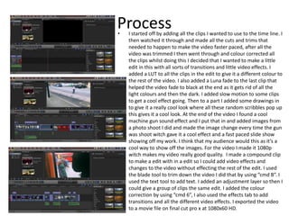
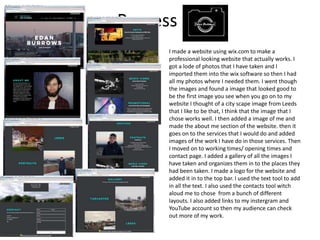
2. Process
• I started off by adding two images to the page, I
chose these images because they look good
and the colours are the same so they contrast
them self's well. I edited the images in
Photoshop I change the contrast to 40%,
brightness to 30% and I added a LUT which I
changed the opacity to 75% of to make it not as
hard. I then added text by using the text tool.
After that I realised that you couldn’t read the
text that well so I put a black box behind it
using the shape tool in Photoshop and then I
brought the opacity down to 10% to make it
more see through this made the text more
visible. This helps the audience to be able to
read what it say as they wouldn’t if it wasn’t
there I added the bottom text from a DVD
cover I found on the internet and cropped that
out, I then added white boxes over the text that
was already there so then I could make it my
own like I did by adding the YouTube logo and
all the other social medias and my own 12
rating. I did this to show all the social medias I
have I also added my user name above the
social medias using the text tool to allow
people to know what to search into those
platforms. I downloaded a font called movie
text and I used that for the top paragraph as it’s
the same style of text I used in my video. I used
guide lines so then I knew where the centre of
the page is so I could get the text in the middle
and so I could get everything lined up where I
wanted to put it.
The tools I used
were the text tool
and the shape tool
and the magic
wand tool
3. Process
• I started off by added two images one at the
top and one at the bottom to get the size
and layout I wanted in Photoshop, I then
went on to editing those images by adding
just luts to them to give it the same feel as
the video. On the top image I added a teal
and pink LUT. On the bottom image I didn’t
edit it at all because I liked the purple look it
already has. I then went on to adding two
more images working up from the bottom. I
then went on to editing these these two
images with the same LUT but on the image
in the middle I dropped the blacks to 50% to
make the image brighter, the LUT I used was
ASPEN. I added one more image to fill in the
space, I edited this by using the same teal
and pink LUT as the first image. There was a
perfect gap to add the title so I added that
by using the text tool. I downloaded the text
movie text and used that to give it the same
look as the video. Finally I added the DVD
logo and the 12 age rating in Photoshop I
used the magic wand tool to get rid of the
backgrounds. I used the ruler tool to make
sure the images on the right hand side were
the same size and fit perfectly together to
give a straight line in the right hand side.
The tool I used
were the text
tool and the
magic wand tool
4. Process
I started off by finding out what size a YouTube
thumbnail size is which is 1280x720 pixels and after that
I added two images to get the layout how I want it. I then
edited the images by changing the brightness down to
50% to make the image darker and then upped the
contrast 70% to make the colours pop and then I
changed the colour by bringing down the blues and up in
the reds to make the sunset red. On the second image I
added a teal and orange LUT then I dropped the opacity
of the LUT by 15% so it wasn’t just orange. I decided that
I wanted it like the DVD cover with the white space for
the title. I then went on to adding two more images
witch I edited them using the ASPEN LUT and then the
same for the bottom row to give that white space for the
text I added the text using the text tool in Photoshop. I
did this for the one that is different to the develops of
the thumbnail but I lost the Photoshop file but I did the
same as this.
The tool I
used were
the text
tool
5. Process
I started off by fining out what size the
DVD cover centre is which is 272 x
183mm and I put that into Photoshop
and the I got a photo I took and put it
on the page and made it the right size. I
edited the image using a LUT for a Sony
camera witch brought out the green
then I added grain to make the image
look older and I brought down the
opacity of the LUT to 70% in Photoshop
I then added text and added a stroke to
it to make it stand out I had to change
the way the text flowed to make it go
side ways I did this by rotating the text
90 degrees in Photoshop, I then added
the 12 age rating and DVD logo I used
the magic wand tool to get rid of the
back grounds to make it look
professional.
the tool I
used were
the text tool
and the
magic wand
tool
6. Process• I started off by adding all the clips I wanted to use to the time line. I
then watched it through and made all the cuts and trims that
needed to happen to make the video faster paced, after all the
video was trimmed I then went through and colour corrected all
the clips whilst doing this I decided that I wanted to make a little
edit in this with all sorts of transitions and little video effects. I
added a LUT to all the clips in the edit to give it a different colour to
the rest of the video. I also added a Luna fade to the last clip that
helped the video fade to black at the end as it gets rid of all the
light colours and then the dark. I added slow motion to some clips
to get a cool effect going. Then to a part I added some drawings in
to give it a really cool look where all these random scribbles pop up
this gives it a cool look. At the end of the video I found a cool
machine gun sound effect and I put that in and added images from
a photo shoot I did and made the image change every time the gun
was shoot witch gave it a cool effect and a fast paced slide show
showing off my work. I think that my audience would this as it’s a
cool way to show off the images. For the video I made it 1080p
witch makes my video really good quality. I made a compound clip
to make a edit with in a edit so I could add video effects and
changes to the video without effecting the rest of the edit. I used
the blade tool to trim down the video I did that by using “cmd B”. I
used the text tool to add text. I added an adjustment layer so then I
could give a group of clips the same edit. I added the colour
correction by using “cmd 6”, I also used the effects tab to add
transitions and all the different video effects. I exported the video
to a movie file on final cut pro x at 1080x60 HD.
7. Process
I made a website using wix.com to make a
professional looking website that actually works. I
got a lode of photos that I have taken and I
imported them into the wix software so then I had
all my photos where I needed them. I went though
the images and found a image that looked good to
be the first image you see when you go on to my
website I thought of a city scape image from Leeds
that I like to be that, I think that the image that I
chose works well. I then added a image of me and
made the about me section of the website. then it
goes on to the services that I would do and added
images of the work I have do in those services. Then
I moved on to working times/ opening times and
contact page. I added a gallery of all the images I
have taken and organizes them in to the places they
had been taken. I made a logo for the website and
added it in to the top bar. I used the text tool to add
in all the text. I also used the contacts tool witch
aloud me to chose from a bunch of different
layouts. I also added links to my instergram and
YouTube account so then my audience can check
out more of my work.
Editor's Notes
Discuss the tools and processes used in your production. Log your thoughts and feelings about your work.