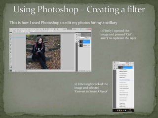
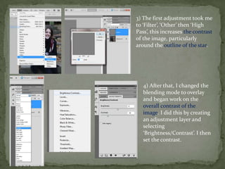
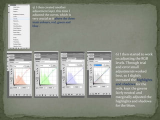
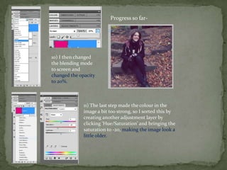
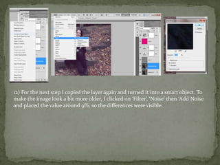
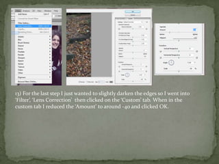
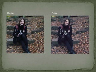
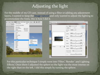
1) The document discusses how the author used Photoshop to edit photos for a school project. They describe steps like duplicating layers, adjusting curves and levels, adding noise, and correcting lens distortion.
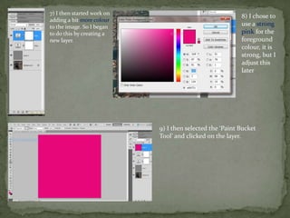
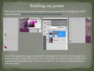
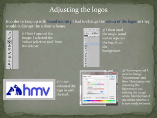
2) They also describe designing a poster by adding shapes and text over an image and adjusting logos to match the color scheme.
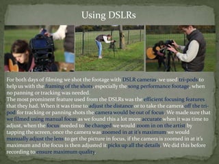
3) Finally, they discuss filming a music performance with DSLR cameras on tripods, focusing manually by zooming in fully and adjusting the lens for sharp focus when needed.