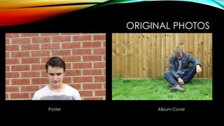
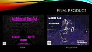
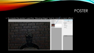
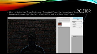
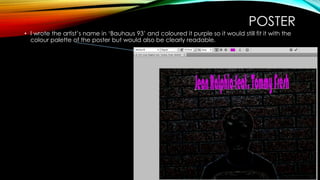
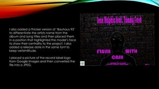
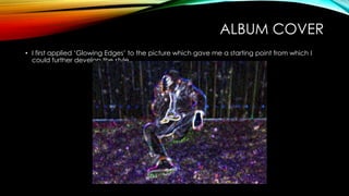
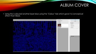
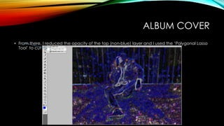
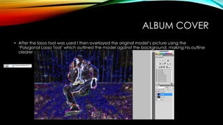
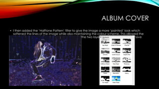
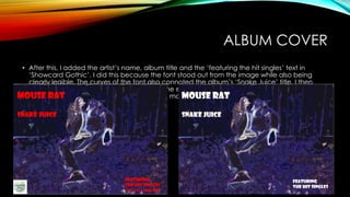
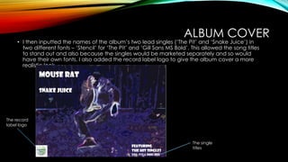
ALBUM COVER & POSTER
(PRACTICE) STEP-BY-STEP
By Anthony Richards
ORIGINAL PHOTOS
Poster Album Cover
FINAL PRODUCT
Poster Album Cover
POSTER
• To create the poster I used the ‘Glowing Edges’ tool to create a neon effect.
POSTER• I then adjusted the ‘Edge Brightness’, ‘Edge Width’ and the ‘Smoothness’ to darken the
image and create the ‘night sky’ effect on the wall and the model’s face.
POSTER
• I wrote the artist’s name in ‘Bauhaus 93’ and coloured it purple so it would still fit it with the
colour palette of the poster but would also be clearly readable.
POSTER
I also added a thicker version of ‘Bauhaus 93’
to differentiate the artists name from the
album and song titles and then placed them
in a position that highlighted the model’s face
to show their centrality to the project. I also
added a release date in the same font to
keep verisimilitude.
I placed a picture of the record label logo
from Google Images and then converted the
file into a JPEG.
ALBUM COVER
• I first applied ‘Glowing Edges’ to the picture which gave me a starting point from which I
could further develop the style.
ALBUM COVER
• Using this I coloured another layer blue using the ‘Colour’ tab which gave it a conceptual
effect that I liked.
ALBUM COVER
• From there, I reduced the opacity of the top (non-blue) layer and I used the ‘Polygonal Lasso
Tool’ to cut out the shape of the model.
ALBUM COVER
• After the lasso tool was used I then overlayed the original model’s picture using the
‘Polygonal Lasso Tool’ which outlined the model against the background, making his outline
clearer and therefore making him more central to the picture.
ALBUM COVER
• I then added the ‘Halftone Pattern’ filter to give the image a more ‘painted’ look which
softened the lines of the image while also maintaining the colour scheme. This allowed the
figure to be more clearly identified and unified the two layers, creating a comprehensive
aesthetic.
ALBUM COVER
• After this, I added the artist’s name, album title and the ‘featuring the hit singles’ text in
‘Showcard Gothic’. I did this because the font stood out from the image while also being
clearly legible. The curves of the font also connoted the album’s ‘Snake Juice’ title. I then
coloured the font white to allow it to become even clearer from the text as opposed to the
previous red which was darker and clashed more.
ALBUM COVER
• I then inputted the names of the album’s two lead singles (‘The Pit’ and ‘Snake Juice’) in
two different fonts – ‘Stencil’ for ‘The Pit’ and ‘Gill Sans MS Bold’. This allowed the song titles
to stand out and also because the singles would be marketed separately and so would
have their own fonts. I also added the record label logo to give the album cover a more
realistic look.
The single
titles
The record
label logo
WHAT I LEARNED
• By creating the poster and album cover, I have learned to use multiple filters for a stronger
effect as well as the ‘Polygonal Lasso Tool’ to composite images together and thereby use
good elements from different pictures to enhance the effect of a piece.

Album cover & poster (practice) step by-step

  • 1.
    ALBUM COVER &POSTER (PRACTICE) STEP-BY-STEP By Anthony Richards
  • 2.
  • 3.
  • 4.
    POSTER • To createthe poster I used the ‘Glowing Edges’ tool to create a neon effect.
  • 5.
    POSTER• I thenadjusted the ‘Edge Brightness’, ‘Edge Width’ and the ‘Smoothness’ to darken the image and create the ‘night sky’ effect on the wall and the model’s face.
  • 6.
    POSTER • I wrotethe artist’s name in ‘Bauhaus 93’ and coloured it purple so it would still fit it with the colour palette of the poster but would also be clearly readable.
  • 7.
    POSTER I also addeda thicker version of ‘Bauhaus 93’ to differentiate the artists name from the album and song titles and then placed them in a position that highlighted the model’s face to show their centrality to the project. I also added a release date in the same font to keep verisimilitude. I placed a picture of the record label logo from Google Images and then converted the file into a JPEG.
  • 8.
    ALBUM COVER • Ifirst applied ‘Glowing Edges’ to the picture which gave me a starting point from which I could further develop the style.
  • 9.
    ALBUM COVER • Usingthis I coloured another layer blue using the ‘Colour’ tab which gave it a conceptual effect that I liked.
  • 10.
    ALBUM COVER • Fromthere, I reduced the opacity of the top (non-blue) layer and I used the ‘Polygonal Lasso Tool’ to cut out the shape of the model.
  • 11.
    ALBUM COVER • Afterthe lasso tool was used I then overlayed the original model’s picture using the ‘Polygonal Lasso Tool’ which outlined the model against the background, making his outline clearer and therefore making him more central to the picture.
  • 12.
    ALBUM COVER • Ithen added the ‘Halftone Pattern’ filter to give the image a more ‘painted’ look which softened the lines of the image while also maintaining the colour scheme. This allowed the figure to be more clearly identified and unified the two layers, creating a comprehensive aesthetic.
  • 13.
    ALBUM COVER • Afterthis, I added the artist’s name, album title and the ‘featuring the hit singles’ text in ‘Showcard Gothic’. I did this because the font stood out from the image while also being clearly legible. The curves of the font also connoted the album’s ‘Snake Juice’ title. I then coloured the font white to allow it to become even clearer from the text as opposed to the previous red which was darker and clashed more.
  • 14.
    ALBUM COVER • Ithen inputted the names of the album’s two lead singles (‘The Pit’ and ‘Snake Juice’) in two different fonts – ‘Stencil’ for ‘The Pit’ and ‘Gill Sans MS Bold’. This allowed the song titles to stand out and also because the singles would be marketed separately and so would have their own fonts. I also added the record label logo to give the album cover a more realistic look. The single titles The record label logo
  • 15.
    WHAT I LEARNED •By creating the poster and album cover, I have learned to use multiple filters for a stronger effect as well as the ‘Polygonal Lasso Tool’ to composite images together and thereby use good elements from different pictures to enhance the effect of a piece.