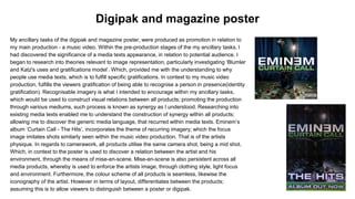
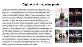
Question two
How effective is the combination of
your main product and ancillary
texts?
My ancillary tasks of the digipak and magazine poster, were produced as promotion in relation to
my main production - a music video. Within the pre-production stages of the my ancillary tasks, I
had discovered the significance of a media texts appearance, in relation to potential audience. I
began to research into theories relevant to image representation, particularly investigating ‘Blumler
and Katz's uses and gratifications model’. Which, provided me with the understanding to why
people use media texts; which is to fulfill specific gratifications. In context to my music video
production, fulfills the viewers gratification of being able to recognise a person in presence(identity
gratification). Recognisable imagery is what I intended to encourage within my ancillary tasks,
which would be used to construct visual relations between all products; promoting the production
through various mediums, such process is known as synergy as I understood. Researching into
existing media texts enabled me to understand the construction of synergy within all products;
allowing me to discover the generic media language, that recurred within media texts. Eminem’s
album ‘Curtain Call - The Hits’, incorporates the theme of recurring imagery; which the focus
image imitates shots similarly seen within the music video production. That is of the artists
physique. In regards to camerawork, all products utilise the same camera shot, being a mid shot.
Which, in context to the poster is used to discover a relation between the artist and his
environment, through the means of mise-en-scene. Mise-en-scene is also persistent across all
media products, whereby is used to enforce the artists image, through clothing style, light focus
and environment. Furthermore, the colour scheme of all products is seamless, likewise the
iconography of the artist. However in terms of layout, differentiates between the products;
assuming this is to allow viewers to distinguish between a poster or digipak.
Digipak and magazine poster
In relation to my digipak and magazine poster. I constructed the representation of
similarity, to enable people to identify the ancillary products as being related to my
advertised production. To achieve this representation, I adopted similar strategies of the
media language used within my study of ‘Eminem's’ album ‘Curtain Call’. I had recreated
the idea of using scenes from my music video production, within my ancillary tasks. Which,
would reinforce the visuals of the artist's iconography and environment. The iconography
of my artist is similarly captured by a mid ranged camera shot shown within the ‘Curtain
Call’ products. The implication of the shot purposely highlights the artist's outfit; this
reinforces his iconography of relating to a thug established social group. Moreover, the mid
ranged shot is used to illustrate his environment. Which the environment has been visually
manipulated to create a sense of distortion; I had incorporated the use of blur effects to
achieve this appeal. Whereby, distortion is a device that is generically used to suggest a
simulation of instability in relation to a person; which is a common symptom and trait of a
drug consumer. And in relation to audience demographics. I acknowledged that similar
interactions of the character within the music video, is suggested within the demographic
bands(‘D’ and ‘E’); which predominantly relates to people that are unemployed and that
possess amateurly developed skills. From my understanding of the demographic bands,
meant that illustrating the common character traits across my ancillary texts, will
encourage the people within the demographic, to recognise the identity of my artist and
production that is being advertised(with ease). I have inevitably highlighted the character
traits through the means of camerawork - a mid ranged shot.
Digipak and magazine poster
Furthermore, in relation to mise-en-scene, I had manipulated the lighting focal point upon the artist, within Eminem’s
products. Which transformed into a backlit focus of light. In relation to my artist, backlit lighting enhances his
visibility within the selected environment. I approached this technique to encourage that the artist is the primary
focus of the production. Whereby, lighting focal points are generically relevant to the dominant subject; I had
implemented the use of backlit lighting into both ancillary tasks to reinforce this image. Additionally, I colourised the
lighting to a saturation of green, to suggest the generic interactions of the artist; which is consuming drugs. In
relation to drugs, the colour green can be commonly associated with marijuana. The relation made to marijuana has
been further encouraged through the indications of smoke fumes; enforcing the viewers to assume the artist has
been consuming drugs from the means of inhaling. Furthermore, the imagery of smoke fumage was also
seamlessly integrated into both ancillary tasks, as drug interaction was the main ideology within the music video
production. As the main ideology, I intended to emphasise the image of drug interaction within the promotion;
through the implication of conventions. This emphasis of drug interaction was intended to be enhanced by the
iconography of the artist in relation to lighting, environment and props; a character that conforms to a troublesome
nature. From researching into ‘Stuart Hall’s’ theory of ‘reception’, provided me with an insight into how I can achieve
a specific viewing of my artist in relation to the audience; this is known to be the dominant reading. By implementing
the recurring lighting techniques within existing media texts, into my ancillary tasks. Enabled me to highlight the
artist’s appearance and interactions; meanwhile restricting the visibility of his environment, via the implication of blur
effects to defocus background imagery. Whereby, as the artist being a focal point of the ancillary tasks, enables
viewers to establish his troublesome nature; this is created through the high visibility of the conventions, that I
intended for the character to relate to. That of smoking and his clothing style, which generically identifies him to be
of a ‘thug’ established social group. In which, as a collaboration of mise-en-scene devices, reinforces the artists
tendencies of drug interaction; as the audience is provided with selective imagery that defines him. This prevents
negotiated readings. High visibility of selective imagery was encouraged within both ancillary tasks, to prevent the
means of the audience creating differentiated readings to what I had intended.
Digipak and magazine poster
Moreover, in regards to the design layout of my ancillary tasks. I had recreated the
design layout shown within ‘Eminem’s’ album ‘Curtain Call’, through the means of
changing the positioning of information, yet maintaining the design formalities across
both promotion mediums. Throughout my analysis of the ‘Curtain Call’ promotional
products. I had identified that the layouts in which information is presented in,
differentiates between the two mediums; assuming that this was to enable viewers to
distinguish between the digipak and magazine poster. Meanwhile, I had also
uncovered that the design formalities are maintained within both products.
Researching into Steve Neale’s’ theory of ‘repetition and difference’, enabled me to
understand the significance of ‘repetition’ and ‘difference’ within my ancillary tasks.
Neale’s theory explores how a media text has to conform to a genre, enough to be
identified as a media text of a specific genre, whilst challenging these expectations by
subverting the generic conventions enough, to be identified as a unique production.
Which he suggests that difference, is a device that obtains a larger potential
audience, in comparison to repetitive media texts. With this concept in consideration, I
had chosen to align the information that informs viewers about the advertised
production, similarly, across both ancillary tasks. The concept of differentiation, is
shown within the digipak positioning of the information, which being similar to the
magazine poster; differentiates from existing posters that advertise productions within
the genre.
Digipak and magazine poster
In relation to the ‘Curtain Call’ magazine poster, I had adopted the centralised positioning of
information into my own magazine poster to conform to generic posters. From my understanding of
existing hip hop magazine posters, the concept of centralising information was generic; which
enables viewers to identify the product as a magazine poster. Moreover, this alignment of content
attracts the immediate attention of viewers. Whereby, the central area of a magazine poster, is
proportionally the largest; in regards to its exterior spacing. Relating back to ‘Blumler and Katz
uses and gratifications model’, I intended to maintain the concept of recognition, through
conforming to the generic expectancies of information positioning, within magazine posters.
Meanwhile, the magazine poster’s use becomes multipurpose; for educational gratifications of the
product. Whereby the information within the magazine poster, is suited to inform audiences about
an album's release. Moreover, in regards to my digipak(front cover), I have recreated the same
concept of centralisation; which in relation to the existing digipaks that advertise hip hop
productions, my digipak differentiates. Which is suited to obtaining larger potential audiences, that
is suggested within ‘Neale’s’ theory of ‘repetition and difference’. However, in relation to ‘Blumler
and Katz’ model’, the digipak reduces the recognisable aspects as being a generic digipak. This is
definitive as the digipak does not implement the typical positioning of information, that is shown
within existing digipaks of the genre; as being within borderline areas. Nonetheless, as the concept
of centralised positioning is persistent across both ancillary tasks, enhances the recognition of the
advertised production; by maintaining similar visual formats of content. In addition, as both ancillary
tasks incorporate the same iconography of the album name, the recognition of the advertised
production is further enhanced through the means of using similar imagery. Notably, as the the
digipak informs viewers about the advertised production; through using the same iconography of
the album name, further fulfills the educational gratification of viewers.
Digipak and magazine poster
Regarding design formalities, both of my ancillary products conform to using an image
based version of the album name. The similarity is persistent to maintain the
recognition of the advertised production. However, the image within the digipak is more
environmentally integrated into the digipak, whereby is seamless in relation to the
smoke fumage across the two panels of the product; this is to enhance the generic
interactions of the artist. Inevitably, the recurring image used to present the album
name ‘exile’ enables the viewer to identify the products as being associated with each
other; denoting that synergy is apparent.
In conclusion, my ancillary texts promote my music video production sufficiently, by
maintaining similar concepts to each other; which enables viewers to identify the
advertised production through the mediums of a magazine poster and digipak. This is
further achieved through the implication of recurring imagery, whereby fulfills the
viewers gratifications of being able to recognise a product - according to Blumler and
Katz uses and gratifications model. Evidently, the concept of synergy has been applied.
Conclusion

A2 Media Studies - Evaluation post 2

  • 1.
    Question two How effectiveis the combination of your main product and ancillary texts?
  • 2.
    My ancillary tasksof the digipak and magazine poster, were produced as promotion in relation to my main production - a music video. Within the pre-production stages of the my ancillary tasks, I had discovered the significance of a media texts appearance, in relation to potential audience. I began to research into theories relevant to image representation, particularly investigating ‘Blumler and Katz's uses and gratifications model’. Which, provided me with the understanding to why people use media texts; which is to fulfill specific gratifications. In context to my music video production, fulfills the viewers gratification of being able to recognise a person in presence(identity gratification). Recognisable imagery is what I intended to encourage within my ancillary tasks, which would be used to construct visual relations between all products; promoting the production through various mediums, such process is known as synergy as I understood. Researching into existing media texts enabled me to understand the construction of synergy within all products; allowing me to discover the generic media language, that recurred within media texts. Eminem’s album ‘Curtain Call - The Hits’, incorporates the theme of recurring imagery; which the focus image imitates shots similarly seen within the music video production. That is of the artists physique. In regards to camerawork, all products utilise the same camera shot, being a mid shot. Which, in context to the poster is used to discover a relation between the artist and his environment, through the means of mise-en-scene. Mise-en-scene is also persistent across all media products, whereby is used to enforce the artists image, through clothing style, light focus and environment. Furthermore, the colour scheme of all products is seamless, likewise the iconography of the artist. However in terms of layout, differentiates between the products; assuming this is to allow viewers to distinguish between a poster or digipak. Digipak and magazine poster
  • 3.
    In relation tomy digipak and magazine poster. I constructed the representation of similarity, to enable people to identify the ancillary products as being related to my advertised production. To achieve this representation, I adopted similar strategies of the media language used within my study of ‘Eminem's’ album ‘Curtain Call’. I had recreated the idea of using scenes from my music video production, within my ancillary tasks. Which, would reinforce the visuals of the artist's iconography and environment. The iconography of my artist is similarly captured by a mid ranged camera shot shown within the ‘Curtain Call’ products. The implication of the shot purposely highlights the artist's outfit; this reinforces his iconography of relating to a thug established social group. Moreover, the mid ranged shot is used to illustrate his environment. Which the environment has been visually manipulated to create a sense of distortion; I had incorporated the use of blur effects to achieve this appeal. Whereby, distortion is a device that is generically used to suggest a simulation of instability in relation to a person; which is a common symptom and trait of a drug consumer. And in relation to audience demographics. I acknowledged that similar interactions of the character within the music video, is suggested within the demographic bands(‘D’ and ‘E’); which predominantly relates to people that are unemployed and that possess amateurly developed skills. From my understanding of the demographic bands, meant that illustrating the common character traits across my ancillary texts, will encourage the people within the demographic, to recognise the identity of my artist and production that is being advertised(with ease). I have inevitably highlighted the character traits through the means of camerawork - a mid ranged shot. Digipak and magazine poster
  • 4.
    Furthermore, in relationto mise-en-scene, I had manipulated the lighting focal point upon the artist, within Eminem’s products. Which transformed into a backlit focus of light. In relation to my artist, backlit lighting enhances his visibility within the selected environment. I approached this technique to encourage that the artist is the primary focus of the production. Whereby, lighting focal points are generically relevant to the dominant subject; I had implemented the use of backlit lighting into both ancillary tasks to reinforce this image. Additionally, I colourised the lighting to a saturation of green, to suggest the generic interactions of the artist; which is consuming drugs. In relation to drugs, the colour green can be commonly associated with marijuana. The relation made to marijuana has been further encouraged through the indications of smoke fumes; enforcing the viewers to assume the artist has been consuming drugs from the means of inhaling. Furthermore, the imagery of smoke fumage was also seamlessly integrated into both ancillary tasks, as drug interaction was the main ideology within the music video production. As the main ideology, I intended to emphasise the image of drug interaction within the promotion; through the implication of conventions. This emphasis of drug interaction was intended to be enhanced by the iconography of the artist in relation to lighting, environment and props; a character that conforms to a troublesome nature. From researching into ‘Stuart Hall’s’ theory of ‘reception’, provided me with an insight into how I can achieve a specific viewing of my artist in relation to the audience; this is known to be the dominant reading. By implementing the recurring lighting techniques within existing media texts, into my ancillary tasks. Enabled me to highlight the artist’s appearance and interactions; meanwhile restricting the visibility of his environment, via the implication of blur effects to defocus background imagery. Whereby, as the artist being a focal point of the ancillary tasks, enables viewers to establish his troublesome nature; this is created through the high visibility of the conventions, that I intended for the character to relate to. That of smoking and his clothing style, which generically identifies him to be of a ‘thug’ established social group. In which, as a collaboration of mise-en-scene devices, reinforces the artists tendencies of drug interaction; as the audience is provided with selective imagery that defines him. This prevents negotiated readings. High visibility of selective imagery was encouraged within both ancillary tasks, to prevent the means of the audience creating differentiated readings to what I had intended. Digipak and magazine poster
  • 5.
    Moreover, in regardsto the design layout of my ancillary tasks. I had recreated the design layout shown within ‘Eminem’s’ album ‘Curtain Call’, through the means of changing the positioning of information, yet maintaining the design formalities across both promotion mediums. Throughout my analysis of the ‘Curtain Call’ promotional products. I had identified that the layouts in which information is presented in, differentiates between the two mediums; assuming that this was to enable viewers to distinguish between the digipak and magazine poster. Meanwhile, I had also uncovered that the design formalities are maintained within both products. Researching into Steve Neale’s’ theory of ‘repetition and difference’, enabled me to understand the significance of ‘repetition’ and ‘difference’ within my ancillary tasks. Neale’s theory explores how a media text has to conform to a genre, enough to be identified as a media text of a specific genre, whilst challenging these expectations by subverting the generic conventions enough, to be identified as a unique production. Which he suggests that difference, is a device that obtains a larger potential audience, in comparison to repetitive media texts. With this concept in consideration, I had chosen to align the information that informs viewers about the advertised production, similarly, across both ancillary tasks. The concept of differentiation, is shown within the digipak positioning of the information, which being similar to the magazine poster; differentiates from existing posters that advertise productions within the genre. Digipak and magazine poster
  • 6.
    In relation tothe ‘Curtain Call’ magazine poster, I had adopted the centralised positioning of information into my own magazine poster to conform to generic posters. From my understanding of existing hip hop magazine posters, the concept of centralising information was generic; which enables viewers to identify the product as a magazine poster. Moreover, this alignment of content attracts the immediate attention of viewers. Whereby, the central area of a magazine poster, is proportionally the largest; in regards to its exterior spacing. Relating back to ‘Blumler and Katz uses and gratifications model’, I intended to maintain the concept of recognition, through conforming to the generic expectancies of information positioning, within magazine posters. Meanwhile, the magazine poster’s use becomes multipurpose; for educational gratifications of the product. Whereby the information within the magazine poster, is suited to inform audiences about an album's release. Moreover, in regards to my digipak(front cover), I have recreated the same concept of centralisation; which in relation to the existing digipaks that advertise hip hop productions, my digipak differentiates. Which is suited to obtaining larger potential audiences, that is suggested within ‘Neale’s’ theory of ‘repetition and difference’. However, in relation to ‘Blumler and Katz’ model’, the digipak reduces the recognisable aspects as being a generic digipak. This is definitive as the digipak does not implement the typical positioning of information, that is shown within existing digipaks of the genre; as being within borderline areas. Nonetheless, as the concept of centralised positioning is persistent across both ancillary tasks, enhances the recognition of the advertised production; by maintaining similar visual formats of content. In addition, as both ancillary tasks incorporate the same iconography of the album name, the recognition of the advertised production is further enhanced through the means of using similar imagery. Notably, as the the digipak informs viewers about the advertised production; through using the same iconography of the album name, further fulfills the educational gratification of viewers. Digipak and magazine poster
  • 7.
    Regarding design formalities,both of my ancillary products conform to using an image based version of the album name. The similarity is persistent to maintain the recognition of the advertised production. However, the image within the digipak is more environmentally integrated into the digipak, whereby is seamless in relation to the smoke fumage across the two panels of the product; this is to enhance the generic interactions of the artist. Inevitably, the recurring image used to present the album name ‘exile’ enables the viewer to identify the products as being associated with each other; denoting that synergy is apparent. In conclusion, my ancillary texts promote my music video production sufficiently, by maintaining similar concepts to each other; which enables viewers to identify the advertised production through the mediums of a magazine poster and digipak. This is further achieved through the implication of recurring imagery, whereby fulfills the viewers gratifications of being able to recognise a product - according to Blumler and Katz uses and gratifications model. Evidently, the concept of synergy has been applied. Conclusion