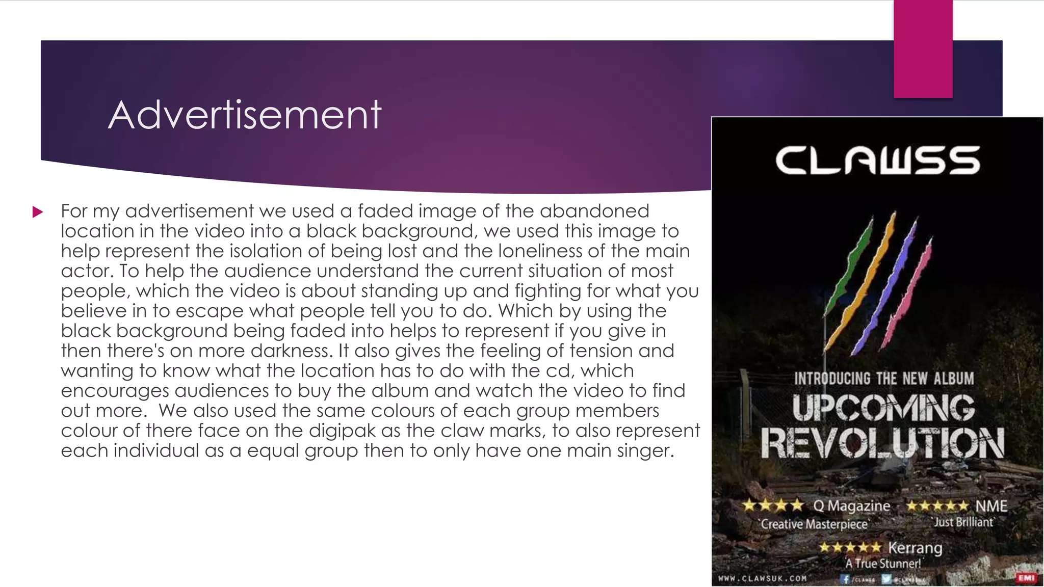
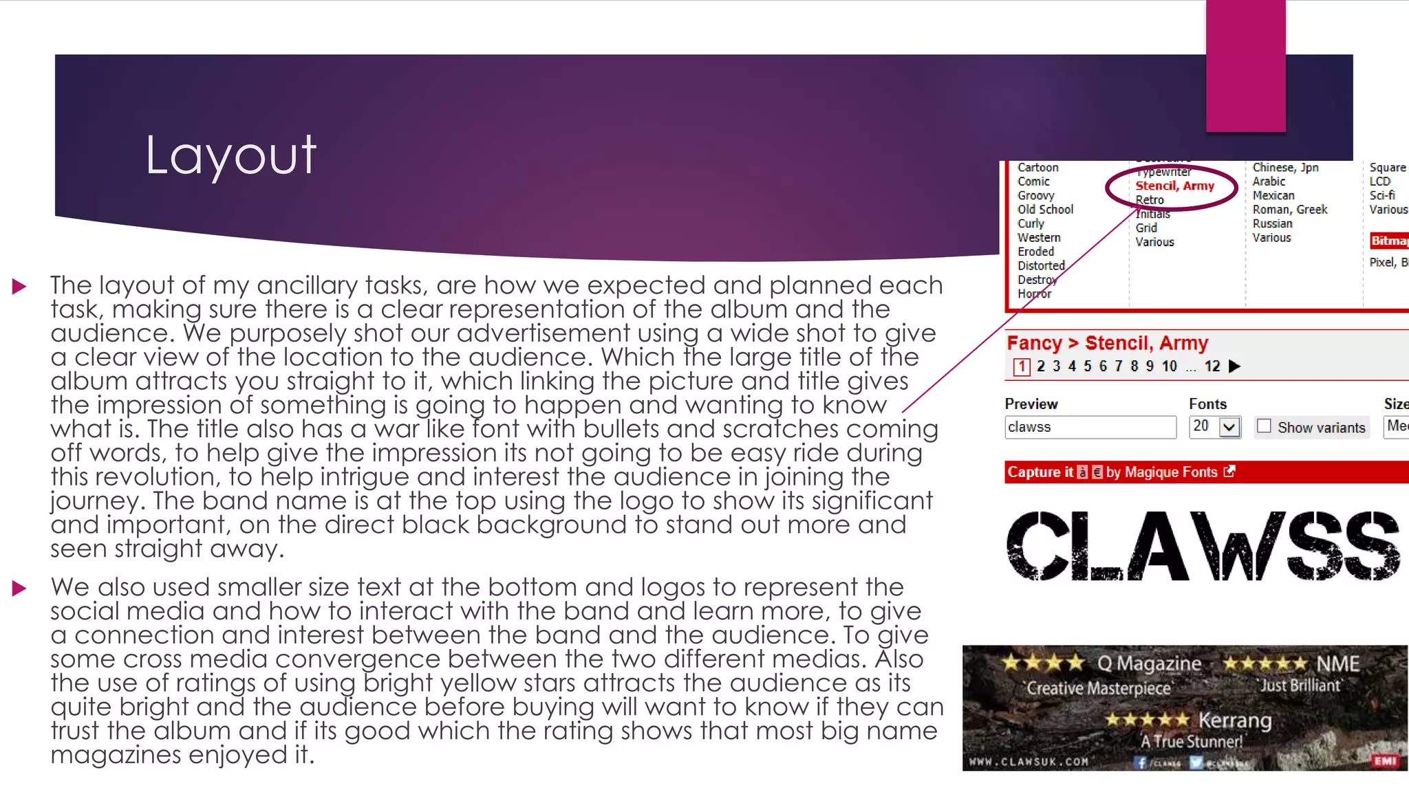
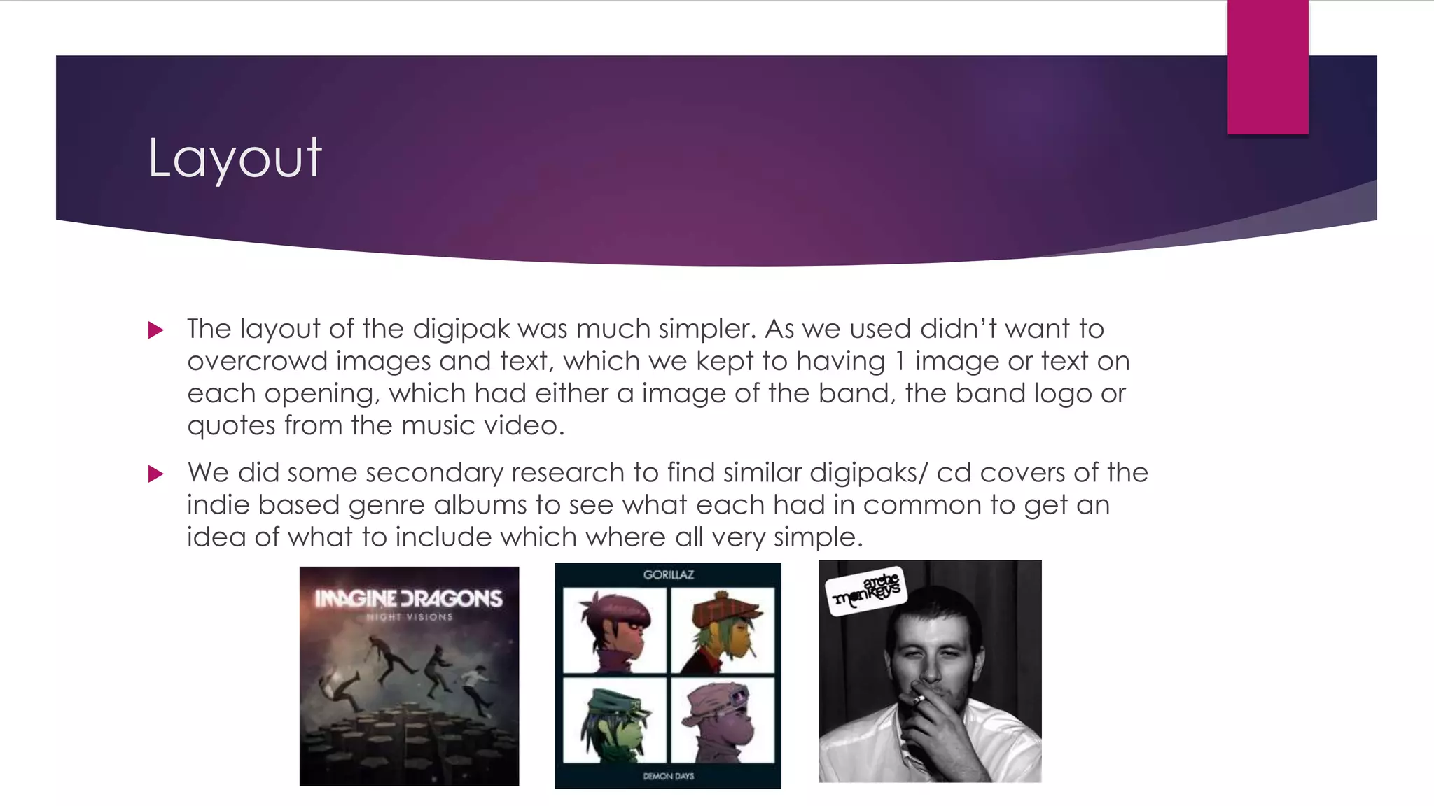
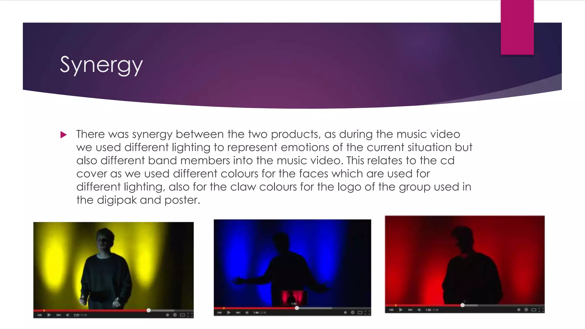
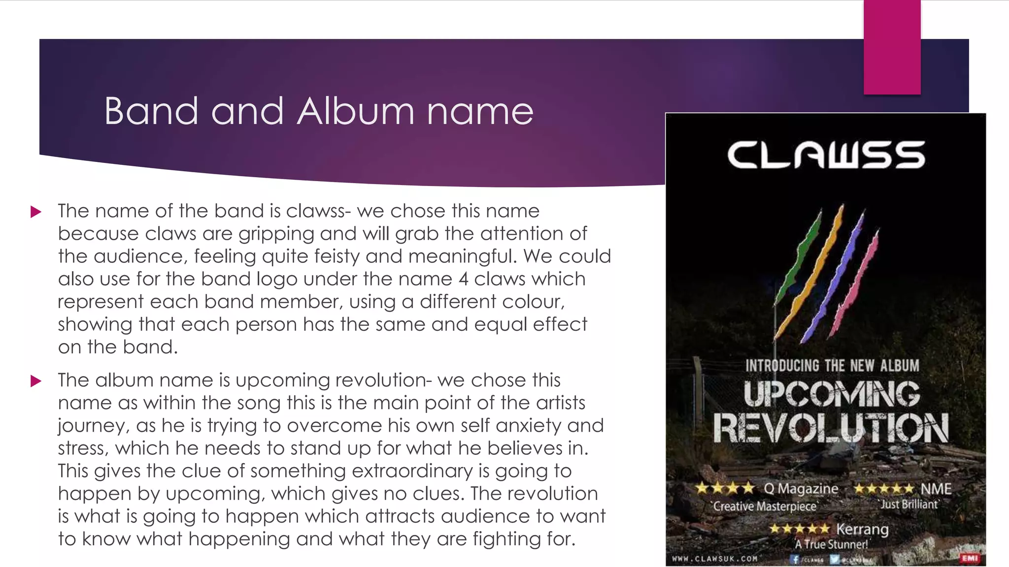
The document discusses the creation of a digipak and advertisement for a music album. It describes using consistent fonts, logos, and colors across both items to maintain a cohesive style. The digipak features all band members' faces equally to show their importance. Colors were chosen to represent each member's personality and connect to themes in the music video. The advertisement uses an image from the video and claw marks in the band members' colors to intrigue audiences without revealing too much. The layouts keep things simple while including relevant information to effectively promote the album.