
Recommended
More Related Content
What's hot
What's hot (17)
Viewers also liked
Viewers also liked (18)
Similar to A2 media portfolio evaluation 2
Similar to A2 media portfolio evaluation 2 (20)
More from chloesmedia
Recently uploaded
Recently uploaded (20)
A2 media portfolio evaluation 2
- 1. HOW EFFECTIVE IS THE COMBINATION OF YOUR MAIN PRODUCT AND ANCILLARY TEXTS?
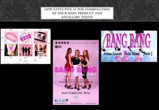
- 2. The type of font used is also very ‘showbiz’, as it looks like spot lights or aluminous lights. Along with the fact that the artists names are underneath the title ( suggesting a film or show), the typography creates a girly image of the band and relates to a ‘powerful women’ ideology that most girl bands try to create, as they are about to put on a show for the audience, and all three texts are promoting this. I have combined my main media product with my ancillary texts through the use of typography. For the magazine advert, front cover and inside cover of the digipak, and the opening sequence of the music video, the title of the song – bang bang – is written in bright pink, large text. For the advert and front cover of the digipak, I have also used the same font to ensure that the audience will see it, remember it and subsequently recognise it when they see the other media text somewhere else. The colour scheme used for the font, will attract primarily, a female audience which is my target audience. The all work together through synergy to make my products recognisable and memorable for my target audience.
- 3. My music video and ancillary texts work together in promoting an ‘independent woman’ ideology of the three artists. All tree media texts include shots/images of the three individual artists coming together to make one powerful girl group. Their poses, appearances and facial expressions are the same throughout the texts, making them familiar to an audience. Having separate personalities for each artists creates more entry points of personal identity for the audience. The attitudes portrayed though the images/shots used suggests what he whole album ad music video will be like. The audience can see that the artists are powerful women through the long shots and close ups used on the digipak and magazine advert. The shots emphasise their outfits, makeup ad appearance. This is then reinforced by the actions and symbolism used in the music video. The artists put their hands on their hips, have seductive dance routines, and have suggestive outfits – such as the spikey necklace Nicki Minaj has on. He ancillary texts work together with the music video in this case to portray certain personalities of each artist, to attract ad relate to as many people as possible, widening the audience.
- 4. My magazine advert works together with he music video to create more entry points for the audience, through media convergence. The advert includes links to each artists official website, and social networking icons at the bottom of the page. This video also includes a reference to social network, and the internet, when it sows a clip of one of the artists phones, writing a tweet. The texts work together in this way, to attract the right target audience of teenagers. This is appropriate as teenagers are most likely to use social networking sites, and the internet. The links on the magazine advert creates entry points for the audience to access the artists a different way than watching the video or buying the digipak. The music video then uses this, and the clip of the phone relates to the audience, as they will try find the artists on twitter, they may relate as they have the same phone, or personal identify with them more as they are more like a normal person than a famous celebrity. Through this, my products are effective in relating to their target audience, as it makes it seem like the artists are just like the average teenager who uses social networking to talk to their friends. The more in contact the artists are with their fans, the larger their fan base becomes.
- 5. The colour scheme used was the same for the main media product and both ancillary texts. Everything was done in pinks and purples, as the texts needed to work together to attract the same target audience of teenage girls. Having the same colour scheme, also connotes the genre of ‘pop’ music, as bright sharp colours and lighting are a common convention of the pop genre of music. This is an example of synergy as my products are using a convention similar to existing media products, to promote each of my productions separately, but also as a whole. Pinks and purples primarily attract a female audience. Having this specific colour scheme suggests what the music video will be like, as the audience will automatically think it will be girly and quite cheesy. His is the main product and ancillary texts working together to attract the target audience, and is effective in making the artists more relatable.