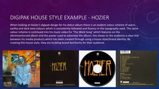
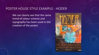
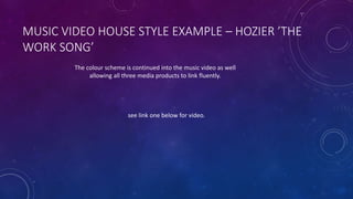
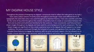
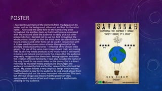
SlideShare a Scribd company logo
1 of 11
HOW EFFECTIVE IS THE
COMBINATION OF YOUR MAIN
PRODUCT AND ANCILLARY
TEXTS?
WHAT IS A HOUSE STYLE/BRAND IDENTITY?
This is when a product is created in a certain fashion predetermined by the production
company. Products made using a house style will usually look very similar and use a similar
colour scheme and typography. Using a house style is important when creating media products
such as digipaks, posters and music videos as it allows a clear link to be made between the
media texts and builds a brand identity that an audience will be able to easily identify and
familiarise themselves with. By having a clear idea of the artists house style in their head the
audience can easily make decisions about what they think of the products and the artist in
general. My house style focuses more on the album concept than the actual artist, this is
conventional of the indie genre and suggests that the music is the most important thing to the
artist and not their image which may build a favourable image of the artist in the audiences
head.
DIGIPAK HOUSE STYLE EXAMPLE - HOZIER
When looking at Hozier’s digipak design for his debut album there is an evident colour scheme of warm,
earthy and dark tone colours which is consistently followed and fluency in the typography used. The same
colour scheme is continued into his music video for ‘The Work Song’ which features on the
aforementioned album and the poster used to advertise the album; this shows to the audience a clear link
between his media products which has been created through using a house style/brand identity. By
creating this house style, they are building brand familiarity for their audience.
POSTER HOUSE STYLE EXAMPLE - HOZIER
We can clearly see that the same
trend of colour scheme and
typography has been used in the
creation of the poster.
MUSIC VIDEO HOUSE STYLE EXAMPLE – HOZIER ’THE
WORK SONG’
The colour scheme is continued into the music video as well
allowing all three media products to link fluently.
see link one below for video.
MY DIGIPAK HOUSE STYLE
Throughout the process of designing my digipak I consciously tried to reflect the indie genre in my style. I
have used a colour scheme of earthy tones throughout and though I have used different forms of
typography the same text colour was used throughout to maintain fluency. I have also used the same font
for the name of my artist throughout the creation of ancillary texts to create an association between the
font and my artist and build brand familiarity for the audience. I have consistently used featured hand
drawn images throughout my digipak and have used the same background for each component. The hand
drawn images are significant as they create a personal tone to the digipak that will appeal to my target
audience, this tone is continued through the inclusion of a quote and signature from my artist. I have
included these features to engage the audience with my artist and build rapport, this has allowed me to
create a house style that is very personal, both to my audience and artist, and a brand that is inclusive.
POSTER
I have continued many of the elements from my digipak on my
poster such as the background, album art and font for the artist
name. I have used the same font for the name of my artist
throughout the ancillary texts so that it will become associated
with my artist and allow the audience to easily pick out other
products by her. I decided not to use this font throughout the
whole product though so that the artist name can stand alone on
future products and other fonts can be used in conjunction with
it. I have used the same colour scheme throughout all of the
ancillary products (earthy tones – reflective of my chosen indie
genre). The use of the same main image show’s that I am making
links to all of my media products as my music video is set heavily
in nature and natural environments this means that the audience
may easily recognise that these texts belong together and aides
the creation of brand familiarity. I have also included the name of
the song I used for my music video on the poster, this is a direct
reference to my other media product and encourages the
audience to make the link and further research the artist and her
music. My poster follows a very simplistic design which ensures
that the poster is easy for my audience to look at and allows them
to effortlessly pick out the most important information. This basic
but effective design also means that the poster isn’t too
overcrowded in terms of text and imagery and is aesthetically
pleasing for my audience.
MUSIC VIDEO
My music video and ancillary texts can be linked through the
use of the same colour scheme. When creating my ancillary
tasks I tried to conciously mimic the natural tones seen
throughout my video to create a subtle visual connection. The
main image from my digipak and poster also contains links to
nature that can also be seen in the content of my music video.
I wanted this to be a running theme throughout all of my
media products as I wanted to comment on how we as a
society need to strip back to basics and regain a sense of self.
This is an image/symbol that will resonate with my audience
as indie music is very often about the individuals sense of self,
connection with the world and their own experiences. My
artists name features at the beginning of the video on a title
slide I have not used the artists signature font in this part of
the video as I found the font I eventually chose to use fit in
better with the ‘breaking news’ style of the opening
sequence. A similar typewriter style font is used in the end
credits and for the name of the record label however. This
reinforces my artists brand identity and association between
the font style and my musician.
See link two for video below.
HOW MY DIGIPAK ‘SELLS’ MY MUSIC VIDEO TO THE
AUDIENCE:
My music video for don’t dream it’s over was created to evoke meaningful discussion about the state our
world is in and to get my audience to look at themselves and evaluate whether they are being their truest
self. I have used the natural setting in my music video as a symbol of this message as it connotes purity and
truth and this imagery also features on my digipak cover. I have named my album ‘Proof’ to create further
links to this message as the word ‘proof’ is a synonym of evidence and the album is about finding the truth
in everyday life and this will appeal to my target audience’s interests. This therefore allows associations to
be made between the media texts and create familiarity for the audience. I tried to adhere to the
conventions of a digipak which has made my end product look professional and will make the product
seem more attractive to the audience.
HOW MY POSTER ‘SELLS’ MY DIGIPAK:
My poster follows a similar design to and features many of the components of my digipak such as colour
scheme, main image and font for the artist name. The use of short declarative sentences such as ‘NEW
ALBUM’ and ‘FEATURING THE NUMBER ONE SINGLE…” are advertising ploys that will draw the audience’s
attention and make them want to buy the album. Further information about where to find the album is
included at the bottom of the poster, this makes finding the product very easy for the audience and may
tempt them to look the album up and purchase it after reading the poster. The inclusion of good reviews
from known music magazines such as ‘GQ’ and ‘NME’ will peak the audiences interest and build up their
expectations about the quality of the album and its content.
HOW MY MEDIA PRODUCTS COMMUNICATE MY
GENRE:
The genre of the song I chose is indie-pop, though in the creation of my media products I made the conscious decision to stray away from the pop
elements of the song to create an indie product. I have tried to present this genre through every aspect of the production of my media products
including costume, mise en scene, colour scheme and makeup.
I decided that I wanted my actress to wear an understated and natural makeup look as this is conventional of the genre and also portrayed the
natural and earthy look I wanted my video to convey to the audience. I thought the audience would find this look appealing as it suggests that she
is genuine and doesn’t hide her true self from her audience.
I had my actress wear two different costumes in my music video, one for the bath scene and another for the rest of the video, to show a clear
distinction between the atmosphere of these two scenes/segments. These costumes consisted of a black body suit (bath scene) and ripped blue
jeans, combat boots, a tan knit jumper and a backpack. This soft look was reflective of my genre and blended very well with the settings I chose to
film my music video in. I researched the type of clothing worn by members of the indie genre (artists and audience) to ensure that I reflected this
effectively in my video and created a persona (both in terms of personality and style) that the audience could identify with.
I used a very loose colour scheme as I wanted to give myself as much creative freedom as possible in the creation of my music video and ancillary
texts so instead of just limiting myself to the use of only one or two colours I decided to stick to using natural earthy tones such as greens, blues and
warm colours instead. This decision meant that links between my ancillary texts and music video could easily be made and that the products would
look aesthetically pleasing when placed side by side. Such colour schemes as this are conventional of the indie music genre along with pastel
colours.
My choice of background/setting for my music video is also relevant to how I portray the indie genre as initially when looking at music videos by
similar artists and researching my genre I found that many of the indie music videos I watched ( ‘Eet’ – Regina Spektor, ‘High Hopes’ – Kodaline and
‘Sleep On The Floor’ – The Lumineers) were filmed in natural settings. I enjoyed the visual aesthetic of this and sought to recreate it in my own
music video. This choice of setting also opens up my audience to not just people who enjoy indie music but those who enjoy nature videography.
Before filming I also had my actress watch videos of other female indie vocalists (Lana Del Rey – ‘Ride’ https://www.youtube.com/watch?v=Py_-
3di1yx0) to give her an idea of the type of acting and atmosphere I wanted to feature in my music video. I found this was helpful as this meant my
actress had an understanding of the conventions of an indie music video and how the artists usually like to portray themselves to their audience.
She mimicked their soft style of lip-syncing and pensive facial expressions and this allowed me to make explicit connections between other artists
from the genre and my own.

More Related Content

What's hot

Evaluation Question 2
Evaluation Question 2Evaluation Question 2
Evaluation Question 2jadeashworthx
 
Evaluation question 1 jhj
Evaluation question 1 jhjEvaluation question 1 jhj
Evaluation question 1 jhjshaniceA
 
Media evaluation question 1
Media evaluation question 1Media evaluation question 1
Media evaluation question 1amanda white
 
Media evaluation part 1
Media evaluation part 1Media evaluation part 1
Media evaluation part 1Molly Strike
 
Question 2: Media Evaluation
Question 2: Media EvaluationQuestion 2: Media Evaluation
Question 2: Media Evaluationjoshthorleykba
 
Untitleddocument (1)
Untitleddocument (1)Untitleddocument (1)
Untitleddocument (1)baileydoyle
 
Music Video - Lecture 1
Music Video - Lecture 1Music Video - Lecture 1
Music Video - Lecture 1jackhurst8
 
Music Video - Lecture
Music Video - Lecture Music Video - Lecture
Music Video - Lecture jackhurst8
 
Music Video - Lecture 1
Music Video - Lecture 1Music Video - Lecture 1
Music Video - Lecture 1jackhurst8
 
Evaluation question 2
Evaluation question 2Evaluation question 2
Evaluation question 2sethtumwa
 
Question two evaluation
Question two evaluationQuestion two evaluation
Question two evaluationLuke Newcombe
 
Question 1 evaluation
Question 1 evaluationQuestion 1 evaluation
Question 1 evaluationDwayne Rapley
 
Question 1 evaluation
Question 1 evaluationQuestion 1 evaluation
Question 1 evaluationDwayne Rapley
 

What's hot (20)

Evaluation Question 2
Evaluation Question 2Evaluation Question 2
Evaluation Question 2
 
Evaluation Question 2
Evaluation Question 2Evaluation Question 2
Evaluation Question 2
 
Question 2
Question 2Question 2
Question 2
 
Evaluation question 1 jhj
Evaluation question 1 jhjEvaluation question 1 jhj
Evaluation question 1 jhj
 
Evaluation 4
Evaluation 4Evaluation 4
Evaluation 4
 
Media evaluation question 1
Media evaluation question 1Media evaluation question 1
Media evaluation question 1
 
Media evaluation part 1
Media evaluation part 1Media evaluation part 1
Media evaluation part 1
 
Question 2: Media Evaluation
Question 2: Media EvaluationQuestion 2: Media Evaluation
Question 2: Media Evaluation
 
Evaluation 2
Evaluation 2Evaluation 2
Evaluation 2
 
Untitleddocument (1)
Untitleddocument (1)Untitleddocument (1)
Untitleddocument (1)
 
Question two
Question twoQuestion two
Question two
 
Question two
Question two Question two
Question two
 
Evaluation 2
Evaluation 2 Evaluation 2
Evaluation 2
 
Music Video - Lecture 1
Music Video - Lecture 1Music Video - Lecture 1
Music Video - Lecture 1
 
Music Video - Lecture
Music Video - Lecture Music Video - Lecture
Music Video - Lecture
 
Music Video - Lecture 1
Music Video - Lecture 1Music Video - Lecture 1
Music Video - Lecture 1
 
Evaluation question 2
Evaluation question 2Evaluation question 2
Evaluation question 2
 
Question two evaluation
Question two evaluationQuestion two evaluation
Question two evaluation
 
Question 1 evaluation
Question 1 evaluationQuestion 1 evaluation
Question 1 evaluation
 
Question 1 evaluation
Question 1 evaluationQuestion 1 evaluation
Question 1 evaluation
 

Similar to Your Indie Brand

Evaluation Question 2
Evaluation Question 2Evaluation Question 2
Evaluation Question 2KayleeH55
 
Evaluation 2 media studies
Evaluation 2 media studiesEvaluation 2 media studies
Evaluation 2 media studiesHarry Jones
 
Media evaluation2
Media evaluation2Media evaluation2
Media evaluation2Leloo Ming
 
How effective is the combination of your main
How effective is the combination of your mainHow effective is the combination of your main
How effective is the combination of your mainAlexJWoodworth
 
Combination of media product and ancillary tetxsw
Combination of media product and ancillary tetxswCombination of media product and ancillary tetxsw
Combination of media product and ancillary tetxswchevstarks94
 
Evaluation Question 2
Evaluation Question 2Evaluation Question 2
Evaluation Question 2smithy123
 
Evaluation question 2: How effective is the combination of your main and anci...
Evaluation question 2: How effective is the combination of your main and anci...Evaluation question 2: How effective is the combination of your main and anci...
Evaluation question 2: How effective is the combination of your main and anci...Helen1245
 
Evaluation question 2
Evaluation question 2Evaluation question 2
Evaluation question 2smithy123
 
How effective is the combination of your main product and ancillary texts?
How effective is the combination of your main product and ancillary texts?How effective is the combination of your main product and ancillary texts?
How effective is the combination of your main product and ancillary texts?lydiamedia
 
Evaluation Sam Hammond media a2
Evaluation Sam Hammond media a2Evaluation Sam Hammond media a2
Evaluation Sam Hammond media a2hammonday
 
Media evautaion a2
Media evautaion a2Media evautaion a2
Media evautaion a2CharLilyMay
 
Question 2 media
Question 2 mediaQuestion 2 media
Question 2 mediaAlice Roe
 
(Pdf)media eval q 2 : a2
(Pdf)media   eval q 2 : a2(Pdf)media   eval q 2 : a2
(Pdf)media eval q 2 : a2Yasemin Sehri
 
Evaluation Question 1
Evaluation Question 1Evaluation Question 1
Evaluation Question 1hannah
 

Similar to Your Indie Brand (20)

Evaluation Question 2
Evaluation Question 2Evaluation Question 2
Evaluation Question 2
 
Evaluation 2 media studies
Evaluation 2 media studiesEvaluation 2 media studies
Evaluation 2 media studies
 
Media evaluation2
Media evaluation2Media evaluation2
Media evaluation2
 
How effective is the combination of your main
How effective is the combination of your mainHow effective is the combination of your main
How effective is the combination of your main
 
Combination of media product and ancillary tetxsw
Combination of media product and ancillary tetxswCombination of media product and ancillary tetxsw
Combination of media product and ancillary tetxsw
 
Evaluation Question 2
Evaluation Question 2Evaluation Question 2
Evaluation Question 2
 
Evaluation 2
Evaluation 2Evaluation 2
Evaluation 2
 
Evaluation question 2: How effective is the combination of your main and anci...
Evaluation question 2: How effective is the combination of your main and anci...Evaluation question 2: How effective is the combination of your main and anci...
Evaluation question 2: How effective is the combination of your main and anci...
 
Evaluation question 2
Evaluation question 2Evaluation question 2
Evaluation question 2
 
How effective is the combination of your main product and ancillary texts?
How effective is the combination of your main product and ancillary texts?How effective is the combination of your main product and ancillary texts?
How effective is the combination of your main product and ancillary texts?
 
Question 2
Question 2Question 2
Question 2
 
Evaluation Sam Hammond media a2
Evaluation Sam Hammond media a2Evaluation Sam Hammond media a2
Evaluation Sam Hammond media a2
 
Media evautaion a2
Media evautaion a2Media evautaion a2
Media evautaion a2
 
Evaluation question magazine
Evaluation question magazineEvaluation question magazine
Evaluation question magazine
 
Question 2
Question 2 Question 2
Question 2
 
Question 2 media
Question 2 mediaQuestion 2 media
Question 2 media
 
Q2
Q2Q2
Q2
 
Evaluation Question Two
Evaluation Question TwoEvaluation Question Two
Evaluation Question Two
 
(Pdf)media eval q 2 : a2
(Pdf)media   eval q 2 : a2(Pdf)media   eval q 2 : a2
(Pdf)media eval q 2 : a2
 
Evaluation Question 1
Evaluation Question 1Evaluation Question 1
Evaluation Question 1
 

Recently uploaded

Keynote by Prof. Wurzer at Nordex about IP-design
Keynote by Prof. Wurzer at Nordex about IP-designKeynote by Prof. Wurzer at Nordex about IP-design
Keynote by Prof. Wurzer at Nordex about IP-designMIPLM
 
Crayon Activity Handout For the Crayon A
Crayon Activity Handout For the Crayon ACrayon Activity Handout For the Crayon A
Crayon Activity Handout For the Crayon AUnboundStockton
 
Roles & Responsibilities in Pharmacovigilance
Roles & Responsibilities in PharmacovigilanceRoles & Responsibilities in Pharmacovigilance
Roles & Responsibilities in PharmacovigilanceSamikshaHamane
 
Difference Between Search & Browse Methods in Odoo 17
Difference Between Search & Browse Methods in Odoo 17Difference Between Search & Browse Methods in Odoo 17
Difference Between Search & Browse Methods in Odoo 17Celine George
 
ENGLISH6-Q4-W3.pptxqurter our high choom
ENGLISH6-Q4-W3.pptxqurter our high choomENGLISH6-Q4-W3.pptxqurter our high choom
ENGLISH6-Q4-W3.pptxqurter our high choomnelietumpap1
 
Like-prefer-love -hate+verb+ing & silent letters & citizenship text.pdf
Like-prefer-love -hate+verb+ing & silent letters & citizenship text.pdfLike-prefer-love -hate+verb+ing & silent letters & citizenship text.pdf
Like-prefer-love -hate+verb+ing & silent letters & citizenship text.pdfMr Bounab Samir
 
Hierarchy of management that covers different levels of management
Hierarchy of management that covers different levels of managementHierarchy of management that covers different levels of management
Hierarchy of management that covers different levels of managementmkooblal
 
Introduction to ArtificiaI Intelligence in Higher Education
Introduction to ArtificiaI Intelligence in Higher EducationIntroduction to ArtificiaI Intelligence in Higher Education
Introduction to ArtificiaI Intelligence in Higher Educationpboyjonauth
 
Influencing policy (training slides from Fast Track Impact)
Influencing policy (training slides from Fast Track Impact)Influencing policy (training slides from Fast Track Impact)
Influencing policy (training slides from Fast Track Impact)Mark Reed
 
Employee wellbeing at the workplace.pptx
Employee wellbeing at the workplace.pptxEmployee wellbeing at the workplace.pptx
Employee wellbeing at the workplace.pptxNirmalaLoungPoorunde1
 
Romantic Opera MUSIC FOR GRADE NINE pptx
Romantic Opera MUSIC FOR GRADE NINE pptxRomantic Opera MUSIC FOR GRADE NINE pptx
Romantic Opera MUSIC FOR GRADE NINE pptxsqpmdrvczh
 
ENGLISH 7_Q4_LESSON 2_ Employing a Variety of Strategies for Effective Interp...
ENGLISH 7_Q4_LESSON 2_ Employing a Variety of Strategies for Effective Interp...ENGLISH 7_Q4_LESSON 2_ Employing a Variety of Strategies for Effective Interp...
ENGLISH 7_Q4_LESSON 2_ Employing a Variety of Strategies for Effective Interp...JhezDiaz1
 
Proudly South Africa powerpoint Thorisha.pptx
Proudly South Africa powerpoint Thorisha.pptxProudly South Africa powerpoint Thorisha.pptx
Proudly South Africa powerpoint Thorisha.pptxthorishapillay1
 
HỌC TỐT TIẾNG ANH 11 THEO CHƯƠNG TRÌNH GLOBAL SUCCESS ĐÁP ÁN CHI TIẾT - CẢ NĂ...
HỌC TỐT TIẾNG ANH 11 THEO CHƯƠNG TRÌNH GLOBAL SUCCESS ĐÁP ÁN CHI TIẾT - CẢ NĂ...HỌC TỐT TIẾNG ANH 11 THEO CHƯƠNG TRÌNH GLOBAL SUCCESS ĐÁP ÁN CHI TIẾT - CẢ NĂ...
HỌC TỐT TIẾNG ANH 11 THEO CHƯƠNG TRÌNH GLOBAL SUCCESS ĐÁP ÁN CHI TIẾT - CẢ NĂ...Nguyen Thanh Tu Collection
 
Types of Journalistic Writing Grade 8.pptx
Types of Journalistic Writing Grade 8.pptxTypes of Journalistic Writing Grade 8.pptx
Types of Journalistic Writing Grade 8.pptxEyham Joco
 
Earth Day Presentation wow hello nice great
Earth Day Presentation wow hello nice greatEarth Day Presentation wow hello nice great
Earth Day Presentation wow hello nice greatYousafMalik24
 
Alper Gobel In Media Res Media Component
Alper Gobel In Media Res Media ComponentAlper Gobel In Media Res Media Component
Alper Gobel In Media Res Media ComponentInMediaRes1
 

Recently uploaded (20)

Keynote by Prof. Wurzer at Nordex about IP-design
Keynote by Prof. Wurzer at Nordex about IP-designKeynote by Prof. Wurzer at Nordex about IP-design
Keynote by Prof. Wurzer at Nordex about IP-design
 
Crayon Activity Handout For the Crayon A
Crayon Activity Handout For the Crayon ACrayon Activity Handout For the Crayon A
Crayon Activity Handout For the Crayon A
 
Roles & Responsibilities in Pharmacovigilance
Roles & Responsibilities in PharmacovigilanceRoles & Responsibilities in Pharmacovigilance
Roles & Responsibilities in Pharmacovigilance
 
Difference Between Search & Browse Methods in Odoo 17
Difference Between Search & Browse Methods in Odoo 17Difference Between Search & Browse Methods in Odoo 17
Difference Between Search & Browse Methods in Odoo 17
 
ENGLISH6-Q4-W3.pptxqurter our high choom
ENGLISH6-Q4-W3.pptxqurter our high choomENGLISH6-Q4-W3.pptxqurter our high choom
ENGLISH6-Q4-W3.pptxqurter our high choom
 
Like-prefer-love -hate+verb+ing & silent letters & citizenship text.pdf
Like-prefer-love -hate+verb+ing & silent letters & citizenship text.pdfLike-prefer-love -hate+verb+ing & silent letters & citizenship text.pdf
Like-prefer-love -hate+verb+ing & silent letters & citizenship text.pdf
 
Hierarchy of management that covers different levels of management
Hierarchy of management that covers different levels of managementHierarchy of management that covers different levels of management
Hierarchy of management that covers different levels of management
 
Introduction to ArtificiaI Intelligence in Higher Education
Introduction to ArtificiaI Intelligence in Higher EducationIntroduction to ArtificiaI Intelligence in Higher Education
Introduction to ArtificiaI Intelligence in Higher Education
 
9953330565 Low Rate Call Girls In Rohini Delhi NCR
9953330565 Low Rate Call Girls In Rohini  Delhi NCR9953330565 Low Rate Call Girls In Rohini  Delhi NCR
9953330565 Low Rate Call Girls In Rohini Delhi NCR
 
Influencing policy (training slides from Fast Track Impact)
Influencing policy (training slides from Fast Track Impact)Influencing policy (training slides from Fast Track Impact)
Influencing policy (training slides from Fast Track Impact)
 
Employee wellbeing at the workplace.pptx
Employee wellbeing at the workplace.pptxEmployee wellbeing at the workplace.pptx
Employee wellbeing at the workplace.pptx
 
Romantic Opera MUSIC FOR GRADE NINE pptx
Romantic Opera MUSIC FOR GRADE NINE pptxRomantic Opera MUSIC FOR GRADE NINE pptx
Romantic Opera MUSIC FOR GRADE NINE pptx
 
ENGLISH 7_Q4_LESSON 2_ Employing a Variety of Strategies for Effective Interp...
ENGLISH 7_Q4_LESSON 2_ Employing a Variety of Strategies for Effective Interp...ENGLISH 7_Q4_LESSON 2_ Employing a Variety of Strategies for Effective Interp...
ENGLISH 7_Q4_LESSON 2_ Employing a Variety of Strategies for Effective Interp...
 
Proudly South Africa powerpoint Thorisha.pptx
Proudly South Africa powerpoint Thorisha.pptxProudly South Africa powerpoint Thorisha.pptx
Proudly South Africa powerpoint Thorisha.pptx
 
HỌC TỐT TIẾNG ANH 11 THEO CHƯƠNG TRÌNH GLOBAL SUCCESS ĐÁP ÁN CHI TIẾT - CẢ NĂ...
HỌC TỐT TIẾNG ANH 11 THEO CHƯƠNG TRÌNH GLOBAL SUCCESS ĐÁP ÁN CHI TIẾT - CẢ NĂ...HỌC TỐT TIẾNG ANH 11 THEO CHƯƠNG TRÌNH GLOBAL SUCCESS ĐÁP ÁN CHI TIẾT - CẢ NĂ...
HỌC TỐT TIẾNG ANH 11 THEO CHƯƠNG TRÌNH GLOBAL SUCCESS ĐÁP ÁN CHI TIẾT - CẢ NĂ...
 
Types of Journalistic Writing Grade 8.pptx
Types of Journalistic Writing Grade 8.pptxTypes of Journalistic Writing Grade 8.pptx
Types of Journalistic Writing Grade 8.pptx
 
Model Call Girl in Tilak Nagar Delhi reach out to us at 🔝9953056974🔝
Model Call Girl in Tilak Nagar Delhi reach out to us at 🔝9953056974🔝Model Call Girl in Tilak Nagar Delhi reach out to us at 🔝9953056974🔝
Model Call Girl in Tilak Nagar Delhi reach out to us at 🔝9953056974🔝
 
Model Call Girl in Bikash Puri Delhi reach out to us at 🔝9953056974🔝
Model Call Girl in Bikash Puri  Delhi reach out to us at 🔝9953056974🔝Model Call Girl in Bikash Puri  Delhi reach out to us at 🔝9953056974🔝
Model Call Girl in Bikash Puri Delhi reach out to us at 🔝9953056974🔝
 
Earth Day Presentation wow hello nice great
Earth Day Presentation wow hello nice greatEarth Day Presentation wow hello nice great
Earth Day Presentation wow hello nice great
 
Alper Gobel In Media Res Media Component
Alper Gobel In Media Res Media ComponentAlper Gobel In Media Res Media Component
Alper Gobel In Media Res Media Component
 

Your Indie Brand

  • 1. HOW EFFECTIVE IS THE COMBINATION OF YOUR MAIN PRODUCT AND ANCILLARY TEXTS?
  • 2. WHAT IS A HOUSE STYLE/BRAND IDENTITY? This is when a product is created in a certain fashion predetermined by the production company. Products made using a house style will usually look very similar and use a similar colour scheme and typography. Using a house style is important when creating media products such as digipaks, posters and music videos as it allows a clear link to be made between the media texts and builds a brand identity that an audience will be able to easily identify and familiarise themselves with. By having a clear idea of the artists house style in their head the audience can easily make decisions about what they think of the products and the artist in general. My house style focuses more on the album concept than the actual artist, this is conventional of the indie genre and suggests that the music is the most important thing to the artist and not their image which may build a favourable image of the artist in the audiences head.
  • 3. DIGIPAK HOUSE STYLE EXAMPLE - HOZIER When looking at Hozier’s digipak design for his debut album there is an evident colour scheme of warm, earthy and dark tone colours which is consistently followed and fluency in the typography used. The same colour scheme is continued into his music video for ‘The Work Song’ which features on the aforementioned album and the poster used to advertise the album; this shows to the audience a clear link between his media products which has been created through using a house style/brand identity. By creating this house style, they are building brand familiarity for their audience.
  • 4. POSTER HOUSE STYLE EXAMPLE - HOZIER We can clearly see that the same trend of colour scheme and typography has been used in the creation of the poster.
  • 5. MUSIC VIDEO HOUSE STYLE EXAMPLE – HOZIER ’THE WORK SONG’ The colour scheme is continued into the music video as well allowing all three media products to link fluently. see link one below for video.
  • 6. MY DIGIPAK HOUSE STYLE Throughout the process of designing my digipak I consciously tried to reflect the indie genre in my style. I have used a colour scheme of earthy tones throughout and though I have used different forms of typography the same text colour was used throughout to maintain fluency. I have also used the same font for the name of my artist throughout the creation of ancillary texts to create an association between the font and my artist and build brand familiarity for the audience. I have consistently used featured hand drawn images throughout my digipak and have used the same background for each component. The hand drawn images are significant as they create a personal tone to the digipak that will appeal to my target audience, this tone is continued through the inclusion of a quote and signature from my artist. I have included these features to engage the audience with my artist and build rapport, this has allowed me to create a house style that is very personal, both to my audience and artist, and a brand that is inclusive.
  • 7. POSTER I have continued many of the elements from my digipak on my poster such as the background, album art and font for the artist name. I have used the same font for the name of my artist throughout the ancillary texts so that it will become associated with my artist and allow the audience to easily pick out other products by her. I decided not to use this font throughout the whole product though so that the artist name can stand alone on future products and other fonts can be used in conjunction with it. I have used the same colour scheme throughout all of the ancillary products (earthy tones – reflective of my chosen indie genre). The use of the same main image show’s that I am making links to all of my media products as my music video is set heavily in nature and natural environments this means that the audience may easily recognise that these texts belong together and aides the creation of brand familiarity. I have also included the name of the song I used for my music video on the poster, this is a direct reference to my other media product and encourages the audience to make the link and further research the artist and her music. My poster follows a very simplistic design which ensures that the poster is easy for my audience to look at and allows them to effortlessly pick out the most important information. This basic but effective design also means that the poster isn’t too overcrowded in terms of text and imagery and is aesthetically pleasing for my audience.
  • 8. MUSIC VIDEO My music video and ancillary texts can be linked through the use of the same colour scheme. When creating my ancillary tasks I tried to conciously mimic the natural tones seen throughout my video to create a subtle visual connection. The main image from my digipak and poster also contains links to nature that can also be seen in the content of my music video. I wanted this to be a running theme throughout all of my media products as I wanted to comment on how we as a society need to strip back to basics and regain a sense of self. This is an image/symbol that will resonate with my audience as indie music is very often about the individuals sense of self, connection with the world and their own experiences. My artists name features at the beginning of the video on a title slide I have not used the artists signature font in this part of the video as I found the font I eventually chose to use fit in better with the ‘breaking news’ style of the opening sequence. A similar typewriter style font is used in the end credits and for the name of the record label however. This reinforces my artists brand identity and association between the font style and my musician. See link two for video below.
  • 9. HOW MY DIGIPAK ‘SELLS’ MY MUSIC VIDEO TO THE AUDIENCE: My music video for don’t dream it’s over was created to evoke meaningful discussion about the state our world is in and to get my audience to look at themselves and evaluate whether they are being their truest self. I have used the natural setting in my music video as a symbol of this message as it connotes purity and truth and this imagery also features on my digipak cover. I have named my album ‘Proof’ to create further links to this message as the word ‘proof’ is a synonym of evidence and the album is about finding the truth in everyday life and this will appeal to my target audience’s interests. This therefore allows associations to be made between the media texts and create familiarity for the audience. I tried to adhere to the conventions of a digipak which has made my end product look professional and will make the product seem more attractive to the audience.
  • 10. HOW MY POSTER ‘SELLS’ MY DIGIPAK: My poster follows a similar design to and features many of the components of my digipak such as colour scheme, main image and font for the artist name. The use of short declarative sentences such as ‘NEW ALBUM’ and ‘FEATURING THE NUMBER ONE SINGLE…” are advertising ploys that will draw the audience’s attention and make them want to buy the album. Further information about where to find the album is included at the bottom of the poster, this makes finding the product very easy for the audience and may tempt them to look the album up and purchase it after reading the poster. The inclusion of good reviews from known music magazines such as ‘GQ’ and ‘NME’ will peak the audiences interest and build up their expectations about the quality of the album and its content.
  • 11. HOW MY MEDIA PRODUCTS COMMUNICATE MY GENRE: The genre of the song I chose is indie-pop, though in the creation of my media products I made the conscious decision to stray away from the pop elements of the song to create an indie product. I have tried to present this genre through every aspect of the production of my media products including costume, mise en scene, colour scheme and makeup. I decided that I wanted my actress to wear an understated and natural makeup look as this is conventional of the genre and also portrayed the natural and earthy look I wanted my video to convey to the audience. I thought the audience would find this look appealing as it suggests that she is genuine and doesn’t hide her true self from her audience. I had my actress wear two different costumes in my music video, one for the bath scene and another for the rest of the video, to show a clear distinction between the atmosphere of these two scenes/segments. These costumes consisted of a black body suit (bath scene) and ripped blue jeans, combat boots, a tan knit jumper and a backpack. This soft look was reflective of my genre and blended very well with the settings I chose to film my music video in. I researched the type of clothing worn by members of the indie genre (artists and audience) to ensure that I reflected this effectively in my video and created a persona (both in terms of personality and style) that the audience could identify with. I used a very loose colour scheme as I wanted to give myself as much creative freedom as possible in the creation of my music video and ancillary texts so instead of just limiting myself to the use of only one or two colours I decided to stick to using natural earthy tones such as greens, blues and warm colours instead. This decision meant that links between my ancillary texts and music video could easily be made and that the products would look aesthetically pleasing when placed side by side. Such colour schemes as this are conventional of the indie music genre along with pastel colours. My choice of background/setting for my music video is also relevant to how I portray the indie genre as initially when looking at music videos by similar artists and researching my genre I found that many of the indie music videos I watched ( ‘Eet’ – Regina Spektor, ‘High Hopes’ – Kodaline and ‘Sleep On The Floor’ – The Lumineers) were filmed in natural settings. I enjoyed the visual aesthetic of this and sought to recreate it in my own music video. This choice of setting also opens up my audience to not just people who enjoy indie music but those who enjoy nature videography. Before filming I also had my actress watch videos of other female indie vocalists (Lana Del Rey – ‘Ride’ https://www.youtube.com/watch?v=Py_- 3di1yx0) to give her an idea of the type of acting and atmosphere I wanted to feature in my music video. I found this was helpful as this meant my actress had an understanding of the conventions of an indie music video and how the artists usually like to portray themselves to their audience. She mimicked their soft style of lip-syncing and pensive facial expressions and this allowed me to make explicit connections between other artists from the genre and my own.