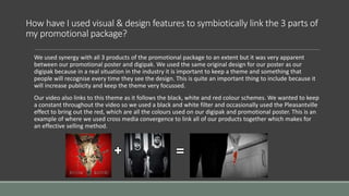
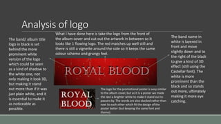
The document discusses the effectiveness of combining the main product and two ancillary texts in a promotional package. It summarizes how visual and design features were used to link the three parts, with the poster and digipak using the same original design. The video also links this theme through a consistent black, white, and red color scheme. Logos and branding were also important aspects considered. The logo was designed to stand out clearly while reflecting the original band. Branding delivered a consistent message through original artwork and design that appealed to the target audience. Overall, the package aimed to effectively sell the product through synergy, themes, and remembering the brand.