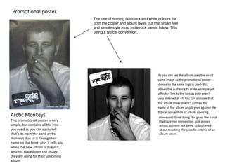
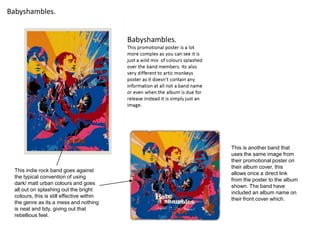
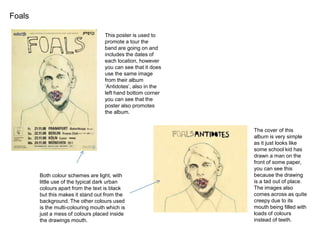
Promotional poster.
The use of nothing but black and white colours for
both the poster and album gives out that urban feel
and simple style most indie rock bands follow. This
being a typical convention.

Arctic Monkeys.
This promotional poster is very
simple, but contains all the info
you need as you can easily tell
that’s its from the band arctic
monkeys due to it having their
name on the front. Also it tells you
when the new album is due out,
which is placed over the image
they are using for their upcoming
album.

However I think doing this gives the band
that carefree convention as it comes
across as them not being to bothered
about reaching the specific criteria of an
album cover.
Babyshambles.

This indie rock band goes against
the typical convention of using
dark/ matt urban colours and goes
all out on splashing out the bright
colours, this is still effective within
the genre as its a mess and nothing
is neat and tidy, giving out that
rebellious feel.

This is another band that
uses the same image from
their promotional poster on
their album cover, this
allows once a direct link
from the poster to the album
shown. The band have
included an album name on
their front cover which.
Foals
This poster is used to
promote a tour the
band are going on and
includes the dates of
each location, however
you can see that it does
use the same image
from their album
‘Antidotes’, also in the
left hand bottom corner
you can see that the
poster also promotes
the album.

Both colour schemes are light, with
little use of the typical dark urban
colours apart from the text is black
but this makes it stand out from the
background. The other colours used
is the multi-colouring mouth which is
just a mess of colours placed inside
the drawings mouth.

The cover of this
album is very simple
as it just looks like
some school kid has
drawn a man on the
front of some paper,
you can see this
because the drawing
is a tad out of place.
The images also
comes across as quite
creepy due to its
mouth being filled with
loads of colours
instead of teeth.
During my research of indie rock album covers and posters I have found
just like their logos indie rock bands try their best to make their album
covers and posters unique and stand out from the rest but still managing to
keep it simple. They do this through their random image choices and the
colouring choices they use. Another thing is that nearly always the poster
and the actual album have some sort of link to one another, this is usually
done by using the same image on the poster that is used for the album
cover.
All these techniques makes the digi pack either effective in promoting
something or just make the band successful in selling their albums or
items.

Digi pack research

  • 1.
    Promotional poster. The useof nothing but black and white colours for both the poster and album gives out that urban feel and simple style most indie rock bands follow. This being a typical convention. Arctic Monkeys. This promotional poster is very simple, but contains all the info you need as you can easily tell that’s its from the band arctic monkeys due to it having their name on the front. Also it tells you when the new album is due out, which is placed over the image they are using for their upcoming album. However I think doing this gives the band that carefree convention as it comes across as them not being to bothered about reaching the specific criteria of an album cover.
  • 2.
    Babyshambles. This indie rockband goes against the typical convention of using dark/ matt urban colours and goes all out on splashing out the bright colours, this is still effective within the genre as its a mess and nothing is neat and tidy, giving out that rebellious feel. This is another band that uses the same image from their promotional poster on their album cover, this allows once a direct link from the poster to the album shown. The band have included an album name on their front cover which.
  • 3.
    Foals This poster isused to promote a tour the band are going on and includes the dates of each location, however you can see that it does use the same image from their album ‘Antidotes’, also in the left hand bottom corner you can see that the poster also promotes the album. Both colour schemes are light, with little use of the typical dark urban colours apart from the text is black but this makes it stand out from the background. The other colours used is the multi-colouring mouth which is just a mess of colours placed inside the drawings mouth. The cover of this album is very simple as it just looks like some school kid has drawn a man on the front of some paper, you can see this because the drawing is a tad out of place. The images also comes across as quite creepy due to its mouth being filled with loads of colours instead of teeth.
  • 4.
    During my researchof indie rock album covers and posters I have found just like their logos indie rock bands try their best to make their album covers and posters unique and stand out from the rest but still managing to keep it simple. They do this through their random image choices and the colouring choices they use. Another thing is that nearly always the poster and the actual album have some sort of link to one another, this is usually done by using the same image on the poster that is used for the album cover. All these techniques makes the digi pack either effective in promoting something or just make the band successful in selling their albums or items.