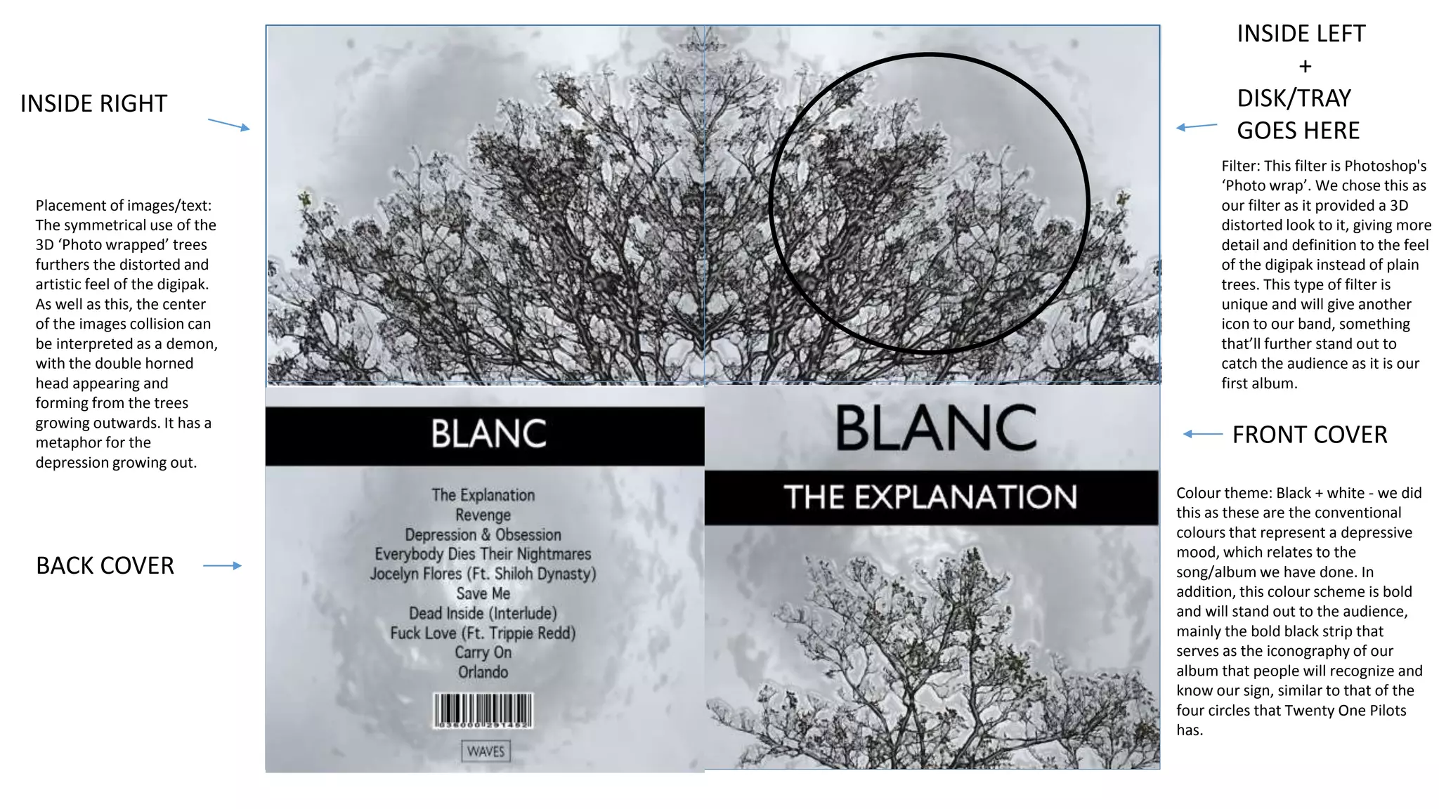
FRONT COVER
Colour theme: Black + white - we did
this as these are the conventional
colours that represent a depressive
mood, which relates to the
song/album we have done. In
addition, this colour scheme is bold
and will stand out to the audience,
mainly the bold black strip that
serves as the iconography of our
album that people will recognize and
know our sign, similar to that of the
four circles that Twenty One Pilots
has.
BACK COVER
INSIDE RIGHT
INSIDE LEFT
+
DISK/TRAY
GOES HERE
Filter: This filter is Photoshop's
‘Photo wrap’. We chose this as
our filter as it provided a 3D
distorted look to it, giving more
detail and definition to the feel
of the digipak instead of plain
trees. This type of filter is
unique and will give another
icon to our band, something
that’ll further stand out to
catch the audience as it is our
first album.
Placement of images/text:
The symmetrical use of the
3D ‘Photo wrapped’ trees
furthers the distorted and
artistic feel of the digipak.
As well as this, the center
of the images collision can
be interpreted as a demon,
with the double horned
head appearing and
forming from the trees
growing outwards. It has a
metaphor for the
depression growing out.
Album Release Poster Digipak side
116123
As our song is about depression, we have
placed the Samaritans phone number
(suicide number) on the side of our digipak
to further the message of our album
Album art [1]
Album art [2]
Album art [3]

A2 Ancillary/Digipak Task - Last Draft

  • 1.
    FRONT COVER Colour theme:Black + white - we did this as these are the conventional colours that represent a depressive mood, which relates to the song/album we have done. In addition, this colour scheme is bold and will stand out to the audience, mainly the bold black strip that serves as the iconography of our album that people will recognize and know our sign, similar to that of the four circles that Twenty One Pilots has. BACK COVER INSIDE RIGHT INSIDE LEFT + DISK/TRAY GOES HERE Filter: This filter is Photoshop's ‘Photo wrap’. We chose this as our filter as it provided a 3D distorted look to it, giving more detail and definition to the feel of the digipak instead of plain trees. This type of filter is unique and will give another icon to our band, something that’ll further stand out to catch the audience as it is our first album. Placement of images/text: The symmetrical use of the 3D ‘Photo wrapped’ trees furthers the distorted and artistic feel of the digipak. As well as this, the center of the images collision can be interpreted as a demon, with the double horned head appearing and forming from the trees growing outwards. It has a metaphor for the depression growing out.
  • 2.
    Album Release PosterDigipak side 116123 As our song is about depression, we have placed the Samaritans phone number (suicide number) on the side of our digipak to further the message of our album
  • 3.
  • 4.
  • 5.