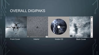
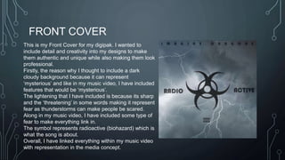
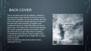
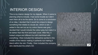
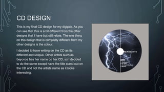
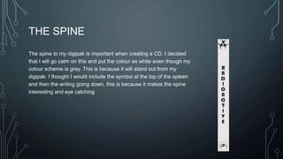
DIGIPAKS 
BY CHLOE YEARSLEY
OVERALL DIGIPAKS 
Front Cover Interior Inside CD Back Cover
FRONT COVER 
This is my Front Cover for my digipak. I wanted to 
include detail and creativity into my designs to make 
them authentic and unique while also making them look 
professional. 
Firstly, the reason why I thought to include a dark 
cloudy background because it can represent 
‘mysterious’ and like in my music video, I have included 
features that would be ‘mysterious’. 
The lightening that I have included is because its sharp 
and the ‘threatening’ in some words making it represent 
fear as thunderstorms can make people be scared. 
Along in my music video, I have included some type of 
fear to make everything link in. 
The symbol represents radioactive (biohazard) which is 
what the song is about. 
Overall, I have linked everything within my music video 
with representation in the media concept.
BACK COVER 
This is my back cover for my digipak. I wanted to 
have the same colour theme as my front cover so 
they blend in together. As you can witness, the front 
cover and back cover contain light grey so they do 
link with each other and also go together well. 
I edited the clouds to make them stand out as my 
back cover. The reason why I did this was because 
the clouds represent sadness and emotion which 
also links into my music video that I’m creating. 
I included the track list but I haven’t added much 
songs as its supposed to be a single with a couple 
of bonus tracks. 
I then included the label at the bottom of who 
distributed my CD.
INTERIOR DESIGN 
This is my interior design for my digipak. When it came to 
planning what to include, I had some trouble as I didn’t 
want them all to be the same. So to come to a conclusion 
of an idea, I decided that it would be unique to design 
something that relates to clouds etc. which is rain. I 
added in the rain but as my colour theme was grey, I 
decided that I would include the colour grey but make it a 
bit darker than the front and back cover. After this, it 
looked unique and different but still interlinked with 
everything. I then included the radioactive symbol in the 
middle of the interior making it authentic but making it 
blend within the rain. Finally, I then included the company 
who distributed the artist's CD.
CD DESIGN 
This is my final CD design for my digipak. As you 
can see that this is a bit different from the other 
designs that I have but still relate. The one thing 
on this design that is complelty different from my 
other designs is the colour. 
I decided to have writing on the CD as its 
different and unique. Other aritsts such as 
beyonce has her name on her CD, so I decided 
to do the same except have the title stand out on 
the CD and not the artists name as it looks 
interesting.
THE SPINE 
The spine to my digipak is important when creating a CD. I decided 
that I will go calm on this and put the colour as white even though my 
colour scheme is grey. This is because it will stand out from my 
digipak. I thought I would include the symbol at the top of the spleen 
and then the writing going down, this is because it makes the spine 
interesting and eye catching

Digipakss

  • 1.
  • 2.
    OVERALL DIGIPAKS FrontCover Interior Inside CD Back Cover
  • 3.
    FRONT COVER Thisis my Front Cover for my digipak. I wanted to include detail and creativity into my designs to make them authentic and unique while also making them look professional. Firstly, the reason why I thought to include a dark cloudy background because it can represent ‘mysterious’ and like in my music video, I have included features that would be ‘mysterious’. The lightening that I have included is because its sharp and the ‘threatening’ in some words making it represent fear as thunderstorms can make people be scared. Along in my music video, I have included some type of fear to make everything link in. The symbol represents radioactive (biohazard) which is what the song is about. Overall, I have linked everything within my music video with representation in the media concept.
  • 4.
    BACK COVER Thisis my back cover for my digipak. I wanted to have the same colour theme as my front cover so they blend in together. As you can witness, the front cover and back cover contain light grey so they do link with each other and also go together well. I edited the clouds to make them stand out as my back cover. The reason why I did this was because the clouds represent sadness and emotion which also links into my music video that I’m creating. I included the track list but I haven’t added much songs as its supposed to be a single with a couple of bonus tracks. I then included the label at the bottom of who distributed my CD.
  • 5.
    INTERIOR DESIGN Thisis my interior design for my digipak. When it came to planning what to include, I had some trouble as I didn’t want them all to be the same. So to come to a conclusion of an idea, I decided that it would be unique to design something that relates to clouds etc. which is rain. I added in the rain but as my colour theme was grey, I decided that I would include the colour grey but make it a bit darker than the front and back cover. After this, it looked unique and different but still interlinked with everything. I then included the radioactive symbol in the middle of the interior making it authentic but making it blend within the rain. Finally, I then included the company who distributed the artist's CD.
  • 6.
    CD DESIGN Thisis my final CD design for my digipak. As you can see that this is a bit different from the other designs that I have but still relate. The one thing on this design that is complelty different from my other designs is the colour. I decided to have writing on the CD as its different and unique. Other aritsts such as beyonce has her name on her CD, so I decided to do the same except have the title stand out on the CD and not the artists name as it looks interesting.
  • 7.
    THE SPINE Thespine to my digipak is important when creating a CD. I decided that I will go calm on this and put the colour as white even though my colour scheme is grey. This is because it will stand out from my digipak. I thought I would include the symbol at the top of the spleen and then the writing going down, this is because it makes the spine interesting and eye catching