Downloaded 135 times
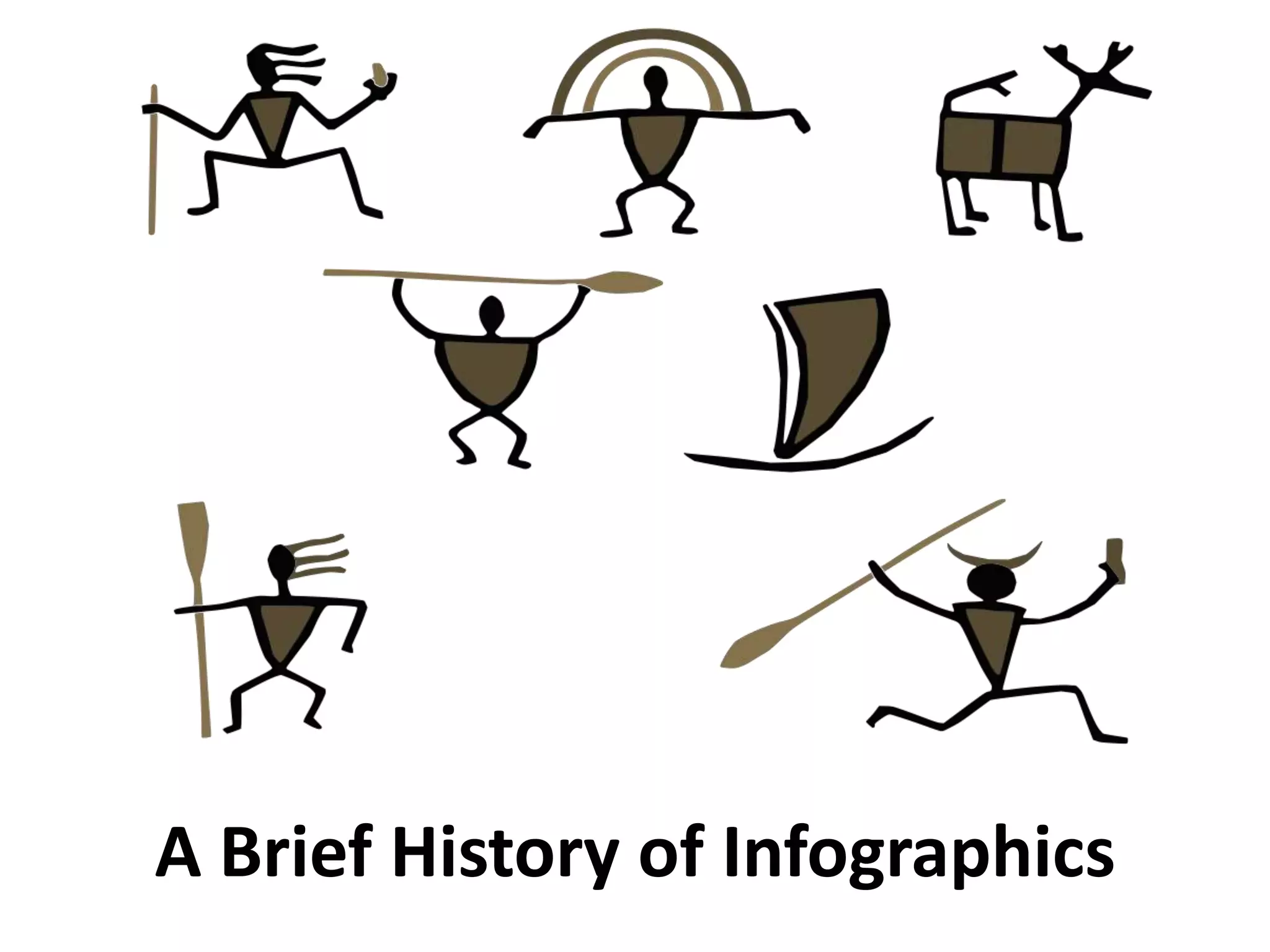

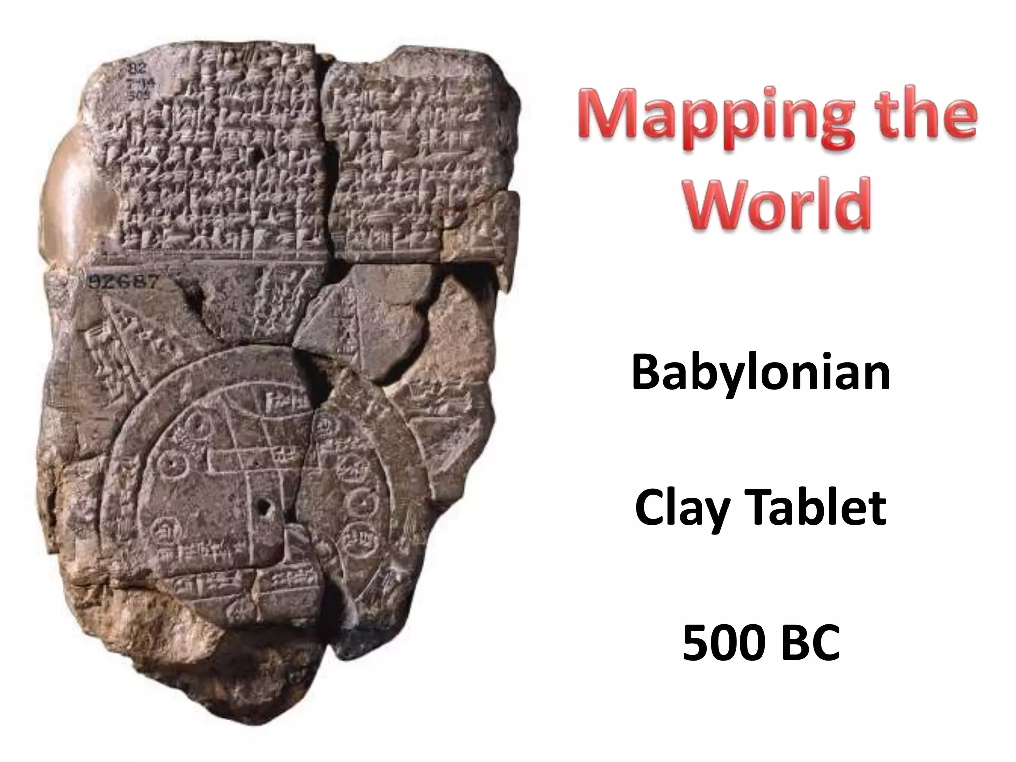

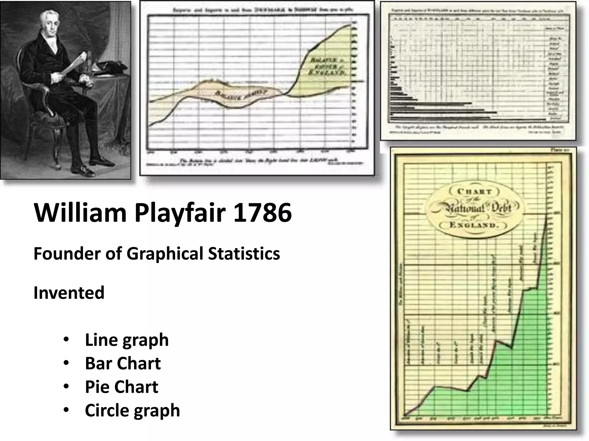


This document provides a brief history of infographics from ancient times to the modern era. It notes that some of the earliest infographics include Babylonian clay tablets from 500 BC depicting prevailing winds, and William Playfair in 1786 who invented the line graph, bar chart, pie chart and circle graph. The document then outlines key infographics through history for subjects like cholera outbreaks, human history timelines, Napoleon's military campaigns, human metabolism, electromagnetic radiations, newspaper graphics including weather maps, explaining wars, and modern beer varieties and humor.
An overview of the development of infographics throughout history.
Introduction to Babylonian clay tablets used as early infographics dating back to 500 BC.
Notable early infographics include Edmond Halley's wind map (1686) and Frances Galton's daily weather map (1875).
William Playfair's contributions to graphical statistics and the invention of line graphs, bar charts, pie charts.
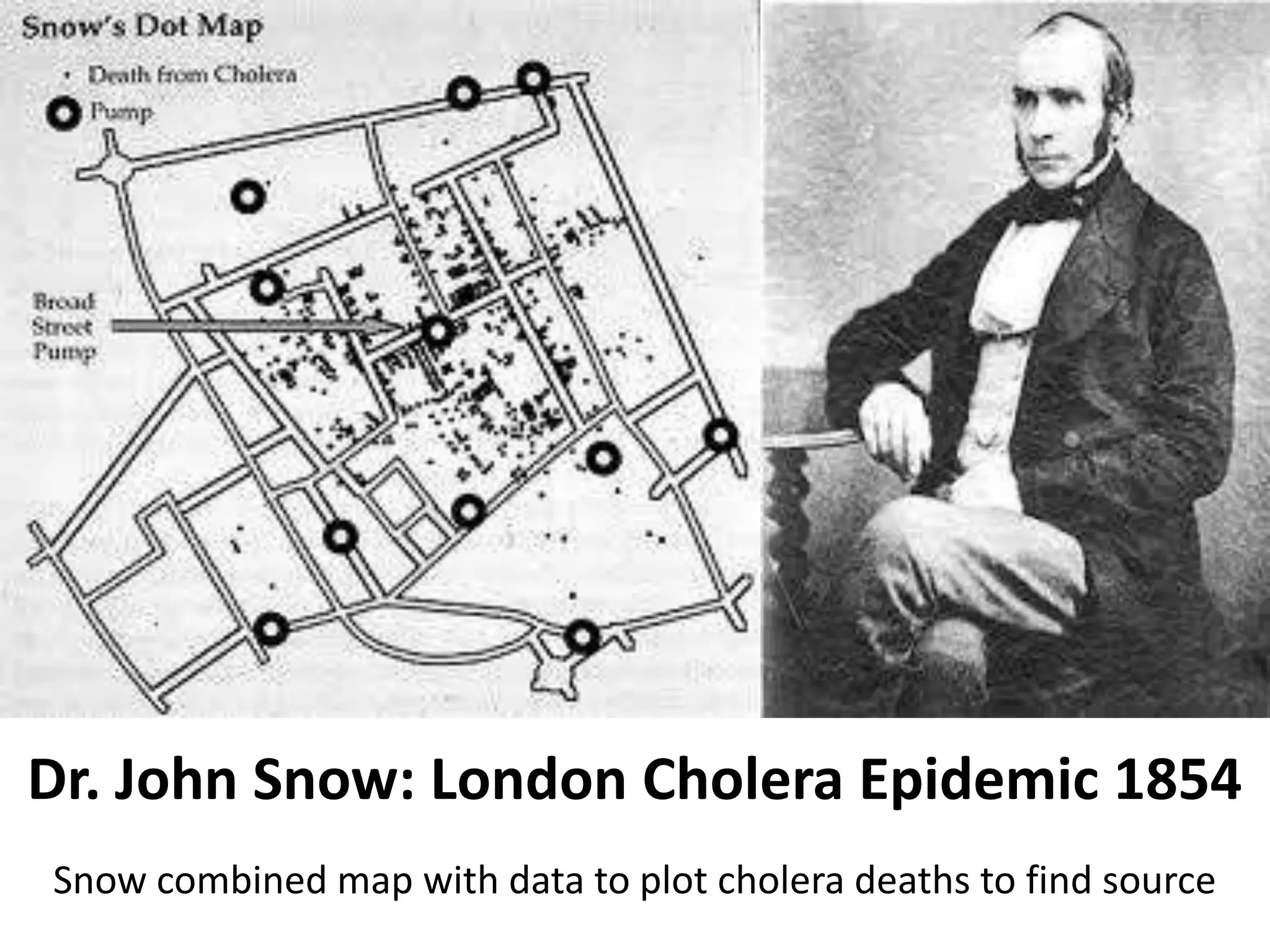
Dr. John Snow's cholera map (1854) combined geographical data with statistical data to identify disease sources.
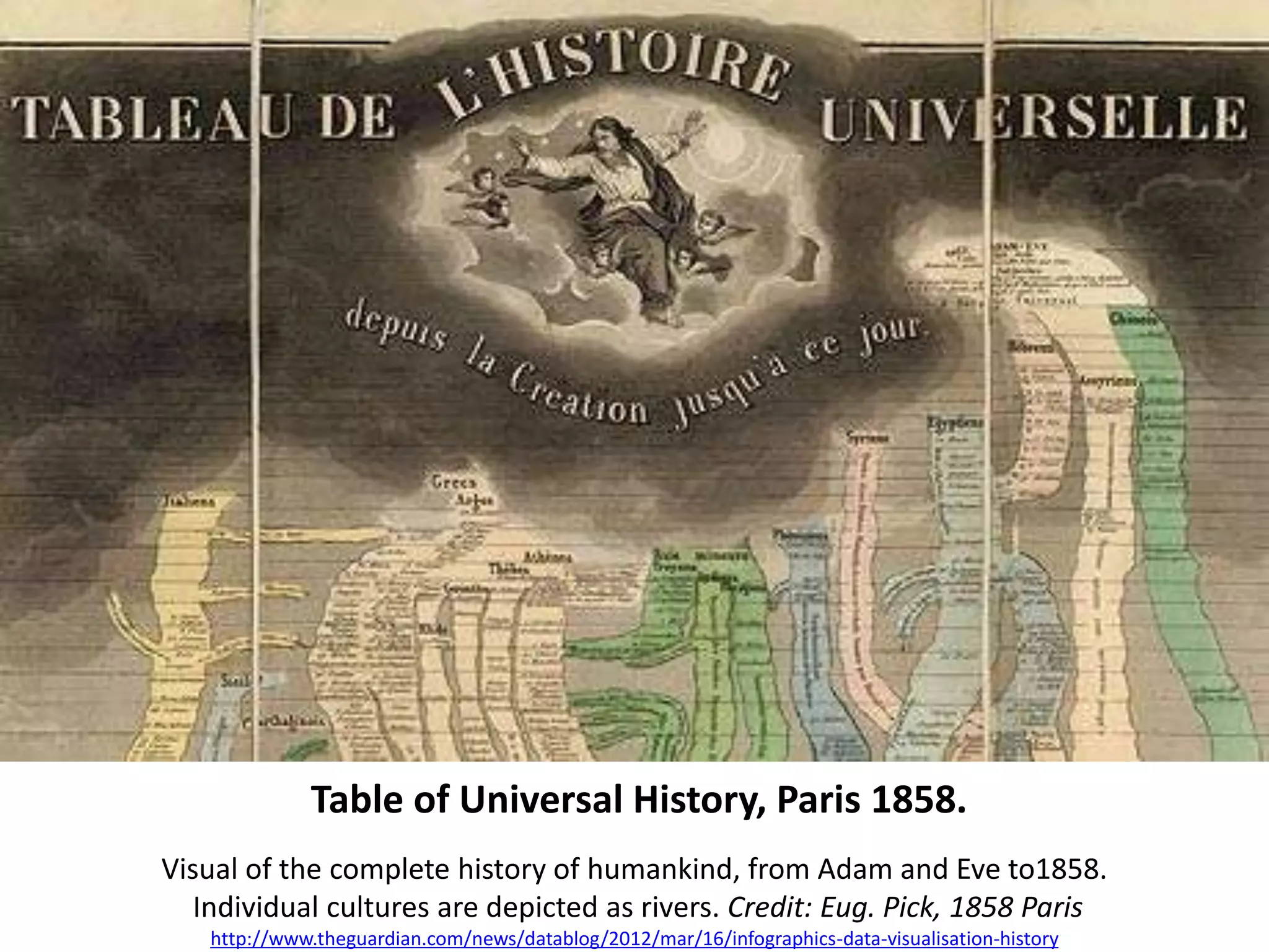
The Table of Universal History depicts human history visually from Adam and Eve to 1858, illustrating cultural timelines.
Exploration of historical narratives and the use of infographics to connect events, like Napoleon's campaigns.
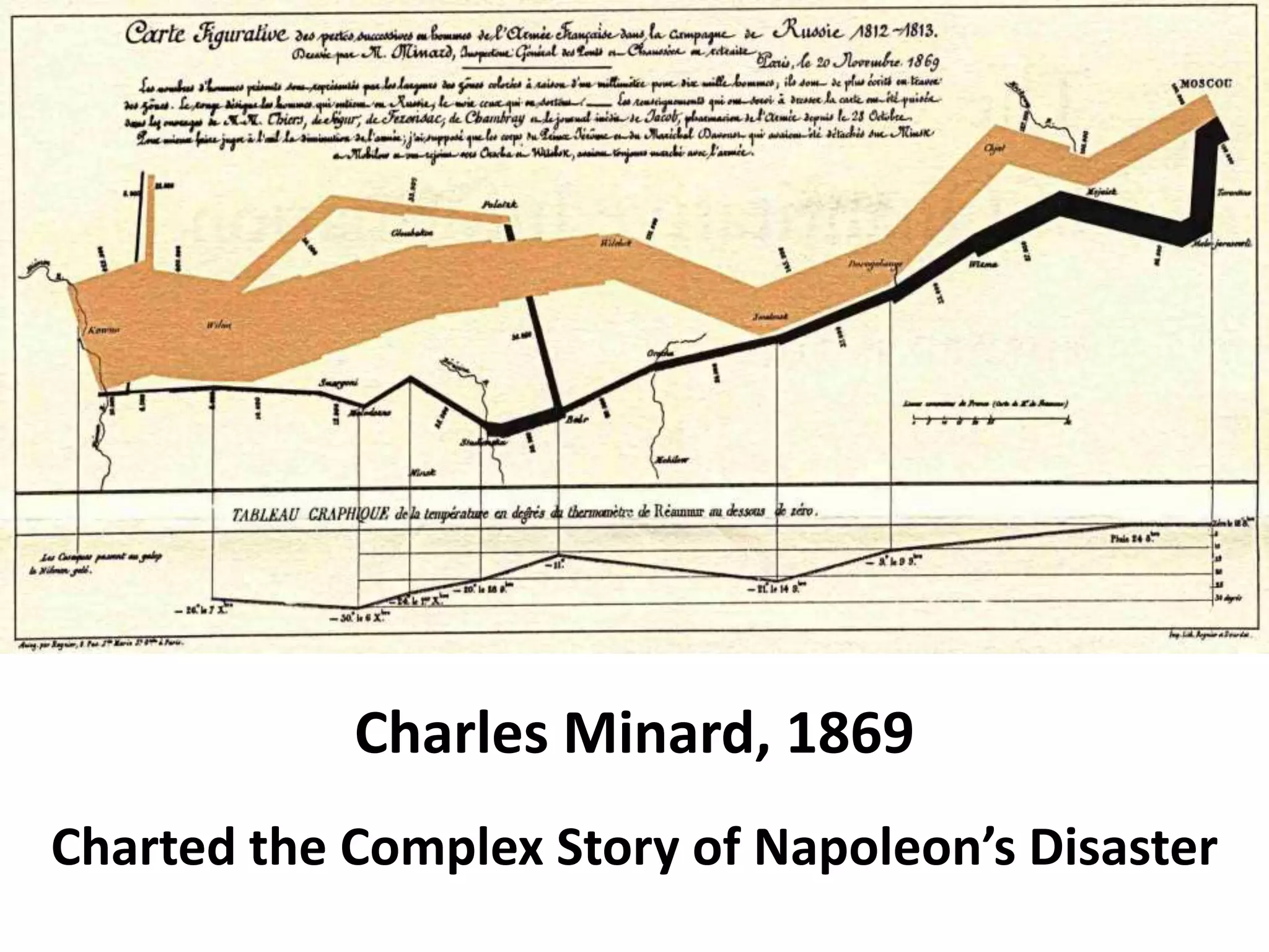
Minard's chart from 1869 illustrates the disastrous retreat of Napoleon's army, combining geography and statistics.
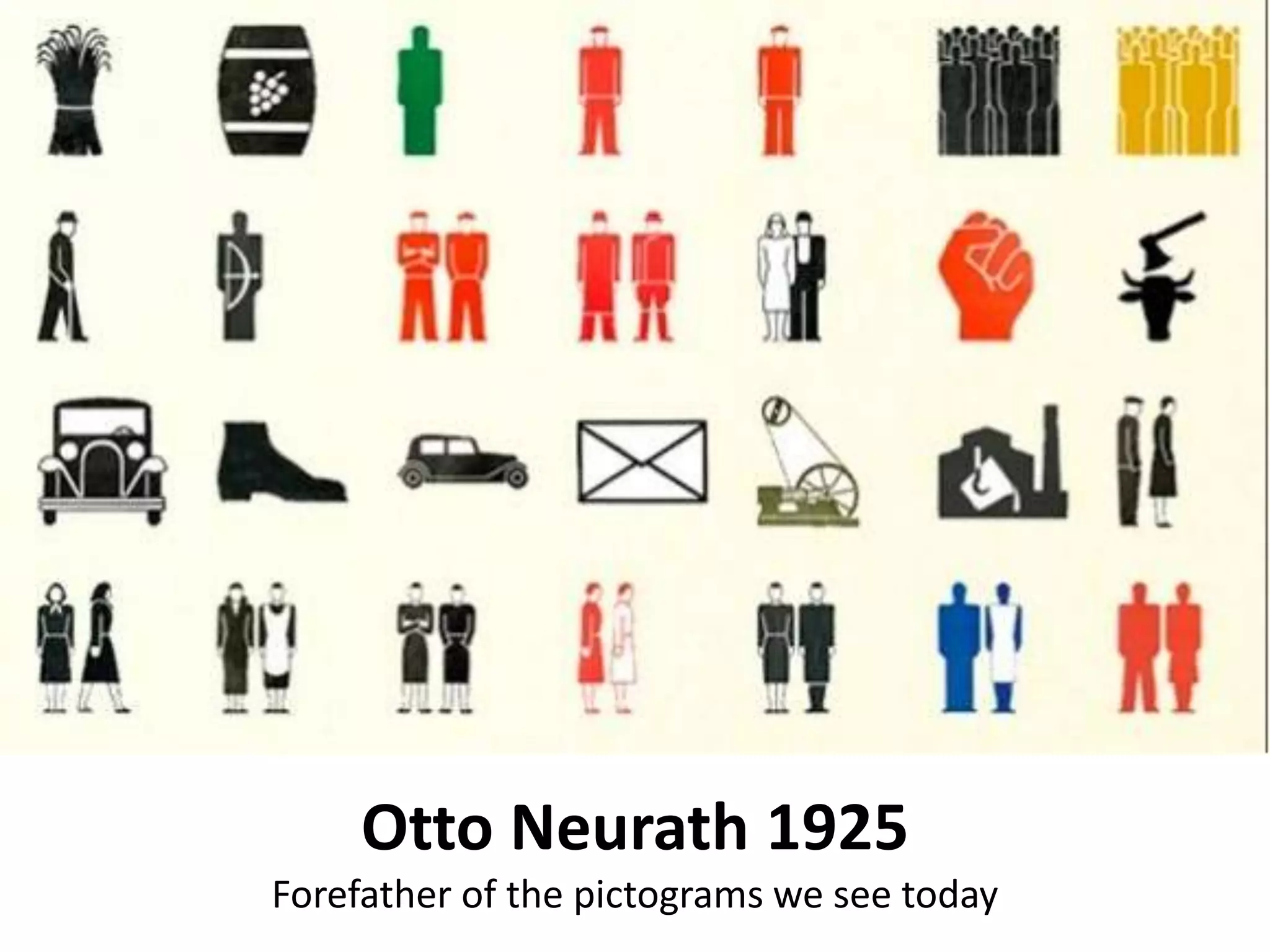
Otto Neurath's influence on modern pictograms and visual communication initiated in 1925.
Fritz Khan's 1926 visualization of human metabolism as an industrial process, highlighting creativity in infographic design.
Emergence of complex charts such as the Chart of Electromagnetic Radiations in 1944 from Lawrence Livermore Lab.
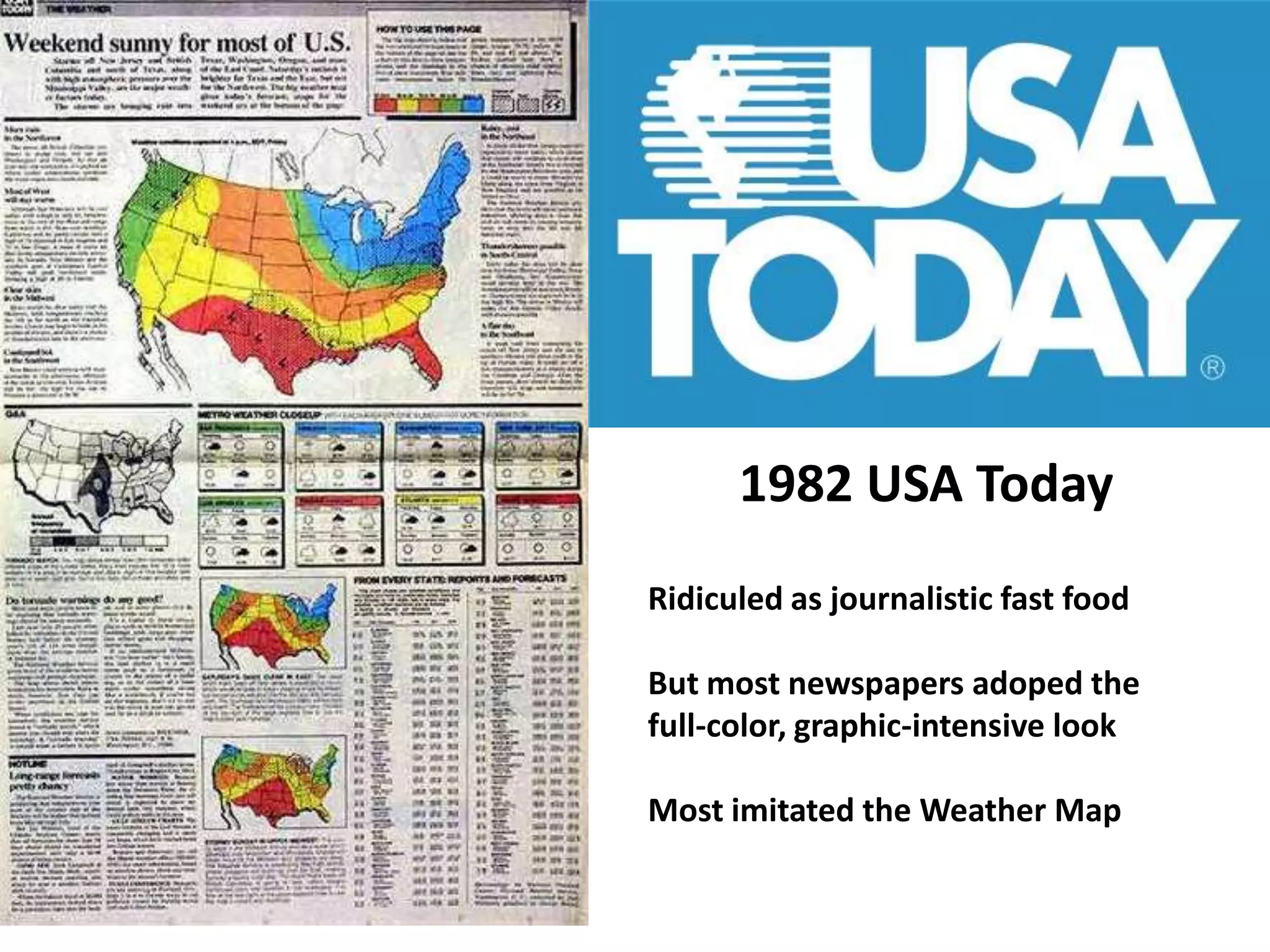
In the 1982 USA Today, infographics were criticized yet became widely adopted for their aesthetic appeal.
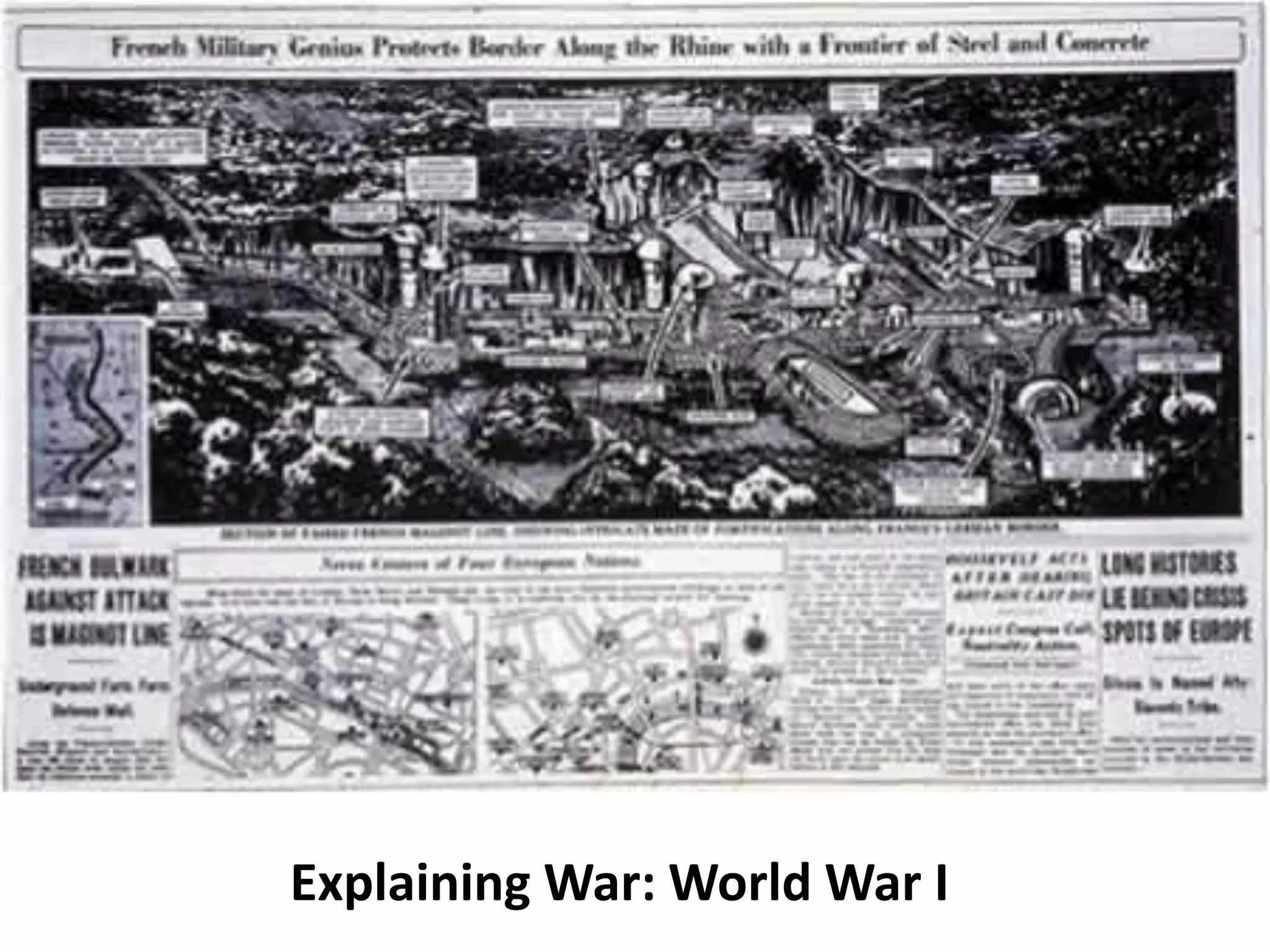
Use of infographics to explain complex narratives of military conflicts during World War I.
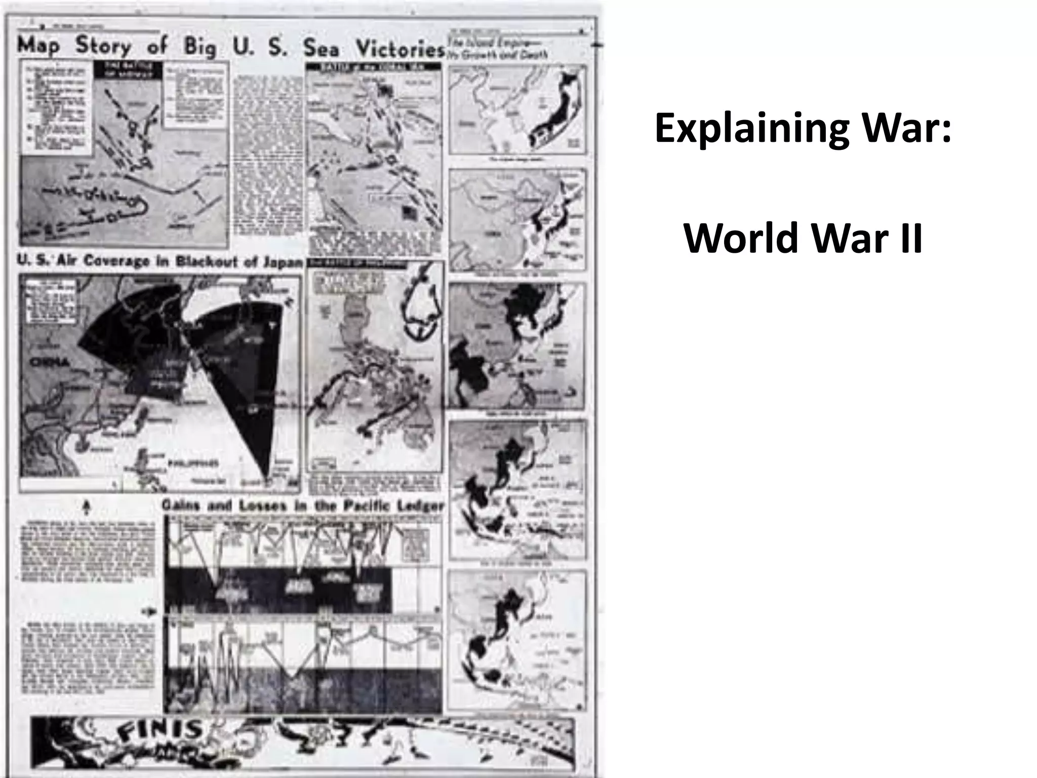
Continued application of infographics to visualize and explain the intricacies of World War II.
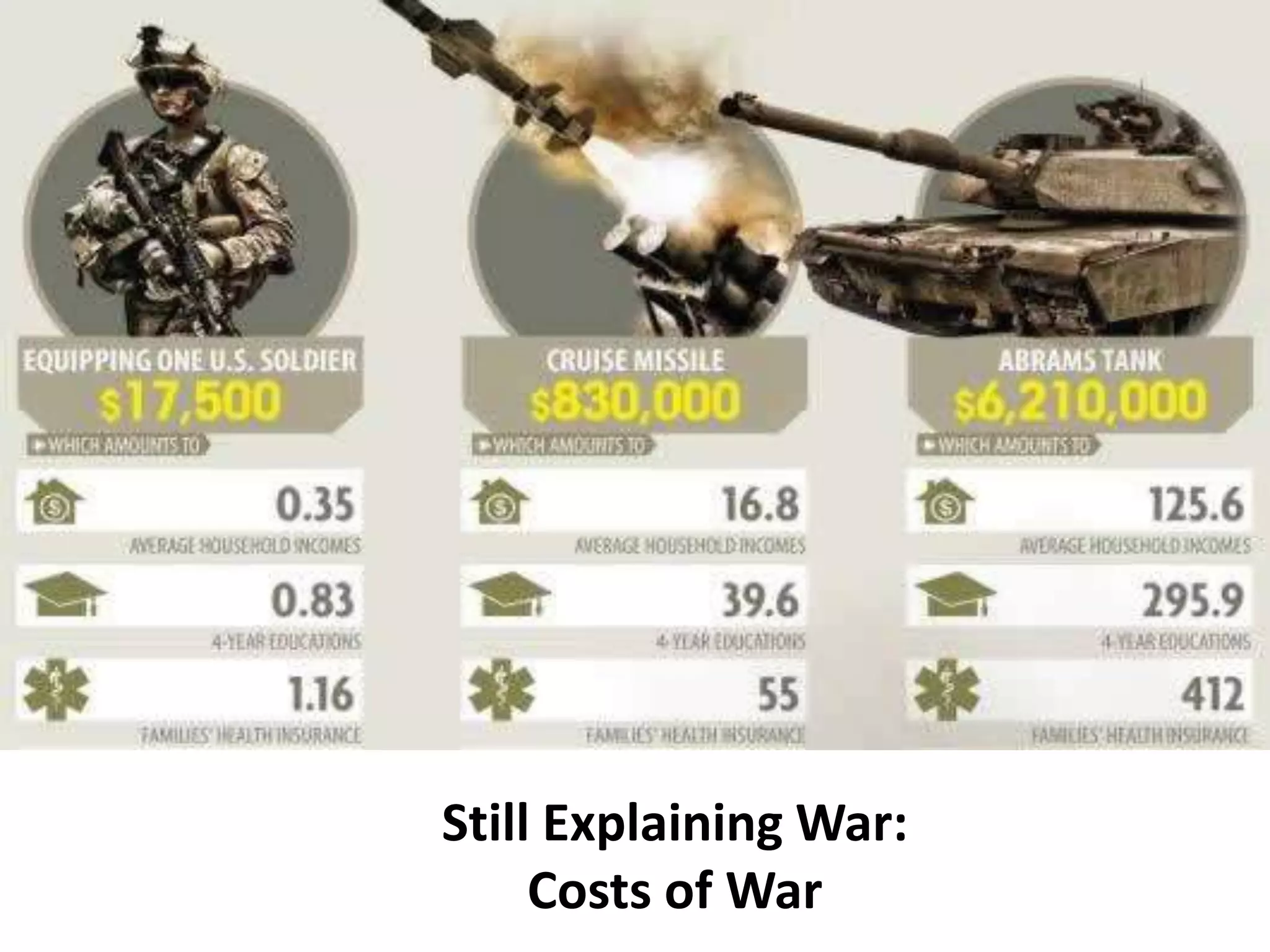
Infographics illustrating the costs associated with war, maintaining clarity on financial implications.
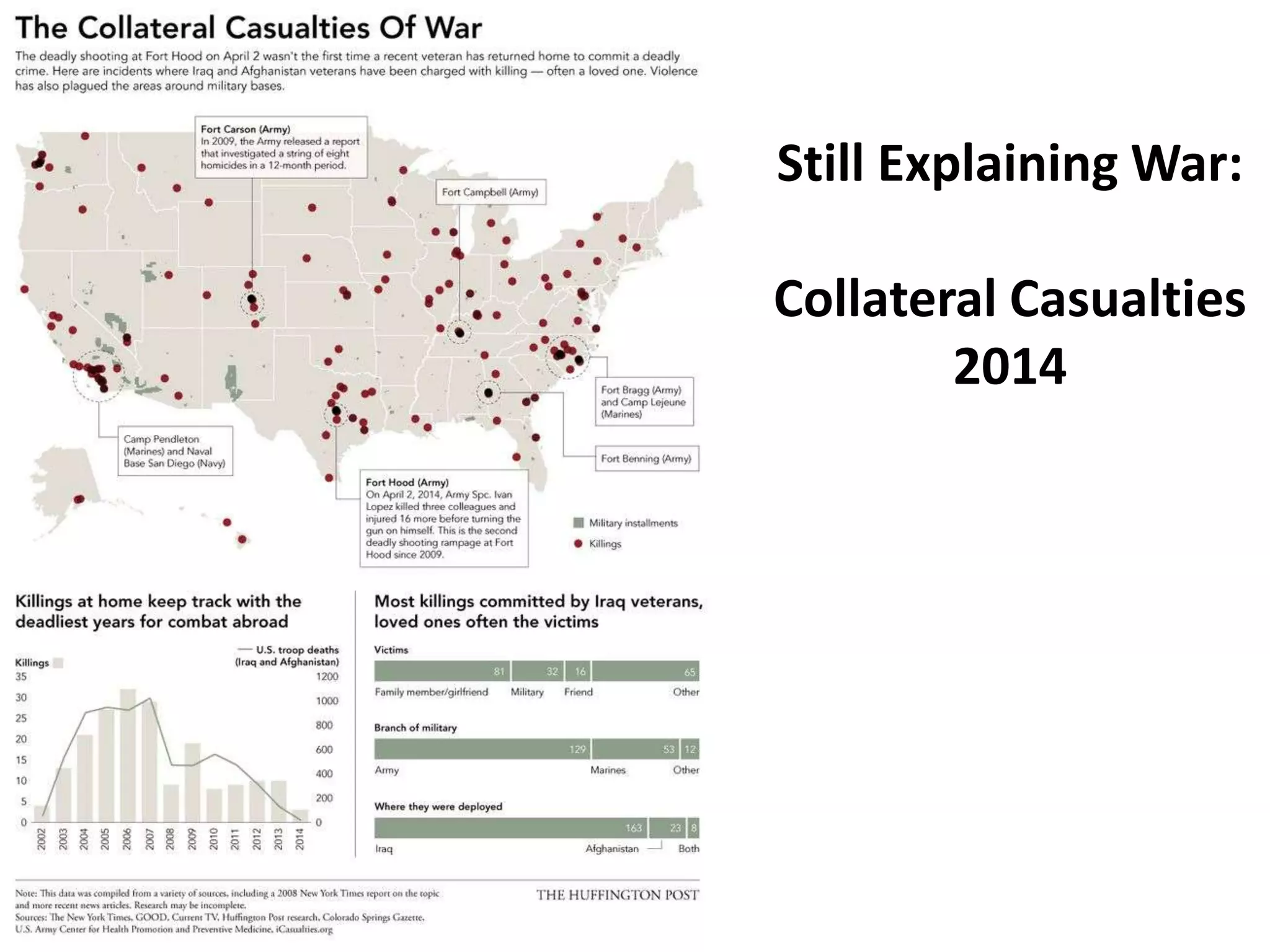
Infographics evaluating collateral casualties in recent conflicts, providing numerical perspective.
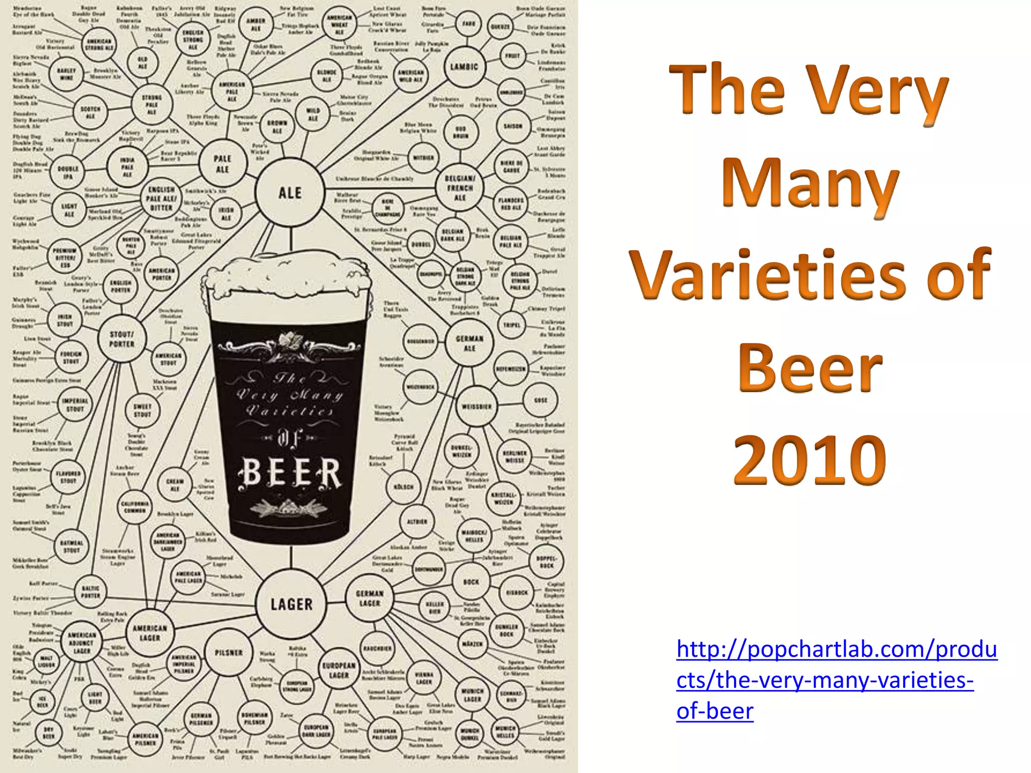
Engaging infographics like those detailing various beer types reflect contemporary infographic trends.
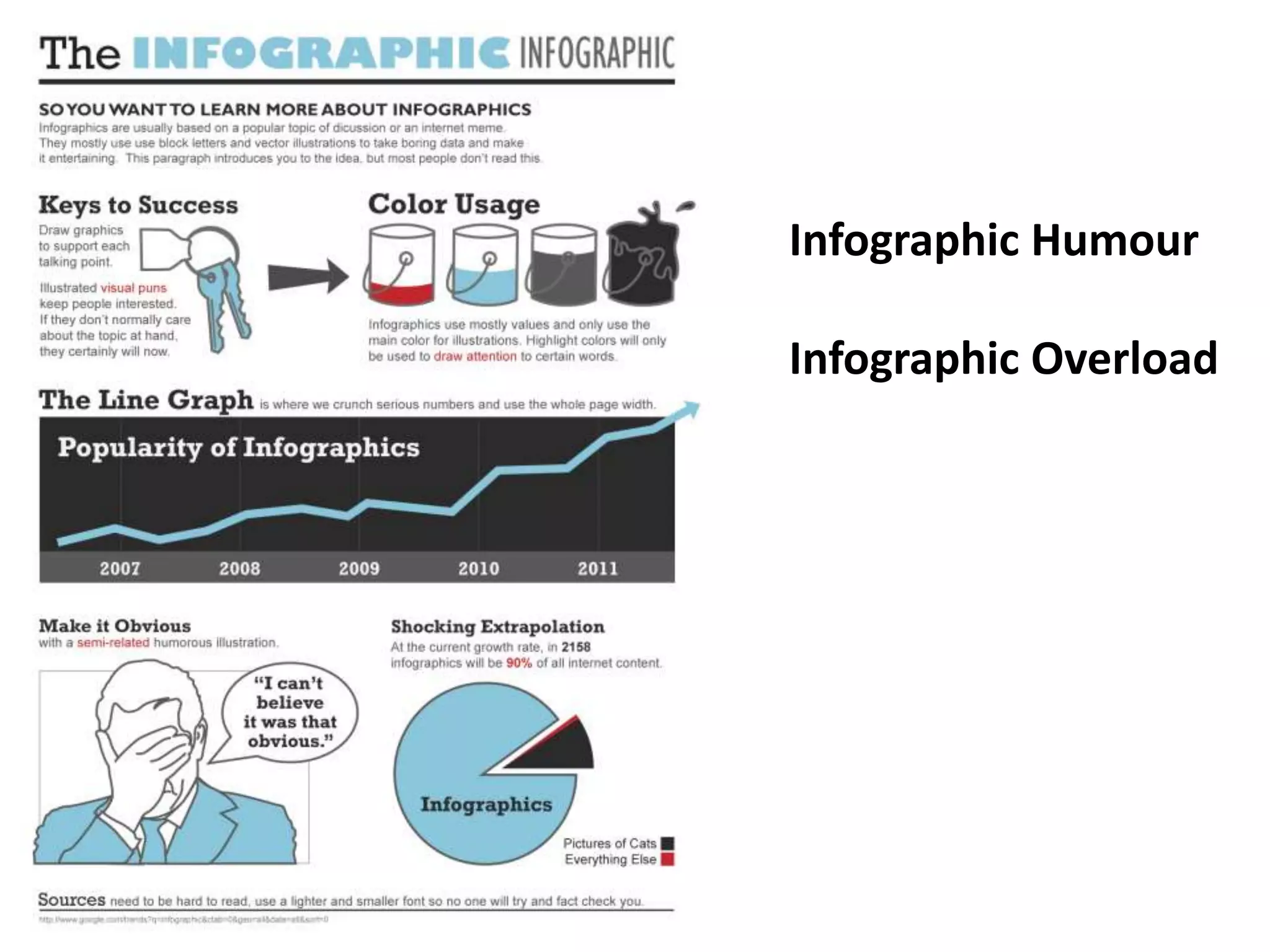
Highlighting the phenomenon of infographic humor and the challenges of information overload.


