Downloaded 389 times
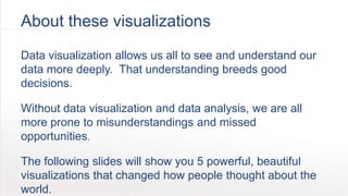
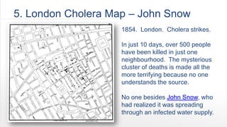
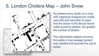
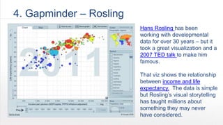
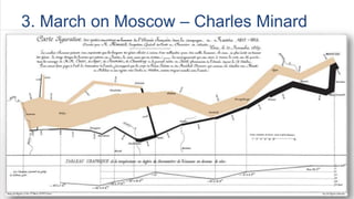
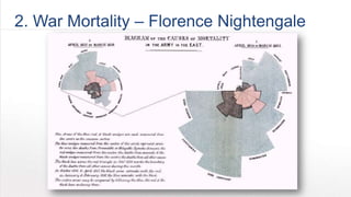
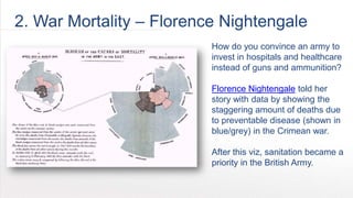
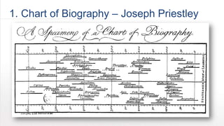
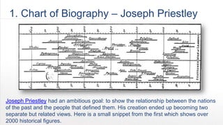


The document discusses the five most influential data visualizations in history, highlighting their impact on public understanding and decision-making. Key examples include John Snow's cholera map, Hans Rosling's Gapminder, and Florence Nightingale's war mortality chart, each illustrating how data visualization can convey significant insights. The document emphasizes the importance of visual storytelling in interpreting complex data and its role in driving social change.


