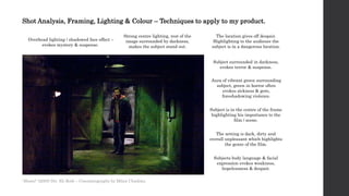
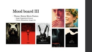
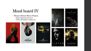
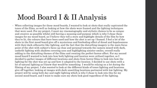
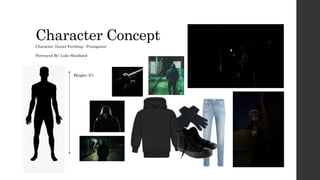
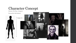
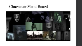
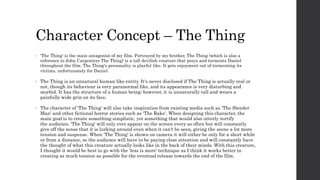
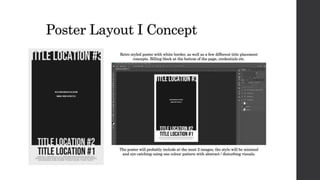
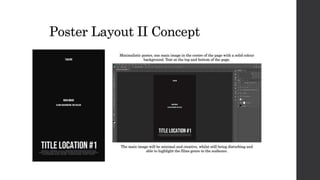
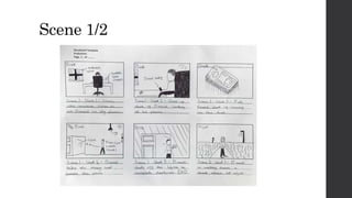
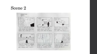
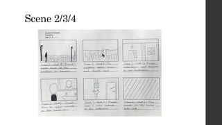
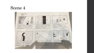
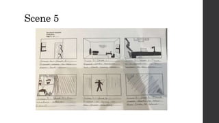
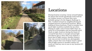
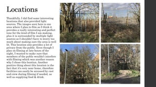
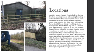
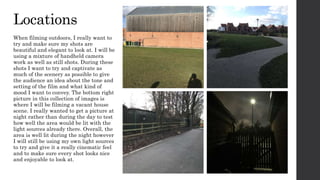
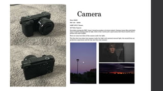
2. Introduction to Planning
• While planning for my production, I will be looking into multiple different
aesthetics and design choices that should hopefully inspire my product as I
create it and also further help towards my idea generation as the project
moves along. For my project, I will be creating a short film with two movie
posters (horror being the main theme). During planning, I will be looking at
aesthetical choices, for example colour patterns & gradients in film, and
layout choices in movie posters. I'll be creating a series of mood boards to
collect all of these aesthetics to constantly refer to and look back on, as well as
choosing images and ideas that I believe are best suited to my product. When
planning for my product, I am going to make sure that each individual
element I look into and plan will be useful to my product and that I will be
able to apply it in one way or another to help advance the quality of my
product. I will also be location scouting, taking pictures of the places I plan to
film. I'll be discussing in detail the equipment I plan to use when filming,
what camera and light settings I need for specific scenes etc. Overall, my
planning will serve as a gateway into production and will help me develop
many more / different ideas that will greatly impact the quality of my project.
3. Film Synopsis
Serpent
The film follows a young man named Daniel struggling to manage his journey through drug
addiction rehabilitation. Daniel is constantly berated with bad influence and always had been
from a young age. The people he surrounds himself with only act to further his plummet into
addiction rather than being actual friends and helping him out of it. One night 2 months
clean into his rehibilitation, he can't take the urge anymore and agrees to meet with one of
his closest friends Charlie for a meet up. Charlie is hesitant at first understanding that he
shouldn’t allow Daniel to fall back into his old habbits, but once a large amount of ransom is
offered, Charlie is in no mood to back down. The two of them arrange a meet one late night
and upon Daniels' arrival at the location they chose to exchange the deal he notices that
Charlie is nowhere to be seen, however his pick-up has been left behind. Daniel moves to
collect the small bag of powder and notices a not sitting directly under it. The note simply
reads 'GUILTY' in old scruffy handwriting. Daniel shrugs the note off and proceeds the take
the bag without giving it a second thought. This would only mark the beginning of a fatal
mistake that would cost him everything, as he soon notices he is being followed by something
human like – but not all quite there. Whatever it is that's following him, it exists to only
desire three things from its victims; pain, torment and death, and Daniel is its next target.
4. Film / Video Planning Introduction
• When planning different ideas and aesthetical choices for my short film I will
be collecting images for my mood board, specifically images that feature
different interesting cinematography concepts, as well as camera angles, shot
framing, character design, setting etc. I also plan on going to my intended
filming locations and taking pictures of all the different areas I plan on
filming at, as well as taking pictures of where I plan to have the camera when
filming and how I plan on framing the scenes when I eventually film.
Throughout my film planning, I'll be referring back to my research. A lot of
my planning will revolve around the things I have researched which will help
me when it comes to creating my mood boards as I will be able to look back at
the things I researched and look at the things that are important to my film,
whether that’s camera angles or colour to convey emotion. I also plan to
analyse a few shots from different horror movies, talking about the
cinematography and what it may represent, as well as how the shot is
framed, how colour is used in the shot & what visuals the director has used to
convey emotion towards the audience as something to look back on and
reference in my own way during production when filming my product.
5. Poster Planning Introduction
• During the course of planning for my film, I will also be planning the styles
and layout concepts for my posters I plan on making for my product. I will be
looking into different existing posters with similar styles and design
techniques that I would like to implement into my own work, as well as
creating potential layout concepts in photoshop for when I eventually create
my posters during production. For my layout concepts, I'll be looking into
different techniques I could use when making my posters. Anything from
where the text / title placement could be, where the images will be placed
and what style of poster I want to make I.e. minimalistic or more cinematic.
Ill also e looking at existing posters that I personally like and analysing
some of the different design choices and which elements of the posters I
would like to implement into my own work. In total I will be making two
posters and I plan on having one in a minimalistic style and the other in a
bigger / more theatrical style so that they are both different.
14. Shot Analysis, Framing, Lighting & Colour – Techniques to apply to my product.
Pink & pleasant lighting gives a sense
of juxtaposition & mistrust.
Intriguing character design &
unusual clothing evokes mystery
and discomfort.
Colours are very vibrant & pleasing
to look at, leading the audience into
a false sense of security.
The subject feels very up close and
personal towards the audience
adding to the discomfort.
The lighting is also very bright and
juxtaposing much like the colours.
Subject is portrayed up close &
centre frame, giving more feeling of
discomfort & fear.
Subject has a very exaggerated and
uncomfortable looking facial
expression making the shot all the
more disturbing.
Subject highlighting a potential
threat or importance based on
posture & appearance.
'The Rocky Horror Picture Show ' (1975) Dir. Jim Sharman – Cinematography by Peter Suschitzky
15.
16. Shot Analysis, Framing, Lighting & Colour – Techniques to apply to my product.
Overhead lighting / shadowed face effect –
evokes mystery & suspense.
Strong centre lighting, rest of the
image surrounded by darkness,
makes the subject stand out.
Subject surrounded in darkness,
evokes terror & suspense.
Aura of vibrant green surrounding
subject, green in horror often
evokes sickness & gore,
foreshadowing violence.
Subject is in the centre of the frame
highlighting his importance to the
film / scene.
The location gives off despair.
Highlighting to the audience the
subject is in a dangerous location.
The setting is dark, dirty and
overall unpleasant which highlights
the genre of the film.
Subjects body language & facial
expression evokes weakness,
hopelessness & despair.
'Hostel ' (2005) Dir. Eli Roth – Cinematography by Milan Chadima
17.
18.
19. Mood Board I & II Analysis
• When collecting images for these mood boards, I wanted to look at shots that really captivated the
tones of the films, as well as looking at how the shots were framed and the lighting techniques
that were used. For my project, I want my cinematography and stylistic choices to be as unique
and creative as possible whilst still having a meaning and purpose which is why I chose these
images for my mood board, as I believe they tell a story and highlight details of the film by how
they're lit, the colours that have been used and how the shot is set up / framed. I feel a lot of the
shots in the first mood board give off a mysterious and foreboding effect of dread and hopelessness
with their dark silhouette like lighting, and the fact that the disturbing imagery is the main focus
point of the shot with subject's faces up close and personal towards the camera mixed with dark,
underlit lighting with shadows covering eyes and highlighting sinister smiles, overall really
adding to the disturbing themes of the films and creating the perfect horror effect. For my second
mood board I wanted to look into how both lighting and location were utilised together, so I
decided to gather images of different locations and shots from horror films to look into how the
lighting for the shot was set up and how it adapted to the location. I decided to use shots with a
lot of natural lighting as I knew that would be something I would be relying on a lot during the
filming of my project. I also wanted to look at the different kinds of tones lighting and locations
give off together, looking at images with dark unsettling locations partnered with low lighting. My
project will be using both day and night lighting which is why I chose to look into this for my
second mood board, and I want to make sure my shots look good regardless of the lighting.
20. Mood Board III & IV Analysis
• I wanted to create mood boards looking specifically at movie posters. I wanted to put a collection
together that focused on minimalism and colour, as well as how the poster portrays its main
image and the different kinds of styles and techniques that artists used in order to convey the
genre of the film to the target audience. A lot of the posters I chose aren't explicitly horrific,
instead they use subtle indicators that highlight they are a member of the horror genre. I
believe that this style is much more effective in captivating an audience and is something I want
to do with both of my posters. Posters like 'Raw' & 'Midsommar' use subtle indicators such as
facial expressions and singular key visuals such as a little blood to highlight the tone and genre of
the film. Both of the posters are simple yet highly captivating, especially with their use of
vibrant colours which really catches your eyes and brings your attention to the posters. Some of
the posters I have chosen only stick with one colour pallet which really makes the poster stand
out much more in my opinion rather than having a lot of different colours. The colours in the
posters also help to highlight the nature of the films, for example the poster for 'You're Next' and
'Saw VI' are very washed down and have little to no colour highlighting the dark, unpleasant tone
of both films. Posters for films such as 'The Killing of a Sacred Deer' use very unique and minimal
imagery to captivate the audience and also rely a lot on facial expressions to highlight the tone
and mood of the film and don’t need a lot of bright and vibrant colours to stand out when there is
only one main focus point of the poster with a blank background. I hope to achieve the same effect
a lot of these posters have with my own product, which I will be working on during production.
23. Shot Framing Mood board
Shot framing can highlight a lot about a scene, character or mood the director wants to convey to their audience. The way a shot or an entire scene is
framed can hold a lot of symbolical meaning. For example, in the movie 'Se7en', the character John Doe is portrayed as a demented 'God' like figure.
Director David Fincher highlights this during the final scene of the film by framing John in a way where the light from the sun creates a halo effect
around the characters head, further highlighting his 'God' like complex to the audience. In the TV series 'Mr Robot', the director uses 'quadrant
framing' to highlight social anxiety towards the main character Elliot, conveying isolation and loneliness with an almost empty frame. In the movie
'The Invisible Man', director Leigh Whannell uses wide open shots, which further illudes to the title of the film and makes the audience as well as
the characters feel constantly on edge, giving the invisible man a constant unknown yet hinted presence throughout the film.
25. Character Concept - Daniel
• For my main character Daniel, (portrayed by myself) I wanted to design him in a way where he would fit
the mood, style, tone and theme of the film. In the script, Daniel is a worn-down drug addict struggling
with his journey of rehabilitation. He is anti-social, as well as narcissistic.
• For the design of Daniel, I wanted him to be portrayed in almost all black clothing, highlighting his
depressive and unwelcoming tone. I want my audience to get the idea that he isn't trying to impress
anyone with what he wears but instead comes off as an outcast and someone who has disconnected
himself with most of the people in his life. This will also be further highlighted through body language
and line delivery. Overall, I want to give the impression that Daniel isn't somebody you would want to
associate yourself with however throughout the film there will be subtle indications highlighting that
Daniel might not be as bad as he is portrayed, and still has sympathy and care for himself and the people
around him.
• Though Daniels actions throughout the film will portray him as careless, there will be a layer of
conscience under everything he does. I want people to try and sympathise with the Daniel. Throughout
the film there will also be subtle indicators to all of the good in Daniel's life that is now gone, showing
that there was a time where Daniel was at a much better point in his life compared to where he is now.
This will all be highlighted through visual details that won't be illuded or focused on for too long. Daniel
is a character concept I have had in mind for a long time. In my pre-proposal, I mentioned how my film
and characters will have personal connections towards myself. While Daniel is a completely fictional
character, the themes of mental health in the film will serve almost like a public service announcement
and spread awareness. The topic of mental health is personal to me, and I want to try and highlight this
through my film, making sure that this film and characters may leave an impact on my audience.
28. Character Concept – The Thing
• 'The Thing' is the main antagonist of my film. Portrayed by my brother, The Thing (which is also a
reference to John Carpenters The Thing) is a tall devilish creature that preys and torments Daniel
throughout the film. The Thing's personality is playful like. It gets enjoyment out of tormenting its
victims, unfortunately for Daniel.
• The Thing is an unnatural human like entity. It's never disclosed if The Thing is actually real or
not, though its behaviour is very paranormal like, and its appearance is very disturbing and
morbid. It has the structure of a human being; however, it is unnaturally tall and wears a
painfully wide grin on its face.
• The character of 'The Thing' will also take inspiration from existing media such as 'The Slender
Man' and other fictional horror stories such as 'The Rake'. When designing this character, the
main goal is to create something simplistic, yet something that would also utterly terrify
the audience. 'The Thing' will only ever appear on the screen every so often but will constantly
give off the sense that it is lurking around even when it can't be seen, giving the scene a lot more
tension and suspense. When 'The Thing' is shown on camera it will either be only for a short while
or from a distance, so the audience will have to be paying close attention and will constantly have
the thought of what this creature actually looks like in the back of their minds. With this creature,
I thought it would be best to go with the 'less is more' technique as I think it works better in
creating as much tension as possible for the eventual release towards the end of the film.
38. Locations
During location scouting, I went around looking
for places that would specifically work well for
my outdoor scenes, as I knew they were
probably going to be the biggest challenge to
film. I walked around my neighbourhood and
snapped pictures of potential locations. When
looking at these locations, I had to consider how
much light would be available for me when
filming at night. A lot of areas didn’t have an
awful lot of streetlights and are basically pitch
black at night, however during the hours of
around 6-7pm there is enough natural light
provided to give a clear shot even without a
great deal of light sources. Another thing to
take into account would be my photography
lights. I knew that even if there wasn’t a great
deal of light sources it wouldn’t matter too
much as I had my own to use at any location If I
needed to.
39. Locations
Thankfully, I did find some interesting
locations that also provided light
sources. The images seen here is one
area where I plan to film as I think it
provides a really interesting and perfect
tone for the kind of film I am making,
plus it is surrounded by multiple light
sources so I shouldn’t have to worry too
much about making sure the area is well
lit. This location also provides a lot of
privacy from the public. Even though I
plan on filming at late hours of the
night, I wanted to make sure that
members of the public wouldn’t interfere
with filming which was another reason
why I chose this location. Another
positive thing about this location is the
fact that it's very near home, therefore
facilities can easily be accessed by cast
and crew during filming if needed, as
well as supplying food & drink.
40. Locations
Another aspect I was trying to look for during
location scouting was an interesting backdrop. I
didn’t want all of my outdoor locations to have
the same style and feeling and I wanted to
make sure to make it a little more interesting
by having different things / buildings in the
background. The fact that my film is a horror
film doesn’t mean I have to go out and look for
beautiful and colourful locations. Having an old
warehouse or rusty sewer pipes in the
background of my scenes will only further add
to the horror tone, which is what I will be trying
to portray when filming as I want to give off an
old, abandoned and unpleasant tone during my
outdoor scenes. These locations, much like the
one on the previous slide are also incredibly
close to home therefore facilities for the cast
and crew won't be much of a problem when
filming during the late-night hours.
41. Locations
When filming outdoors, I really want to
try and make sure my shots are
beautiful and elegant to look at. I will be
using a mixture of handheld camera
work as well as still shots. During these
shots I want to try and captivate as
much of the scenery as possible to give
the audience an idea about the tone and
setting of the film and what kind of
mood I want to convey. The bottom right
picture in this collection of images is
where I will be filming a vacant house
scene. I really wanted to get a picture at
night rather than during the day to test
how well the area would be lit with the
light sources already there. Overall, the
area is well lit during the night however
I will still be using my own light sources
to try and give it a really cinematic feel
and to make sure every shot looks nice
and enjoyable to look at.
45. Other Equipment
I Will Be Using
Camera Stabiliser
Tri Pod
Photography Lights
During filming I will be utilising all this equipment
when needed. When planning ideas for my product
I knew that I was going to include a lot of
filmmaking techniques and styles into my film, for
example, still shots, handheld / shaky cam etc.
Luckily, I own equipment such as a camera
stabiliser and tri pod that will help me with this.
Like mentioned before I also knew that I would be
filming under low light conditions, given the fact I
would be making a horror film, so I bought some
cheap photography lights that work well in lighting
large spaces / areas, which I know will help me
when filming low light scenes if I need them.
53. Finances
Equipment:
• Sony A6400 (Aquired)
• Tri Pod (Aquired)
• Stabiliser (Aquired)
• Photography Lights (Aquired)
Props for film to purchase:
• Antagonist Mask - £30
• Antagonist Outfit -£10 - £15
• Fake Blood – £10 - £20
• All props and equipment used in the film will
be financed by myself and all equipment used
will be owned by myself – no equipment
borrowing required.