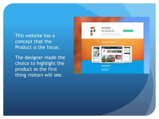
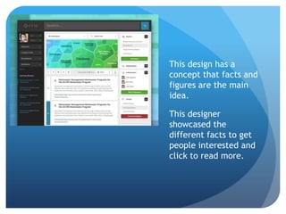
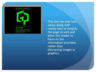
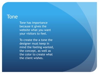
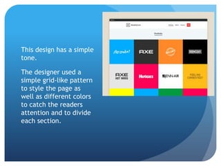
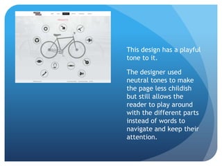
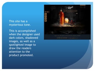
Unsolicited Redesign
Visual Inventory
Created by Amy Benders
Within this presentation you will find a brief description of
concept, color, and tone, along with examples for each.
Each topic is important for a designer to know before
beginning as each impacts the final design heavily.
Without further ado, please enjoy this presentation.
Concept is important for
designers to know
before they begin to
work. Different
concepts mean that
different choices must
be made.
Concept
This website has a
concept that the
Product is the focus.
The designer made the
choice to highlight the
product as the first
thing visitors will see.
This design has a
concept that facts and
figures are the main
idea.
This designer
showcased the
different facts to get
people interested and
click to read more.
This has the navigation
to different pages as
the focus.
The designer used
images of the the
models to catch peoples
attention and allow
people to click and be
redirected to read more
about the model.
Color
Color is also important to
think about, as if the
client wants a specific
palette then the design
might change to include
more or less of each color
along with which color to
highlight with.
This designer used a
palette of three
colors to simplify and
highlight what they
wished to show.
Instead of any specific
or solid color, this
designer choose to use
images to get people
interested in the site.
This site has only two
colors along with
mostly text to simplify
the page as well and
allow the reader to
focus on the
information provided,
rather than
distracting images or
graphics.
Tone
Tone has importance
because it gives the
website what you want
your visitors to feel.
To create the a tone the
designer must keep in
mind the feeling wanted,
the concept, as well as
the color to create what
the client wishes.
This design has a simple
tone.
The designer used a
simple grid-like pattern
to style the page as
well as different colors
to catch the readers
attention and to divide
each section.
This design has a playful
tone to it.
The designer used
neutral tones to make
the page less childish
but still allows the
reader to play around
with the different parts
instead of words to
navigate and keep their
attention.
This site has a
mysterious tone.
This is accomplished
when the designer used
dark colors, shadowed
images, as well as a
spotlighted image to
draw the readers
attention to the
product promoted.
These were just a few ideas of what
could be done for your website.
Which do you think would fit well
with what you had in mind?
The next step would be an follow-up
call to discuss what ideas and
brainstorms you have come up with.
We’re eager to hear everything you
think of, thank you for your time and I
am looking forward to hearing from
you.
Images are not owned by me
and are from dribbble.com

Unsolicited redesign visual inventory

  • 1.
  • 2.
    Within this presentationyou will find a brief description of concept, color, and tone, along with examples for each. Each topic is important for a designer to know before beginning as each impacts the final design heavily. Without further ado, please enjoy this presentation.
  • 3.
    Concept is importantfor designers to know before they begin to work. Different concepts mean that different choices must be made. Concept
  • 4.
    This website hasa concept that the Product is the focus. The designer made the choice to highlight the product as the first thing visitors will see.
  • 5.
    This design hasa concept that facts and figures are the main idea. This designer showcased the different facts to get people interested and click to read more.
  • 6.
    This has thenavigation to different pages as the focus. The designer used images of the the models to catch peoples attention and allow people to click and be redirected to read more about the model.
  • 7.
    Color Color is alsoimportant to think about, as if the client wants a specific palette then the design might change to include more or less of each color along with which color to highlight with.
  • 8.
    This designer useda palette of three colors to simplify and highlight what they wished to show.
  • 9.
    Instead of anyspecific or solid color, this designer choose to use images to get people interested in the site.
  • 10.
    This site hasonly two colors along with mostly text to simplify the page as well and allow the reader to focus on the information provided, rather than distracting images or graphics.
  • 11.
    Tone Tone has importance becauseit gives the website what you want your visitors to feel. To create the a tone the designer must keep in mind the feeling wanted, the concept, as well as the color to create what the client wishes.
  • 12.
    This design hasa simple tone. The designer used a simple grid-like pattern to style the page as well as different colors to catch the readers attention and to divide each section.
  • 13.
    This design hasa playful tone to it. The designer used neutral tones to make the page less childish but still allows the reader to play around with the different parts instead of words to navigate and keep their attention.
  • 14.
    This site hasa mysterious tone. This is accomplished when the designer used dark colors, shadowed images, as well as a spotlighted image to draw the readers attention to the product promoted.
  • 15.
    These were justa few ideas of what could be done for your website. Which do you think would fit well with what you had in mind?
  • 16.
    The next stepwould be an follow-up call to discuss what ideas and brainstorms you have come up with. We’re eager to hear everything you think of, thank you for your time and I am looking forward to hearing from you. Images are not owned by me and are from dribbble.com