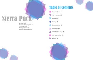
Sierra Pack’s
Design Portfolio
801-550-1580
sierrajanedesigns@gmail.com
1290 Regal Way
Saratoga Springs, UT
www.sierrajanedesigns.com
Sierra Pack
Table of Contents
Magazine Cover 3
Prezi Presentation 5
Photodesign 7
Montage 9
Business Identity 11
Infographic 13
HTML & CSS Coding 15
Web Page Mockup 17
Brochure 19
Magazine CoverDescription
A magazine cover that is all about ME! I wanted to describe myself through my various articles
while keeping the overall style minimalistic and very pleasing to the eye.
Date
May 4, 2016
Programs
Photoshop, InDesign, and Illustrator
Objective
Create an eye catching magazine cover incorporating high quality images with eye catching
article titles to intrigue the audience into grabbing my magazine off the shelf.
Process
I knew from the very beginning that I wanted the title of my magazine to have to do with
Motherhood since that is my first and most important title that I hold. I started out my design
process by researching magazine covers. I chose to stick to one typeface for the majority of my
text, taking advantage of multiple font weights, and then throwing in a second typeface for a
couple little accents. I then thought about what I wanted my articles to be about. After initial
research, the process of creating my cover went like so: sketched out possible layouts, created a
shape map in InDesign of a possible idea, digitized my title, decided on what picture I wanted
to use and extracted the image from the background in Photoshop and made it black and white,
placed it in InDesign, added my article titles, created my Wedding Anniversary icon in Illustrator
and placed it in InDesign. I then received critiques and completed multiple revisions, the most
important one being the drop shadow that I added to my title and name to help them be more
legible as well as adusting my Anniversary icon to be more easily read.
Prezi Presentation
Description
A presentation created in Prezi on education systems around the World.
Date
May 12, 2016
Programs
Prezi
Objective
Create an instructional, visual presentation with 15 frames, a catchy title, and use a
graphic on each slide.
Process
I spent some time exploring various Prezi projects to learn what Prezi was capable of. I wanted
to do my presentation on education around the world because I liked the idea of having a world
map and zooming in on specific countries. I purchased a world map vector that I could
manipulate and change the color of the countries I chose to highlight. I researched education
around the world and wrote a list of facts on some of the best and worst education systems. (I
initially chose 12 different countries but as I was creating my project, I decided to do multiple
different slides for each country which caused me to need to eliminate some of the other coun-
tries.) I then got to work in Prezi, adding my background and placing content and images within
each country that I wanted to emphasize. I did a frame at the end of the entire world with text
crediting the source of my icons. I originally had one icon that was created by a different
designer that didn’t mesh as well with the rest of the other icons and it was also pixelated so I
switched that out. It was also pointed out in a critique that the color red I had for Mexico
blended too much with the flag and made the red on the Mexico flag hard to see. I decided to
change it to a green color that was found in the center of the flag.
PhotodesignDescription
A photo illustrating that no matter how little you are, or how insignificant you feel, you can, and
will, make a difference in this world.
Date
May 19, 2016
Programs
Photoshop and Illustrator
Objective
Create a design that includes your own original, quality image, with a consistent color scheme
based on that image, some text, and a few design elements.
Process
Deciding on my image took some time but I’m always inspired by my baby so I decided to use
him and his cute little feet. After editing the image, I used the eye dropper tool to grab colors
from the photo and placed the hex code into a color scheme generator and played around with
it until I found my desired color scheme that included colors found in my photo. Because my
photo was of feet, I googled baby feet quotes and found the one used in my design. I couldn’t
find the author of the quote though. I wanted a design element that matched the photo, I didn’t
want to just insert a random shape, that’s when I thought of doing little feet and I could
incorporate my color scheme into them. It’s always nice to get an outside view on a design
because, as the designer, I never struggle with reading the text because I know what it’s
supposed to say. In a critique, I was informed that the text was a little hard to see and read
because of the light colors, so I added a slight drop shadow to my text to help aid in that area.
I didn’t want to darken the image in those areas because it was a nice white background. I was
also told that my original design was a little right-side heavy, and it was suggested to move the
quote to the left side and arrange it so the baby’s toes point toward it. It was also suggested to
add some more content to my design so I moved the quote and added the baby’s name and
birthdate to the top right corner.
MontageDescription
An image depicting the love between a parent and a child and the importance of raising that
child right since they are the future.
Date
May 26, 2016
Programs
Photoshop
Objective
Create a spiritual poster montage using two or more images and type that must be spiri-
tual in nature. Create this montage by using a layer mask to blend the images.
Process
I started out by deciding on a quote. I asked my husband and he sent me multiple ideas of
quotes he thought I would love. This was the quote that stuck out to me. I started searching
through free images that I felt would fit my theme. I liked the idea of having the earth and a
mom and child somehow within the earth. Once I found the images that I liked, I opened them
up in Photoshop and started blending. I used multiple layer masks and the brush tool in order to
get the blending effect that I desired. I added my quote and because it was hard to read I tried
to add some white behind it to make it easier. I received feedback saying I had too many words
in my second font and it was slightly distracting. It was also suggested to refine some edges
more, particularly the white I used to have behind my text, but I ended up removing that after
receiving critiques. It was also conveyed to me that my draft was the wrong size and needed to
be changed and by fixing my size issue I would have more room to fit my text and also make it
easier to read my quote. It was also suggested to choose one phrase from my quote to change
the font on in order to highlight it so I chose the phrase that I wanted to stick out the most. If the
viewer was to read only one part of the quote, I wanted it to be that phrase, and it matched well
with the images too.
Business Identity
Description
Professional logo, business card, and letter head using a motif of gold dots because
I like things fancy.
Date
June 4, 2016
Programs
Illustrator & InDesign
Objective
Design a logo, business card, and letterhead creating a visual identity across
all documents.
Process
First I thought of ideas and sketched options for my logo. I created digital renderings of various
logo options. I realized that each of my logos needed a different color scheme and fonts so I
made two new logos. I got critiques and votes and decided to go with my typographical logo,
mostly because I loved the motif of the gold dot. I then created my business card and letterhead.
My gold dot was too fancy apparently because it made InDesign extremely slow and took me
hours to do some things that only should have taken an hour. I received some really good
critiques that really helped to refine my work. My business card had a black background on
one side and it wasn’t unified and consistent enough with the whole design that I made both
sides white.
InfographicDescription
An infographic with some fun, random facts about traveling that can inspire you to want to
travel more.
Date
June 8, 2016
Programs
Illustrator & InDesign
Objective
Create an infographic that organizes data in a visually pleasing way.
Process
I started brainstorming some topics and I originally wanted to do an infographic on child sleep,
but I struggled figuring out how I wanted to represent the data. After spending lots of time
researching children’s sleep, I switched my focus to fun travel facts and started researching that
instead. I found 5 fun facts that provided specific data that I thought would be good for the
infographic. I chose travel because I already had some free use graphics that I could use that fit
that theme. Next I opened up Illustrator and started on my Infographic. I created the pie charts
and organized the other graphics to help organize all the data.
HTML & CSSDescription
A basic coded website to show the design process of a logo.
Date
June 16, 2016
Programs
Photoshop
Objective
Code a basic, custom webpage with HTML and CSS to display the logo project.
Process
I resized my logo and determined all of the images that I wanted to use on my webpage. Using
Brackets Text Editor, I got to work on my HTML file, adding my content and necessary tags. I then
worked on my CSS file and linked it to my HTML file. I created necessary classes in order to
customize my content accordingly. I embedded the Google Fonts that I wanted to use and added
the necessary CSS code. I created my background by creating an image in Adobe Illustrator with
the same gold swatch as my logo. Once done, I validated all of my code. I updated my original
design by taking my instructor’s advice and removing the thin, black stroke around the body.
And for the H1 (the black bar), I removed the rounded edges and instead, just used a regular
rectangle so the edges sat flush.
Webpage Mockup
Description
A webpage mockup for a web and graphic designer.
Date
June 23, 2016
Programs
Photoshop & Illustrator
Objective
Design a website home page, full fidelity mockup using a grid.
Process
I decided I wanted to create a website mockup for myself using the logo I created in a previous
project. I sketched up some ideas, I knew I wanted to include what I do and the tools I use. I
jumped into Photoshop and created a wireframe of my idea using a 12-column grid. I then got
to work on my mockup adding actual content and images and came up with my final design. I
received a few critiques from my best friend Nate. He helped me realize that I had a lot of space
for my navigation bar and that I could shrink it down and so I did. He also wasn’t a big fan of
my gold, “What I Do” circles, I’m not sure if I’m a big fan of them either. I was trying to match
the logo but I think I may end up changing the colors of those circles. I updated my mockup by
adjusting text and icon spacing and colors.
BrochureDescription
A brochure for an event catering bakery showcasing their delicious homemade baked goods and
treats and pricing for your special event.
Date
July 7, 2016
Programs
InDesign, Illustrator, & Photoshop
Objective
Design a two-sided brochure for a company.
Process
I started out by brainstorming ideas and looking up various, unique brochure designs. After
deciding on a subject direction and brochure size, I did the math to determine the sizes of each
fold. I then opened up InDesign and set up my brochure. I wrote my body copy and then added
it into the brochure. I found images of cookies and opened them up in Photoshop to cut the
backgrounds out. I placed the images into my brochure and played with my layout and
backgrounds until I reached my desired design. I received critiques on my brochure. After
printing it, a great idea was presented, of making the cookies in the circles bigger so you only
see the texture from the front and then when you open the brochure, you see the whole cookie,
so I tried to make that update but InDesign wouldn’t allow me to copy and paste and I ran
out of time.

Sierra Pack's Portfolio

  • 1.
  • 2.
    801-550-1580 sierrajanedesigns@gmail.com 1290 Regal Way SaratogaSprings, UT www.sierrajanedesigns.com Sierra Pack Table of Contents Magazine Cover 3 Prezi Presentation 5 Photodesign 7 Montage 9 Business Identity 11 Infographic 13 HTML & CSS Coding 15 Web Page Mockup 17 Brochure 19
  • 3.
    Magazine CoverDescription A magazinecover that is all about ME! I wanted to describe myself through my various articles while keeping the overall style minimalistic and very pleasing to the eye. Date May 4, 2016 Programs Photoshop, InDesign, and Illustrator Objective Create an eye catching magazine cover incorporating high quality images with eye catching article titles to intrigue the audience into grabbing my magazine off the shelf. Process I knew from the very beginning that I wanted the title of my magazine to have to do with Motherhood since that is my first and most important title that I hold. I started out my design process by researching magazine covers. I chose to stick to one typeface for the majority of my text, taking advantage of multiple font weights, and then throwing in a second typeface for a couple little accents. I then thought about what I wanted my articles to be about. After initial research, the process of creating my cover went like so: sketched out possible layouts, created a shape map in InDesign of a possible idea, digitized my title, decided on what picture I wanted to use and extracted the image from the background in Photoshop and made it black and white, placed it in InDesign, added my article titles, created my Wedding Anniversary icon in Illustrator and placed it in InDesign. I then received critiques and completed multiple revisions, the most important one being the drop shadow that I added to my title and name to help them be more legible as well as adusting my Anniversary icon to be more easily read.
  • 4.
    Prezi Presentation Description A presentationcreated in Prezi on education systems around the World. Date May 12, 2016 Programs Prezi Objective Create an instructional, visual presentation with 15 frames, a catchy title, and use a graphic on each slide. Process I spent some time exploring various Prezi projects to learn what Prezi was capable of. I wanted to do my presentation on education around the world because I liked the idea of having a world map and zooming in on specific countries. I purchased a world map vector that I could manipulate and change the color of the countries I chose to highlight. I researched education around the world and wrote a list of facts on some of the best and worst education systems. (I initially chose 12 different countries but as I was creating my project, I decided to do multiple different slides for each country which caused me to need to eliminate some of the other coun- tries.) I then got to work in Prezi, adding my background and placing content and images within each country that I wanted to emphasize. I did a frame at the end of the entire world with text crediting the source of my icons. I originally had one icon that was created by a different designer that didn’t mesh as well with the rest of the other icons and it was also pixelated so I switched that out. It was also pointed out in a critique that the color red I had for Mexico blended too much with the flag and made the red on the Mexico flag hard to see. I decided to change it to a green color that was found in the center of the flag.
  • 5.
    PhotodesignDescription A photo illustratingthat no matter how little you are, or how insignificant you feel, you can, and will, make a difference in this world. Date May 19, 2016 Programs Photoshop and Illustrator Objective Create a design that includes your own original, quality image, with a consistent color scheme based on that image, some text, and a few design elements. Process Deciding on my image took some time but I’m always inspired by my baby so I decided to use him and his cute little feet. After editing the image, I used the eye dropper tool to grab colors from the photo and placed the hex code into a color scheme generator and played around with it until I found my desired color scheme that included colors found in my photo. Because my photo was of feet, I googled baby feet quotes and found the one used in my design. I couldn’t find the author of the quote though. I wanted a design element that matched the photo, I didn’t want to just insert a random shape, that’s when I thought of doing little feet and I could incorporate my color scheme into them. It’s always nice to get an outside view on a design because, as the designer, I never struggle with reading the text because I know what it’s supposed to say. In a critique, I was informed that the text was a little hard to see and read because of the light colors, so I added a slight drop shadow to my text to help aid in that area. I didn’t want to darken the image in those areas because it was a nice white background. I was also told that my original design was a little right-side heavy, and it was suggested to move the quote to the left side and arrange it so the baby’s toes point toward it. It was also suggested to add some more content to my design so I moved the quote and added the baby’s name and birthdate to the top right corner.
  • 6.
    MontageDescription An image depictingthe love between a parent and a child and the importance of raising that child right since they are the future. Date May 26, 2016 Programs Photoshop Objective Create a spiritual poster montage using two or more images and type that must be spiri- tual in nature. Create this montage by using a layer mask to blend the images. Process I started out by deciding on a quote. I asked my husband and he sent me multiple ideas of quotes he thought I would love. This was the quote that stuck out to me. I started searching through free images that I felt would fit my theme. I liked the idea of having the earth and a mom and child somehow within the earth. Once I found the images that I liked, I opened them up in Photoshop and started blending. I used multiple layer masks and the brush tool in order to get the blending effect that I desired. I added my quote and because it was hard to read I tried to add some white behind it to make it easier. I received feedback saying I had too many words in my second font and it was slightly distracting. It was also suggested to refine some edges more, particularly the white I used to have behind my text, but I ended up removing that after receiving critiques. It was also conveyed to me that my draft was the wrong size and needed to be changed and by fixing my size issue I would have more room to fit my text and also make it easier to read my quote. It was also suggested to choose one phrase from my quote to change the font on in order to highlight it so I chose the phrase that I wanted to stick out the most. If the viewer was to read only one part of the quote, I wanted it to be that phrase, and it matched well with the images too.
  • 7.
    Business Identity Description Professional logo,business card, and letter head using a motif of gold dots because I like things fancy. Date June 4, 2016 Programs Illustrator & InDesign Objective Design a logo, business card, and letterhead creating a visual identity across all documents. Process First I thought of ideas and sketched options for my logo. I created digital renderings of various logo options. I realized that each of my logos needed a different color scheme and fonts so I made two new logos. I got critiques and votes and decided to go with my typographical logo, mostly because I loved the motif of the gold dot. I then created my business card and letterhead. My gold dot was too fancy apparently because it made InDesign extremely slow and took me hours to do some things that only should have taken an hour. I received some really good critiques that really helped to refine my work. My business card had a black background on one side and it wasn’t unified and consistent enough with the whole design that I made both sides white.
  • 8.
    InfographicDescription An infographic withsome fun, random facts about traveling that can inspire you to want to travel more. Date June 8, 2016 Programs Illustrator & InDesign Objective Create an infographic that organizes data in a visually pleasing way. Process I started brainstorming some topics and I originally wanted to do an infographic on child sleep, but I struggled figuring out how I wanted to represent the data. After spending lots of time researching children’s sleep, I switched my focus to fun travel facts and started researching that instead. I found 5 fun facts that provided specific data that I thought would be good for the infographic. I chose travel because I already had some free use graphics that I could use that fit that theme. Next I opened up Illustrator and started on my Infographic. I created the pie charts and organized the other graphics to help organize all the data.
  • 9.
    HTML & CSSDescription Abasic coded website to show the design process of a logo. Date June 16, 2016 Programs Photoshop Objective Code a basic, custom webpage with HTML and CSS to display the logo project. Process I resized my logo and determined all of the images that I wanted to use on my webpage. Using Brackets Text Editor, I got to work on my HTML file, adding my content and necessary tags. I then worked on my CSS file and linked it to my HTML file. I created necessary classes in order to customize my content accordingly. I embedded the Google Fonts that I wanted to use and added the necessary CSS code. I created my background by creating an image in Adobe Illustrator with the same gold swatch as my logo. Once done, I validated all of my code. I updated my original design by taking my instructor’s advice and removing the thin, black stroke around the body. And for the H1 (the black bar), I removed the rounded edges and instead, just used a regular rectangle so the edges sat flush.
  • 10.
    Webpage Mockup Description A webpagemockup for a web and graphic designer. Date June 23, 2016 Programs Photoshop & Illustrator Objective Design a website home page, full fidelity mockup using a grid. Process I decided I wanted to create a website mockup for myself using the logo I created in a previous project. I sketched up some ideas, I knew I wanted to include what I do and the tools I use. I jumped into Photoshop and created a wireframe of my idea using a 12-column grid. I then got to work on my mockup adding actual content and images and came up with my final design. I received a few critiques from my best friend Nate. He helped me realize that I had a lot of space for my navigation bar and that I could shrink it down and so I did. He also wasn’t a big fan of my gold, “What I Do” circles, I’m not sure if I’m a big fan of them either. I was trying to match the logo but I think I may end up changing the colors of those circles. I updated my mockup by adjusting text and icon spacing and colors.
  • 11.
    BrochureDescription A brochure foran event catering bakery showcasing their delicious homemade baked goods and treats and pricing for your special event. Date July 7, 2016 Programs InDesign, Illustrator, & Photoshop Objective Design a two-sided brochure for a company. Process I started out by brainstorming ideas and looking up various, unique brochure designs. After deciding on a subject direction and brochure size, I did the math to determine the sizes of each fold. I then opened up InDesign and set up my brochure. I wrote my body copy and then added it into the brochure. I found images of cookies and opened them up in Photoshop to cut the backgrounds out. I placed the images into my brochure and played with my layout and backgrounds until I reached my desired design. I received critiques on my brochure. After printing it, a great idea was presented, of making the cookies in the circles bigger so you only see the texture from the front and then when you open the brochure, you see the whole cookie, so I tried to make that update but InDesign wouldn’t allow me to copy and paste and I ran out of time.