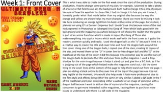
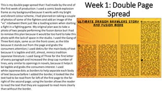
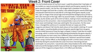
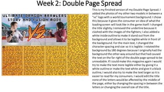
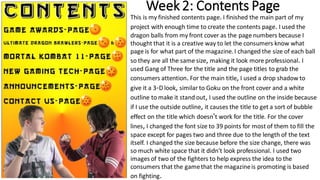
2. Week1: Front Cover This is what I was able to create on the first week since the start of the production. During
production, I had to change some parts of my plan; for example, I planned to take a photo
of a forest or flat field to use ads the background but I had to change it to a mix of colours
because of how the weather has been like, I had to change it to hoe you see it now; I,
honestly, prefer what I had made better than my original idea because the way the
orange and yellow are shown helps my main character stand out more by making it look
like he is producing an orange light from his body at the centre of the page. For my text, I
planned on using CF Le Dernier Empereur but I couldn't use this because none of the text
had appeared in Photoshop so I changed it to Gang of Three which looks good with the
background and the magazine as a whole because it still shows the reader that the game
is part of an anime franchise which is made in Japan; the Gang of Three also
makeseverything into capital letters which works well with the front cover as it grabs the
readers attention quickly and easily. I used the dragon balls as the "o" because I think it is
a creative way to create the title and cover lines and have the dragon balls around the
fron cover. Using one of the dragon balls, I copied one of the stars, creating to copies of
the star, and moved them to the "O" in cover line for free dragon ball and the "D" in the
masthead at the top of the cover; I did this because it is a creative way to use the stars of
the dragon balls to decorate the title and cover lines on the magazine. I used a drop
shadow for the main image because it helps it stand out and give him a 3-D look, as if he
is popping out of the page which helped make the magazine stand out; I did the same
thing to the cover lines at the bottom of the page to help them stand out from the page. I
plan on adding a black outline to the cover line at the top of the page because it is not
very legible at the moment, this would also help make it look more professional due to
the font style and effects being either the same or very similar. I added a QR code in the T
of the masthead and I plan on creating either a website or an image of someone with a
dragon ball because I want to add an idea of mystery to the magazine, causing the
consumers to get more interested in the magazines, causing them to purchase more
issues to understand why there is a QR code in the magazine.
3. Week 1: Double Page
Spread
This is my double page spread that I had made by the end of
the first week of production.I used a comic book explosion
frame as my backgroundbecause it works with my bright
and vibrant colourscheme, I had plannedon taking a couple
of photos of some of the fighters and add an image of the
"vs" inbetween them just like a loadingscreen when starting
a fight in a fighting game. My original plan was to take a
photo of two people performing the fusion dance but I had
to remove this plan because it would be too hard to take this
photo with the lack of space in the studio. I used the Gang of
Three font style, same as on the front cover, as the title
because it standsout from the page and grabs the
consumers attention;I used dekiru for the main body of text
because it is legible and still, almost, mimics tradition
Japanese literature.I used Gang of Three for the first letter
of every paragraphand increased the drop cap number of
lines, very similarto openingsin novels, because it helpsit
be legible and grabs the consumers interest. I used
white Japanesedots as borders to help separate each body
of text because before I added the border, it looked like the
text had to be read from far left of the first page to the far
right of the second page; using the border allowsthe reader
to read the text that they are supposed to read more clearly
than without the border.
4. Week 2: Front Cover
This my finished version of my front cover. I used the photosthat I had taken of
my models as a way to promote the game detailsand the game awards; for my
game awardsmodel, I set the four star dragon ball in between his hands to
make the dragon ball look like a trophy, I also added the game awards2018 logo
and placed it behind him to look like he is the logo of the game awards, to do
this, I got an image of the actual logo and removed the background so all that is
left is the main part of the logo. With my second model, I moved the QR code to
his hip, by the darker parts of his shirt to hide it, making it more interesting and
mysteriousto the consumers. I also increased Goku's size so he fills more of the
front cover and making it more eye-catching for the consumers. For the cover
lines, I changed the outline so it is outside the text so it pops out of the
magazine and doesn't fall intothe dark colours of my model's clothing. If I could
do this again,I would probablyremove the game awardslogo from my game
awardsmodel because of how the logo is shaped, it doesn't look like my model
has wings, which is similar to the trophy being promoted by the game awards. I
would also give my main cover line a different colourscheme because while it
fits with the colourscheme of the background, I believeit would have looked
better using a similareffects as the background with a similarcolourscheme, I
think that doing this would make the cover line more interesting and eye-
catching for my consumers. I would also add a drop shadow to the other dragon
ballsaround the background(the two and three star dragon balls) so that they
pop out of the magazine and give them a 3-D effect just like Goku.
5. Week 2: DoublePage Spread
This is my finished version of my Double Page Spread. I
added the photosof my other two models in between a
"vs" logo with a world tournament background.I chose
this because it gives the consumer an idea of what the
loadingscreen will look like in the game itself. I changed
the title slightly, I removed the underline because it
clashed with the images of the fighters; I also added a
white inside outlineto make it stand out from the
background and allowsit to be legible while in front of
the background. For the main text, I changed the
characterspacing and size so it is legible. I rotated the
background by 180 degrees because I originallyhad the
background the other way around but that had caused
the text on the far right of the double page spread to be
unreadable.If I could make this magazine again I would
try to make the text more legible either by giving it a
white outlineor make the text white and give it a black
outline,I would also try to make the text larger so it is
easier to read for my consumers. I would edit the title
none of the letters would be affected by the middle of
the page, either by changing the spacing in between the
letters or changing the overallsize of the title.
6. Week 2: Contents Page
This is my finished contents page. I finished the main part of my
project with enough time to create the contents page. I used the
dragon balls from my front cover as the page numbers because I
thought that it is a creative way to let the consumers know what
page is for what part of the magazine. I changed the size of each ball
so they are all the same size, making it look more professional. I
used Gang of Three for the title and the page titles to grab the
consumers attention. For the main title, I used a drop shadow to
give it a 3-D look, similar to Goku on the front cover and a white
outline to make it stand out, I used the outline on the inside because
if I use the outside outline, it causes the title to get a sort of bubble
effect on the title which doesn't work for the title. For the cover
lines, I changed the font size to 39 points for most of them to fill the
space except for pages two and three due to the length of the text
itself. I changed the size because before the size change, there was
so much white space that it didn't look professional. I used two
images of two of the fighters to help express the idea to the
consumers that the gamethat the magazineis promoting is based
on fighting.