Download to read offline


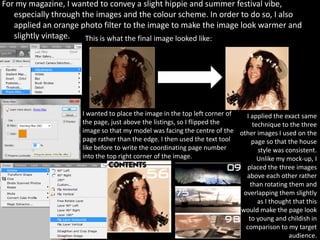

The document describes the process of designing a magazine contents page in Photoshop. Key steps included: 1) Choosing a background color by sampling from the front cover and applying it at low opacity. 2) Using lines and text boxes to layout the page structure and listings. Fonts and sizing were used to distinguish headings from subheadings. 3) Adding images from a photo shoot and editing them to match the design's color scheme and style. 4) Finalizing details like page numbers, addresses and slogans to complete the contents page design.


