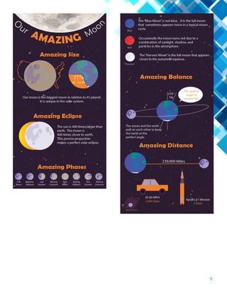
Here are a few trends from August that we released in September:
- Overall inquiry volumes fell less than 1%.
- In Philadelphia, programs with the fastest growing job postings are ALL in health care and health sciences.
- Surprisingly, Certificate programs outperformed the higher level degrees in the most recent quarter.
- Student demand for on-campus higher education programs dropped 17% year-over-year.
- The ten largest programs produced 22% of the total completions in 2015.
- Distance education completions have increased 24% since 2013.
7 Alternatives to Bullet Points in PowerPointAlvis Oh
So you tried all the ways to beautify your bullet points on your pitch deck but it just got way uglier. These points are supposed to be memorable and leave a lasting impression on your audience. With these tips, you'll no longer have to spend so much time thinking how you should present your pointers.
White wonder, Work developed by Eva TschoppMansi Shah
White Wonder by Eva Tschopp
A tale about our culture around the use of fertilizers and pesticides visiting small farms around Ahmedabad in Matar and Shilaj.
You could be a professional graphic designer and still make mistakes. There is always the possibility of human error. On the other hand if you’re not a designer, the chances of making some common graphic design mistakes are even higher. Because you don’t know what you don’t know. That’s where this blog comes in. To make your job easier and help you create better designs, we have put together a list of common graphic design mistakes that you need to avoid.
Book Formatting: Quality Control Checks for DesignersConfidence Ago
This presentation was made to help designers who work in publishing houses or format books for printing ensure quality.
Quality control is vital to every industry. This is why every department in a company need create a method they use in ensuring quality. This, perhaps, will not only improve the quality of products and bring errors to the barest minimum, but take it to a near perfect finish.
It is beyond a moot point that a good book will somewhat be judged by its cover, but the content of the book remains king. No matter how beautiful the cover, if the quality of writing or presentation is off, that will be a reason for readers not to come back to the book or recommend it.
So, this presentation points designers to some important things that may be missed by an editor that they could eventually discover and call the attention of the editor.
Can AI do good? at 'offtheCanvas' India HCI preludeAlan Dix
Invited talk at 'offtheCanvas' IndiaHCI prelude, 29th June 2024.
https://www.alandix.com/academic/talks/offtheCanvas-IndiaHCI2024/
The world is being changed fundamentally by AI and we are constantly faced with newspaper headlines about its harmful effects. However, there is also the potential to both ameliorate theses harms and use the new abilities of AI to transform society for the good. Can you make the difference?
Unleash Your Inner Demon with the "Let's Summon Demons" T-Shirt. Calling all fans of dark humor and edgy fashion! The "Let's Summon Demons" t-shirt is a unique way to express yourself and turn heads.
https://dribbble.com/shots/24253051-Let-s-Summon-Demons-Shirt
2. 3
Daniel Wilson:
555 S. Main St
Pima, AZ 85543
928 · 792 · 6284
daniel@dwstuido.design
5 Brochure
7 Montage
9 Info Graphic
11 Business Card
13 Invitation
15 Magazine
17 Prezi
19 Logos
21 Business Identity
23 Coding
25 Web Mockpup
27 Photo Design
CONTACT CONTENTS
3. 5
Description:
A complex hexagon shape folding brochure.
Date:
11/30/16
Course/Instructor:
Comm 130 Section 13
Sarah Tranberg
Program(s)/Tools:
Adobe InDesign
Adobe Photoshop
Adobe Illustrator
Objectives:
Size and optimize an original logo as a .png for the brochure.
Link a Photoshop file with a background cut-out and wrap
the text
Learn paragraph styling for InDesign.
Process:
I started by creating the logo in Illustrator. I kept that
simple. I then created a hexagon layout in InDesign and
combined them into groups of three. This gave place for
background images, one of which was a Photoshop file
wherein I had removed the background. Now I could
enter the text and wrap it around the cut out picture. I
intentionally broke the rules of typography by adding a few
bold colored placed and going with center justified text in
the hexagon. It looked better and reviewed better so I went
with it. It took some work to get the folding sequence right
but it was worth it.
BROCHURE
4. 7
MONTAGE
Description:
An inspirational montage made by the blending of two or
more images, and the use of typography. One image is an
original.
Date:
10/19/16
Course/Instructor:
Comm 130 Section 13
Sarah Tranberg
Program(s)/Tools:
Adobe Photoshop
Sony Cybershot Camera
Objectives:
Learn to manage Photoshop layers.
Learn to blend images together smoothly, using masks.
Use filters.
Apply appropriate typography.
Process:
I started off by taking an image of the moon with my point
and shoot camera. Then I cropping the image to a 1:1 ratio
and added a masking layer for blending. Upon finding
an image of Christ and an image of the milky way that fit
together nicely I made the milky way the background added
a blending mask to the picture of Christ for blending. With
black paint and a 100% opacity, soft-edged brush, I painted
away the hard image edges. With a larger black brush at
30% opacity and 30% flow, I blended the image into the
background, so it looks like he is melting into the scene. I
finally added some type with two contrasting fonts and I
added a transparent layer style to some text to make the text
a transparent glow for emphasis.
5. 9
Description:
An collection of graphics representing facts on a subject of
personal interest.
Date:
11/2/16
Course/Instructor:
Comm 130 Section 13
Sarah Tranberg
Program(s)/Tools:
Adobe Illustrator
Objectives:
Learn basic illustrator skills.
Learn how to use the adobe pen tool.
Create custom graphics.
Incorporate a chart graphic.
Learn layout techniques.
Process:
I found a picture of the moon that was very detailed and
used it for the header. Then I divided the design into several
categories. This gave me the structure so I could focus on
the content under each category. I first created the moon
graphic with the pen tool and this became a repeating
theme. Repeating and scaling it made the design work. This
lead to the creation of an earth graphic that tied the design
all together. I placed a field of stars for the background and
masked it with a muted color to makes sure the content was
the focus.
INFO GRAPHIC
6. 11
Description:
An collection of graphics representing facts on a subject of
personal interest.
Date:
11/2/16
Course/Instructor:
Comm 130 Section 13
Sarah Tranberg
Program(s)/Tools:
Adobe Illustrator
Objectives:
Learn basic illustrator skills.
Learn how to use the adobe pen tool.
Create custom graphics.
Incorporate a chart graphic.
Learn layout techniques.
Process:
I found a picture of the moon that was very detailed and
used it for the header. Then I divided the design into several
categories. This gave me the structure so I could focus on
the content under each category. I first created the moon
graphic with the pen tool and this became a repeating
theme. Repeating and scaling it made the design work. This
lead to the creation of an earth graphic that tied the design
all together. I placed a field of stars for the background and
masked it with a muted color to makes sure the content was
the focus.
BUSINESS CARD
7. 13
Description:
A personalized photo design invitation
Date:
12/5/16
Course/Instructor:
Comm 130 Section 13
Sarah Tranberg
Program(s)/Tools:
Adobe Photoshop
Objectives:
Find, scan and import several high-quality image.
Create a collage type layout.
Apply text with a layer mask effect.
Process:
I was given the images by the client. I created a new image
in Photoshop and arranged the images in collage fashion.
Then I applied a new layer of white with 70% opacity. Then
I added the different texts. I adjusted the shallow blending
of the text to create the transparent effect.
INVITATION
8. 15
Description:
An collection of graphics representing facts on a subject of
personal interest.
Date:
11/2/16
Course/Instructor:
Comm 130 Section 13
Sarah Tranberg
Program(s)/Tools:
Adobe Illustrator
Objectives:
Learn basic illustrator skills.
Learn how to use the adobe pen tool.
Create custom graphics.
Incorporate a chart graphic.
Learn layout techniques.
Process:
I found a picture of the moon that was very detailed and
used it for the header. Then I divided the design into several
categories. This gave me the structure so I could focus on
the content under each category. I first created the moon
graphic with the pen tool and this became a repeating
theme. Repeating and scaling it made the design work. This
lead to the creation of an earth graphic that tied the design
all together. I placed a field of stars for the background and
masked it with a muted color to makes sure the content was
the focus.
MAGAZINE
9. 17
PREZI
Description:
An interactive info graph on the Prezi platform.
Project URL: https://prezi.com/lsj0af-uy8tx/tips-for-raising-
teens/
Date:
10/5/16
Course/Instructor:
Comm 130 Section 13
Sarah Tranberg
Program(s)/Tools:
Adobe InDesign
Prezi Presentation Platform
Objectives:
Learn InDesign Layout
Apply appropriate typography.
Process:
I designed the entire slide in Adobe InDesign. I found a
free graphic of a teenager online and used that for the center.
That lead to the creation of the tips around the circle. User
rule guides I placed the circles in proportion to each other.
Placing an image that coordinated with the tip in each circle
was next. Finally, I added a bright sunshine background for
happy contrast. The slide being finished, I then imported it
10. 19
LOGOS
Description:
Three logo variations for the same company.
Date:
10/27/16
Course/Instructor:
Comm 130 Section 13
Sarah Tranberg
Program(s)/Tools:
Adobe Illustrator
Objectives:
Create a variety of logos to fit a company or personal image.
Use the basic tools of Illustrator.
Process:
This was really fun to create a logo in Illustrator. I used a
vector graphic of a family silhouette for the first logo. The
font Centaur worked well to blend the two together. The
other two logos were made with both text and the pen tool
to make the shapes. Most of the other elements are just
typography, which I balanced with the scale of the graphics.
I also tried getting some more contrast by changing the sizes
of the words.
11. 21
Description:
Matching letterhead and business card designed using a
personally created logo.
Date:
10/27/16
Course/Instructor:
Comm 130 Section 13
Sarah Tranberg
Program(s)/Tools:
Adobe InDesign
Objectives:
Create a new logo to fit a company or personal image.
Design consistent layouts for a business card and letterhead.
Use the basic tools of Illustrator & InDesign.
Process:
I used the rectangle tool to create the front and back out-
line of my business card. I then copied/pasted the logo and
contact information onto this page. I used the back of the
card to simply display the company logo in a clean design.
The front of the card uses a portrait and has contact info. The
margins are all uniform. The stationary uses both the compa-
ny logo and the deign pattern of the business card.
BUSINESS IDENTITY
12. 23
Description:
A web page designed to showcase a personally created logo.
Date:
11/16/16
Course/Instructor:
Comm 130 Section 13
Sarah Tranberg
Program(s)/Tools:
Adobe Brackets Text Editor
CSS / HTML
Objectives:
Size and optimize an original logo as a .png for a web page.
Write content to describe the process of creating your logo and how
it appeals to a target audience.
Design a web page using HTML to display a logo and content.
Acquire a working knowledge of HTML and basic understanding
of CSS.
Identify hex colors for web design.
Compress multiple files in a zipped folder to attach as one file.
Process:
I created this web page using only Adobe Brackets. After I marked
up all my content and inserted my image, I attached a pre-made
CSS document to my HTML. I then used the colors from my logo
as the colors for my web page. I found these colors by opening
Photoshop and using the hex code in the color palette. I also
changed my fonts to Times New Roman. I declared some backup
fonts just in case the viewer’s browser didn’t have these fonts. I
made a visual walk through using images of the design process.
I also incorporated a hand draw look with some script text in the
Reenie Beanie font along with a hand drawn arrow graphic that
was incorporated into my list.
CODING
13. 25
Description:
An collection of graphics representing facts on a subject of
personal interest.
Date:
11/2/16
Course/Instructor:
Comm 130 Section 13
Sarah Tranberg
Program(s)/Tools:
Adobe Illustrator
Objectives:
Learn basic illustrator skills.
Learn how to use the adobe pen tool.
Create custom graphics.
Incorporate a chart graphic.
Learn layout techniques.
Process:
I found a picture of the moon that was very detailed and
used it for the header. Then I divided the design into several
categories. This gave me the structure so I could focus on
the content under each category. I first created the moon
graphic with the pen tool and this became a repeating
theme. Repeating and scaling it made the design work. This
lead to the creation of an earth graphic that tied the design
all together. I placed a field of stars for the background and
masked it with a muted color to makes sure the content was
the focus.
WEB MOCKUP
14. 27
Description:
A personally taken photograph that has been edited/
formatted using Photoshop, with graphics added.
Date:
10/27/16
Course/Instructor:
Comm 130 Section 13
Sarah Tranberg
Program(s)/Tools:
Sony Cybershot Camera
Adobe Photoshop
Objectives:
Learn basic photography skills.
Use a digital camera to take a quality image, then download
it.
Size and crop the image.
Adjust image brightness, contrast, hue and saturation levels.
Use a selection tool to isolate a portion of the image.
De saturate the selected portion of the image.
Use a filter or colorize a portion of the image.
Add a custom text design.
Process:
I took this picture using my little Sony Cybershot digital
camera at the County Fair. Even though it was a point and
shoot camera I was able to take this nice shot. I then took
my image into Photoshop and cropped it to. I then used
the image adjustment tools to make the picker a bit more
vibrant. Then I used the color picker tool to make the text
colors match the red comb of the rooster.
PHOTO DESIGN