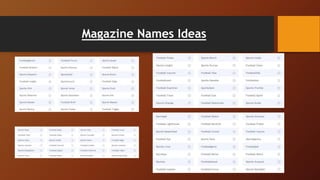
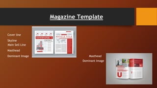
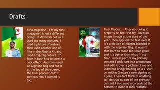
Magazine
By Karim Katouche
Magazine Names Ideas
Photography for Front Cover Ideas
Photography for Double Page Spread Ideas
Main Sell Line Ideas
• Algeria Triumph Senegal to Win
• Afcon 2019 triumph made
‘exceptional’ Mahrez believe in his
quality – Man City boss Guardiola
• Algeria crowned Africa Cup of
Nations champion after beating
Senegal
Sell Lines and Sub-lines Ideas
• The champions sport and football.
• African Champions
• Afcon Winners
• Winners of AFCON
Magazine Examples and Inspirations
Double Page Spread Examples Ideas
Magazine Template
Masthead
Dominant Image
Cover line
Skyline
Main Sell Line
Masthead
Dominant Image
Magazine Font Ideas
Production Log
Intro slide
I will be creating a print magazine as I
think it is going out of trend and I would
prefer my magazine to be printed and
held it in hand, my target audience will
be around 12 years old to about 65, their
hobbies and interests will be sport,
football and any type of ball sport, they
would read my magazine to keep up-to-
date on all new information about
football rumours scores fixtures and
general information in the football world.
The social grade could be for anyone as
football is watched by almost everyone.
Inspiration slide
After exploring front cover in double page
spreads I learnt quite a lot from my
research, I wanted to follow the codes and
conventions and make my magazine
similar to 443. Because I think the
magazine set out is how I like the
magazine and I would want mine to look
like that. I also do it for to meet the
audience expectations as I am making it
for sport based audience but also wanted
to stand out I did not do it exactly like
443.
Drafts
First Magazine – For my first
magazine I tried a different
design, it did work out as I
used too many pictures, I
used a picture of Mahrez
then used another one of
him in the Algeria Kit and
used a zig-zag cut-out, to
fade in both kits to create a
cool effect. And then used
an Algerian flag and out it
at the top of the screen,
the final product didn’t
turn out how I wanted it
too.
Final Product – After not doing it
properly on the first try I used an
image I made at the start of the
year, then applied the text over it,
it’s a picture of Mahrez blended in
with the Algerian flag, it wasn’t
that hard to make but looks good
and it’s better than what I first
tried, also as part of my primary
content I took part in a photoshoot
and edit it over a picture of me and
Stamford Bridge holding up a T-shirt
on veiling Chelsea‘s new signing as
a joke, I couldn’t think of anything
so I do that as part of the primary
content I also used a barcode at the
bottom to make it look realistic.
Double Page Spread
For my double page spread, I found a picture of a player celebrating
since he was on the left part of the screen I put the title, header and
text on the right part, for the text I made it as close of the kit and flag
as possible with the green, red and white, I used the rest of the text
as black as it makes the “BOUNJAH” more appealing, I also made the
black text smaller as it makes the rest look bigger, for my double page
spread I didn’t wanna do too much I wanted to make it look simple and
similar to the magazine cover, I wanted the main highlight of it to be
the picture and not too much text, there were only three layers, the
image, the title and the small text. I didn’t have any effect on the
picture and I thought it looked good the way it is. The image is classed
as secondary content as I found online And did not contain any
copyright issues.
Primary Content
I completed a photoshoot behind the green screen, I believe they are
suitable for my magazine as they are primary content and not contain any
copyright issues, for the audience appeal I think it’s a nice touch for the
magazine to have a small image it’s not too much light colour and dark
colour I think the green reflects the green on the bigger image of the
magazine and goes along nicely, it goes along with the genre as it is football-
themed and goes along with the purpose as well as it is informing the
audience of what is happening.
Thought illustrations and graphics I didn’t do much of that, but I did add an
effect on the front cover for the image to look a little more vibrant I used
bevel and emboss, I added in a shadow and glow colour overlay, as well as a
drop shadow.
Analysing the aesthetic qualities of the content I created I think it would be
appealing for the audience to look at as it is appropriate on the sports genre,
As well as the colour scheme being white green and red quite a vibrant
colours and at the viewers' attention.
Secondary content
All my secondary content was checked for copyright and
according to my research, I could use most of it under fair use.
I searched for a good couple of hours all over Google images to
look for the best pictures I could find, The best one I could find
was a player celebrating on the left side meaning I could put
my text on my title wall on the right side as done in most
magazines, for the source as I couldn’t find an exact link but
this is what I searched into Google ‘Algeria afcon win 2019’.
For the aesthetic look, The picture I chose goes along with all
of the genre and the purpose of the magazine, With the player
being on the left side of the screen at a diagonal tilt I was able
to put my text and title on the top right as he was facing in the
top left and with the very blurry Background it takes all focus
away from the background and put it on the player on the text
making it more appealing for the audience. On the image is
exactly what my magazines is about so it goes on perfectly.
Legal and Ethical issues
The only legal or ethical issues that might occur or copyright could come in many
ways through pictures or even my primary content if I were to be wearing
something copyrighted, looking through all of my work and analysing my magazine I
believe that none of my primary or secondary content has copyright issues and
everything should be good.
Analyse the aesthetic and technical qualities of the visual content it comes across
really eye-catching not only that but it is appropriate based on my genre my target
audience and the purpose of my magazine, I couldn’t have chosen a better image to
use for my double page spread and front cover
Prepare content
Preparing the images and print I had to resize my magazine cover and
images and cropping them correctly as well as making sure nothing
was extorted on my front cover, I made all levels of the font the same
size so none of it would be chunky or opposite to each other, to make
sure spelling and grammar was not wrong for my double page spread
are used an app called Grammarly where I posted my working to and
it automatically gives me a correct product. And when selecting the
appropriate file format sizes and the image quality for my visual
material at work took most of my time, I spent quite a long time
looking for images with good resolution for my double page spread, as
many images were good quality but not clear enough and want a good
resolution for it to be a double-page spread at one point I thought
about going half and half using two images but in the end, I found a
good image.
Final design

Making a Magazine

  • 1.
  • 2.
  • 3.
  • 4.
    Photography for DoublePage Spread Ideas
  • 5.
    Main Sell LineIdeas • Algeria Triumph Senegal to Win • Afcon 2019 triumph made ‘exceptional’ Mahrez believe in his quality – Man City boss Guardiola • Algeria crowned Africa Cup of Nations champion after beating Senegal
  • 6.
    Sell Lines andSub-lines Ideas • The champions sport and football. • African Champions • Afcon Winners • Winners of AFCON
  • 7.
  • 8.
    Double Page SpreadExamples Ideas
  • 9.
    Magazine Template Masthead Dominant Image Coverline Skyline Main Sell Line Masthead Dominant Image
  • 10.
  • 11.
  • 12.
    Intro slide I willbe creating a print magazine as I think it is going out of trend and I would prefer my magazine to be printed and held it in hand, my target audience will be around 12 years old to about 65, their hobbies and interests will be sport, football and any type of ball sport, they would read my magazine to keep up-to- date on all new information about football rumours scores fixtures and general information in the football world. The social grade could be for anyone as football is watched by almost everyone.
  • 13.
    Inspiration slide After exploringfront cover in double page spreads I learnt quite a lot from my research, I wanted to follow the codes and conventions and make my magazine similar to 443. Because I think the magazine set out is how I like the magazine and I would want mine to look like that. I also do it for to meet the audience expectations as I am making it for sport based audience but also wanted to stand out I did not do it exactly like 443.
  • 14.
    Drafts First Magazine –For my first magazine I tried a different design, it did work out as I used too many pictures, I used a picture of Mahrez then used another one of him in the Algeria Kit and used a zig-zag cut-out, to fade in both kits to create a cool effect. And then used an Algerian flag and out it at the top of the screen, the final product didn’t turn out how I wanted it too. Final Product – After not doing it properly on the first try I used an image I made at the start of the year, then applied the text over it, it’s a picture of Mahrez blended in with the Algerian flag, it wasn’t that hard to make but looks good and it’s better than what I first tried, also as part of my primary content I took part in a photoshoot and edit it over a picture of me and Stamford Bridge holding up a T-shirt on veiling Chelsea‘s new signing as a joke, I couldn’t think of anything so I do that as part of the primary content I also used a barcode at the bottom to make it look realistic.
  • 15.
    Double Page Spread Formy double page spread, I found a picture of a player celebrating since he was on the left part of the screen I put the title, header and text on the right part, for the text I made it as close of the kit and flag as possible with the green, red and white, I used the rest of the text as black as it makes the “BOUNJAH” more appealing, I also made the black text smaller as it makes the rest look bigger, for my double page spread I didn’t wanna do too much I wanted to make it look simple and similar to the magazine cover, I wanted the main highlight of it to be the picture and not too much text, there were only three layers, the image, the title and the small text. I didn’t have any effect on the picture and I thought it looked good the way it is. The image is classed as secondary content as I found online And did not contain any copyright issues.
  • 16.
    Primary Content I completeda photoshoot behind the green screen, I believe they are suitable for my magazine as they are primary content and not contain any copyright issues, for the audience appeal I think it’s a nice touch for the magazine to have a small image it’s not too much light colour and dark colour I think the green reflects the green on the bigger image of the magazine and goes along nicely, it goes along with the genre as it is football- themed and goes along with the purpose as well as it is informing the audience of what is happening. Thought illustrations and graphics I didn’t do much of that, but I did add an effect on the front cover for the image to look a little more vibrant I used bevel and emboss, I added in a shadow and glow colour overlay, as well as a drop shadow. Analysing the aesthetic qualities of the content I created I think it would be appealing for the audience to look at as it is appropriate on the sports genre, As well as the colour scheme being white green and red quite a vibrant colours and at the viewers' attention.
  • 17.
    Secondary content All mysecondary content was checked for copyright and according to my research, I could use most of it under fair use. I searched for a good couple of hours all over Google images to look for the best pictures I could find, The best one I could find was a player celebrating on the left side meaning I could put my text on my title wall on the right side as done in most magazines, for the source as I couldn’t find an exact link but this is what I searched into Google ‘Algeria afcon win 2019’. For the aesthetic look, The picture I chose goes along with all of the genre and the purpose of the magazine, With the player being on the left side of the screen at a diagonal tilt I was able to put my text and title on the top right as he was facing in the top left and with the very blurry Background it takes all focus away from the background and put it on the player on the text making it more appealing for the audience. On the image is exactly what my magazines is about so it goes on perfectly.
  • 18.
    Legal and Ethicalissues The only legal or ethical issues that might occur or copyright could come in many ways through pictures or even my primary content if I were to be wearing something copyrighted, looking through all of my work and analysing my magazine I believe that none of my primary or secondary content has copyright issues and everything should be good. Analyse the aesthetic and technical qualities of the visual content it comes across really eye-catching not only that but it is appropriate based on my genre my target audience and the purpose of my magazine, I couldn’t have chosen a better image to use for my double page spread and front cover
  • 19.
    Prepare content Preparing theimages and print I had to resize my magazine cover and images and cropping them correctly as well as making sure nothing was extorted on my front cover, I made all levels of the font the same size so none of it would be chunky or opposite to each other, to make sure spelling and grammar was not wrong for my double page spread are used an app called Grammarly where I posted my working to and it automatically gives me a correct product. And when selecting the appropriate file format sizes and the image quality for my visual material at work took most of my time, I spent quite a long time looking for images with good resolution for my double page spread, as many images were good quality but not clear enough and want a good resolution for it to be a double-page spread at one point I thought about going half and half using two images but in the end, I found a good image.
  • 20.