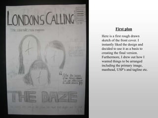
Creating my front cover
First planHere is a first rough drawn sketch of the front cover. I instantly liked the design and decided to use it as a basis to creating the final version. Furthermore, I drew out how I wanted things to be arranged including the primary image, masthead, USP’s and tagline etc.
First stageFollowing on from the original plan, I started creating my front cover. I added the three most important features . I put the masthead on the top, the, band name below the artists and the primary image covering the whole page. I used this picture as it was clear and fitted the whole page without having excess setting/backdrop.
Second stageI started adding more features to the front cover such as the primary lead, ultimate selling point, barcode etcin a stereotypical format.
Third stageAs again, I added more things to my front cover. At this point I thought I was doing verywell and didn’t need to make any changes.
Fourth stageAfter thinking, I realised that I needed to make some changes. Firstly the masthead was not  as bold as it could be so I stretched the masthead to go from the left corner to the right. Therefore I had to re-arrange the barcode, issue date and price. Lastly, the tagline was made to fit across the page in one straight line. But it was too small and had to read so I decided to make it bigger and be in two lines.
Final stageHere is the final version. To make it look more appealing I decided to add some special effects. The USP is lined in a purple line to look good and importantly to contrast against the setting because the white blended in. I also put a purple glow on the box around the ‘free poster’ box to make it stand out and grab the attention of the reader.

Front cover

  • 1.
  • 2.
    First planHere isa first rough drawn sketch of the front cover. I instantly liked the design and decided to use it as a basis to creating the final version. Furthermore, I drew out how I wanted things to be arranged including the primary image, masthead, USP’s and tagline etc.
  • 3.
    First stageFollowing onfrom the original plan, I started creating my front cover. I added the three most important features . I put the masthead on the top, the, band name below the artists and the primary image covering the whole page. I used this picture as it was clear and fitted the whole page without having excess setting/backdrop.
  • 4.
    Second stageI startedadding more features to the front cover such as the primary lead, ultimate selling point, barcode etcin a stereotypical format.
  • 5.
    Third stageAs again,I added more things to my front cover. At this point I thought I was doing verywell and didn’t need to make any changes.
  • 6.
    Fourth stageAfter thinking,I realised that I needed to make some changes. Firstly the masthead was not as bold as it could be so I stretched the masthead to go from the left corner to the right. Therefore I had to re-arrange the barcode, issue date and price. Lastly, the tagline was made to fit across the page in one straight line. But it was too small and had to read so I decided to make it bigger and be in two lines.
  • 7.
    Final stageHere isthe final version. To make it look more appealing I decided to add some special effects. The USP is lined in a purple line to look good and importantly to contrast against the setting because the white blended in. I also put a purple glow on the box around the ‘free poster’ box to make it stand out and grab the attention of the reader.