Evaluation
Your name
Research
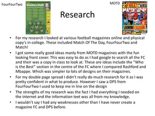
• For my research I looked at various football magazines online and physical
copy's in college. These included Match Of The Day, FourFourTwo and
Match!
• I got some really good ideas manly from MOTD magazines with the fun
looking front cover. This was easy to do as I had google to search all the FC
and their was a copy in class to look at. These are ideas include the “Who
is the Best” section in the centre of the FC where I compared Rashford and
Mbappe. Which was simpler to lots of designs on their magazines.
• For my double page spread I didn’t really do much research for it as I was
pretty confident in what to produce. However I saw a DPS from
FourFourTwo I used to keep me in line on the design
• The strengths of my research was the fact I had everything I needed on
the internet and the information text was all from my knowledge.
• I wouldn’t say I had any weaknesses other than I have never create a
magazine FC and DPS before.
MOTDFourFourTwo
Planning
• My planning didn’t really reflect on the final production as I changed my mind as I was
creating it. Such as Ryan showed me how do download different texts so I used these instead
of what I proposed in my Planning where I said I was just going to use 1 type of texts. Also I
changed/moved a lot of sections that I had on my FC Layout, such as the fact I was going to
use 3 players and compare but in the FP I only used to and made the FC much more compact.
• One of the ideas in my planning I actually used in my FP was the colour scheme with the dark
gold and the bright red, I believe the 2 colours work well with the target audience and the
topic of the magazine as it is fun and exotic.
• For my DPS my planning went well correlated to the FP as I pretty much used everything I
planned in it.
• My strengths of planning this was my passion in football which helped keeping me motivated
for the planning.
• My weakness in my planning for this was the fact I’ve never used Photoshop or made a FC
and DPS for a magazine before so was all very new to me so I couldn’t have planned
something to extreme I would never be able to handle.
Time Management
• I believe I could have improved in my time management as I spent too
much time on my phone/socializing when I should be focusing on my
work. It didn’t hinder my work to much but had a dint in it. As my work
would have improved with additional time. Also I was ill for some of the
time we had on this project which didn’t help. I feel like if I had more time
I could have produced a more stand out DPS as it is very basic
Technical Qualities
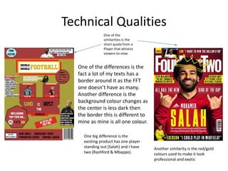
One of the
similarities is the
short quote from a
Player that attracts
viewers to view
One of the differences is the
fact a lot of my texts has a
border around it as the FFT
one doesn’t have as many.
Another difference is the
background colour changes as
the center is less dark then
the border this is different to
mine as mine is all one colour.
Another similarity is the red/gold
colours used to make it look
professional and exotic
One big difference is the
existing product has one player
standing out (Salah) and I have
two (Rashford & Mbappe).
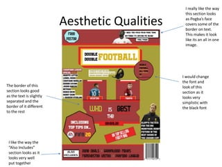
Aesthetic Qualities
I really like the way
this section looks
as Pogba’s face
covers some of the
border on text.
This makes it look
like its an all in one
image.
I like the way the
“Also Includes”
section looks as it
looks very well
put together
The border of this
section looks good
as the text is slightly
separated and the
border of it different
to the rest
I would change
the font and
look of this
section as it
looks very
simplistic with
the black font
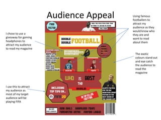
Audience Appeal
I chose to use a
giveaway for gaming
headphones to
attract my audience
to read my magazine
I use this to attract
my audience as
most of my target
audience will be
playing FIFA
The exotic
colours stand out
and eye catch
the audience to
read the
magazine
Using famous
footballers to
attract my
audience as they
would know who
they are and
want to read
about them

PRINT | Evaluation

  • 1.
  • 2.
    Research • For myresearch I looked at various football magazines online and physical copy's in college. These included Match Of The Day, FourFourTwo and Match! • I got some really good ideas manly from MOTD magazines with the fun looking front cover. This was easy to do as I had google to search all the FC and their was a copy in class to look at. These are ideas include the “Who is the Best” section in the centre of the FC where I compared Rashford and Mbappe. Which was simpler to lots of designs on their magazines. • For my double page spread I didn’t really do much research for it as I was pretty confident in what to produce. However I saw a DPS from FourFourTwo I used to keep me in line on the design • The strengths of my research was the fact I had everything I needed on the internet and the information text was all from my knowledge. • I wouldn’t say I had any weaknesses other than I have never create a magazine FC and DPS before. MOTDFourFourTwo
  • 3.
    Planning • My planningdidn’t really reflect on the final production as I changed my mind as I was creating it. Such as Ryan showed me how do download different texts so I used these instead of what I proposed in my Planning where I said I was just going to use 1 type of texts. Also I changed/moved a lot of sections that I had on my FC Layout, such as the fact I was going to use 3 players and compare but in the FP I only used to and made the FC much more compact. • One of the ideas in my planning I actually used in my FP was the colour scheme with the dark gold and the bright red, I believe the 2 colours work well with the target audience and the topic of the magazine as it is fun and exotic. • For my DPS my planning went well correlated to the FP as I pretty much used everything I planned in it. • My strengths of planning this was my passion in football which helped keeping me motivated for the planning. • My weakness in my planning for this was the fact I’ve never used Photoshop or made a FC and DPS for a magazine before so was all very new to me so I couldn’t have planned something to extreme I would never be able to handle.
  • 4.
    Time Management • Ibelieve I could have improved in my time management as I spent too much time on my phone/socializing when I should be focusing on my work. It didn’t hinder my work to much but had a dint in it. As my work would have improved with additional time. Also I was ill for some of the time we had on this project which didn’t help. I feel like if I had more time I could have produced a more stand out DPS as it is very basic
  • 5.
    Technical Qualities One ofthe similarities is the short quote from a Player that attracts viewers to view One of the differences is the fact a lot of my texts has a border around it as the FFT one doesn’t have as many. Another difference is the background colour changes as the center is less dark then the border this is different to mine as mine is all one colour. Another similarity is the red/gold colours used to make it look professional and exotic One big difference is the existing product has one player standing out (Salah) and I have two (Rashford & Mbappe).
  • 6.
    Aesthetic Qualities I reallylike the way this section looks as Pogba’s face covers some of the border on text. This makes it look like its an all in one image. I like the way the “Also Includes” section looks as it looks very well put together The border of this section looks good as the text is slightly separated and the border of it different to the rest I would change the font and look of this section as it looks very simplistic with the black font
  • 7.
    Audience Appeal I choseto use a giveaway for gaming headphones to attract my audience to read my magazine I use this to attract my audience as most of my target audience will be playing FIFA The exotic colours stand out and eye catch the audience to read the magazine Using famous footballers to attract my audience as they would know who they are and want to read about them

Editor's Notes

  • #3 What were the strengths of your research? How did your research help your product? What were the weaknesses of your research? What could you have done better/improve? What effect would this have had on your product?
  • #4 What were the strengths of your planning? How did your planning help your product? What were the weaknesses of your planning? What could you have done better/improve? What effect would this have had on your product?
  • #5 Did you manage your time well? Did you complete your project on time or would your products have improved with additional time? What would you have done if you had more time to produce your work?
  • #6 Compare your work to similar existing products and discuss the similarities and differences Put your final piece(s) in the centre of a page alongside an existing product Use text boxes and arrows
  • #7 Does your work look good? Was it creative? What aspects of your game’s visuals do you like? What would you improve? How would you improve it? Discuss the strengths and weaknesses Put your final piece(s) in the centre of a page and analyse them Use text boxes and arrows
  • #8 How have you appealed to your target audience? What specific bits of content would appeal to your target audience. Refer to your findings from your questionnaire. Put your final piece(s) in the centre of a page and analyse them Use text boxes and arrows