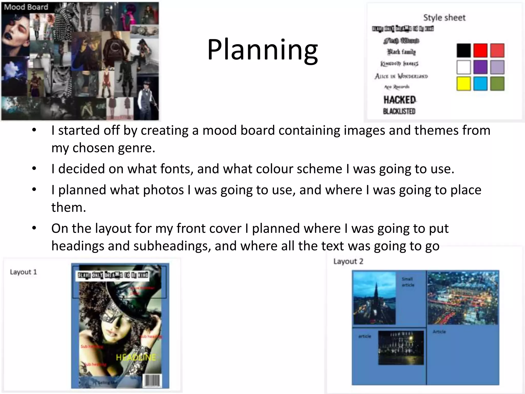
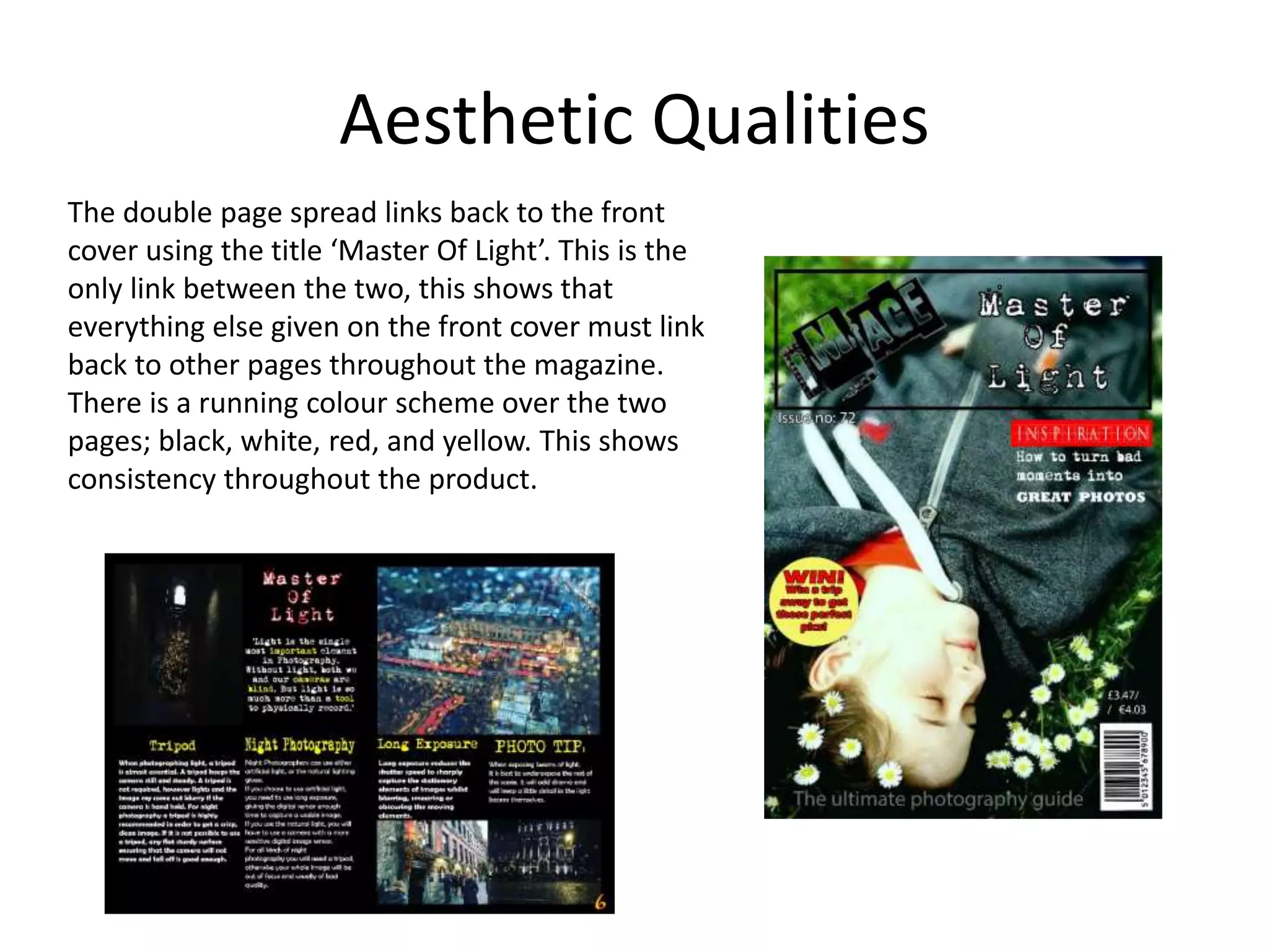
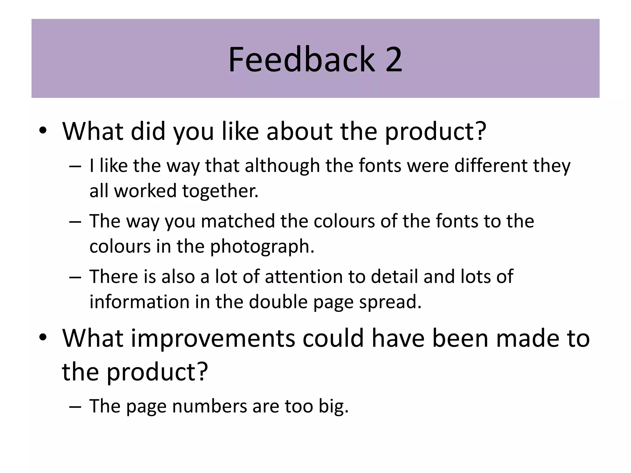
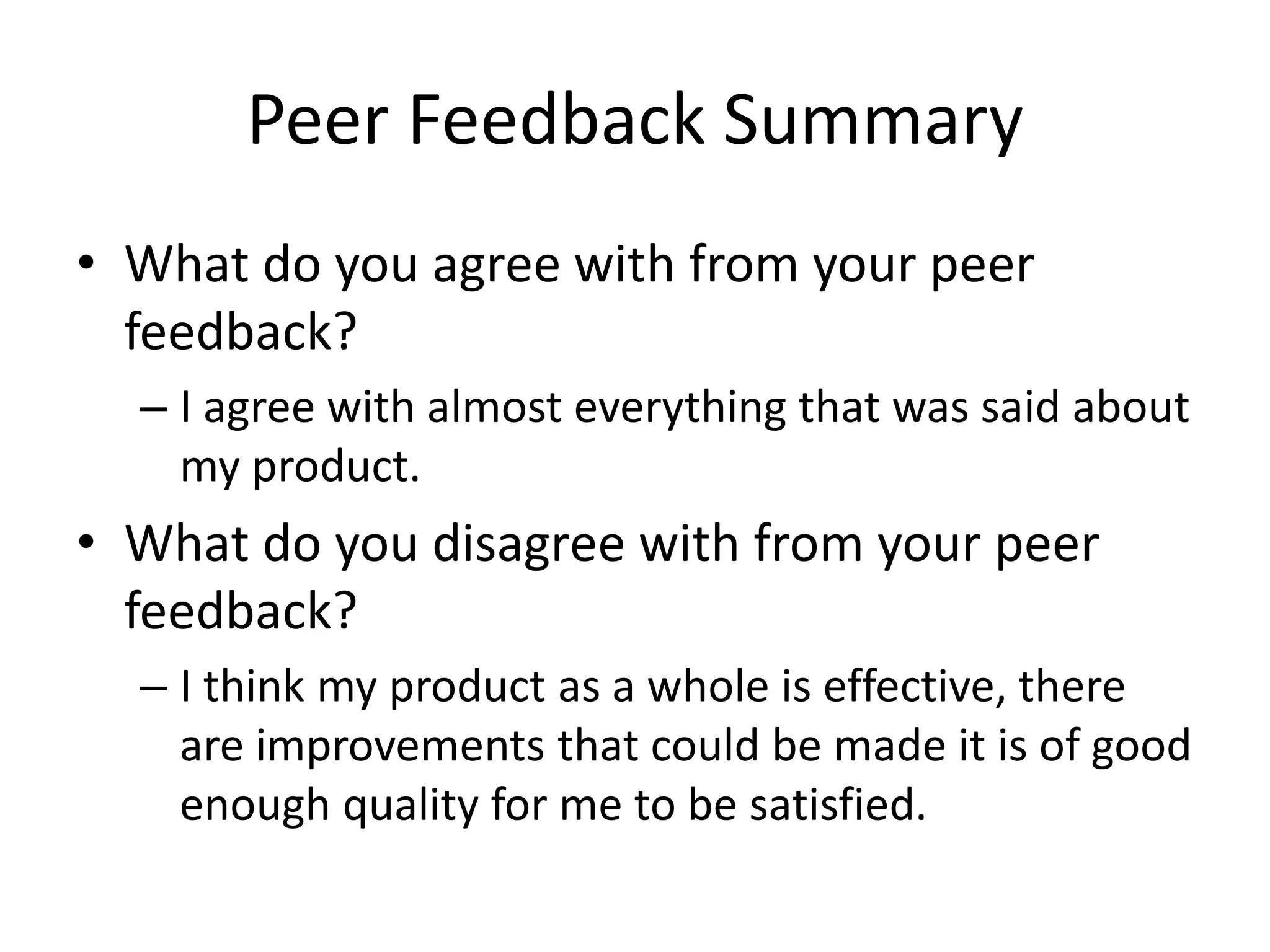
Rhiannah Baker evaluated the production process of her photography magazine by researching existing products, planning layouts and scheduling work, and received feedback noting the vibrant colors and quality images but suggesting improvements to text alignment and page number size.
Francesca Gottschalk - How can education support child empowerment.pptxEduSkills OECD
Francesca Gottschalk from the OECD’s Centre for Educational Research and Innovation presents at the Ask an Expert Webinar: How can education support child empowerment?
Model Attribute Check Company Auto PropertyCeline George
In Odoo, the multi-company feature allows you to manage multiple companies within a single Odoo database instance. Each company can have its own configurations while still sharing common resources such as products, customers, and suppliers.
How to Make a Field invisible in Odoo 17Celine George
It is possible to hide or invisible some fields in odoo. Commonly using “invisible” attribute in the field definition to invisible the fields. This slide will show how to make a field invisible in odoo 17.
Read| The latest issue of The Challenger is here! We are thrilled to announce that our school paper has qualified for the NATIONAL SCHOOLS PRESS CONFERENCE (NSPC) 2024. Thank you for your unwavering support and trust. Dive into the stories that made us stand out!
Introduction to AI for Nonprofits with Tapp NetworkTechSoup
Dive into the world of AI! Experts Jon Hill and Tareq Monaur will guide you through AI's role in enhancing nonprofit websites and basic marketing strategies, making it easy to understand and apply.
Operation “Blue Star” is the only event in the history of Independent India where the state went into war with its own people. Even after about 40 years it is not clear if it was culmination of states anger over people of the region, a political game of power or start of dictatorial chapter in the democratic setup.
The people of Punjab felt alienated from main stream due to denial of their just demands during a long democratic struggle since independence. As it happen all over the word, it led to militant struggle with great loss of lives of military, police and civilian personnel. Killing of Indira Gandhi and massacre of innocent Sikhs in Delhi and other India cities was also associated with this movement.
3. Research
• First I researched 3 already existing products, this helped me to see what
already existed, possibly giving me ideas that I could use in my own
product. It also helped me to know what exists so I won’t accidentally
plagiarise it, and get myself into trouble.
• I looked at what they all had in common, and looked at why they are
needed.
• This helped me to know what I needed to include in my product.
• I also researched existing photography articles to know how I need to style
it, and also what to include
4. Planning
• I started off by creating a mood board containing images and themes from
my chosen genre.
• I decided on what fonts, and what colour scheme I was going to use.
• I planned what photos I was going to use, and where I was going to place
them.
• On the layout for my front cover I planned where I was going to put
headings and subheadings, and where all the text was going to go
5. Time Management
• I created a day to day schedule, on what I was going to do and work on,
this helped me stick to a deadline and to keep myself organised.
• Even though I created a plan of when I was going to do things, not
everything went exactly to plan. For example I ended up spending too
much time on certain things, meaning I got behind on my work; however I
managed to sort myself out and meet the deadlines.
6. Technical Qualities
Both my product and the existing product both contain vibrant colours, the use of
lighting is very prominent in both products.
On the double page spreads, both mine and the existing product used black as the
background colour, and white for the font colour.
Another similarity is that both mine and the existing
double page spread use another colour on the
subheadings to highlight them and make them stand out.
Both double page spreads have a large photo, and a few
smaller ones surrounding the text.
7. Aesthetic Qualities
The double page spread links back to the front
cover using the title ‘Master Of Light’. This is the
only link between the two, this shows that
everything else given on the front cover must link
back to other pages throughout the magazine.
There is a running colour scheme over the two
pages; black, white, red, and yellow. This shows
consistency throughout the product.
8. Audience Appeal
I used basic primary colours throughout my
product to appeal to the targeted male and
female audience.
The simplicity of the cover draws in the audience
to know more about it.
I used a spring photo to also grab the audiences
attention, this is also done by using a young girl
on the cover; this may entice the audience by
reminding them of either themselves, in their
youth, or of someone close to them.
10. Feedback 1
• What did you like about the product?
– The image on the front cover was a high quality, which made the page
effective and professional. The variety of fonts used worked well with
the cover and the style of the cover worked to reflect the genre.
– The double page spread used the colours of the images so using the
mise-en-scene is really effective. The font choice works nicely and the
information is very well written.
• What improvements could have been made to the product?
– The cover could have done with some final touches on the editing of
the ‘Image’ text as the outline could be smoother.
– The conventions of the selling line and issue number are usually in
capitals
– The text in the plug could have used the space more effectively.
11. Feedback 2
• What did you like about the product?
– I like the way that although the fonts were different they
all worked together.
– The way you matched the colours of the fonts to the
colours in the photograph.
– There is also a lot of attention to detail and lots of
information in the double page spread.
• What improvements could have been made to
the product?
– The page numbers are too big.
12. Feedback 3
• What did you like about the product?
– I like how you have used your own images and made
everything fit together. I also like how you have used all
the common conventions for the magazine front cover and
double page spread.
• What improvements could have been made to
the product?
– I think you could improve how the writing on the double
page spread is, the fonts and make everything in line.
13. Peer Feedback Summary
• What do you agree with from your peer
feedback?
– I agree with almost everything that was said about
my product.
• What do you disagree with from your peer
feedback?
– I think my product as a whole is effective, there
are improvements that could be made it is of good
enough quality for me to be satisfied.
14. Peer Feedback Summary
I would use the ruler tool more effectively to ensure that everything is in line and
organised on my double page spread. I would also make my page numbers are
smaller.
On the front cover I would make my ‘image’ text smoother and the edges cleaner.
I would also use the small more effectively in the plug, and follow the conventions of
having the issue number and selling line in capital letters.
Editor's Notes
What were the strengths of your research? How did your research help your product?
What were the weaknesses of your research? What could you have done better/improve? What effect would this have had on your product?
What were the strengths of your planning? How did your planning help your product?
What were the weaknesses of your planning? What could you have done better/improve? What effect would this have had on your product?
Did you manage your time well? Did you complete your project on time or would your products have improved with additional time?
What would you have done if you had more time to produce your work?
Compare your work to similar existing products and discuss the similarities and differences
Put your final piece(s) in the centre of a page alongside an existing product
Use text boxes and arrows
Does your work look good? Was it creative? What aspects of your game’s visuals do you like? What would you improve? How would you improve it?
Discuss the strengths and weaknesses
Put your final piece(s) in the centre of a page and analyse them
Use text boxes and arrows
How have you appealed to your target audience? What specific bits of content would appeal to your target audience.
Refer to your findings from your questionnaire.
Put your final piece(s) in the centre of a page and analyse them
Use text boxes and arrows
What changes would you make to your product based upon your peer feedback and why?