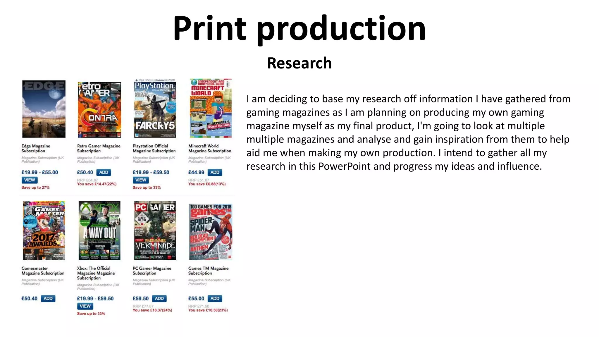
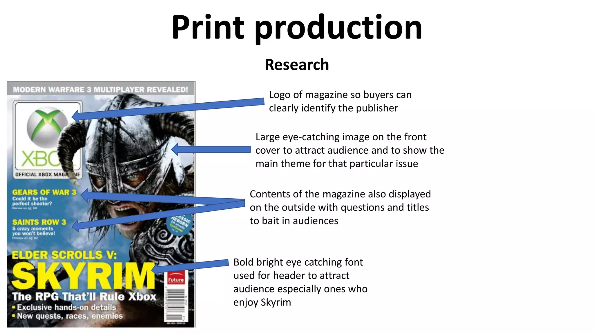
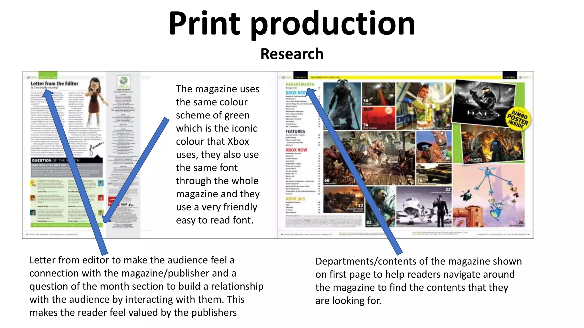
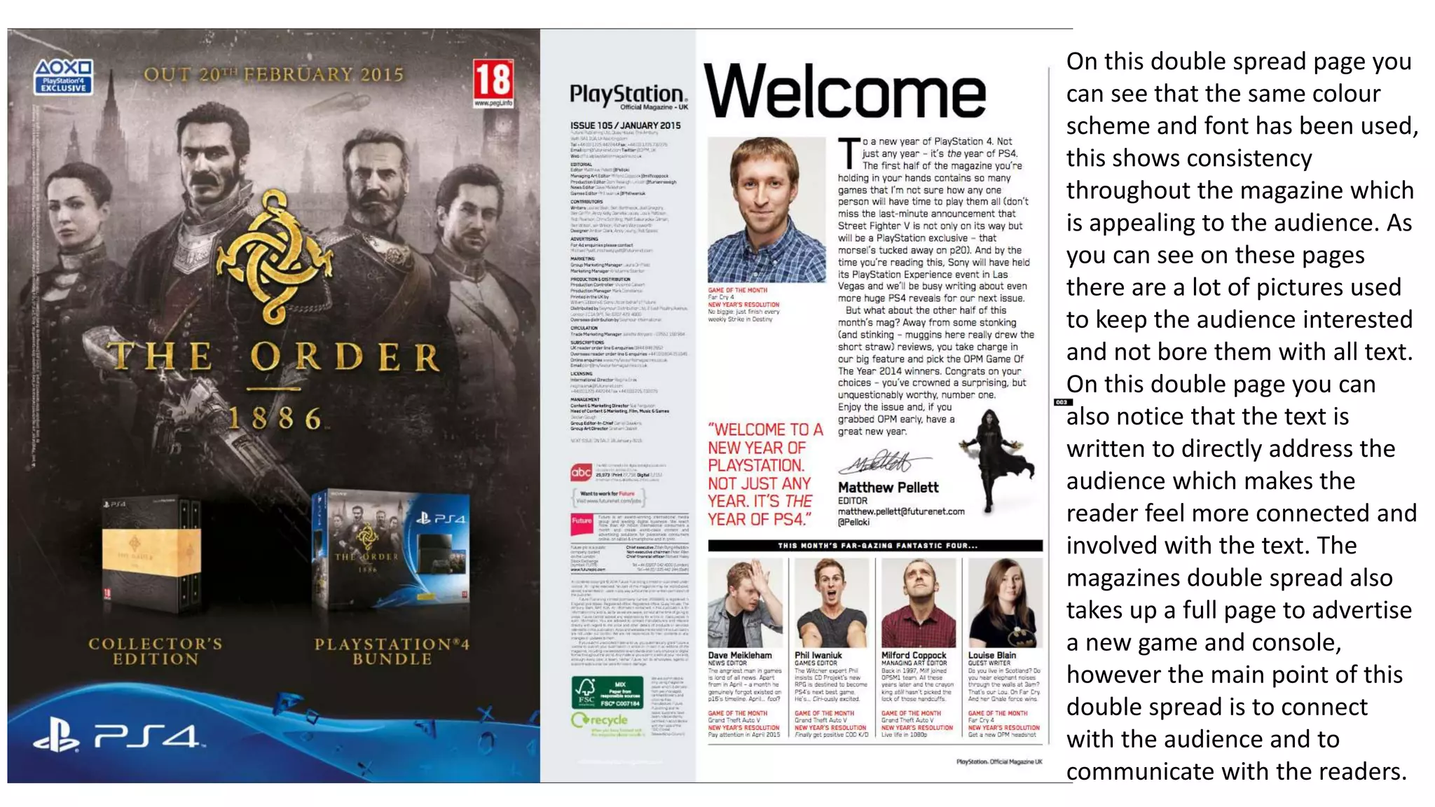
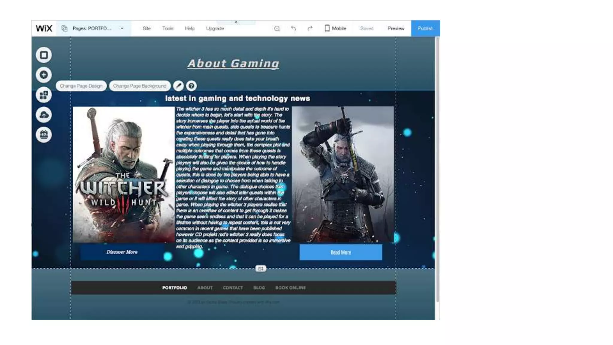
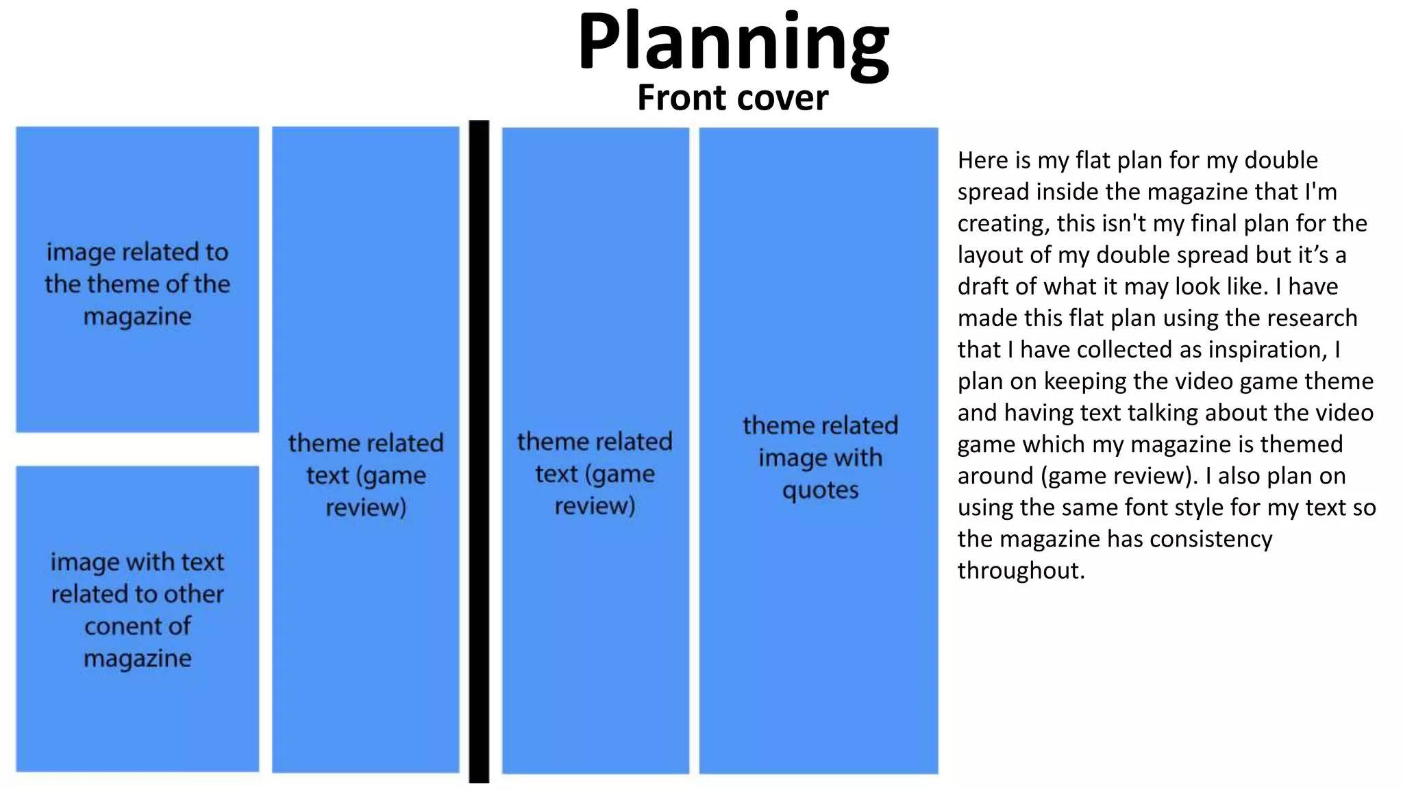
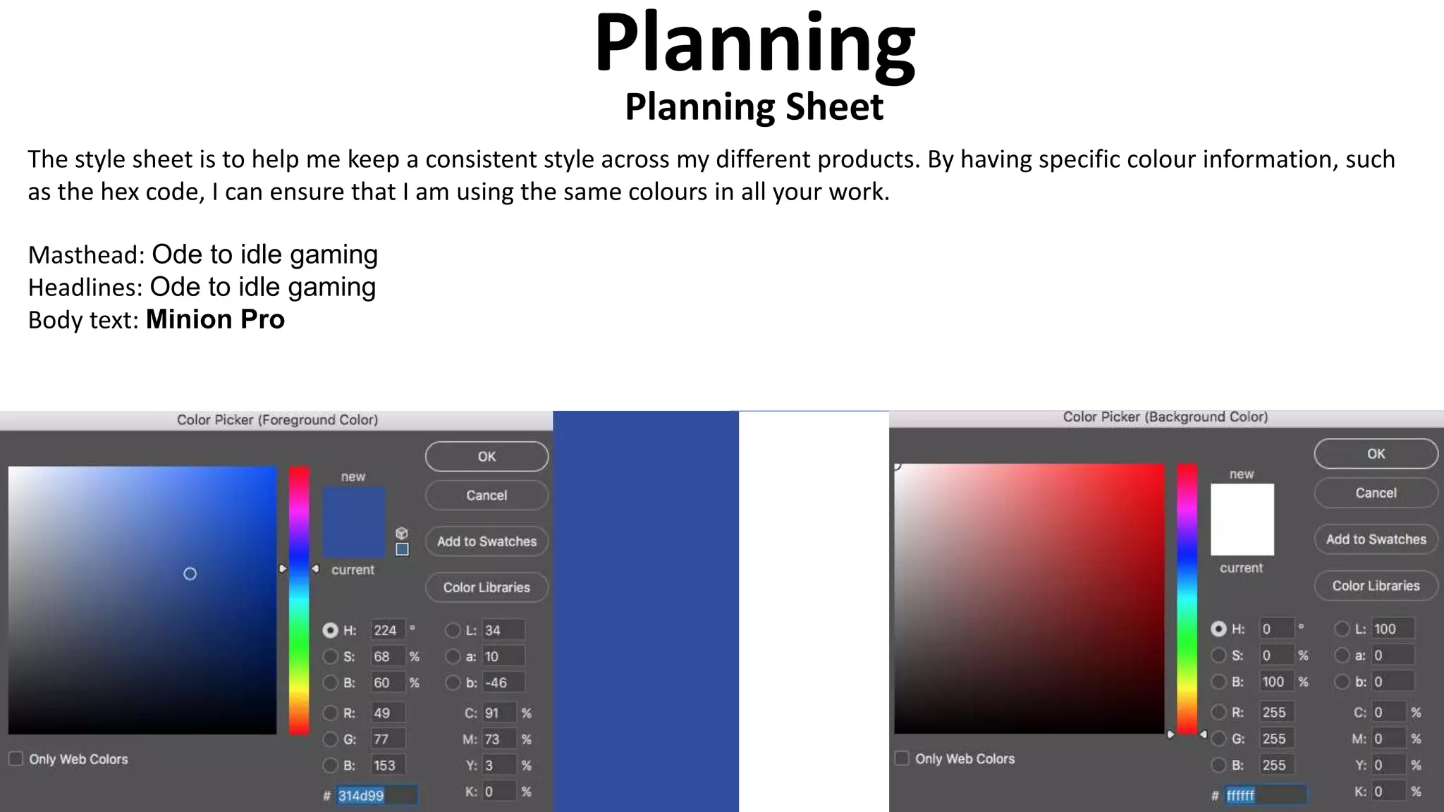
Print production
Print production
Research
I am deciding to base my research off information I have gathered from
gaming magazines as I am planning on producing my own gaming
magazine myself as my final product, I'm going to look at multiple
multiple magazines and analyse and gain inspiration from them to help
aid me when making my own production. I intend to gather all my
research in this PowerPoint and progress my ideas and influence.
Print production
Research
Bold bright eye catching font
used for header to attract
audience especially ones who
enjoy Skyrim
Large eye-catching image on the front
cover to attract audience and to show the
main theme for that particular issue
Logo of magazine so buyers can
clearly identify the publisher
Contents of the magazine also displayed
on the outside with questions and titles
to bait in audiences
Print production
Research
Letter from editor to make the audience feel a
connection with the magazine/publisher and a
question of the month section to build a relationship
with the audience by interacting with them. This
makes the reader feel valued by the publishers
Departments/contents of the magazine shown
on first page to help readers navigate around
the magazine to find the contents that they
are looking for.
The magazine uses
the same colour
scheme of green
which is the iconic
colour that Xbox
uses, they also use
the same font
through the whole
magazine and they
use a very friendly
easy to read font.
Here I looked at the website for the Xbox official magazine, when looking at the website I noticed that the website tried to
follow a colour scheme of green which is the iconic traditional colour scheme that Xbox uses, they also continue to use
friendly easy to read fonts. The website also tries to promote other articles or gaming news that has been published or
covered by Xbox by having the articles on the first page. Xbox has also used a lot of pictures to help promote their articles
on the website, this makes the page seem more appealing to the audience. Another feature that Xbox has added to their
site is the “NEWS” that’s in the top left corner of the pictures, this helps audiences identify what type of posts they are.
Print production
Research
Here is another magazine I have used for research as you can see with this
article the header is up at the top in the largest font on the cover to clearly
show the audience the brand that published the article and so that audiences
can find it easily in the shops when looking for it. The font used for the header
is the iconic traditional font and colour used by PlayStation, this makes the
front page very eye catching for anyone who knows the brand. This magazine
cover also uses contrasting colours to help make the cover look more eye
catching so customers will notice it amongst other magazines. The cover also
features a character from a well known game that audiences had yet to be
released, this attracts an audience due to the hype and interest in the game by
customers. The cover also uses text to bait readers in by intriguing them, this
gives the reader some insight into what's inside the magazine but will only be
able to read it if they purchase it.
On this double spread page you
can see that the same colour
scheme and font has been used,
this shows consistency
throughout the magazine which
is appealing to the audience. As
you can see on these pages
there are a lot of pictures used
to keep the audience interested
and not bore them with all text.
On this double page you can
also notice that the text is
written to directly address the
audience which makes the
reader feel more connected and
involved with the text. The
magazines double spread also
takes up a full page to advertise
a new game and console,
however the main point of this
double spread is to connect
with the audience and to
communicate with the readers.
This is one of the websites which sells the PlayStation official magazine however this one is the official provider as there
isn't a website for the PlayStation official magazine, as you can see the same iconic blue is used for the background of the
header and the text is still directed at the reader along with the friendly fonts used. This site also uses the same
technique as the Xbox website by using a orange box and white text in the top left to categorise the articles for the
reader. The website has also used pictures to attract readers and to make the site look more appealing to an audience
rather than just covering it in text which would bore an audience.
Print production
Research
Here is another magazine cover I have looked at as you can see the main focus
of this cover is around the game “FARCRY 5”. This magazine uses the traditional
header style having it up at the top so customers can identify it easily when its
under or surrounded by other magazines. The magazine has also themed its
front cover around the game “FARCRY 5” to attract the fan base surrounding
this game, you can also see the that the magazine has text on the front to
attract customers who are interested in the advertised information on the
front.
On the first double spread page
you can see that these pages
are dedicated to the contents of
the magazine, this allows the
reader to be able to navigate
around the magazine and
shortcut to certain pages of
interest. You will also notice it
still follows the Farcry 5 theme
boldly showing a Farcry 5
related image in the middle and
having a red theme going
around both pages. This page
also uses pictures to attract
readers to specific pages of the
magazine as if it was to say
those pages are more important
as they are highlighted on the
cover.
As you can see from the website it includes links and front covers of their most recent magazines that they published, the
magazines also have an eye-catching background to get the audiences attention and to click onto the magazine. The website
also has a latest updates section where the most recent news in gaming and technology is published, all articles or magazines
are accompanied with pictures to entice the audience.
Planning
Here I have created a flat plan of my magazine front cover, this allows me
to make a draft layout and rough plans of what I will create my magazine
from cover to look like. I used inspiration from other magazine covers that I
have gained from my research to help me create this flat plan, when
creating my final product I will add more text/images onto the cover to
make it seem more appealing and less bland. I also plan on adding an
appealing colour scheme and use appealing font styles to make my
magazine seem more authentic and visually appealing.
Front cover
PlanningFront cover
Here is my flat plan for my double
spread inside the magazine that I'm
creating, this isn't my final plan for the
layout of my double spread but it’s a
draft of what it may look like. I have
made this flat plan using the research
that I have collected as inspiration, I
plan on keeping the video game theme
and having text talking about the video
game which my magazine is themed
around (game review). I also plan on
using the same font style for my text so
the magazine has consistency
throughout.
PlanningWebsite
Here is my flat plan for my website, I
used the research I gained as
inspiration. The website will include
the same theme and consistency from
the magazines by following the same
colour scheme and font style. The
website will be focused around the
headline but will also advertise other
articles published by the magazine,
this website will also have features to
find other issues published, contact
information and information about the
magazine company itself. 262
Home
Magazines About Contact
Latest Issue
Brief
description
Contact
form
Planning
This planning will hep me organise the pages that I want to make and how I will link my website together
Website planning
Planning
Planning Sheet
The style sheet is to help me keep a consistent style across my different products. By having specific colour information, such
as the hex code, I can ensure that I am using the same colours in all your work.
Masthead: Ode to idle gaming
Headlines: Ode to idle gaming
Body text: Minion Pro
Final DPS
Here is my final DPS I
made this using
Photoshop and in
design. I created the
graphics in Photoshop
like the star reviews, the
logo, the review quotes,
the magazine title and
the image boarders.
Production
https://louisrobinson62.wixsite.com/abo
ut-gaming-mag
Production
WebsiteWebsite
Here is my website which I produced using wix, I made sure to keep to my
website map however my website looks a lot different from my flat plan as I
preferred the template I used, when doing this I made sure to keep my colour
scheme so it looked consistent along with the fonts I used.
Production
Front Cover
Here is my front cover that I produced, I wanted to keep it simple but
also have the page filled by adding a what's inside box along with a
quote that’s inside the magazine from my review. When doing this I
continued to follow the same colour scheme and font so that the
magazine would seem consistent and fit in with the rest of my
products.

Print powerpoint

  • 1.
  • 2.
    Print production Research I amdeciding to base my research off information I have gathered from gaming magazines as I am planning on producing my own gaming magazine myself as my final product, I'm going to look at multiple multiple magazines and analyse and gain inspiration from them to help aid me when making my own production. I intend to gather all my research in this PowerPoint and progress my ideas and influence.
  • 3.
    Print production Research Bold brighteye catching font used for header to attract audience especially ones who enjoy Skyrim Large eye-catching image on the front cover to attract audience and to show the main theme for that particular issue Logo of magazine so buyers can clearly identify the publisher Contents of the magazine also displayed on the outside with questions and titles to bait in audiences
  • 4.
    Print production Research Letter fromeditor to make the audience feel a connection with the magazine/publisher and a question of the month section to build a relationship with the audience by interacting with them. This makes the reader feel valued by the publishers Departments/contents of the magazine shown on first page to help readers navigate around the magazine to find the contents that they are looking for. The magazine uses the same colour scheme of green which is the iconic colour that Xbox uses, they also use the same font through the whole magazine and they use a very friendly easy to read font.
  • 5.
    Here I lookedat the website for the Xbox official magazine, when looking at the website I noticed that the website tried to follow a colour scheme of green which is the iconic traditional colour scheme that Xbox uses, they also continue to use friendly easy to read fonts. The website also tries to promote other articles or gaming news that has been published or covered by Xbox by having the articles on the first page. Xbox has also used a lot of pictures to help promote their articles on the website, this makes the page seem more appealing to the audience. Another feature that Xbox has added to their site is the “NEWS” that’s in the top left corner of the pictures, this helps audiences identify what type of posts they are.
  • 6.
    Print production Research Here isanother magazine I have used for research as you can see with this article the header is up at the top in the largest font on the cover to clearly show the audience the brand that published the article and so that audiences can find it easily in the shops when looking for it. The font used for the header is the iconic traditional font and colour used by PlayStation, this makes the front page very eye catching for anyone who knows the brand. This magazine cover also uses contrasting colours to help make the cover look more eye catching so customers will notice it amongst other magazines. The cover also features a character from a well known game that audiences had yet to be released, this attracts an audience due to the hype and interest in the game by customers. The cover also uses text to bait readers in by intriguing them, this gives the reader some insight into what's inside the magazine but will only be able to read it if they purchase it.
  • 7.
    On this doublespread page you can see that the same colour scheme and font has been used, this shows consistency throughout the magazine which is appealing to the audience. As you can see on these pages there are a lot of pictures used to keep the audience interested and not bore them with all text. On this double page you can also notice that the text is written to directly address the audience which makes the reader feel more connected and involved with the text. The magazines double spread also takes up a full page to advertise a new game and console, however the main point of this double spread is to connect with the audience and to communicate with the readers.
  • 8.
    This is oneof the websites which sells the PlayStation official magazine however this one is the official provider as there isn't a website for the PlayStation official magazine, as you can see the same iconic blue is used for the background of the header and the text is still directed at the reader along with the friendly fonts used. This site also uses the same technique as the Xbox website by using a orange box and white text in the top left to categorise the articles for the reader. The website has also used pictures to attract readers and to make the site look more appealing to an audience rather than just covering it in text which would bore an audience.
  • 9.
    Print production Research Here isanother magazine cover I have looked at as you can see the main focus of this cover is around the game “FARCRY 5”. This magazine uses the traditional header style having it up at the top so customers can identify it easily when its under or surrounded by other magazines. The magazine has also themed its front cover around the game “FARCRY 5” to attract the fan base surrounding this game, you can also see the that the magazine has text on the front to attract customers who are interested in the advertised information on the front.
  • 10.
    On the firstdouble spread page you can see that these pages are dedicated to the contents of the magazine, this allows the reader to be able to navigate around the magazine and shortcut to certain pages of interest. You will also notice it still follows the Farcry 5 theme boldly showing a Farcry 5 related image in the middle and having a red theme going around both pages. This page also uses pictures to attract readers to specific pages of the magazine as if it was to say those pages are more important as they are highlighted on the cover.
  • 11.
    As you cansee from the website it includes links and front covers of their most recent magazines that they published, the magazines also have an eye-catching background to get the audiences attention and to click onto the magazine. The website also has a latest updates section where the most recent news in gaming and technology is published, all articles or magazines are accompanied with pictures to entice the audience.
  • 13.
    Planning Here I havecreated a flat plan of my magazine front cover, this allows me to make a draft layout and rough plans of what I will create my magazine from cover to look like. I used inspiration from other magazine covers that I have gained from my research to help me create this flat plan, when creating my final product I will add more text/images onto the cover to make it seem more appealing and less bland. I also plan on adding an appealing colour scheme and use appealing font styles to make my magazine seem more authentic and visually appealing. Front cover
  • 14.
    PlanningFront cover Here ismy flat plan for my double spread inside the magazine that I'm creating, this isn't my final plan for the layout of my double spread but it’s a draft of what it may look like. I have made this flat plan using the research that I have collected as inspiration, I plan on keeping the video game theme and having text talking about the video game which my magazine is themed around (game review). I also plan on using the same font style for my text so the magazine has consistency throughout.
  • 15.
    PlanningWebsite Here is myflat plan for my website, I used the research I gained as inspiration. The website will include the same theme and consistency from the magazines by following the same colour scheme and font style. The website will be focused around the headline but will also advertise other articles published by the magazine, this website will also have features to find other issues published, contact information and information about the magazine company itself. 262
  • 16.
    Home Magazines About Contact LatestIssue Brief description Contact form Planning This planning will hep me organise the pages that I want to make and how I will link my website together Website planning
  • 17.
    Planning Planning Sheet The stylesheet is to help me keep a consistent style across my different products. By having specific colour information, such as the hex code, I can ensure that I am using the same colours in all your work. Masthead: Ode to idle gaming Headlines: Ode to idle gaming Body text: Minion Pro
  • 18.
    Final DPS Here ismy final DPS I made this using Photoshop and in design. I created the graphics in Photoshop like the star reviews, the logo, the review quotes, the magazine title and the image boarders. Production
  • 19.
    https://louisrobinson62.wixsite.com/abo ut-gaming-mag Production WebsiteWebsite Here is mywebsite which I produced using wix, I made sure to keep to my website map however my website looks a lot different from my flat plan as I preferred the template I used, when doing this I made sure to keep my colour scheme so it looked consistent along with the fonts I used.
  • 20.
    Production Front Cover Here ismy front cover that I produced, I wanted to keep it simple but also have the page filled by adding a what's inside box along with a quote that’s inside the magazine from my review. When doing this I continued to follow the same colour scheme and font so that the magazine would seem consistent and fit in with the rest of my products.