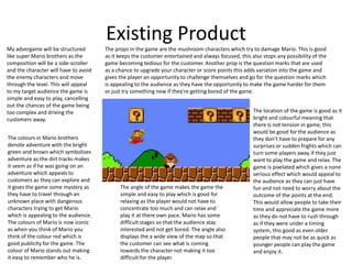
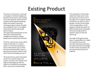
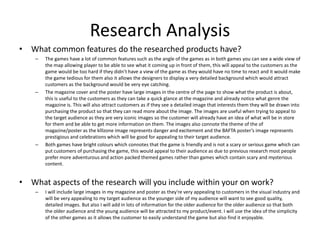
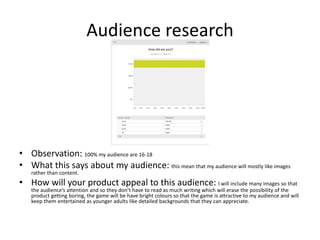
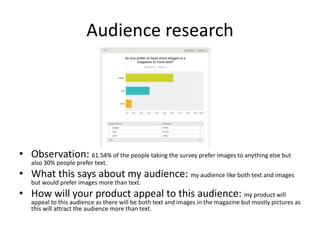
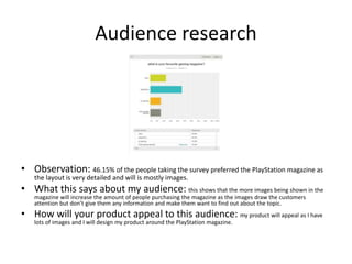
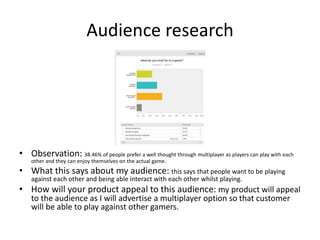
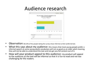
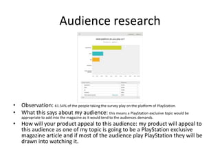
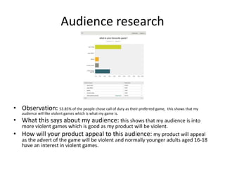
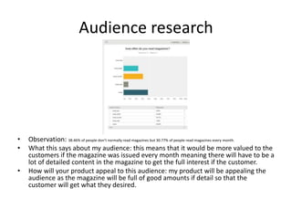
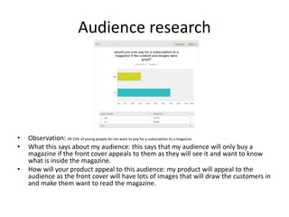
The common features of the researched products include using wide angles to display map views, large central images on magazine covers and posters to showcase the topic, and bright colors to convey a fun, non-serious tone. Both games have wide viewing angles of the map so players can see upcoming obstacles or goals. Magazine covers and posters prominently feature large, recognizable images related to the topic. Bright colors are used across products to signal they are approachable for all audiences without being too scary or serious. These design elements help appeal to target audiences by clearly communicating what the product is about and maintaining an entertaining atmosphere.