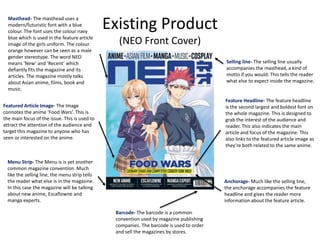
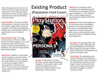
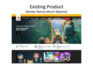
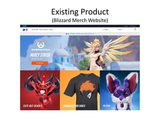
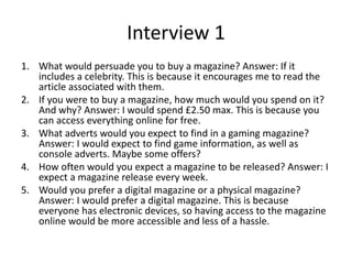
1. The research analyzed existing magazine and merchandise websites to identify common design elements. These included things like prominent images, mastheads, menus, and color schemes related to their brands.
2. Questionnaires and interviews with the target audience provided insights into their preferences and buying behaviors. For example, many said they would only spend $2-3 on a magazine and prefer digital formats over print.
3. The research will help inform the design and content of the new magazine product to effectively target the audience of gaming and anime fans. Elements like relevant images, pricing, and digital accessibility will be considered.
The document provides research on existing magazine products, including their cover designs, layouts, target audiences, and purposes. It analyzes magazines for anime/manga (NEO), video games (PlayStation), and merchandise stores (Bandai Namco, Blizzard). Common features identified are mastheads, headlines, images to attract audiences, menus, and barcodes. Audience research found the target was mostly male, aged 24, into FPS games, and willing to spend £3.40. Interviews suggested audiences want gaming news and prefer monthly digital magazines. Research will inform the production of a new gaming magazine.
The key observations from the audience research were:
- The audience was majority male
- They primarily game on PC and PS4
- The average age was 24
- Their favorite genres were FPS, RPG, and action games
- They would spend an average of £3.40 on a magazine
This informs that the target audience is male, young adults who enjoy gaming on PC and consoles. The product should focus on genres like FPS, RPG, and action games at an affordable price point of around £3.40 to appeal to this audience.
Here are my key takeaways from reviewing your experiments:
Positives:
- You tested different layouts and design elements to see what works best, which is important for refinement. Testing different options is valuable.
- Your double page spread experiment had a clean, balanced layout that allowed the content to shine. The imagery and text worked well together.
Areas for Improvement:
- Consider adding more details in your evaluations, like specific feedback on what elements could be improved further, what worked best and why.
- For planning, include details on your goals/objectives for each experiment to provide context.
- Consider testing with target audiences when possible to get feedback beyond just your own perspective. User
The document discusses research conducted for a magazine focused on video games, including analyzing the front covers, content pages, and articles of existing gaming magazines. The research covered topics like color schemes, layouts, images, and typography used on covers. The goal of the research was to help design an effective magazine cover that would appeal to the target gaming audience.
As media studies coursework preliminary taskFilipstojcic
Filip Stojcic will design a school magazine in three stages: pre-production, production, and post-production. In pre-production, he will conduct research on existing school magazine designs and conduct a market research survey. During production, he will hold a photo shoot and select images for the cover and content pages. In post-production, he will enhance the images digitally and design the cover and a content page based on his research. He will then evaluate the final outcomes.
The document provides details for an upcoming photo shoot, including those involved in the shoot and the equipment needed. It lists the models and crew members, including their contact information. It then outlines the props required and equipment to be used. Finally, it lists the two locations where the shoot will take place and provides brief descriptions of the planned shots for the front cover, inside content page, and double-page article spread. The shoot is for a gaming magazine to feature typical gamers and gaming scenes.
The document outlines a magazine pitch for a gaming magazine. It will target late-teen and young adult males ages 16-24 who have a strong interest in gaming. The magazine will provide gaming reviews and previews, news about the gaming industry, hardware tips, a Q&A page, and an interview with a pro gamer. It will have a modern design inspired by other gaming magazines, using striking colors, images, and fonts to appeal to its target demographic.
The document analyzes existing gaming magazine covers and layouts to inform the design of the author's own gaming magazine. It discusses the fonts, images, and layouts used in magazines like PC Gamer, PlayStation, Xbox, and others. Inspired by these examples, the author considers potential magazine names through a survey, choosing "OutSider." Font and cover image research is also presented to finalize the magazine design. The analysis of existing magazines provides guidance for an original student-designed gaming publication.
The document contains multiple draft layout designs for the front cover, content page, and article pages of a magazine.
For the front cover design, the author experiments with different masthead styles, fonts, image placements, and additional elements. They receive feedback to simplify the design and improve readability.
For the content page, the author tests different masthead designs, background styles, image selections, and font choices. Feedback notes the designs could be more visually appealing and professionally formatted.
In later drafts, the author makes adjustments like modifying backgrounds, image framing, masthead placement, and contact information to create a more cohesive, reader-focused magazine layout.
The document compares the student's preliminary magazine project to their final magazine product. They analyzed improvements in design skills, use of conventions, organization, and targeting the intended audience. Specifically, the student learned how to design magazine covers and content pages that are neat, visually appealing through limited colors and fonts, and that better engage the target gaming audience through relevant images and articles. They also gained skills in photography and image editing software. Overall, the student showed significant progression from an amateur preliminary version to a more polished final magazine product.
The survey responses indicate that the target audience for the gaming magazine is primarily male ages 15-20 who play games for both entertainment and competition on both consoles and PC. They prefer magazine covers with a mixture of colors and both pictures and some writing to draw their attention. The magazine should include tips, guides, and news about upcoming games to appeal to those seeking to improve their skills as well as entertain readers.
This document summarizes the contents of a magazine focused on video games. It describes the different sections on the contents page, including screenshots and previews of upcoming games, reviews of recently released games, articles on classic games from the 1980s, and a section with news and advertisements. The contents page provides an overview of the stories, previews, and other coverage contained in the issue to help readers find content of interest.
Here are 3 potential citations for research conducted for this project:
1. Thompson, Daniel. (2019, Month Day) Target Audience Research Survey. Survey Monkey.
2. Interviewee 1, Name. (2019, Month Day) Personal Interview.
3. Interviewee 2, Name. (2019, Month Day) Personal Interview.
These citations provide the necessary information about the source according to APA style guidelines: author/interviewer name, year, title, and for online sources the platform. This bibliography captures the primary research conducted with survey and interviews to inform the magazine design project.
The document discusses research on existing magazine and website designs that could provide inspiration for the creator's own magazine cover design. Common successful elements identified include strong color schemes, layering to create depth and emphasis, and use of bold fonts to highlight important features. The creator plans to incorporate text wrapping around images in their double page spread design, as well as a minimalist, information-focused style inspired by the analyzed website.
The document discusses print production research for a gaming magazine. Key points include:
- Researching other gaming magazine covers and websites to inform planning, focusing on fonts, images, color schemes, and layouts.
- Creating flat plans for the magazine cover, inside spread, and website to draft designs before production.
- Producing a magazine cover, inside double page spread, and website, making adjustments from the plans based on creative choices.
- Evaluating similarities and differences between initial plans and final products, such as sticking closely to plans or experimenting more. Consistency of branding elements like color and font was emphasized.
The document provides research and planning for a gaming magazine final product. It analyzes existing gaming magazines and websites to gather inspiration. It examines font, layout, use of images, and common sections. Flat plans are created for a magazine cover and inside double page spread, and for a website promoting the magazine. The plans aim to incorporate consistency of theme, color scheme, and fonts based on the research.
Here are the strengths and weaknesses of each research method you conducted:
- Product research:
- Strengths: Allowed you to closely analyze existing products and identify best practices. Gave concrete examples to model your own work after.
- Weaknesses: Only captured one perspective (yours). More subjective than other methods.
- Questionnaires:
- Strengths: Gathered input from multiple people. Provided quantitative data to understand preferences. Anonymous so may get honest feedback.
- Weaknesses: Lower response rates than other methods. Can't ask follow up questions for clarity.
- Interviews:
- Strengths: Allowed for open-ended discussion to get rich qualitative insights. Could ask follow
This document provides an introduction and outline for a proposed music magazine pitch. It discusses the working title ("EMBERS"), which aims to portray that music is continuous and timeless. The magazine will cover a wide range of genres from indie to chart music to rock to appeal to a diverse audience. It will be published monthly at a cost of £4-4.50. Style sheets are included that outline font choices and layouts for the front cover, contents page, and double page spread. A reader profile, mission statement, and flat plan of magazine contents are also discussed.
The document provides details on the planning for a music magazine pitch. It outlines the working title ("EMBERS"), genres of music to be included (indie, alternative, chart, rock, country, jazz, soul), planned monthly publication schedule and cost (£4-4.50). It includes style sheets for fonts, layouts and color schemes for the front cover, contents page and double page spread. A reader profile, mission statement and digital dummies of sample pages are also presented to outline the vision for the magazine.
The document outlines the author's plans for pitching a music magazine, including:
- Providing a working title ("EMBERS"), genres of music covered (indie, chart, rock, country, jazz), and proposed monthly cost (£4-4.50)
- Creating a reader profile, mission statement, and style sheet with colors, fonts, and layout designs
- Including dummy plans for the front cover, contents page, and double page spread showing proposed fonts, colors, and layouts
The author aims to provide an overview of the key elements of the magazine to serve as a base for initial ideas and gain feedback before final production. Diagrams and examples are presented on subsequent slides.
This document outlines the planning for a music magazine called "EMBERS". It includes details such as the working title, genres of music that will be covered, planned publication frequency and cost. Style elements like fonts, layouts and color schemes are proposed for the front cover, contents page and double page spread. A reader profile, mission statement and digital dummies of sample pages are also included to demonstrate the vision for the magazine.
This document outlines the planning for a music magazine called "EMBERS". It discusses the working title, genres of music that will be included, planned publication frequency and cost. Style elements like fonts, layouts and color schemes are proposed for the front cover, contents page, and double page spread. A reader profile, mission statement, and digital dummies of sample pages are also included to demonstrate the vision for the magazine.
The document discusses various magazine and website designs. It provides examples of double page spreads and front covers created in InDesign for a photography magazine and a gaming magazine. It also shows mock-ups of website designs created in Wix and Website Builder. The document compares different website building software and concludes that Wix and Website Builder offer more customization options than WordPress.
Here are the key points from Interview 1:
- The interviewee is familiar with existing streetwear brands but does not personally wear any.
- They typically wear dark clothing rather than bright or a mixture of dark and light.
- When shopping for clothing, they consider style, fit and comfort over brand name.
- They would be interested in checking out a new streetwear brand if the designs appealed to them in terms of style and aesthetic.
- For marketing, they suggested using Instagram to showcase clothing through lifestyle photos rather than just product shots.
This interview provided insights into how to appeal to an audience that is aware of but not loyal to existing streetwear brands. Emphasizing style, fit and
The document outlines a proposal for a new gaming magazine targeted at 16-25 year olds. Key details include:
- The magazine will be called "Player" and focus on gaming content like reviews, esports, and news.
- The target audience is described as mostly male, aged 16-25, students or unemployed, into games like shooters and fighters.
- Market research found an opportunity for a gaming magazine that offers community opinions, streaming coverage, and a lack of trust in other reviews.
- Sample articles and designs were created and critiqued, with adjustments to fonts, layouts and imagery.
- Budget and costs were estimated, with projections showing the magazine could turn
Here are some key aspects of the target audience to consider including in your magazine based on the profile:
- Focus game and article content on popular franchises and titles appealing to 16-18 year old male gamers. Feature previews and reviews of upcoming AAA games rated M for Mature.
- Include discussions and opinions on gaming news, hardware/accessories, esports and gaming culture that would interest balanced male gamers in that age range.
- Design the visual style, layout and tone of the magazine to attract older teenage male gamers without excluding readers of any social status. Ensure all content is appropriate for all readers.
- Leverage social media to engage the target audience and drive traffic. Profile popular gaming
The document provides research on existing gaming magazine covers and merchandise websites. Key findings include common design elements like mastheads, featured images/headlines, and menus. Colors are generally neutral. Target audiences are teenagers to adults interested in games. Websites aim to advertise and sell merchandise. Layouts are clean with minimal text. Research will inform the production of the new magazine, drawing on established conventions.
The document discusses existing magazine products that are similar to the student's product. It analyzes three existing products that have game covers on the front, use bold text, and have dark or light color backgrounds. The student notes they will include a main character or game on the front cover, a two-page spread discussing an upcoming game on one side and a YouTube game review on the other, and possibly a flashy slogan on the front cover related to the game featured. The student also profiles their target audience as 15-20 year olds of both genders interested in mobile games, from middle-class backgrounds, and will include games that appeal to both genders as well as individually.
The document discusses existing magazine products that are similar to the student's product. It analyzes three existing products that have games or characters featured prominently on the cover in bold text to attract readers. Key similarities include flashy slogans and images related to games. The student notes they will include a main character or game on the cover, a two-page spread discussing an upcoming game on one side and a YouTube review on the other, and potentially a flashy slogan depending on the game featured. An audience profile targets 15-20 year olds of both genders interested in games they can enjoy on the move, focusing on games that would appeal to that demographic and social status.
The document discusses print production research for magazines and websites. It includes research on magazine covers, layouts, fonts, and color schemes. It also shows planning documents for a magazine cover, double page spread, and website layout. Draft versions and final products are displayed to demonstrate the planning and production process.
The document discusses print production research for a gaming magazine. Key points include using eye-catching fonts and images on magazine covers to attract audiences, including a letter from the editor and contents page to engage readers, and maintaining consistent branding through a shared color scheme and font across multiple products like the magazine and website. Research of other publications informed choices around layout, design elements, and building relationships with readers.
This document summarizes some of the key technical considerations for print and digital magazines. For print magazines, considerations include using standard page sizes (A4 or A5), selecting appropriate fonts for the genre and audience, including bleedlines so images aren't cut off, and using gutters for layout clarity. For digital magazines, considerations are which apps support the format, ensuring consistent display of pages, images, text, colors and fonts across platforms, and planning user navigation through the magazine.
This document analyzes and summarizes several existing product designs that are relevant to the creator's magazine project. It discusses the common features found across the researched products, such as strong color schemes, layering for depth, and use of bold fonts. The creator notes they will take inspiration from the minimalist yet colorful website design and will include text wrapping in their own double page spread design. The research will help inform the creator's production work, particularly the magazine cover and website design aspects.
The document provides details about the student's research and planning for producing their own gaming magazine. They analyzed existing magazines and websites to gather inspiration. They created flat plans for the magazine cover, inside pages, and website. The plans follow color schemes and fonts from popular gaming brands. The student produced a double-page spread, website using the plans, keeping consistency in style.
I do not have any observations from interviews to analyze, as no interview transcripts were provided. To analyze audience research, it is necessary to have direct quotes, paraphrased observations, or summarized insights from interactions with potential customers such as interviews. Without any interview content, I cannot infer anything about the target audience or how the product might appeal to them based on interviews.
The researcher conducted product research by analyzing existing gaming magazines online to understand effective designs. Questionnaires were distributed to friends on Facebook to gather audience preferences for the new product. Interviews were also conducted with a friend to get direct feedback on a poster design. Strengths included getting quick responses, but weaknesses included limited sample sizes that may not represent all gamers and potential for joking responses. Expanding the surveys publicly could provide a broader understanding of the target audience.
The document provides research and analysis on existing gaming magazine products. It notes several common conventions across the products, such as large, bold text and brighter colors. However, it argues these conventions do not well relate to the gaming genre. The analysis states aspects that will be included in the author's own work, such as using dark colors at the bottom graduating to lighter at the top, and not placing text over images. The document also profiles the intended audience for the magazine as mainly male, aged 10-25, from middle-class backgrounds, and with needs-driven psychographics responding to impulse and missing opportunities.
The document discusses how color schemes and layout are used in magazines to draw attention to important information and increase sales. It analyzes existing magazine covers and notes their use of 3 main colors and inclusion of multiple game topics. It also describes how a red circle on one magazine cover draws immediate attention to a special offer. The document concludes that these design elements allow certain parts to stand out while making the magazine appealing overall.
Here are the key points from the research evaluation:
- Product research allowed understanding current trends but consumer opinions can change
- Questionnaires provided insights into audience preferences but some incorrect responses are possible
- Interviews ensured the product would interest specific people but their opinions may change over time
- The research responses focused on colors, advertising, fonts, superhero topics and basing the magazine on Empire
- Distributing surveys via WhatsApp and Teams allowed viewing delivery/read rates but posed risks of leading questions
Overall this evaluation highlighted both the strengths and limitations of each research method used to inform the magazine design based on audience needs and preferences. The mixed methods approach provided valuable insights but also acknowledged potential weaknesses to consider.
The document summarizes research on existing gaming magazines - Nintendo Power, PlayStation Magazine, and Edge. Nintendo Power was officially licensed by Nintendo from 1988-2007 and focused on upcoming Nintendo games. PlayStation Magazine focuses on PlayStation games, developers, and strategy guides. Edge covers all major platforms and focuses on reviews, interviews, and strategies. The research will inform the creation of a new gaming magazine by considering features like previews, bold titles, and promotional items. A survey of the target audience found it is mostly male teenagers who prefer affordable magazines and strategy guides conveyed visually over text. The new magazine will aim to appeal to this audience.
- The video and gameplay recordings are done in Apollo's home using his own PC. Footage is recorded from all angles to provide cinematic views of battles.
- Visual effects like maps and background music are used to immerse viewers and provide context. Colors are used clearly distinguish unit types and armies.
- Feedback is gathered through questionnaires sent to classmates, allowing specific questions but limited representation. Interviews provide detailed answers but potential bias.
- The research found the target audience is primarily male, prefers intense gameplay, and has varying color preferences, so multiple color options will be offered.
The document summarizes three existing magazine covers that were analyzed. Some common features identified across the magazines were placing the main character of the advertised game or product prominently in the center, and using color schemes that match the tone of the game or product. When developing their own magazine cover, the author intends to include these elements of a matching color scheme and central character placement.
The document summarizes research on existing magazine products, including PlayStation Magazine, a fashion magazine, and a Christmas magazine. It describes the typical content, conventions, codes, and target audiences of each magazine type. The research analysis identifies common features like escapism and consideration of the reader's eyes. Aspects the creator will include in their own work are soft welcoming colors, unharsh text colors, a good balance of text and pictures, and intriguing titles. The bibliography cites the specific magazines and websites reviewed.
The magazine covers Battlefield 1 in detail, showing a character emerging from a large "1" on the cover. It asks whether Call of Duty: Infinite Warfare is "a leap too far" and lists bullet points about what can be read about the new Battlefield game inside. The Little Player magazine aims at children with colorful branding and offers a digital edition. It features an artistic shot of The Legend of Zelda: Breath of the Wild to interest readers. The final magazine uses retro-styled text and cool artwork instead of words to attract readers' attention.
Here are the summaries of the two interviews:
Interview 1:
- Last anime watched was Attack on Titan and currently watching The Devil is a Part Timer
- Never bought magazines but reads brother's gaming magazines
- Prefers physical magazines over digital
- Thinks £5 is a reasonable price for a magazine
- Front cover art persuades them to buy
Interview 2:
- Last anime watched was shows from childhood like Digimon, Pokemon, Avatar
- Last magazine bought was PlayStation magazine for £4.99
- Prefers physical magazines to collect and keep
- Thinks £3.75 is a reasonable magazine price
- Likes cover art and posters included in magazines
The student struggled with various aspects of the project such as research, planning, and production due to mental and physical health issues. Production was particularly challenging, as the student only managed to take 10 mediocre photos due to a lack of effort and inability to leave home frequently. While the final product was a black and white street photography portfolio as intended, the quality and standard did not meet the student's original intentions due to weaknesses in various phases of the project. The student learned from the experience but remained disappointed they could not push themselves further or accomplish their full goals.
The interviews provided feedback on expectations for a photography portfolio. Both interviewees said they would expect photos to be named, dated, and have location details. They also agreed a website would help promote the work. One preferred black and white while the other said a mix of color and black and white would be best. The number of photos expected ranged from 10-12 to 20-30. Both said framed photos would look more professional than board-mounted. The interviews reinforced the photographer's plans to include names, shoot in black and white, create a website, and frame the final portfolio photos.
The document provides an evaluation by Alexander Sullivan-Cree of various aspects of a client project they completed. For research, they struggled to find relevant demographic information for their target audience. Their planning went well as they developed good ideas, creating initial designs before finalizing in Illustrator. Time management was poor due to health issues, resulting in rushed work that did not meet their standards. They achieved the retro aesthetic they aimed for but were unhappy with the quality, especially the "alien" mascot created through copying rather than skill.
This document outlines a client project for a comic book store called Destination Venus. The student proposes 3 ideas: 1) Creating a mascot for the store in the form of an alien or astronaut, which could be used on promotional materials. 2) Designing new promotional materials like posters and business cards with a space theme. 3) Redesigning the store's website and social media pages to have a more modern space and comic book theme. The student decides to pursue the mascot idea as their final project. They provide details on the design inspiration, colors, production schedule, and plan to create both an astronaut and alien mascot in Adobe Illustrator over 3 weeks.
Alexander Sullivan-Cree is applying to university through UCAS. He attended King James Highschool where he earned various GCSE grades. He then attended York College where he earned pass, merit, and distinction grades. He is considering courses in Marine and Natural History Photography at Falmouth University, Japanese at the University of Edinburgh or University of Leeds, and Graphic Design which he rates as an 8/10 suitability due to being a good choice for his current course of study.
This document provides an evaluation of the student's fanzine project. For the research stage, the student felt their initial ideas were strongest but struggled to find related existing fanzines. Their planning was one of the strongest parts as they knew the information and chose a layout/color scheme. However, they changed their pagination multiple times. They managed their time effectively using a production schedule but wish they had more time for additional pages/a more professional look. Their fanzine has a simpler, notebook-like aesthetic compared to a professional fanzine and they would improve layout, original artwork, and front cover design for the future.
This document outlines Alexander Sullivan-Cree's showreel, which includes work from Level 3 Year 1, Level 3 Year 2, and Level 2 Year 1 of his studies. The showreel provides a high-level overview of the types of projects and work Alexander completed during different years and levels of his education.
UCAS is an organization that handles applications to higher education programs in the United Kingdom. The document discusses an individual named Alexander Sullivan-Cree who is likely involved with UCAS as their name is the title of the document. However, no other contextual information is provided about Alexander Sullivan-Cree or their specific role at UCAS.
This document discusses the color scheme, fonts, and locations for a photography portfolio project. For the color scheme, the project will focus on black and white photography and use the color #0c0c0c for the website. No special fonts are needed for the photography, but the creator plans to design their own font incorporating their name for the portfolio title. The primary photography locations will be the creator's hometown of Knaresborough for its tourist attractions, Whitby for its seaside scenery, and York for its historic areas and street performers.
The document discusses research conducted for a photography portfolio project. It includes interviews with two people about what they would expect to see in a portfolio. It also covers the interviewees' familiarity with street photographers and preferences for displaying work. Both interviews indicated names and locations should be included with photos and that a website could help promote the work. Black and white images were favored over color by one interviewee. The document also provides a bibliography of sources consulted.
The document discusses potential problems that could arise during a street photography project and ways to address them. It identifies issues with equipment failure or unavailability, including cameras breaking down or memory cards corrupting. Software and hardware compatibility between college and personal devices is also flagged as a risk. Location access problems and unpredictable British weather are highlighted as external factors that could impact shoots. Backups, spare gear, and alternative local shooting spots are proposed to mitigate many of these potential problems.
Alexander Sullivan-Cree has had a lifelong interest in photography and media that began when he was diagnosed with Type 1 diabetes at age nine. This dashed his hopes of joining the navy like other men in his family. At college, he studied photography, video editing, and audio editing software. For projects, he created video game assets, magazines focused on anime and manga, and a fashion magazine featuring original photography shoots. His dream is to have his photography published in prestigious magazines like National Geographic that document wildlife and culture around the world.
This document discusses research for a photography portfolio, including existing photographers like Vivian Maier, William Klein, Robert Frank, Eddie Adams, and Alfred Eisenstaedt. It also includes interviews with two people about what they would expect to see in a portfolio, whether black and white or color is more professional, and how many photos a portfolio should contain. The document ends with a bibliography of sources about iconic street photographers.
The document summarizes research conducted for a local comic book store client. It discusses the store's diverse audience due to its range of comics, citing a survey that found 63% of comic buyers are men aged 13-29. It also notes that while comics generally appeal more to boys and men, the store is located in a cinema, so it gets traffic from all ages. To avoid alienating female customers, the document recommends a gender-neutral color scheme for marketing. It also discusses Harrogate's demographics, including its female population of 51% and religious diversity.
The student proposes a black and white street photography portfolio titled "City Ruins" featuring images taken in their hometown of Knaresborough, Yorkshire. Photography will be the primary medium, with the goal of also creating a website and booklet to showcase the work. The student has researched street photographers like Joel Meyerowitz, Helen Levitt, and Henri Cartier-Bresson for inspiration. Peer and public feedback will be gathered to evaluate the project, which will involve primary research, experiments, image taking and editing over 15 weeks culminating in a final presentation.
The document provides biographies of four photographers: Joel Meyerowitz, Helen Levitt, Henri Cartier-Bresson, and Nick Turpin. It describes their backgrounds, influences, notable works, and contributions to photography. Joel Meyerowitz pioneered the use of color photography and published influential books. Helen Levitt photographed street scenes and children in New York. Henri Cartier-Bresson developed a passion for photography after being introduced to the Leica camera, and published The Decisive Moment. Nick Turpin studied photography and established the In-Public collective to promote street photography.
The student proposes a black and white street photography portfolio titled "City Ruins" featuring images taken in their hometown of Knaresborough, Yorkshire. Photography will be the primary medium, and if time allows, a website and booklet will be created to showcase the work. The student has researched street photographers like Joel Meyerowitz, Helen Levitt, and Henri Cartier-Bresson for inspiration. Peer and public feedback will be gathered to evaluate the project, and over 20 weeks the student will complete tasks like primary/secondary research, experiments, production, and presentation.
The proposal outlines a street photography portfolio titled "City Ruins" focused on the student's hometown of Knaresborough, Yorkshire. Photography will be the primary medium, with the goal of also creating a website and booklet to showcase the work. The student has researched street photographers like Joel Meyerowitz, Helen Levitt, and Henri Cartier-Bresson for inspiration. Peer and public feedback will be used for evaluation, with the project timeline spanning pre-production, production, and evaluation phases over 17 weeks culminating in a final presentation.
The document provides details about Nobuo Uematsu, the famous composer for many Final Fantasy soundtracks. It summarizes that Uematsu grew up in Kochi Prefecture in Shikoku, Japan, and that despite no formal music training, he started composing music for Square and became their main composer. It also discusses some of his musical influences like Deep Purple and mentions that he is proud that his music brings people together in harmony.
The document provides details on idea development, pagination, and a production schedule for creating a fanzine about the Final Fantasy video game series. It includes mood boards, character pages on Cloud Strife, Jenova and Sephiroth, an interview with Nobuo Uematsu, and illustrations to feature in the fanzine. A production schedule is outlined over 3 weeks to complete layouts, illustrations, written pages, and assembly of the fanzine.
LAND USE LAND COVER AND NDVI OF MIRZAPUR DISTRICT, UPRAHUL
This Dissertation explores the particular circumstances of Mirzapur, a region located in the
core of India. Mirzapur, with its varied terrains and abundant biodiversity, offers an optimal
environment for investigating the changes in vegetation cover dynamics. Our study utilizes
advanced technologies such as GIS (Geographic Information Systems) and Remote sensing to
analyze the transformations that have taken place over the course of a decade.
The complex relationship between human activities and the environment has been the focus
of extensive research and worry. As the global community grapples with swift urbanization,
population expansion, and economic progress, the effects on natural ecosystems are becoming
more evident. A crucial element of this impact is the alteration of vegetation cover, which plays a
significant role in maintaining the ecological equilibrium of our planet.Land serves as the foundation for all human activities and provides the necessary materials for
these activities. As the most crucial natural resource, its utilization by humans results in different
'Land uses,' which are determined by both human activities and the physical characteristics of the
land.
The utilization of land is impacted by human needs and environmental factors. In countries
like India, rapid population growth and the emphasis on extensive resource exploitation can lead
to significant land degradation, adversely affecting the region's land cover.
Therefore, human intervention has significantly influenced land use patterns over many
centuries, evolving its structure over time and space. In the present era, these changes have
accelerated due to factors such as agriculture and urbanization. Information regarding land use and
cover is essential for various planning and management tasks related to the Earth's surface,
providing crucial environmental data for scientific, resource management, policy purposes, and
diverse human activities.
Accurate understanding of land use and cover is imperative for the development planning
of any area. Consequently, a wide range of professionals, including earth system scientists, land
and water managers, and urban planners, are interested in obtaining data on land use and cover
changes, conversion trends, and other related patterns. The spatial dimensions of land use and
cover support policymakers and scientists in making well-informed decisions, as alterations in
these patterns indicate shifts in economic and social conditions. Monitoring such changes with the
help of Advanced technologies like Remote Sensing and Geographic Information Systems is
crucial for coordinated efforts across different administrative levels. Advanced technologies like
Remote Sensing and Geographic Information Systems
9
Changes in vegetation cover refer to variations in the distribution, composition, and overall
structure of plant communities across different temporal and spatial scales. These changes can
occur natural.
हिंदी वर्णमाला पीपीटी, hindi alphabet PPT presentation, hindi varnamala PPT, Hindi Varnamala pdf, हिंदी स्वर, हिंदी व्यंजन, sikhiye hindi varnmala, dr. mulla adam ali, hindi language and literature, hindi alphabet with drawing, hindi alphabet pdf, hindi varnamala for childrens, hindi language, hindi varnamala practice for kids, https://www.drmullaadamali.com
it describes the bony anatomy including the femoral head , acetabulum, labrum . also discusses the capsule , ligaments . muscle that act on the hip joint and the range of motion are outlined. factors affecting hip joint stability and weight transmission through the joint are summarized.
Temple of Asclepius in Thrace. Excavation resultsKrassimira Luka
The temple and the sanctuary around were dedicated to Asklepios Zmidrenus. This name has been known since 1875 when an inscription dedicated to him was discovered in Rome. The inscription is dated in 227 AD and was left by soldiers originating from the city of Philippopolis (modern Plovdiv).
Communicating effectively and consistently with students can help them feel at ease during their learning experience and provide the instructor with a communication trail to track the course's progress. This workshop will take you through constructing an engaging course container to facilitate effective communication.
Main Java[All of the Base Concepts}.docxadhitya5119
This is part 1 of my Java Learning Journey. This Contains Custom methods, classes, constructors, packages, multithreading , try- catch block, finally block and more.
Leveraging Generative AI to Drive Nonprofit InnovationTechSoup
In this webinar, participants learned how to utilize Generative AI to streamline operations and elevate member engagement. Amazon Web Service experts provided a customer specific use cases and dived into low/no-code tools that are quick and easy to deploy through Amazon Web Service (AWS.)
2. Existing Product
(NEO Front Cover)
Featured Article Image- The Image
connotes the anime ‘Food Wars’. This is
the main focus of the issue. This is used to
attract the attention of the audience and
target this magazine to anyone who has
seen or interested on the anime.
Masthead- The masthead uses a
modern/futuristic font with a blue
colour. The font uses the colour navy
blue which is used in the feature article
image of the girls uniform. The colour
orange however can be seen as a male
gender stereotype. The word NEO
means ‘New’ and ‘Recent’ which
defiantly fits the magazine and its
articles. The magazine mostly talks
about Asian anime, films, book and
music.
Feature Headline- The feature headline
is the second largest and boldest font on
the whole magazine. This is designed to
grab the interest of the audience and
reader. This also indicates the main
article and focus of the magazine. This
also links to the featured article image as
they’re both related to the same anime.
Selling line- The selling line usually
accompanies the masthead, a kind of
motto if you would. This tells the reader
what else to expect inside the magazine.
Anchorage- Much like the selling line,
the anchorage accompanies the feature
headline and gives the reader more
information about the feature article.
Barcode- The barcode is a common
convention used by magazine publishing
companies. The barcode is used to order
and sell the magazines by stores.
Menu Strip- The Menu is is yet another
common magazine convention. Much
like the selling line, the menu strip tells
the reader what else is in the magazine.
In this case the magazine will be talking
about new anime, Escaflowne and
manga experts.
3. Existing Product
(PlayStation Front Cover)
Featured Article Image- The image
connotes the game ’Persona 5’ which
features the main protagonist. This is used
to draw fans of the series to buy the
magazine as well as draw the attention of
bystanders. The colors and image look like
they’re pulled straight
Masthead- The font for the magazine is
the same font used on all PlayStation
products so its easily recognizable to
fans which are probably their target
audience too. The font itself uses a
white colour as white is gender neutral
and easily stands out among the red and
black background.
Feature Headline- The Feature headline
in this example is ’Persona 5’ which links
to the feature image as they’re both the
same game. Much like the masthead the
headline uses a white bold font. White is
a good colour to use as its gender
neutral.
Selling line- The Selling line often
accompanies the masthead and gives
the reader more information about the
type of magazine it is. This selling line
tells us that the magazine will be
covering articles related to PS4 PS-VR
and PS-VITA.
Menu Strip- The Menu is is yet another
common magazine convention. Much
like the selling line, the menu strip tells
the reader what else is in the magazine.
In this case the magazine will be
discussing ‘Prey’ and Horizon Zero
Dawn’. The menu strip uses a white font
to easily stand out among the red and
background.
Barcode- The barcode is a common
convention used by magazine publishing
companies. The barcode is used to order
and sell the magazines by stores.
However this magazine doesn't’t have
the barcode on the front cover
Plug- The plug stands out from the rest
of the front cover in order to draw more
attention to it. This makes the reader/
audience see that the as long as talking
about Persona 5 it will also be talking
about Mass Effect.
Sub Heading- The subheading uses a
smaller and thinner font compared to
the feature headline. This time however
the subheading is enclosed in a white
shape to make it stand out from the
feature article image. The text uses a
blue colour alongside a small few
sentences in black.
Sub Image- The sub image links to the
sun heading as they’re both about the
game Crash Bandicoot. Much like the
feature image the sub image is used to
attract the attention of the audience and
any fans of the game series.
5. Existing Product
(Bandai Namco Merch Store)
Colours- The colours used by the Namco Bandai team to create their merchandise store link to their logo
as they use the same tone of orange in their menu navigation strip at the top. A lot of the colours are basic
straight from the website itself like the black and the white, however the images used in the page are all
titles that they've published themselves such as ‘Ni No Kuni II’ and ‘Dragon Ball Z’. All the colours used are
all gender neutral so it isn't targeted at a single gender. The orange and white work well together and the
overall page is quite simplistic.
Target Audience- The target audience of the website I would say would be teenagers to young adults as
it’s a merchandise store so you’ll need money. Like I said in the colours, there is no specific gender to the
store as it contains items for both males and females. The store mostly sells items such as video games
and figures so nothing targeted at a single gender or sexuality.
Purpose- The website doesn't have a single purpose as it contains a range of subject. The websites main
faction is to sell and advertise and sell merchandise and video games. However, the website also has a
membership program where members can get free items and early information about games. You can also
interact with friends on the website.
Layout- The overall layout of the website is extremely clean and in no way unorganized. It isn't bombarded
with text and images but rather small and smart menu buttons at the top, a few images and minimum
text. It contains common web design conventions such as a menu bar, a log in/sign up button and a basket
and checkout button.
7. Existing Product
(Blizzard Merch Store)
Colours- The colours used in the website link to the game they’re selling merchandise for. For example,
the red in the lower left box links to the game ’Diablo’, the orange in the middle box links to the game
‘Overwatch’ and the lower right box isn't related to any game in specific. Yet again this website doesn't
have any colours specific to a single gender like blue or pink. The menu strip at the top in a dark navy blue
which contrasts the light blue of the company logo.
Target Audience- The target audience of this website is the same as the first website I annotated. As it’s a
merchandise store I would expect the target audience to be someone who can afford to buy the
merchandise such as young adults and parents. The website sells items which could be seen as age
specific items such as cook books and shot glasses for adults to plush toys and clothing for the younger
audience.
Purpose- The purpose of the website it so sell and advertise items such as clothing, figures and plush. As a
merchandise website it works well when it comes to trying to persuade people to buy items from it.
Furthermore the website also advertises events like Blizz-con which you can buy the virtual ticket from.
Layout- The website layout is extremely professional and smart, much like the Bandai Namco Website, I
wouldn't’t expect less from a multi billion dollar company. It also contains common website conventions
like a signup/sign in button alongside basket and checkout button.
8. Research Analysis
• What common features do the researched
products have?
• What aspects of the research will you include
within your own production work?
21. Interview 1
1. What would persuade you to buy a magazine? Answer: If it
includes a celebrity. This is because it encourages me to read the
article associated with them.
2. If you were to buy a magazine, how much would you spend on it?
And why? Answer: I would spend £2.50 max. This is because you
can access everything online for free.
3. What adverts would you expect to find in a gaming magazine?
Answer: I would expect to find game information, as well as
console adverts. Maybe some offers?
4. How often would you expect a magazine to be released? Answer: I
expect a magazine release every week.
5. Would you prefer a digital magazine or a physical magazine?
Answer: I would prefer a digital magazine. This is because
everyone has electronic devices, so having access to the magazine
online would be more accessible and less of a hassle.
26. Bibliography
1. Your, Name. (2018) Target Audience Research Survey (conducted on
DATE)
2. Interviewees, Name. (2018) Target Audience Interviews (conducted on
DATE)
Editor's Notes
Choose a recent product similar to your own and annotate it
Type of image- studio/location, angle, effects, post-production
Use of lighting/composition/mise en scene/costume/props/location/colours/fonts etc.
Audience appeal- how does it make its audience want to buy/watch/play it?
Why have you chosen to look at this? What have you learned that can help you in your project?
List all products researched in previous sections. Include anything additional you have watched/read in preparation for production. Alphabetise your list.