The document discusses how the author manipulated images in Photoshop to make them more professional for use in a magazine. They cut out backgrounds, adjusted saturation and colors, and used tools like selective color and smooth edges to make models and images more appealing and stand out to the intended audience. The progress images show how cutting out backgrounds and increasing saturation made one image look much more professional and attractive. Another image was edited by changing the color of the model's shirt with selective color to make it brighter and stand out more.
Presented by Prof. Mark Gallian at the BBLA-NCLIS seminar for librarians held at the ICT Hall, Benguet State University Library, La Trinidad, Benguet. The objectives are 1) Introduce to the librarian desktop publishing and photoshop, 2) Develop in the librarians the skill of technological marketing, and 3) enable librarians for marketing Filipiniana materials.
Presented by Prof. Mark Gallian at the BBLA-NCLIS seminar for librarians held at the ICT Hall, Benguet State University Library, La Trinidad, Benguet. The objectives are 1) Introduce to the librarian desktop publishing and photoshop, 2) Develop in the librarians the skill of technological marketing, and 3) enable librarians for marketing Filipiniana materials.
1. Band image manipulation
At first the images I had taken for my front cover, contents page and double page spread weren’t up
to the professional standard that is expected on the front of a magazine cover. As this was the case, I
believed the best way to make the images look more professional would be to manipulate the
images to make them look professional. I did this using the software programme Photoshop. Editing
software that allows you to do multiple things with images, such as cut the background out, change
the saturation/colours of the image, etc.
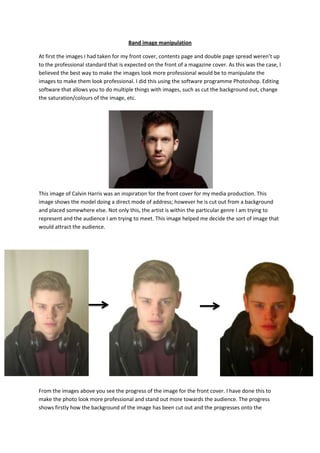
This image of Calvin Harris was an inspiration for the front cover for my media production. This
image shows the model doing a direct mode of address; however he is cut out from a background
and placed somewhere else. Not only this, the artist is within the particular genre I am trying to
represent and the audience I am trying to meet. This image helped me decide the sort of image that
would attract the audience.
From the images above you see the progress of the image for the front cover. I have done this to
make the photo look more professional and stand out more towards the audience. The progress
shows firstly how the background of the image has been cut out and the progresses onto the
2. saturation on the colour of the model, to make him look more appealing and brighter towards the
audience. From the first photo to the edited version you see a huge difference in the contrast of the
image and how it is more attractive.
This image was used for my double page spread. The manipulation of this image was used to get rid
of the background that wasn’t really suitable or fit in with the magazine. I used this image as the
angle looked creative and attractive for the audience, however it did need to be edited to look even
more appealing. One key editing technique was to use the selective colour tool in Photoshop to
change the colour of his top to make it brighter. In the first image the t-shirt looks dull and
ineffective, however now it stands out even if it is only a plain t-shirt. Another key skill was to
smooth the edges around the artist. As the image was edgy after cutting it out, the smooth tool was
effective to make it look more professionally done.