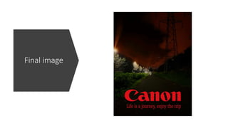
The document summarizes changes made to an image for a poster project. It describes:
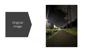
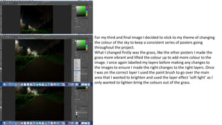
1) Lightening the grass to add more color by using the paint brush and soft light layer effect.
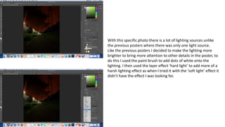
2) Brightening lighting sources by adding white dots with the paint brush and using a hard light layer effect.
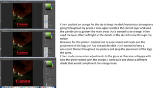
3) Changing the sky to orange to maintain a dark atmosphere, using the paint brush and soft light layer effect.
4) Keeping the logo placement consistent to maintain the project's theme.
5) Adjusting the grass color again to better complement the orange sky.