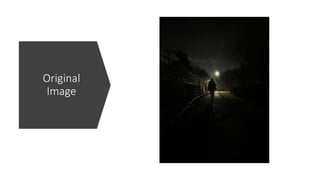
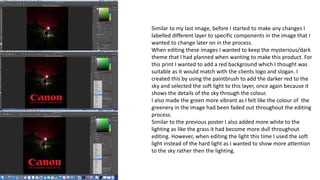
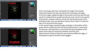
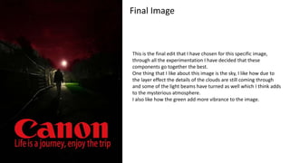
This document summarizes the process of editing an image for a print advertisement. It describes how the author labeled layers to edit specific components. A red background was added to match the client's logo and slogan. The green coloring was made more vibrant and lighting was adjusted using soft light. Different placements for the logo and text were tested before deciding the bottom placement was best as it allowed consistency across advertisements while keeping the audience and client engaged. The final image balances the sky, green coloring, and lighting effects to create a mysterious atmosphere as intended.